Observation framework came out along with iOS 17 in 2023. Using this framework, we can make objects observable very easily. Please refer to @Observable macro in SwiftUI for quick recap if needed. It also has a function withObservationTracking(_:onChange:) what can be used for cases where we would want to manually get a callback when a tracked property is about to change. This function works as a one shot function and the onChange closure is called only once. Note that it is called before the value has actually changed. If we want to get the changed value, we would need to read the value on the next run loop cycle. It would be much more useful if we could use this function in a way where we could have an observation token and as long as it is set, the observation is active. Here is the function with cancellation support.
This file contains hidden or bidirectional Unicode text that may be interpreted or compiled differently than what appears below. To review, open the file in an editor that reveals hidden Unicode characters.
Learn more about bidirectional Unicode characters
The apply closure drives which values are being tracked, and this is passed into the existing withObservationTracking(_:onChange:) function. The token closure controls if the change should be handled and if we need to continue tracking. Will and did change are closures called before and after the value has changed.
Here is a simple example where we have a view which controls if the observation should be active or not. Changing the value in the view model only triggers the print lines when observation token is set.
This file contains hidden or bidirectional Unicode text that may be interpreted or compiled differently than what appears below. To review, open the file in an editor that reveals hidden Unicode characters.
Learn more about bidirectional Unicode characters
In addition to scroll related view modifiers covered in the previous blog post, there is another one for detecting scroll view phases aka the state of the scrolling. The new view modifier is called onScrollPhaseChange(_:) and has three arguments in the change closure: old phase, new phase and a context.
decelerating – user interaction stopped and scroll velocity is decelerating
idle – no scrolling
interacting – user is interacting
tracking – potential user initiated scroll event is going to happen
The enum has a convenience property of isScrolling which is true when the phase is not idle.
ScrollPhaseChangeContext captures additional information about the scroll state, and it is the third argument of the closure. The type gives access to the current ScrollGeometry and the velocity of the scroll view.
Here is an example of a scroll view which has the new view modifier attached.
This file contains hidden or bidirectional Unicode text that may be interpreted or compiled differently than what appears below. To review, open the file in an editor that reveals hidden Unicode characters.
Learn more about bidirectional Unicode characters
WWDC’24 brought some updates to scrolling. One of which is onScrollGeometryChange(for:of:action:) what we can use for reacting to scroll geometry changes. The view modifier has two closures, where the first one is transforming the scroll geometry into an arbitrary equatable type of our liking. If that value changes, the action closure is called. It is a convenient way for triggering view updates or updating other states.
The new ScrollGeometry type provides the current scroll state:
bounds
containerSize
contentInsets
contentOffset
contentSize
visibleRect
This file contains hidden or bidirectional Unicode text that may be interpreted or compiled differently than what appears below. To review, open the file in an editor that reveals hidden Unicode characters.
Learn more about bidirectional Unicode characters
Here is another example where we can use the new modifier for showing a scroll to top button in combination with the new scrollPosition(_:anchor:) view modifier.
This file contains hidden or bidirectional Unicode text that may be interpreted or compiled differently than what appears below. To review, open the file in an editor that reveals hidden Unicode characters.
Learn more about bidirectional Unicode characters
WWDC’24 brought a lot of new and SwiftUI received many updates. One of which, is the new NavigationTransition protocol and the zoom transition. And that is pretty much what it contains at the moment. A built-in way to add a zoom transition to the view. Easy to get going, but does not provide customization, at least for now.
Here is an example of a grid view which opens a DetailView with zoom transition. Here we can see that we need to add navigationTransition view modifier to the destination view and matchedTransitionSource view modifier to the view it starts the transition from.
This file contains hidden or bidirectional Unicode text that may be interpreted or compiled differently than what appears below. To review, open the file in an editor that reveals hidden Unicode characters.
Learn more about bidirectional Unicode characters
While working on a SwiftUI view, I needed a way for aligning views in different stacks in a way that they are centred. Most of the time I can get away using default alignment values, what HStack and VStack provide. In that case I had two views in different stacks and I needed a way to centre align these views. Here is a view which has three labels in one VStack and 2 texts with an image in another VStack. This is just an example view for illustrating the real world case. The question is, how to align the top text “Hello, world!” with the image so that both are centre aligned.
The answer is to use alignment guides. If combining VStacks and HStacks does not work out, then we can take one step further and define a custom alignment for our views.
This file contains hidden or bidirectional Unicode text that may be interpreted or compiled differently than what appears below. To review, open the file in an editor that reveals hidden Unicode characters.
Learn more about bidirectional Unicode characters
That is all what it takes to create a custom vertical alignment. I like to keep custom alignments private, therefore the extension is marked as private.
The next step is hooking it up. We need common ancestor HStack to use the new alignment and the views, which need to be aligned, must use the alignment guide. Here is all the code which illustrates the case.
This file contains hidden or bidirectional Unicode text that may be interpreted or compiled differently than what appears below. To review, open the file in an editor that reveals hidden Unicode characters.
Learn more about bidirectional Unicode characters
A new way how to test your app’s accessibility was added in iOS 17. XCUIApplication has a new method, performAccessibilityAudit. It has two arguments where the first is audit types which is by default set to all. The second argument is an issue handler, and we can use if for filtering out any false positives. Let’s see what are the different audit types. Audit types are listed under XCUIAccessibilityAuditType type: contrast, elementDetection, hitRegion, sufficientElementDescription, dynamicType, textClipped, and trait.
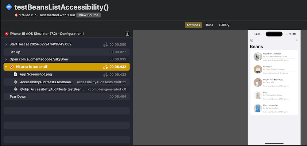
Since I recently released my app Silky Brew, then let’s see how to set up the accessibility auditing with UI-tests.
This file contains hidden or bidirectional Unicode text that may be interpreted or compiled differently than what appears below. To review, open the file in an editor that reveals hidden Unicode characters.
Learn more about bidirectional Unicode characters
The test sets some environment keys which are used by the app to reconfigure some of its state. In the example above, we turn off onboarding view, speed up animations, and enable custom data (pre-defined user content). Here we can see how the test is running.
The accessibility audit did not come back without issues. One of the issues was a hitRegion problem. Report navigator shows more information about the failure.
After some trial and error, I found the issue triggering it. Not sure why, but the performAccessibilityAudit function failed to catch the element triggering the issue. Fortunately, accessibility indicator was able to pinpoint the element without a problem. So seems like if UI-tests catch accessibility issues but fail to highlight elements, then we can still go back to accessibility indicator for finding these. The particular issue was with the row view which shows several lines of text and two of these labels were using footnote and caption text styles. This in turn made text labels smaller and triggered the hitRegion error.
This file contains hidden or bidirectional Unicode text that may be interpreted or compiled differently than what appears below. To review, open the file in an editor that reveals hidden Unicode characters.
Learn more about bidirectional Unicode characters
Since the row view is just multiple lines of text, then we can make it easier for accessibility users to read by combining all the text labels into one by adding .accessibilityElement(children: .combine) to the VStack. This solved that particular issue.
Opening hyperlinks in UIKit with UILabel is unexpectedly complex, what about SwiftUI? In this post, we’ll dive into opening hyperlinks in SwiftUI.
If we just would like to show a hyperlink, then the best way is to the Link view. We can just feed it with a title and the destination URL. In addition, we can even apply a button style to it.
By default, URLs are opened in the default web browser or if we are dealing with universal links, then in the appropriate app. If we have a desire to change how links are opened, we can apply a custom OpenURLAction. Here is an example how to open a URL in SFSafariViewController (SafariURL is just an Identifiable supported URL wrapper used for sheet’s binding and SafariView is SFSafariViewController wrapper with UIViewControllerRepresentable).
Often we are dealing with a case where we have text which contains some links as well. In comparison to UIKit, it is way more simple. We can just use the Markdown syntax to define the link and that is all to it.
Text("Hello, world! Here is my [blog](https://augmentedcode.io/blog)")
If we would like to use a custom URL handler, then we can override the default handler through the openURL environment value. Can be handy to just have keys for URL in text and substituting these with actual URLs when handling the tap.
Text("Here are some apps: [Silky Brew](silky), [Signal Path](signal), and [Drifty Asteroid](drifty)")
                .environment(\.openURL, OpenURLAction(handler: { url in
                    switch url.absoluteString {
                    case "drifty": .systemAction(AppConstants.URLs.driftyAsteroid)
                    case "signal": .systemAction(AppConstants.URLs.signalPath)
                    case "silky": .systemAction(AppConstants.URLs.silkyBrew)
                    default: .systemAction
                    }
                }))
When talking about the OpenURLAction in greater detail, then the different return values are:
handled – handler took care of opening the URL (e.g. opening the URL in SFSafariViewController)
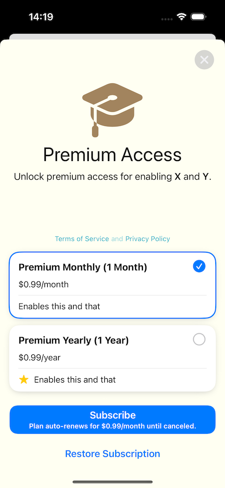
While building my indie iOS app, I decided to go for a subscription type of approach. At first, I built a fully custom upsell view which showed all the subscription options and handled the purchase actions (not as straight-forward as it sounds). Later, I realized that since iOS 17 there is a SubscriptionStoreView which does all of this and allows some customization as well. The aim of the blog post it to demonstrate how to configure the SubscriptionStoreView and therefore saving time by not building a fully custom one.
Configuring the testing environment for subscriptions
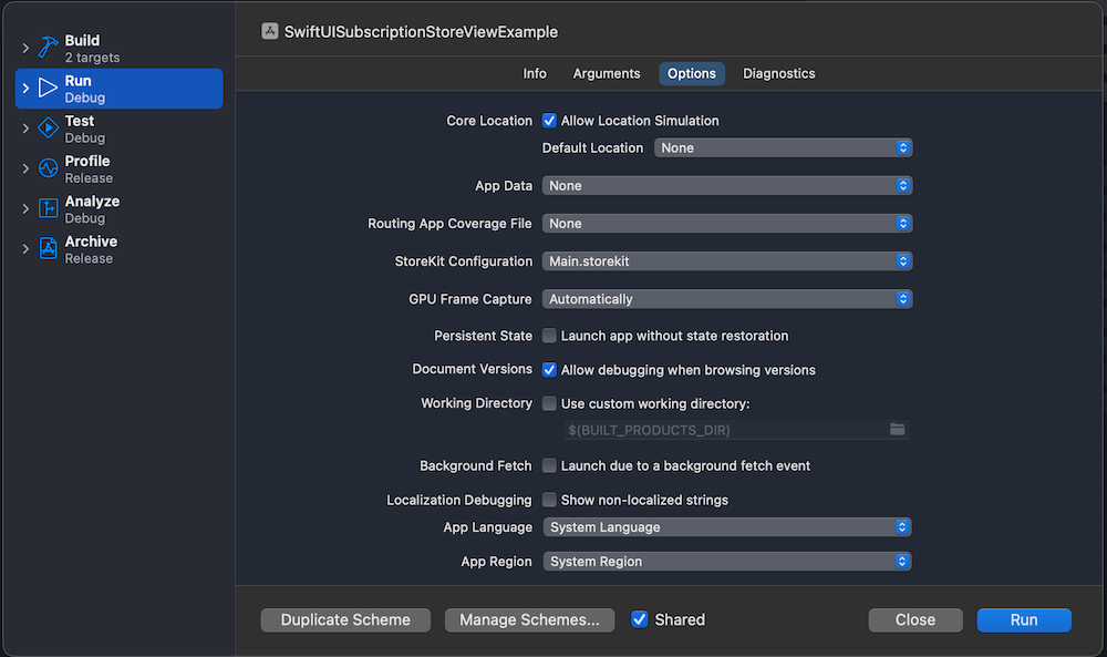
Before we start using the SubscriptionStoreView, we will need to configure subscriptions with Xcode’s StoreKit configuration file. This allows us to test subscriptions without needing to set everything up on the App Store. Open the new file panel and select StoreKit Configuration File. After that, create a subscription group and some auto-renewable subscriptions. In the example app, I just created a “Premium” subscription group and added “Monthly” and “Yearly” auto-renewable subscriptions.
The last thing to do is setting this configuration file as the StoreKit configuration file to the current scheme.
Using the SubscriptionStoreView for managing subscriptions
Now we are ready to go and display the SubscriptionStoreView. Since we are going to configure it a bit by inserting custom content into it, we’ll create a wrapping SubscriptionsView and use the StoreKit provided view from there. Let’s see an example first.
This file contains hidden or bidirectional Unicode text that may be interpreted or compiled differently than what appears below. To review, open the file in an editor that reveals hidden Unicode characters.
Learn more about bidirectional Unicode characters
The view above is pretty much the minimal we need to get going. App review requires having terms of service and privacy policy visible and also the restore subscription button as well.
There is quite a bit of more customization of what we can do. Adding these view modifiers will give us a slightly different view.
This file contains hidden or bidirectional Unicode text that may be interpreted or compiled differently than what appears below. To review, open the file in an editor that reveals hidden Unicode characters.
Learn more about bidirectional Unicode characters
Note: While playing around with subscriptions, an essential tool is in Xcode’s Debug > StoreKit > Manage Transactions menu.
Observing subscription changes
Our app also needs to react to subscription changes. StoreKit provides Transaction.currentEntitlements and Transaction.updates for figuring out the current state and receiving updates. A simple way for setting this up in SwiftUI is to create a class and inserting it into SwiftUI environment. On app launch, we can read the current entitlements and set up the observation for updates.
This file contains hidden or bidirectional Unicode text that may be interpreted or compiled differently than what appears below. To review, open the file in an editor that reveals hidden Unicode characters.
Learn more about bidirectional Unicode characters
Next, let’s insert it into the SwiftUI environment and update the current state. Wherever we need to read the state, we can access the Subscriptions class and read the hasPremium property. Moreover, thanks to the observation framework, the SwiftUI view will automatically update when the state changes.
This file contains hidden or bidirectional Unicode text that may be interpreted or compiled differently than what appears below. To review, open the file in an editor that reveals hidden Unicode characters.
Learn more about bidirectional Unicode characters
In the part 1 of the series, AsyncPhoto for displaying large photos in SwiftUI, we built a SwiftUI view which has a similar interface to Apple’s AsyncImage, but provides a way to use any kind of image data source. In the part 2 of the series, we’ll implement an in-memory cache for the AsyncPhoto. This is important for reducing any flickering caused by the nature of async image loading. An example to highlight where it comes useful is when we have a detail view which displays a thumbnail of a large photo. If we open the detail view multiple times for the same photo, we really do not want to see the loading spinner every single time. Another benefit is that we do not need to load a huge photo in memory and then spending CPU on scaling it down.
OK, let’s jump into it.
The aim of the cache is to cache the scaled down images. We never want to cache the original image data since it would make the memory usage to through the roof, and we would still need to use CPU to scale down the image. Before we start, we need to remember that in part 1 we designed the AsyncPhoto in a way where it has an ID, scaledSize properties and a closure for returning image data asynchronously. Therefore, the caching key needs to be created by using the ID and the scaled size, since we might want to display a photo in multiple AsyncPhoto instances with different sizes. Let’s create an interface for the caching layer. We’ll go for a protocol based approach, which allows replacing the caching logic with different concrete implementations. In this blog post we’ll go for a NSCache backed caching implementation, but anyone else could use other approaches as well, like LRUCache.
This file contains hidden or bidirectional Unicode text that may be interpreted or compiled differently than what appears below. To review, open the file in an editor that reveals hidden Unicode characters.
Learn more about bidirectional Unicode characters
The protocol only defines 3 functions for writing, reading, and creating a caching key. We’ll provide a default implementation for the cacheKey(for:size:) function. Since the same image data should be cached by size, the cache key combines id and size arguments. Since we are dealing with floats in a string, we’ll round the width and height.
The next step is to create a concrete implementation. In this blog post, we’ll go for NSCache which automatically evicts images from the cache in case of a memory pressure. The downside of a NSCache is that the logic in which order images are evicted is not defined. The implementation is straight-forward.
This file contains hidden or bidirectional Unicode text that may be interpreted or compiled differently than what appears below. To review, open the file in an editor that reveals hidden Unicode characters.
Learn more about bidirectional Unicode characters
We also added a shared instance since we want to use a single cache instance for all the AsyncPhoto instances. Let’s see how the AsyncPhoto implementation changes when we add a caching layer. The answer is, not so much.
This file contains hidden or bidirectional Unicode text that may be interpreted or compiled differently than what appears below. To review, open the file in an editor that reveals hidden Unicode characters.
Learn more about bidirectional Unicode characters
We added a new cache argument but also set the default value to the shared instance. The load() function tries to read a cached image as a first step, and the preparedScaledImage(for:) updates the cache. We rely on the cache implementation to keep the cache size small, therefore here is no code for manually evicting images from the cache when the ID changes. The main reason is that the AsyncPhoto instance does not have enough context for deciding this. For example, there might be other instances showing the photo for the old ID or maybe a moment later we want to display the photo for the old ID.
To recap, what we did. We defined an interface for caching images, created a NSCache based in-memory cache and hooked it up to the AsyncPhoto. We did all of this in a way that we did not need to change any existing code using AsyncPhoto instances.
There were some other tiny improvements, like using Task.isCancelled() to more quickly react to the ID change, setting the default placeholder colour to a light gray, and providing a default implementation for the content closure. Please check the example project for the full implementation. Here is the example project which reloads an avatar and as we can see at first, spinner is shown, but when images are cached, the change is immediate.
Sometimes we need to invoke an async function for fetching data before presenting a SwiftUI view. Therefore, a common flow is showing a spinner while the data is being fetched and then showing the main view. Moreover, if an error occurs, we show a failure view with a retry button. Let’s dive in how to build such view in a generic way.
As said before, our container view, let’s call it ContentPrepareView (similar naming to Apple’s ContentUnavailableView), has three distinct states: loading, failure, and success (named as “content” in the enum).
This file contains hidden or bidirectional Unicode text that may be interpreted or compiled differently than what appears below. To review, open the file in an editor that reveals hidden Unicode characters.
Learn more about bidirectional Unicode characters
We’ll go for a fully generic implementation where each of the view state corresponds to a view builder. This gives as flexibility if in some places we want to use custom loading views or different failure view. But on the other hand, most of the time we just want to use a common loading and failure views, that is why we set default values for loading and failure view builders (see below). In addition to view builders, we need an async throwing task closure which handles the data fetching/preparation. If we put it all together, then the ContentPrepareView becomes this:
This file contains hidden or bidirectional Unicode text that may be interpreted or compiled differently than what appears below. To review, open the file in an editor that reveals hidden Unicode characters.
Learn more about bidirectional Unicode characters
Since loading, failure and success views can be any kind of views, then our view needs to be a generic view. The body of the view has a switch-case for creating a view for the current view state. One thing to note here is that the onLoad view modifier is a custom one, and the idea is that it makes sure that the content preparation work only runs once per view life-time (onAppear() or task() can run multiple times). The reasoning is that we want to have an experience where we show the loading spinner only when the view is presented the first time, not when it appears again. The loadTask function is async and has responsibility of running the passed in async task closure and updating the current view state.
This file contains hidden or bidirectional Unicode text that may be interpreted or compiled differently than what appears below. To review, open the file in an editor that reveals hidden Unicode characters.
Learn more about bidirectional Unicode characters
In this example we used a custom FailureView and it is a small view wrapping Apple’s ContentUnavailableView. It sets a label, description and handles the creation of the retry button.
This file contains hidden or bidirectional Unicode text that may be interpreted or compiled differently than what appears below. To review, open the file in an editor that reveals hidden Unicode characters.
Learn more about bidirectional Unicode characters
Here is an example how to use the final ContentPrepareView. For demo purposes, it fails the first load and allows succeeding the second.
This file contains hidden or bidirectional Unicode text that may be interpreted or compiled differently than what appears below. To review, open the file in an editor that reveals hidden Unicode characters.
Learn more about bidirectional Unicode characters


 Augmented Code