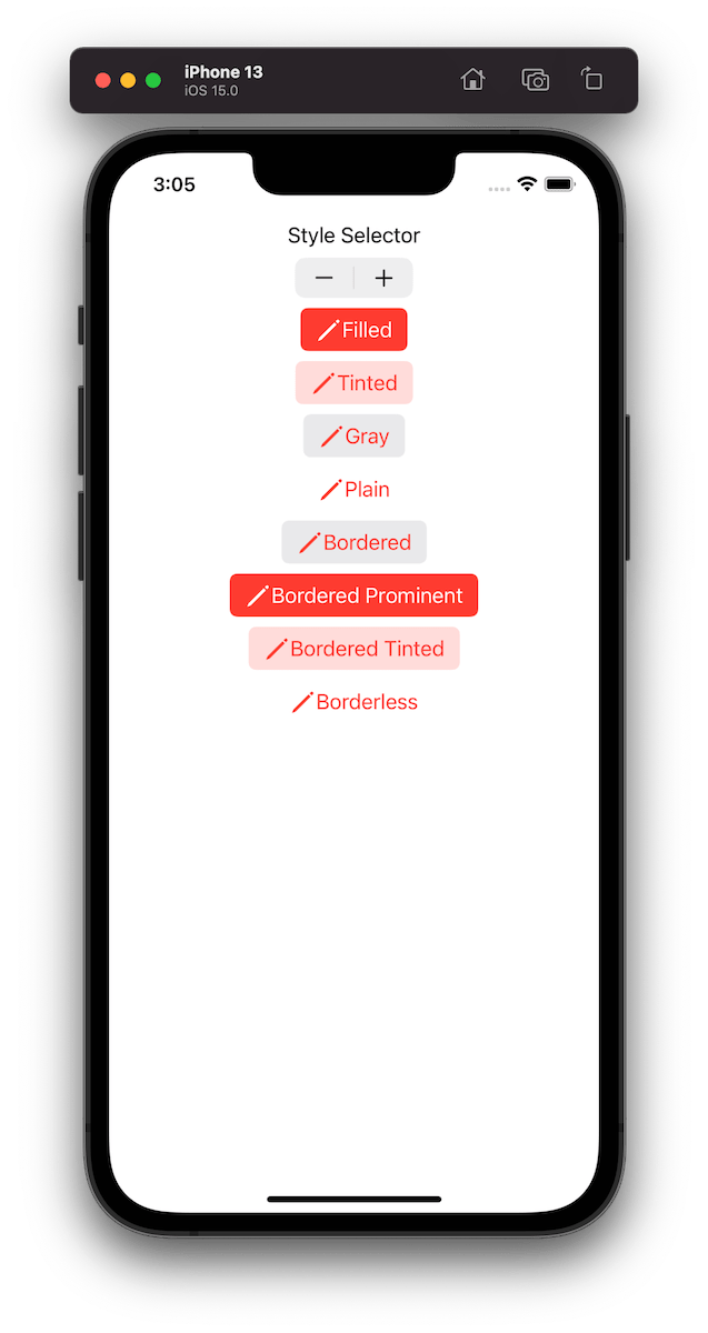
UIButton.Configuration API was introduced in WWDC’21 with a goal of making it easier to create buttons with many styles, sizes, colours etc. Configurations API comes with functions for creating common button configurations: filled(), bordered(), borderedProminent(), borderedTinted(), borderless(), plain(), gray(), tinted(). These configurations can be further customized. One benefit of the API is that it will take care of different states of the button like highlighted, disabled, hovered and so on and applies different styling based on the state. Most of the time that is all we needed, but additionally we can also adjust styling for different states as well through the configurationUpdateHandler().
The basic usage of the API involves in creating a UIButton.Configuration object and passing it to UIButton init function of setting it to UIButton’s configuration property. The button will then apply the configuration. In WWDC session it was emphasized that applying a new configuration is cheap and optimized behind the scenes therefore we should never compare the new configuration with the one currently applied on the button.

For getting a better overview on how default configurations change based on the properties, we set on UIButton.Configuration type, I built a simple preview app which takes configurations: filled(), bordered(), borderedProminent(), borderedTinted(), borderless(), plain(), gray(), tinted() and applies some modifications on these. The results are shown below.


Example Project
UIButtonConfigurationPreview (Xcode 13)
If this was helpful, please let me know on Mastodon@toomasvahter or Twitter @toomasvahter. Feel free to subscribe to RSS feed. Thank you for reading.
 Augmented Code