UICollectionViewCompositionalLayout was an important change to how we create collection view layouts. In iOS14 Apple added a new static function to this class which creates a layout object for list views. Meaning, it is very easy to create a list views which look like a table view we are familiar with. The static list() function takes a configuration object UICollectionLayoutListConfiguration which allows further to configure the appearance of the header view. For example, supplementary header views are enabled here. In this blog post, we’ll create a list view with a collection view and use cell registration and diffable data source APIs.
List view created with diffable data source and collection view.
Generating data for the list view
Firstly, we’ll generate some data types which we want to display in the list view. The aim is to represent each Palette type with one section, and each PaletteColor is a row in the section.
This file contains hidden or bidirectional Unicode text that may be interpreted or compiled differently than what appears below. To review, open the file in an editor that reveals hidden Unicode characters.
Learn more about bidirectional Unicode characters
We’ll create the collection view instance with a layout object which is configured to display lists. We go for insetGrouped appearance and turn on header views.
This file contains hidden or bidirectional Unicode text that may be interpreted or compiled differently than what appears below. To review, open the file in an editor that reveals hidden Unicode characters.
Learn more about bidirectional Unicode characters
Configuring collection view data source and cell registration
The UICollectionViewDiffableDataSource is used for managing the data and also provides cells on demand. We’ll need to define section and item types when creating the data source. With the data we want to display, we’ll use String as a section type and PaletteColor as the item type when the section is just the name of the Palette’s name. In addition, we’ll use the cell and supplementary view registration APIs which keep the logic of creating different cells with a model object in the same place, which I find it to be really nice. Cells and supplementary views we’ll configure using the content configuration APIs which describe the data the cell or supplementary view displays. For list views, there is a specialized UIListContentConfiguration type which supports a variety of appearances. In many cases we do not need any custom cell classes at all since UIListContentConfiguration and UICollectionViewListCell takes care of it for us.
This file contains hidden or bidirectional Unicode text that may be interpreted or compiled differently than what appears below. To review, open the file in an editor that reveals hidden Unicode characters.
Learn more about bidirectional Unicode characters
The final missing piece is creating a snapshot and applying it to the collection view data source which then tells the collection view what to render. If we would generate a new snapshot with slightly different data then the collection view only renders the changes between snapshots. No need to do this manually on our own.
This file contains hidden or bidirectional Unicode text that may be interpreted or compiled differently than what appears below. To review, open the file in an editor that reveals hidden Unicode characters.
Learn more about bidirectional Unicode characters
Diffable data sources with new cell registration APIs make a huge difference in how we implement collection views. Although it might take a bit of time to see how all the new APIs work together, I do not want to go back. Please check the example project for full code.
Recently I was asked a question about creating an app which has SwiftUI views but no navigation logic in it. Instead, UIKit controls how views are presented. It is a fair question since SwiftUI views have navigation support, but not everything is there if we need to support previous iOS versions as well, or we have a case of an app which have both UIKit and SwiftUI views. Therefore, let’s take a look at on one approach, how to handle navigation on the UIKit side but still use SwiftUI views.
UIHostingController presenting SwiftUI view
SwiftUI views are presented in UIKit views with UIHostingController which just takes in the SwiftUI view. UIHostingController is a UIViewController subclass, therefore it can be used like any other view controller in the view hierarchy. For getting things started, let’s configure SceneDelegate to use an object named FlowCoordinator which will handle navigation logic and then ask it to present a simple SwiftUI view.
This file contains hidden or bidirectional Unicode text that may be interpreted or compiled differently than what appears below. To review, open the file in an editor that reveals hidden Unicode characters.
Learn more about bidirectional Unicode characters
A simple app showing a green view which is rendered with SwiftUI but presented with UIKit.
Inserting the FlowCoordinator into SwiftUI view
The next step is that we want to allow SwiftUI view to control what is presented on the screen. For example, let’s add a button to the SwiftUI view which should present a sheet with another SwiftUI view. The button action needs to be able to talk to the flow coordinator, which controls what is presented on the screen. One way to insert the FlowCoordinator into SwiftUI environment is by conforming to ObservableObject and using the environmentObject() view modifier. Alternative is using EnvironmentValues and defining a key. For more information please check Injecting dependencies using environment values and keys in SwiftUI.
This file contains hidden or bidirectional Unicode text that may be interpreted or compiled differently than what appears below. To review, open the file in an editor that reveals hidden Unicode characters.
Learn more about bidirectional Unicode characters
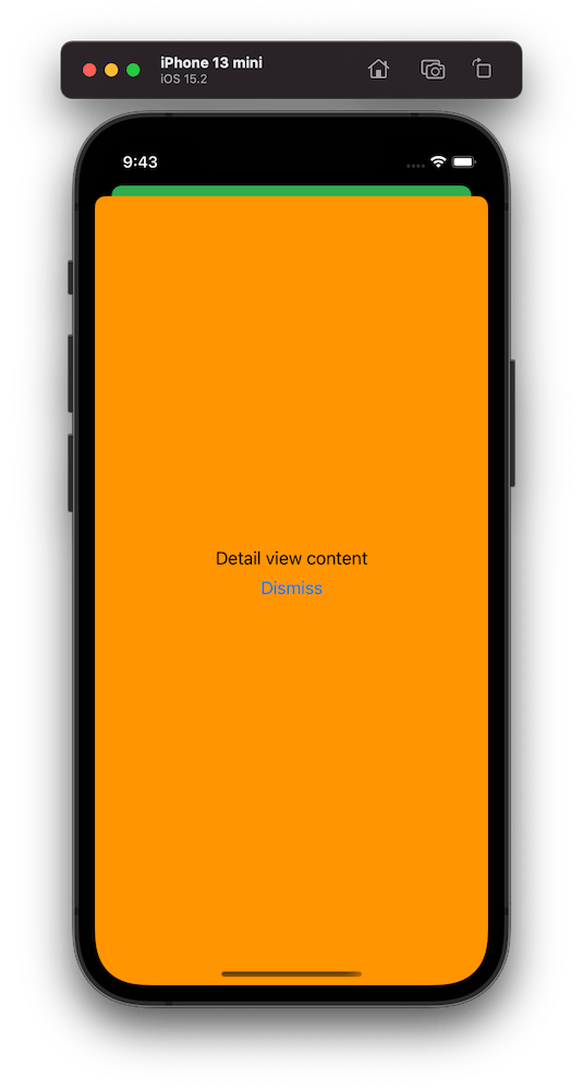
The sheet presentation code goes into the FlowCoordinator and as an example we show a DetailView which has a button for dismissing itself. Yet again, SwiftUI view just passes the handling to the FlowCoordinator.
This file contains hidden or bidirectional Unicode text that may be interpreted or compiled differently than what appears below. To review, open the file in an editor that reveals hidden Unicode characters.
Learn more about bidirectional Unicode characters
A simple app showing an orange sheet which is rendered with SwiftUI but presented with UIKit.
Summary
We created a simple sample app which uses UIKit navigation logic but renders views with SwiftUI views. This kind of setup could be useful for apps which mix UIKit and SwiftUI. But I believe that even in case of that we could still use SwiftUI navigation in sub-flows but could keep using this approach for handling root view navigation.
SwiftUI has a Picker view available with multiple different styles. One example of when it falls short is when we want to use a multi component picker with wheel style. One way how to try to achieve this is using a HStack with two Picker views, but it does not work very well, especially when trying to show it inside a Form view. So what else we can do? If something can’t be done in SwiftUI then we can use UIKit instead.
In my case, I wanted to create a picker which allows picking a date duration. It would have one wheel for selecting a number and the other wheel for selecting either days, weeks or months.
Firstly, let’s create a tiny struct which is going to hold the state of this picker. It needs to store a numeric value and the unit: days, weeks, months. Let’s name it as DateDuration. Since we want to iterate over the DateDuration.Unit, we’ll conform it to CaseIterable protocol.
This file contains hidden or bidirectional Unicode text that may be interpreted or compiled differently than what appears below. To review, open the file in an editor that reveals hidden Unicode characters.
Learn more about bidirectional Unicode characters
UIPickerView in UIKit can do everything we want, therefore we’ll need to wrap it into a SwiftUI view. This can be done by creating a new type which conforms to UIViewRepresentable protocol. Also, we need a binding which holds the value of the current selection: when the user changes it, the binding communicates the changes back and vice-versa. Additionally, we’ll add properties for configuring values and units. UIPickerView us created and configured in the makeUIView(context:) function. UIPickerView is driven by a data source and a delegate, which means we require a coordinator object as well. Coordinator is part of the UIViewRepresentable protocol.
This file contains hidden or bidirectional Unicode text that may be interpreted or compiled differently than what appears below. To review, open the file in an editor that reveals hidden Unicode characters.
Learn more about bidirectional Unicode characters
Coordinator is created in the makeCoordinator() function. It is going to do most of the work by providing data to the UIPickerView and handling the current selection. Therefore, we’ll store the selection binding, values, and units in the Coordinator class as well.
This file contains hidden or bidirectional Unicode text that may be interpreted or compiled differently than what appears below. To review, open the file in an editor that reveals hidden Unicode characters.
Learn more about bidirectional Unicode characters
The last missing piece is implementing UIPickerViewDataSource and UIPickerViewDelegate methods in the Coordinator class. This is pretty straight-forward to do. We’ll need to display two components where the first component is the list of values and the second component is the unit: days, weeks, months. When the user selects a new value, we’ll change the DateDuration value of the binding.
This file contains hidden or bidirectional Unicode text that may be interpreted or compiled differently than what appears below. To review, open the file in an editor that reveals hidden Unicode characters.
Learn more about bidirectional Unicode characters
This file contains hidden or bidirectional Unicode text that may be interpreted or compiled differently than what appears below. To review, open the file in an editor that reveals hidden Unicode characters.
Learn more about bidirectional Unicode characters
Another welcomed change what WWDC’21 brought us was UISheetPresentationController. The sheet presentation controller makes it extremely easy to present sheets like the ones which just take a half of the screen. It allows us to configure the sheet size with detents where there are currently two of them: medium and large. The medium detent means that the sheet takes about the half of the screen height, and the large detent means that the full screen is covered with the sheet. Additionally, we can configure some other visual aspects like corner radius and if the grabber should be visible. The detents property is an array, and we can set both medium and large to it, which enables to dynamically change the size either by dragging or controlling the size programmatically by setting the selectedDetentIdentifier property. And if we would like to animate the change, then the property needs to be set within the animateChanges closure.
This file contains hidden or bidirectional Unicode text that may be interpreted or compiled differently than what appears below. To review, open the file in an editor that reveals hidden Unicode characters.
Learn more about bidirectional Unicode characters
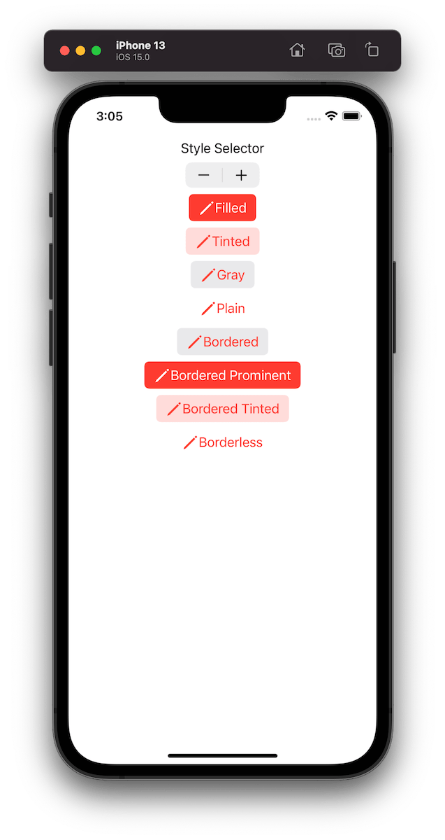
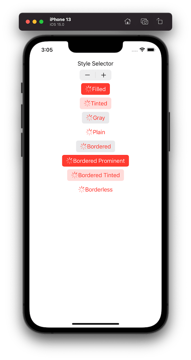
UIButton.Configuration API was introduced in WWDC’21 with a goal of making it easier to create buttons with many styles, sizes, colours etc. Configurations API comes with functions for creating common button configurations: filled(), bordered(), borderedProminent(), borderedTinted(), borderless(), plain(), gray(), tinted(). These configurations can be further customized. One benefit of the API is that it will take care of different states of the button like highlighted, disabled, hovered and so on and applies different styling based on the state. Most of the time that is all we needed, but additionally we can also adjust styling for different states as well through the configurationUpdateHandler().
The basic usage of the API involves in creating a UIButton.Configuration object and passing it to UIButton init function of setting it to UIButton’s configuration property. The button will then apply the configuration. In WWDC session it was emphasized that applying a new configuration is cheap and optimized behind the scenes therefore we should never compare the new configuration with the one currently applied on the button.
This file contains hidden or bidirectional Unicode text that may be interpreted or compiled differently than what appears below. To review, open the file in an editor that reveals hidden Unicode characters.
Learn more about bidirectional Unicode characters
Example of button configurations when the tint colour is set to red.
For getting a better overview on how default configurations change based on the properties, we set on UIButton.Configuration type, I built a simple preview app which takes configurations: filled(), bordered(), borderedProminent(), borderedTinted(), borderless(), plain(), gray(), tinted() and applies some modifications on these. The results are shown below.
This file contains hidden or bidirectional Unicode text that may be interpreted or compiled differently than what appears below. To review, open the file in an editor that reveals hidden Unicode characters.
Learn more about bidirectional Unicode characters
One of the really common layouts I have needed to implement with collection view is a simple flow layout but with fixed spacings. Apple provides us UICollectionViewFlowLayout, but the sad part is that it has dynamic spacing between items. Everything is there but not quite. Before UICollectionViewCompositionalLayout, one needs to create a subclass of the flow layout and then fixing spacings manually, which is pretty cumbersome to do. Therefore, let’s instead see what it takes to implement a simple self-sizing flow layout with fixed spacings when using UICollectionViewCompositionalLayout. The end goal is visible below, where we have a single section with 7 items.
Flow layout with fixed spacings.
UICollectionViewCompositionalLayout was created to be a flexible layout which allows building all sorts of layouts quickly. Data in that layout is divided into sections, where each section can have one or more groups of items. Grouping allows creating more complex layouts, where each group describes how items in the group are laid out in relation to each other. But in our case we have something really simple in mind, which is having self-sizing items which we can configure with NSCollectionLayoutSize and passing estimated dimensions. Then the next step is creating NSCollectionLayoutItem with that layout size and with some space around the item. The edge spacing with fixed edges gives us the wanted fixed spacing between items. After that, we’ll create NSCollectionLayoutGroup with horizontal layout direction and with a layout size which takes max width, but height is fitted based on item sizes. Creating layouts like this is so much better compared to subclassing UICollectionViewLayout and then calculating frames one by one. Down below is the configured layout object, which has fixed spacing and items are self-sizing.
This file contains hidden or bidirectional Unicode text that may be interpreted or compiled differently than what appears below. To review, open the file in an editor that reveals hidden Unicode characters.
Learn more about bidirectional Unicode characters
I have numerous times needed to show some sort of collection view which adjusts its height based on the content. Most of the time it has been a dynamic list within some more complex scrollable UI. Therefore, in this post, we’ll take a look at how to set up a collection view which has its height set to the content height. On the screenshot below, we have a collection view with light grey background and two sections.
Collection view with height fitting size.
The approach for making this working is pretty simple, which involves adding a height constraint with the constant value set to collection view content height. Content height can be retrieved from the layout object. The constraint’s constant value can be updated in viewWillLayoutSubviews.
This file contains hidden or bidirectional Unicode text that may be interpreted or compiled differently than what appears below. To review, open the file in an editor that reveals hidden Unicode characters.
Learn more about bidirectional Unicode characters
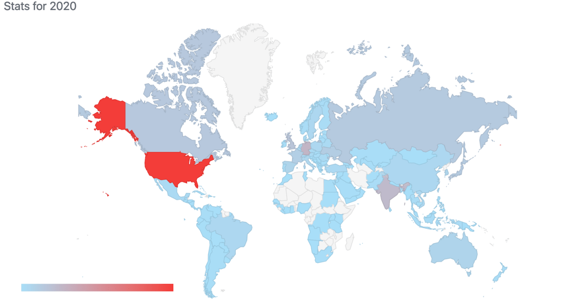
I have been writing a new blog post at least every second week and therefore in 2020 I have published total of 27 blog posts. It is time to take a look back on the 2020 and see which blog posts were the most popular ones. I am just looking at the total count of views per blog post.
UILabel supports displaying attributed strings with link attributes but what it does not support is allowing to tap on hyperlinks and opening those in Safari. An Alternative way is using an UITextView which does support opening hyperlinks but on the other hand it is a more heavy view component and therefore might not be the best choice when we just need to display some text with hyperlinks. This time lets create a simple UILabel subclass which adds support for opening hyperlinks and custom hyperlink styles.
Creating NSAttributedStrings with hyperlinks
Before we jump into implementing an UILabel subclass HyperlinkLabel, let’s first take a look on how to create a NSAttributedString with hyperlinks. In the example app we will have several labels with different configurations: default and custom link styles and left, centre, right text alignments. UITextView has a linkTextAttributes property but in our UILabel subclass we’ll need to implement custom link styling ourselves. The approach we are going to take is creating a new NSAttributedString.Key value named hyperlink and adding text attributes when the attribute is present.
This file contains hidden or bidirectional Unicode text that may be interpreted or compiled differently than what appears below. To review, open the file in an editor that reveals hidden Unicode characters.
Learn more about bidirectional Unicode characters
Let’s now create a convenience method which creates NSAttributedString and sets it to the HyperlinkLabel.
This file contains hidden or bidirectional Unicode text that may be interpreted or compiled differently than what appears below. To review, open the file in an editor that reveals hidden Unicode characters.
Learn more about bidirectional Unicode characters
The final NSAttributedString is created by first initializing a mutable version with a format string. The format string follows the familiar format specifiers like we used with NSString and String APIs when dealing with re-orderable arguments. Format specifiers are replaced with new instances of NSAttributedStrings where the string value equals to a hyperlink name and the URL value is stored on the NSAttributedString.Key.link or NSAttributedString.Key.hyperlink attribute. The former gives us the default link style defined by Apple and the latter our custom link style.
This file contains hidden or bidirectional Unicode text that may be interpreted or compiled differently than what appears below. To review, open the file in an editor that reveals hidden Unicode characters.
Learn more about bidirectional Unicode characters
Creating HyperlinkLabel which supports tapping on hyperlinks
UILabel does not provide access to its text layout and therefore it is not possible to know which hyperlink was tapped. For finding the tapped hyperlink we’ll need to use our own NSLayoutManager, NSTextStorage, and NSTextContainer. If we configure those properly we can figure out which character was tapped and therefore if it was part of the hyperlink. If it is, then we can let UIApplication to open the tapped URL. Let’s contain this in a function which gives us a configured NSTextStorage.
This file contains hidden or bidirectional Unicode text that may be interpreted or compiled differently than what appears below. To review, open the file in an editor that reveals hidden Unicode characters.
Learn more about bidirectional Unicode characters
Now we can use this function when handling UITouch events. We’ll add another private function which will take current UITouches and figure out which hyperlink was tapped. The general flow consists of creating a NSTextStorage with the function we just defined, then asking from the NSLayoutManager which character index was tapped. NSLayoutManager returns the closest character index of the touch. Therefore, we’ll need to go one step deeper and ask for the actual bounding rectangle of the glyphs representing the character and then verifying if the touch location was inside the glyph’s bounding rectangle. This is important when dealing with different text alignments and when tapping on the free space around characters. After figuring out which character was tapped we’ll need to check for the hyperlink attributes. If the tapped character has either attribute set, then we can conclude that we tapped on a hyperlink. This function can then be called in touchesEnded and if we tapped on a hyperlink, then we can open it. One thing to note is that userInteractionEnabled needs to be set to true before UILabel can handle touch events.
This file contains hidden or bidirectional Unicode text that may be interpreted or compiled differently than what appears below. To review, open the file in an editor that reveals hidden Unicode characters.
Learn more about bidirectional Unicode characters
This file contains hidden or bidirectional Unicode text that may be interpreted or compiled differently than what appears below. To review, open the file in an editor that reveals hidden Unicode characters.
Learn more about bidirectional Unicode characters
Next thing we need to do is overriding attributedText property and handling the custom style of our custom hyperlink attribute. If the attributed text has this attribute set, then we will apply custom hyperlink text attributes. The same way as Apple’s link attribute works, when the attributed string gets displayed then custom styling is used. Secondly, we’ll set the UILabel’s font to the attributed string’s ranges which do not have a font attribute set. UILabel internally use UILabel’s font when font attributes are not set, so we want to force the same behaviour when the stored attributed string is set to our own NSTextStorage. If we do not do this, then NSAttributedString just uses its default font and the displayed string is not going to be equal to the string set to NSTextStorage. This in turn will lead to invalid character index calculations because fonts are different.
This file contains hidden or bidirectional Unicode text that may be interpreted or compiled differently than what appears below. To review, open the file in an editor that reveals hidden Unicode characters.
Learn more about bidirectional Unicode characters
We created a UILabel subclass which has a capability of opening tapped links. Useful, if we need just a label for displaying some text along with hyperlinks. Please take a look on the full implementation available here: HyperlinkLabel.


 Augmented Code