In the previous post we looked into how to separate code with local Swift packages within a project. This time let’s create a Swift package, publish it on GitHub, and add it to a separate project. We’ll create a package which extends UIImage and enables calculating color contrast ratios. Color contrast is important factor for keeping text readable in apps.
Creating a Swift package
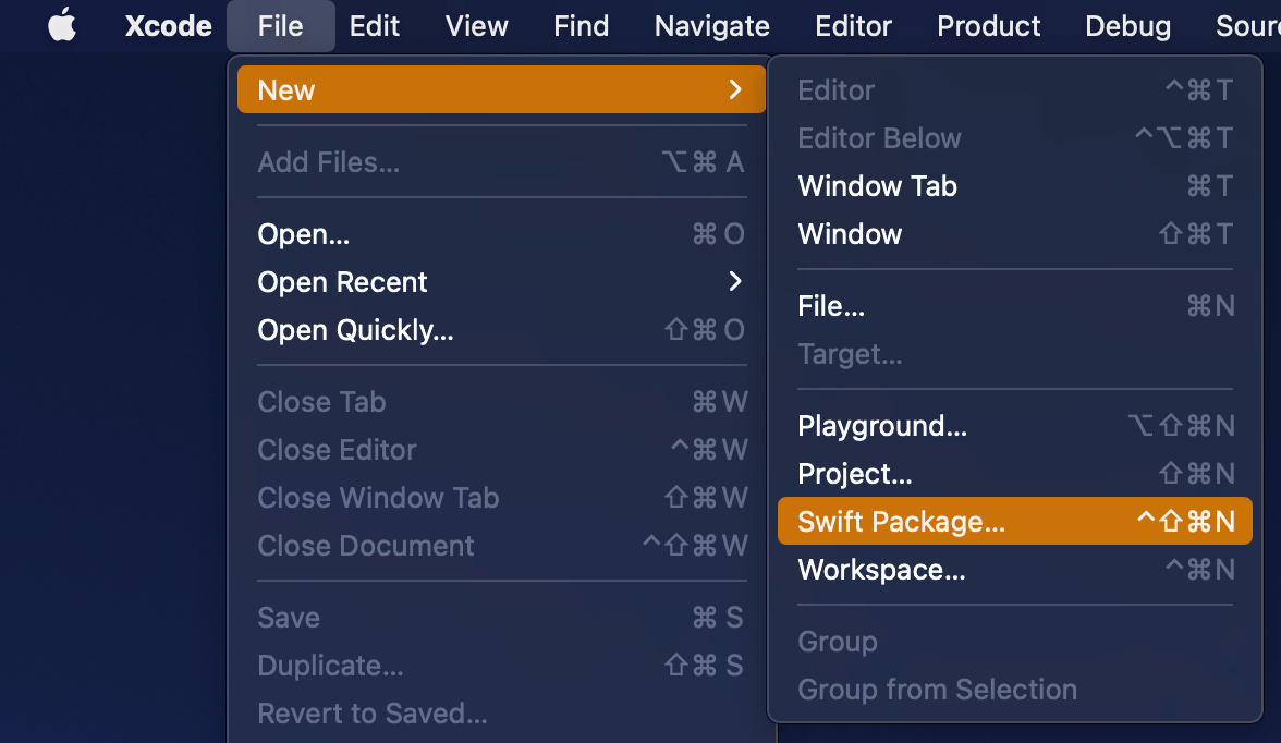
Open Xcode and select “Swift Package” item from the File > New menu. We’ll set the name of the package to “ColorContrastRatio”.
Selecting a new Swift Package.
Saving a new Swift package.
Xcode’s template of new Swift packages is configured to have a basic hello world example with an unit-test. Before we change the package’s implementation, we’ll add minimum platform versions to the Package.swift file, in other words, minimum deployment target.
This file contains hidden or bidirectional Unicode text that may be interpreted or compiled differently than what appears below. To review, open the file in an editor that reveals hidden Unicode characters.
Learn more about bidirectional Unicode characters
Next step is to implement functionality of the package. We’ll keep the package simple and make it UIKit only which can be built for iOS and macCatalyst apps. Package is adding an UIColor extension and providing functionality for calculating relative luminance and contrast ratio. Functionality is set, next step is to publish it.
This file contains hidden or bidirectional Unicode text that may be interpreted or compiled differently than what appears below. To review, open the file in an editor that reveals hidden Unicode characters.
Learn more about bidirectional Unicode characters
First step is to go to GitHub and adding a new repository. I chose to include an automatically created license file, cloned the repository on my mac and then moved the code we added in the previous step to that checkout, then committed and pushed. Alternative is to add a remote to your local git repository. Either way is fine as long as our project ends up on GitHub. In addition, will add a tag which will mark the first release 0.1.0. Tags can be added by running those commands in Terminal:
Adding the published Swift package to another project
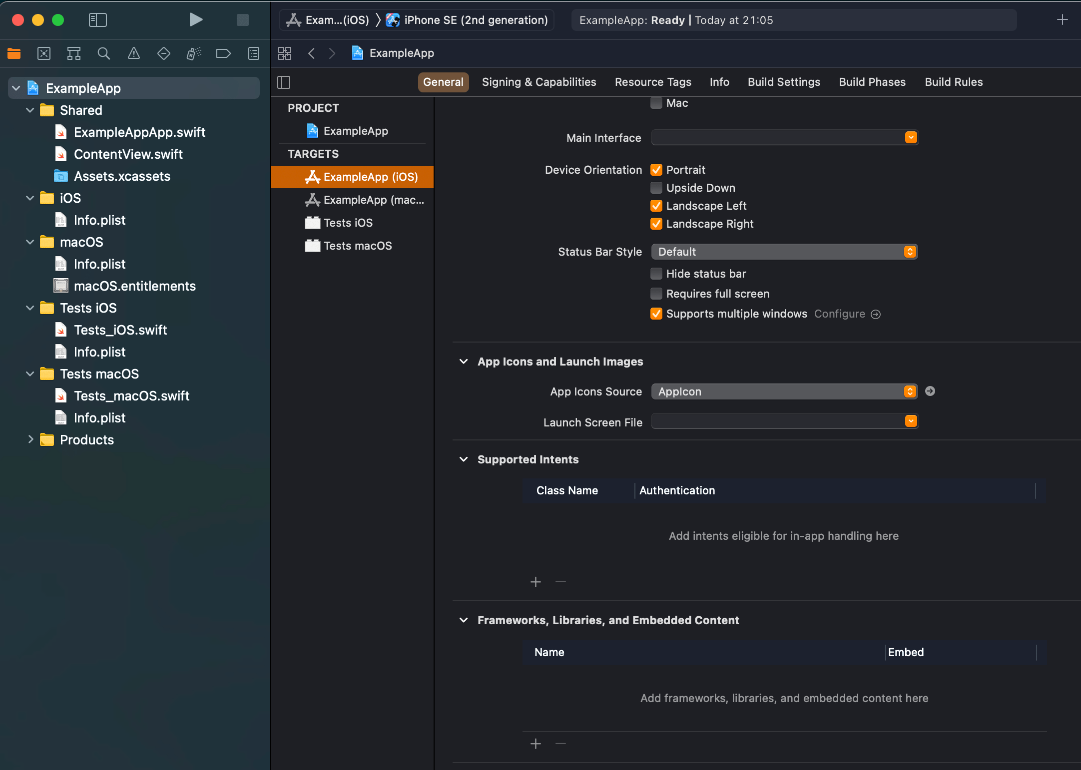
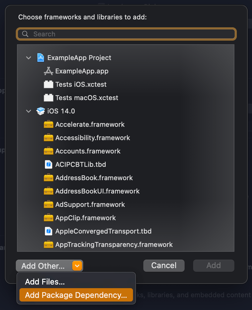
We published our package on GitHub and it requires only a few steps for adding it to an existing project. In an existing project, open the target settings and click on the plus button in the “Frameworks, Libraries, and Embedded Content”. In the opened view, click on the “Add Other” and select “Add Package Dependency”. Then we can paste the package’s GitHub url (https://github.com/laevandus/ColorContrastRatio) to the search field and complete the flow. From then on, it is just a matter of importing the new package and using it in the main project. Described steps are shown below:
Selecting the target where to the package is added.Selecting “Add Package Dependency” which allows adding Swift package.Searching for the Swift package by url.Setting the package update rule.Choosing products from the package.Finished example application using the Swift package’s color contrast ratio function.
This file contains hidden or bidirectional Unicode text that may be interpreted or compiled differently than what appears below. To review, open the file in an editor that reveals hidden Unicode characters.
Learn more about bidirectional Unicode characters
We created a Swift package and a repository on GitHub. Then we proceed with making the first release by adding a git tag. After that, we went ahead and added the package to another example project.
Xcode 12 comes with Swift toolchain 5.3 which brings resource and localisation support to Swift packages. Nice thing is that Swift package support only depends on the toolchain’s version and does not have additional OS requirements. At the same time, let’s keep in mind that OS requirements come from the code we actually add to the package. This means that it is a good time to start using Swift packages for separating code into separate libraries and stop using separate framework projects in a workspace. Additional benefit is that, if needed, it is pretty easy to move the package out of the workspace and creating a sharable package what can be publish and reused in other projects. But for now, let’s take a look on how to set up a new workspace with an app project and a Swift package which represents a design library with custom button style.
File structure of the workspace
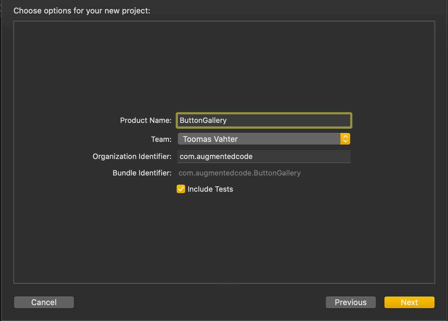
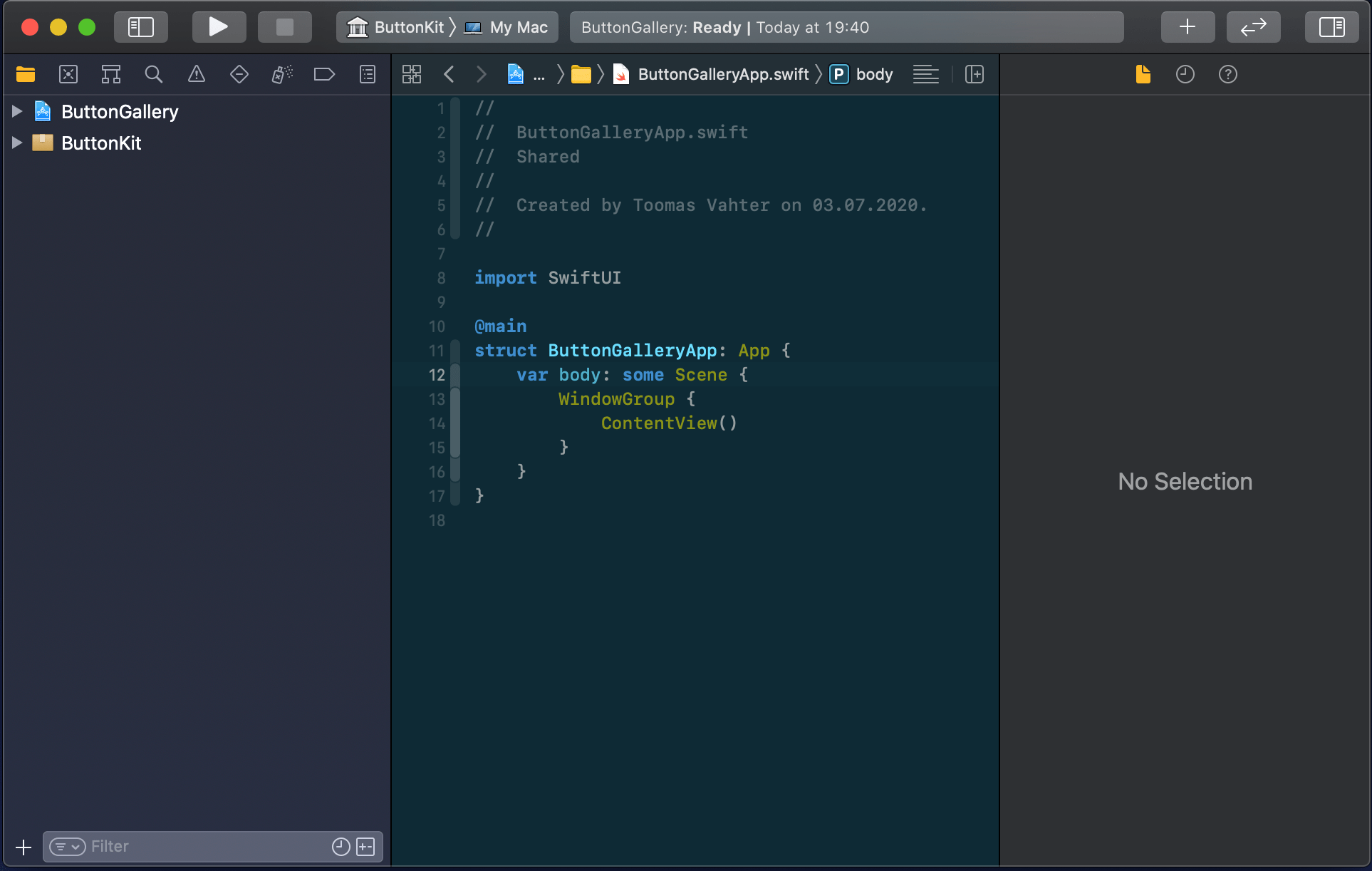
The app project will have a name “ButtonGallery” and the Swift package will have a name “ButtonKit”. But first, let’s create a folder named “SwiftPackageAppWorkspace” which is the root folder of the project. The app project and the Swift package will go to that folder in separate folders.
Adding the workspace, the app project, and the Swift package
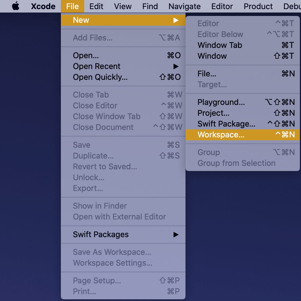
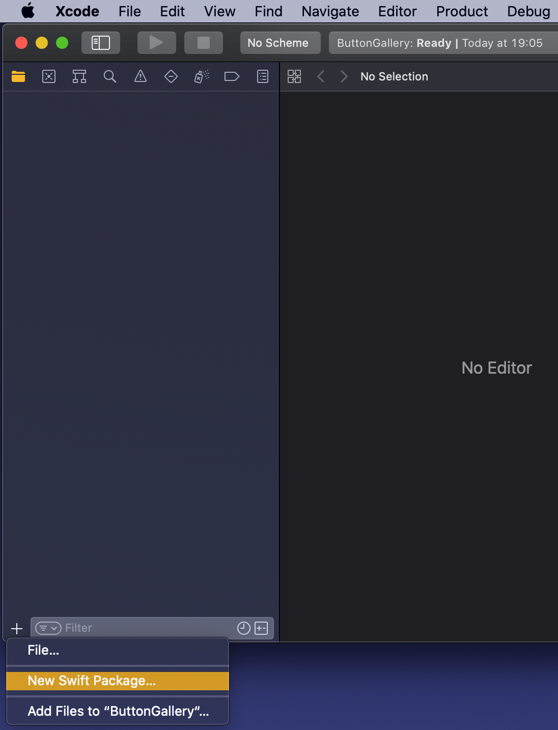
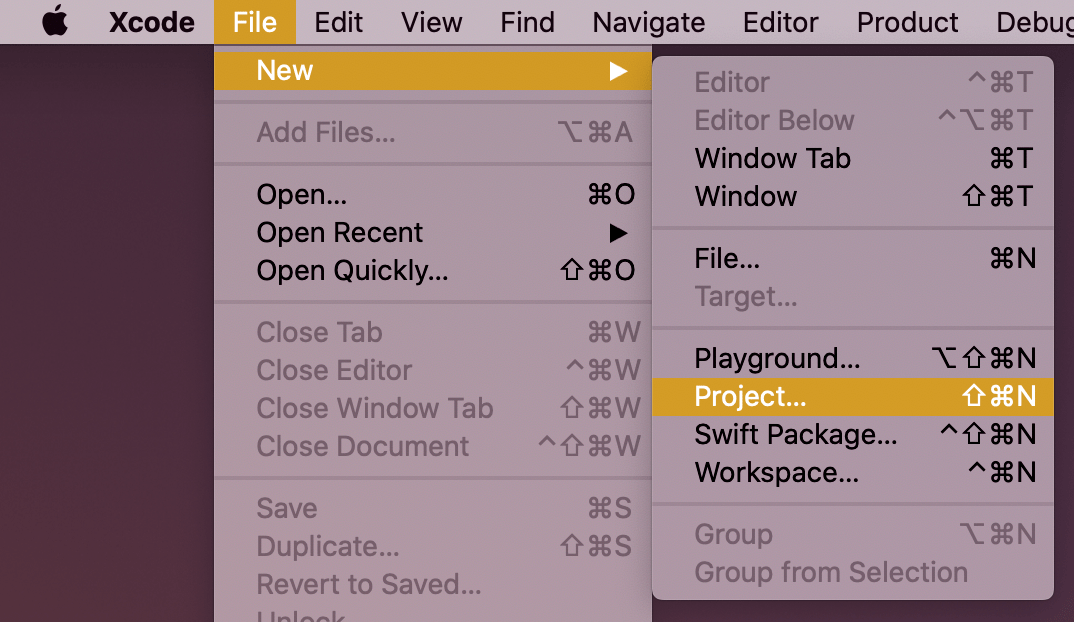
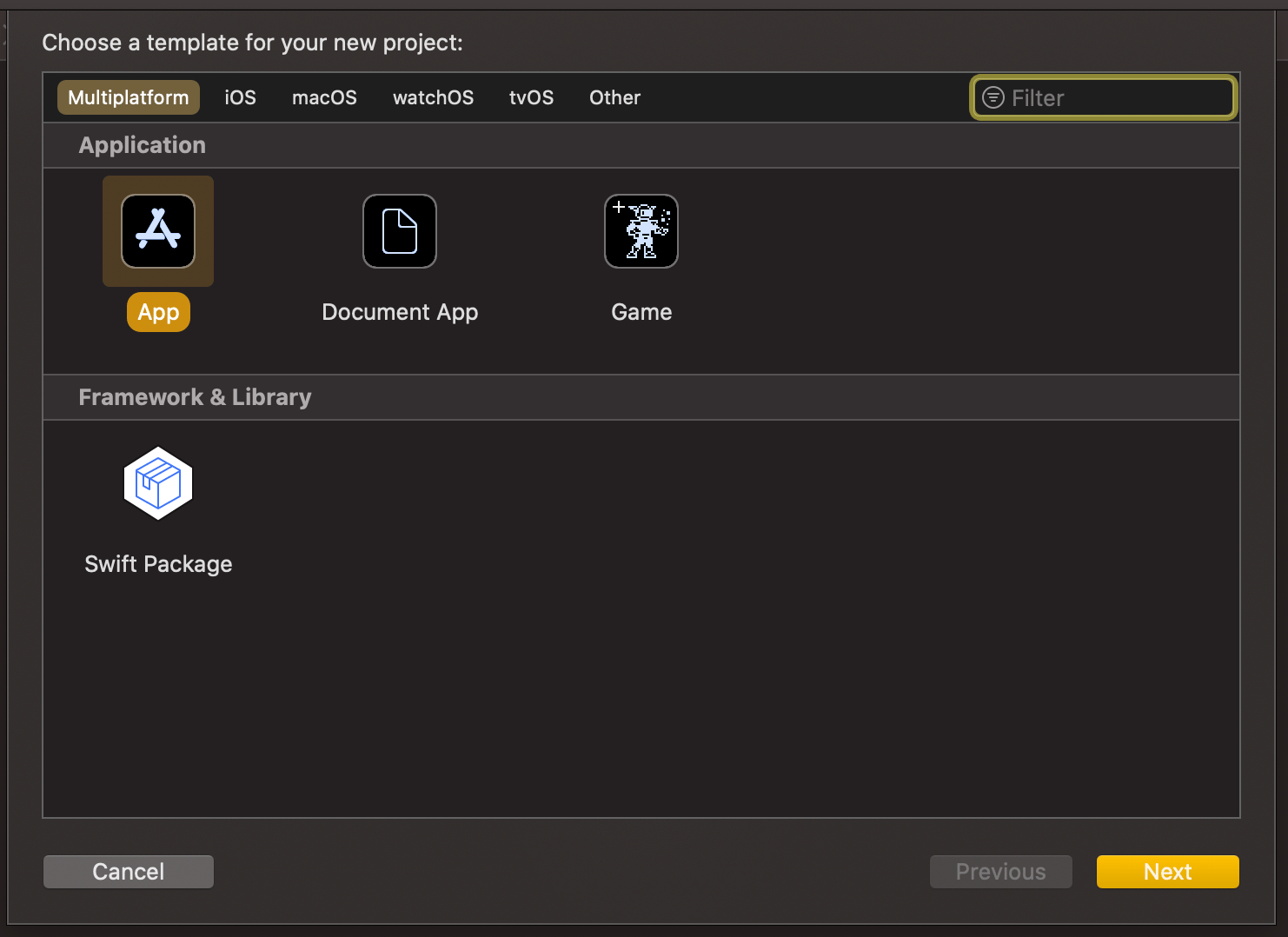
New workspace can be created by selecting the Workspace menu item in File>New menu in the Xcode. Save the workspace in the “SwiftPackageAppWorkspace” folder what we created just before. Xcode opens the created workspace after clicking on save and then the next step is to add a new Swift package. Easiest is to use the plus button at the bottom of the left corner, selecting “New Swift Package”, and saving the package in the “SwiftPackageAppWorkspace” folder. Uncheck the option on the save panel for creating a git repository because the git repository should be added in the “SwiftPackageAppWorkspace” instead (we skipped this step). Third step is to add the app project by using File>New menu. Xcode also offers an option to add the new project to the workspace. Therefore make sure “Add to” and “Group” have the workspace selected on the save panel. Described steps are shown below.
Selecting a new workspace in the main menu.Using the plus button in the workspace for creating a new package.Saving Swift package in the root folder.Adding a new Xcode project.Selecting template for the project.Adding a name to the app project.Saving a new app project and adding to an existing workspace.Workspace with a Swift package and an app project.
Linking the Swift package in the app project
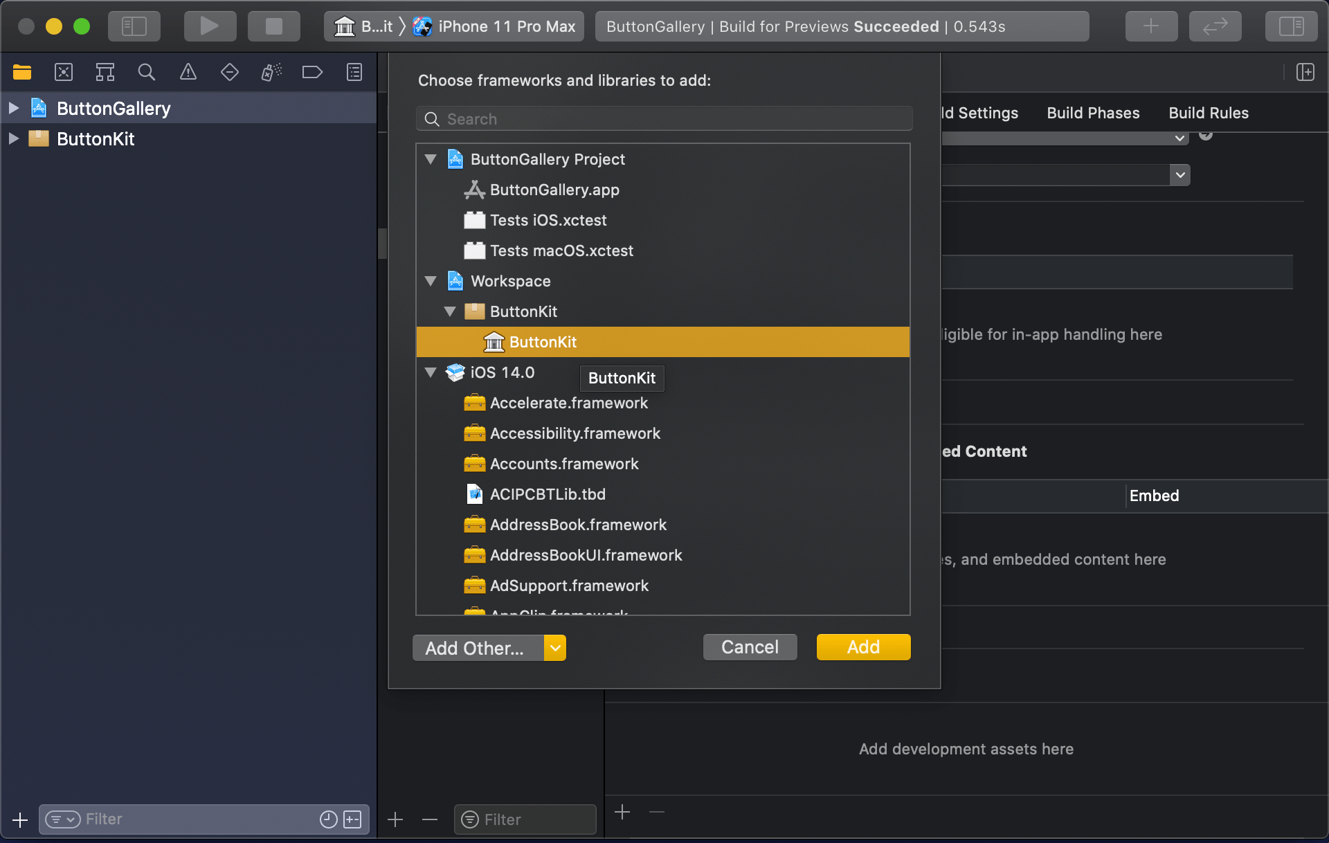
Swift package needs to be added to the app target: select “ButtonGallery” in the project navigator, click on the iOS target, General, and then on the plus button in the “Frameworks, Libraries, and Embedded Content” section, select the “ButtonKit” library.
Navigating to iOS target’s general settings.Linking with the ButtonKit.
Now the workspace is configured but there is not any useful code in the “ButtonKit”. Let’s fix that next and add a FunkyButtonStyle.swift to the package and set minimum platforms in the package manifest because we’ll use SwiftUI in the implementation and it has minimum platform requirements. Because FunkyButtonStyle is in a separate module and by default access control is set to internal, then we’ll need to make it public before it can be imported to the app target.
This file contains hidden or bidirectional Unicode text that may be interpreted or compiled differently than what appears below. To review, open the file in an editor that reveals hidden Unicode characters.
Learn more about bidirectional Unicode characters
This file contains hidden or bidirectional Unicode text that may be interpreted or compiled differently than what appears below. To review, open the file in an editor that reveals hidden Unicode characters.
Learn more about bidirectional Unicode characters
This file contains hidden or bidirectional Unicode text that may be interpreted or compiled differently than what appears below. To review, open the file in an editor that reveals hidden Unicode characters.
Learn more about bidirectional Unicode characters
ContentView in the app target which imports ButtonKit and uses its FunkyButtonStyle.
Summary
We created a new workspace what contains a Swift package and an app project. We looked into how to provide functionality in the package and making it available for the main app target.


 Augmented Code