Categories
iOS Swift SwiftUI

Interactive pie chart in SwiftUI

Apple’s Charts library supports many chart types: bar, line, area, point, rectangle, but proper support for pie charts only came with iOS 17. It was possible to create pie charts before as well, but it required to take a long road and draw each of the sector yourself. iOS 17 brings us a new SectorMark mark type for pie charts. SectorMark represents a slice of the pie and comes with various properties for configuring the visual look of it. What we’ll be building is a pie chart on which we can tap, and then the sector or slice is animating to a larger size.

Before we start setting up the chart, let’s have a look at how the data is laid out. We’ll use a struct which has two properties: country and bags where bags represent a count of 60 kg bags of coffee beans exported from that country.

struct CoffeeExport: Equatable {
let country: String
let bags: Int
}
extension CoffeeExport {
static var data: [CoffeeExport] = [
CoffeeExport(country: "Brazil", bags: 44_200_000),
CoffeeExport(country: "Vietnam", bags: 27_500_000),
CoffeeExport(country: "Colombia", bags: 13_500_000),
CoffeeExport(country: "Indonesia", bags: 11_000_000),
CoffeeExport(country: "Honduras", bags: 9_600_000),
CoffeeExport(country: "Ethiopia", bags: 6_400_000),
CoffeeExport(country: "India", bags: 5_800_000),
CoffeeExport(country: "Uganda", bags: 4_800_000),
CoffeeExport(country: "Mexico", bags: 3_900_000),
CoffeeExport(country: "Guatemala", bags: 3_400_000),
CoffeeExport(country: "Others", bags: 19_209_000),
]
}
view raw Data.swift hosted with ❤ by GitHub

The chart implementation is pretty compact in SwiftUI. It involves creating a Chart and adding SectorMarks with different configuration based on if the sector is selected or not.

Chart(viewModel.countries, id: \.country) { element in
let isSelected = viewModel.isSelected(element)
SectorMark(angle: .value("Bag", element.bags),
outerRadius: .ratio(isSelected ? 1 : 0.9),
angularInset: isSelected ? 2 : 0)
.foregroundStyle(by: .value("Country", element.country))
.cornerRadius(3)
}
.chartAngleSelection(value: $viewModel.rawSelection)
.chartForegroundStyleScale(domain: .automatic, range: Self.chartColors)
.onChange(of: viewModel.rawSelection, viewModel.updateCountrySelection)
.frame(height: 300)
.animation(.bouncy, value: viewModel.selectedCountry)
view raw Chart.swift hosted with ❤ by GitHub

Above, we can see that we loop over an array of countries (CoffeeExport type) and create a SectorMark where the angle is set to the number of bags. The chart normalizes the data and calculates the corresponding angle for the sector. Therefore, the term angle might be slightly confusing at first since we pass in large numbers instead of the actual angle. SectorMark’s outerRadius in combination with angularInset is used for creating the selection effect where the sector has a spacing around it and is also drawn larger. If the sector is selected, then we use the full available plot area for drawing it, otherwise we add an inset to the available plot area which is the ratio of 0.9. The foregroundStyle(by:) view modifier ties the country name to the value.

User interaction is handled through the chartAngleSelection(value:) view modifier and whenever we tap on the chart, it sets the current value to the passed in binding. The value is a raw value used for creating SectorMarks. In our case it can be, for example, 1_000_000 or 123_456, depends on where we tap. The chart converts the actual angle to the number of bags for that angle for our data set. This means that we need to convert the raw value to one of the CoffeeExport types for figuring out which SectorMark is currently selected. We can just loop over the data and find the intersecting country. If the view model’s selectedCountry changes, SwiftUI view is refreshed with a bouncy spring animation.

@Observable final class ViewModel {
// …
var rawSelection: Int?
private(set) var selectedCountry: CoffeeExport?
func updateCountrySelection() {
guard let rawSelection else { return }
let country = self.selectedCountry(for: rawSelection)
guard country != selectedCountry else { return }
selectedCountry = country
}
private func selectedCountry(for value: Int) -> CoffeeExport {
var total = 0
for element in countries {
total += element.bags
if value <= total {
return element
}
}
return countries.last!
}
// …
}
view raw ViewModel.swift hosted with ❤ by GitHub

Last thing to note about the chart implementation is that we are passing in a list of custom colors since the default color list is not suitable for 11 sectors and colors would start to repeat. The chartForegroundStyleScale(domain:range:type:) just takes in a list of colors and these colors are then applied one by one to each of the sector mark. Since I know that there are going to be 11 sectors, then I defined 11 colors.

// …
.chartForegroundStyleScale(domain: .automatic, range: Self.chartColors)
}
// …
private static let chartColors: [Color] = [
.red, .green, .blue, .yellow, .purple, .indigo, .brown, .mint, .orange, .pink, .cyan
]
view raw Colors.swift hosted with ❤ by GitHub

SwiftChartPieExample (GitHub, Xcode 15.0.1)

If this was helpful, please let me know on Mastodon@toomasvahter or Twitter @toomasvahter. Feel free to subscribe to RSS feed. Thank you for reading.
Categories
iOS Swift SwiftUI

Animating with keyframe animator in SwiftUI

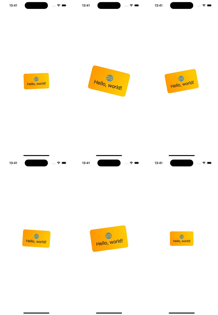
In the previous blog post, we discussed how to use the new phase animator in SwiftUI. Today, we’ll dive into KeyframeAnimator which gives us much more control of the animation. The phase animator worked by specifying different states (e.g. scale, offset etc), and the phase animator animated from one state to another. KeyframeAnimator on the other hand, allows specifying different animation tracks, where each of the track animates a property conforming to the Animatable protocol independently. The value of the property is applied to the view with the content closure of the animator. Each of the animated property is stored by a struct passed into the animator’s initialValues argument. Therefore, the very first thing to start with keyframe animations is creating a new struct which holds animated values and defines initial values. Let’s just animate rotation and scale in our example. Therefore, we can create a struct BannerAnimationValues with rotation and scale properties.

struct BannerAnimationValues {
var rotation: Angle = .zero
var scale = 1.0
}

Secondly, we use keyframeAnimator(initialValue:trigger:content:keyframes:) view modifier on the view. The view modifier defines how these values are applied to the view and when and how exactly the values are animated and interpolated.

BannerView()
.keyframeAnimator(initialValue: BannerAnimationValues(),
trigger: counter,
content: { view, value in
view
.scaleEffect(value.scale)
.rotationEffect(value.rotation)
},
keyframes: { value in
KeyframeTrack(\.scale) {
LinearKeyframe(1.0, duration: 0.5)
SpringKeyframe(2.0, duration: 0.4, spring: .snappy)
CubicKeyframe(1.0, duration: 0.6)
}
KeyframeTrack(\.rotation) {
SpringKeyframe(.degrees(-35), duration: 0.4, spring: .smooth)
SpringKeyframe(.degrees(35), duration: 0.8, spring: .smooth)
LinearKeyframe(.degrees(0), duration: 0.3)
}
})

The first argument is initialValue and we pass our struct with initial values to it. SwiftUI will then modify values of the struct based on the keyframes closure’s KeyframeTracks and keeps calling the content closure to apply new values. In the example above, we can see that the content closure applies scale and rotation effect based on the current animation values. The keyframes closure contains two tracks, since we animate two properties. The first keyframe track defines how the scale property is changed of the BannerAnimationValues struct. Here we keep the scale at 1.0 for 0.5 seconds, then animate the scale value to 2.0 with spring timing function, and finally, setting the scale back to 1.0 using cubic curve timing function. SwiftUI will handle the changes of velocities between different timing functions to keep the animation smooth. The rotation is similar, we use a spring function for setting the rotation to -35 degrees, then to 35 degrees and finally a linear timing for animating the rotation back to 0 degrees.

Some things to keep in mind with keyframe animations is that these animations should not be interrupted or changed in the middle of the animation. This is because we set exact values of the animation, and therefore it can’t retarget to a new set of values and interpolate to new values nicely. Also, the view is updated on every frame, therefore we need to keep in mind performance and not doing any expensive work while the animation is running.

If this was helpful, please let me know on Mastodon@toomasvahter or Twitter @toomasvahter. Feel free to subscribe to RSS feed. Thank you for reading.
Categories
iOS Swift SwiftUI

Animating with PhaseAnimator in SwiftUI

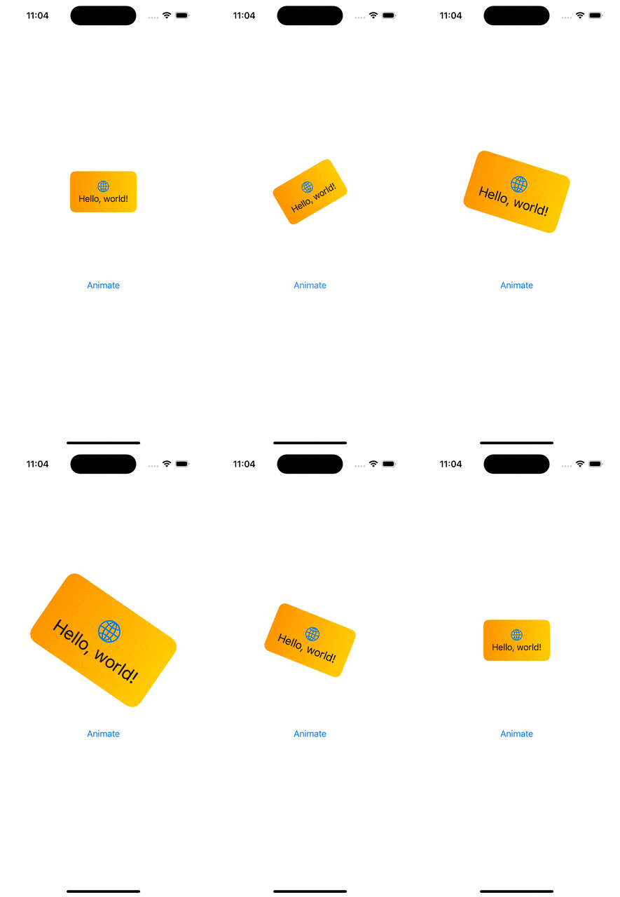
WWDC’23 introduced us a new view modifiers for animating views in SwiftUI. In this blog post, we are going to have a look at phase animation view modifiers. There are two view modifiers: phaseAnimator(_:content:animation:) and phaseAnimator(_:trigger:content:animation:). The first one creates an animation which runs continuously by cycling through all the animation steps. The latter is triggered once when an observed value has changed.

A multistep or multiphase animation is easiest to model using an enum.

enum BannerAnimationPhase: CaseIterable {
case initial, middle, final
var animation: Animation {
switch self {
case .initial: .easeIn
case .middle: .linear
case .final: .easeOut
}
}
var gradientStartPoint: UnitPoint {
switch self {
case .initial: .bottomLeading
case .middle: .leading
case .final: .topLeading
}
}
var rotation: Angle {
switch self {
case .initial: .degrees(-15)
case .middle: .degrees(15)
case .final: .zero
}
}
var scale: Double {
switch self {
case .initial: 1.5
case .middle: 1.7
case .final: 1.0
}
}
}

Here we have an enum with 3 animation phases. Each of the phase slightly modifies 3 values: scale, rotation and gradient start point. These properties are accessed from the phaseAnimator’s view builder, where we modify the original view based on the phase. In addition, we also configured different animations based on the current phase.

struct ContentView: View {
var body: some View {
BannerView()
.phaseAnimator(BannerAnimationPhase.allCases) { content, phase in
content
.background(LinearGradient(colors: [.orange, .yellow],
startPoint: phase.gradientStartPoint,
endPoint: .trailing))
.cornerRadius(8.0)
.scaleEffect(phase.scale)
.rotationEffect(phase.rotation)
} animation: { phase in
phase.animation
}
}
}

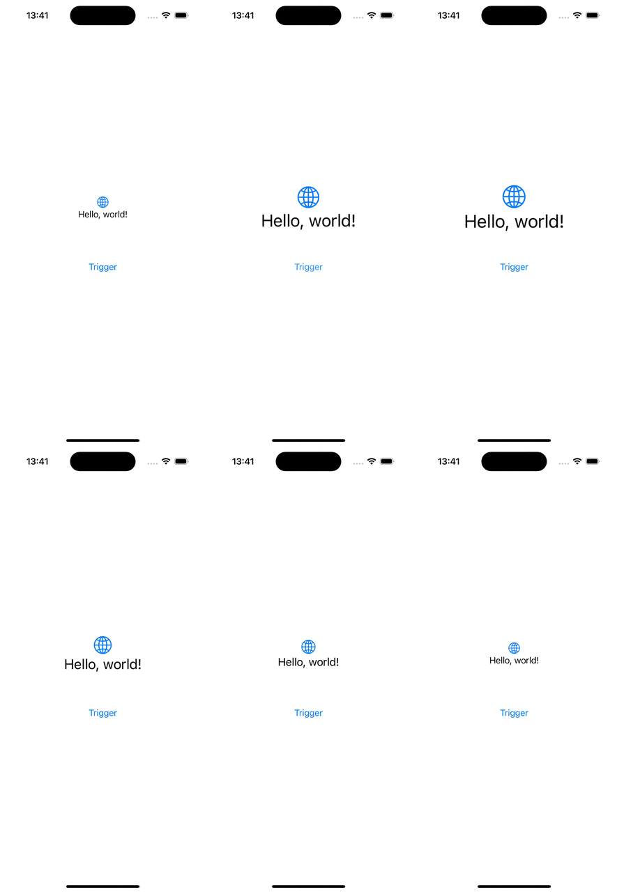
When we only want to have 2 phases for our animation, then we can use boolean values for defining the animation. Below is an example of an animation which is triggered when a value changes and the animation just scales up the banner view and then animates to the initial state – false.

BannerView()
.phaseAnimator([false, true],
trigger: counter) { content, isEnabled in
content
.scaleEffect(isEnabled ? 2.0 : 1.0)
} animation: { isEnabled in
isEnabled ? .bouncy : .easeOut(duration: 0.7)
}
Button("Trigger", action: { counter += 1 })

If this was helpful, please let me know on Mastodon@toomasvahter or Twitter @toomasvahter. Feel free to subscribe to RSS feed. Thank you for reading.
Categories
iOS Swift SwiftUI

Examples of animating SF symbols in SwiftUI

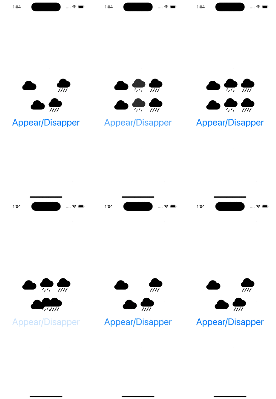
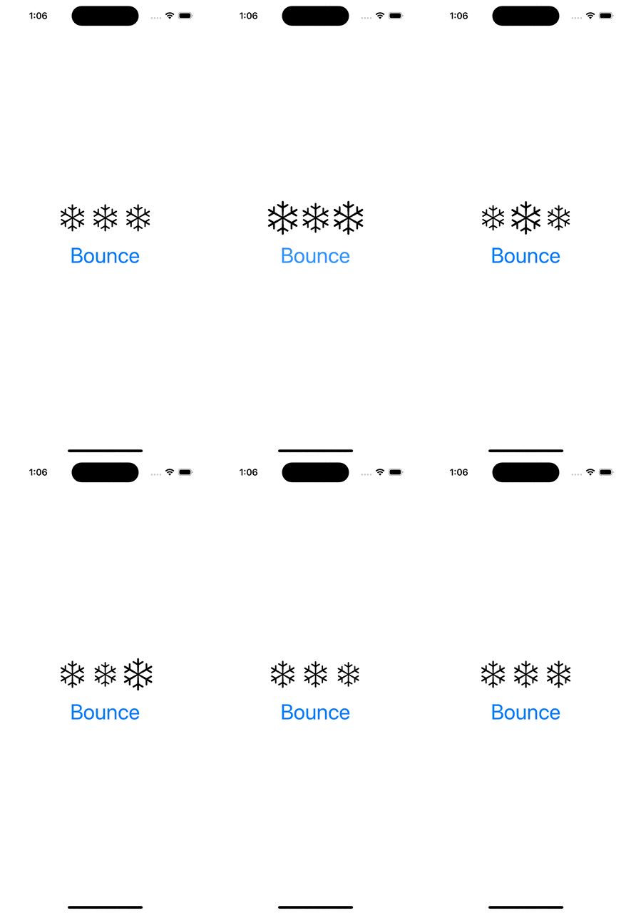
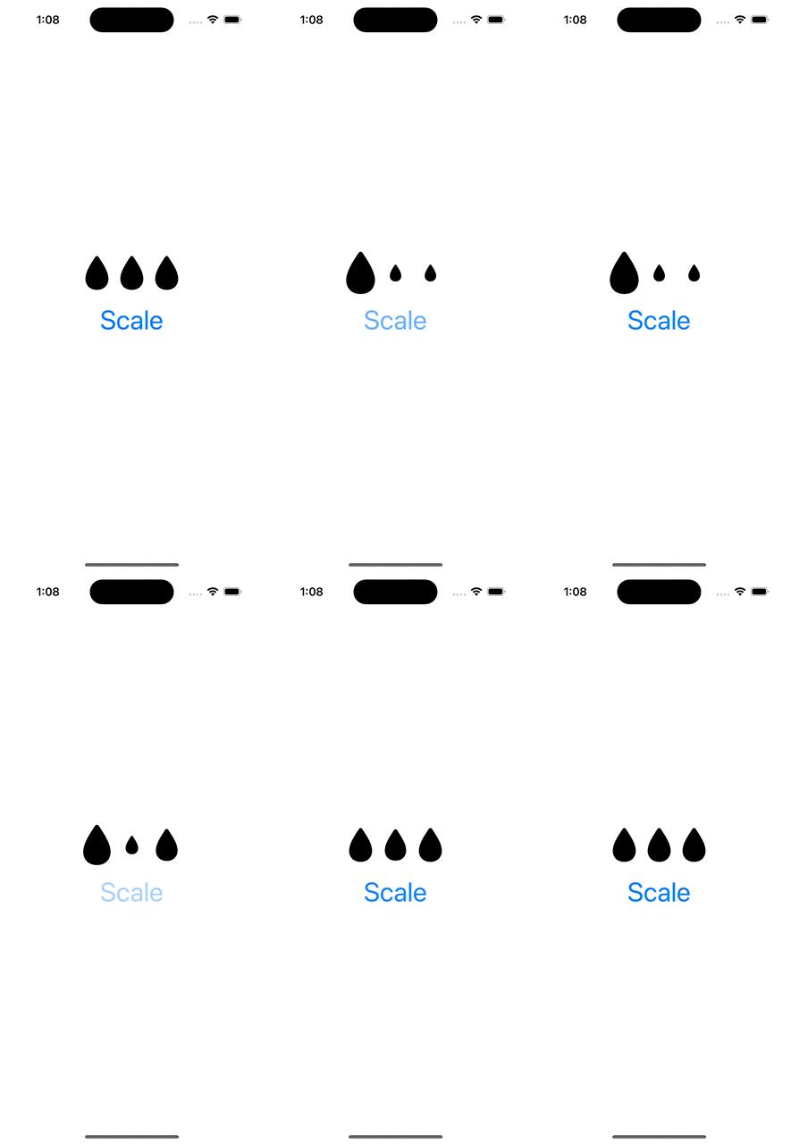
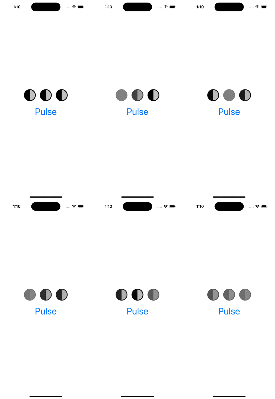
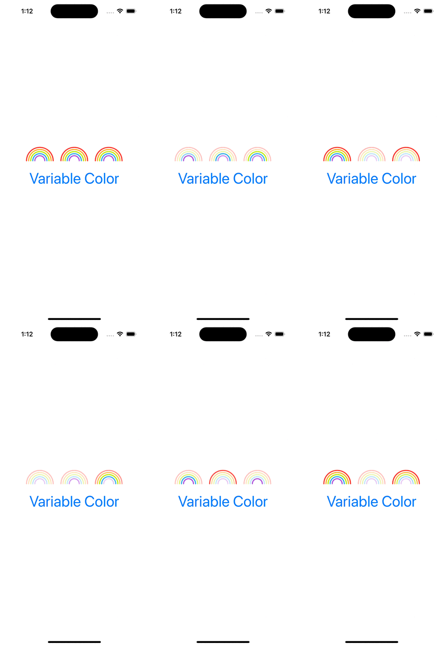
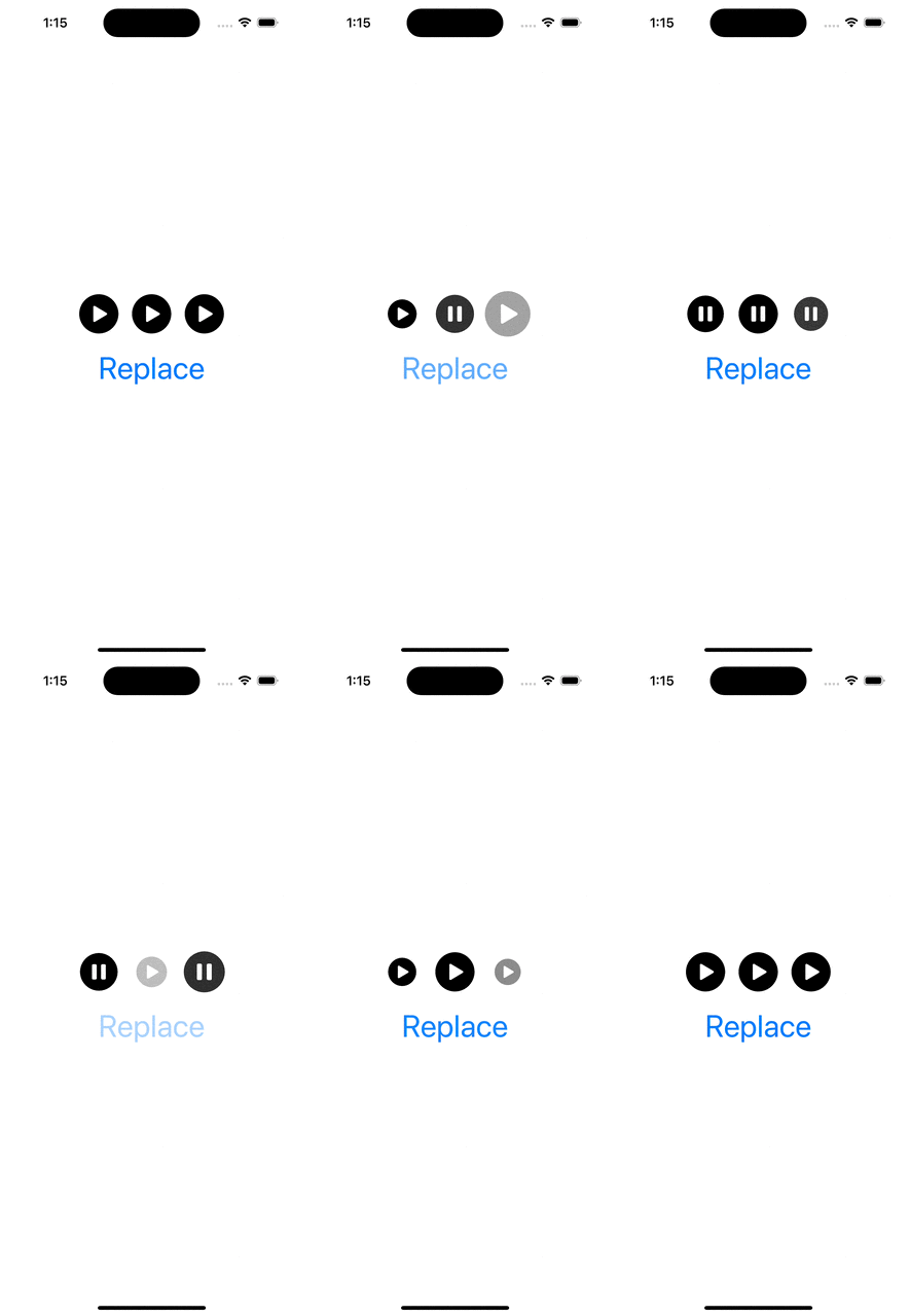
WWDC’23 introduced SF symbol animations. There are 8 different animation presets: appear, disappear, bounce, scale, pulse, variable color, and replace. Each of these presets have a dedicated use-cases. Appear animation is used when a symbol is shown in the UI for the first time. Disappear when a symbol is removed from the UI. Bounce is suitable for communicating to a user that an action was triggered, or it was completed successfully. Scale animation is suitable for highlighting elements in the UI, like when hovering on the element. It could also be used to let the user know that an action has taken a place (think about a button which has pressed down state). Pulse animation is an excellent way to show that some action is ongoing. While recording a video, the record button’s symbol pulses. Variable color animation communicates a state which changes over time (Wi-Fi signal strength). Replace animation is useful for communicating that the function of a symbol has changed. Think about a play button changing to a pause button.

Symbol animations are applied with symbolEffect(_:options:value:) for discrete effects, symbolEffect(_:options:isActive:) for indefinite effects and contentTransition(_:) and transition() view modifiers with a new symbolEffect. Discrete effects are on-off effects, whereas indefinite effects change the symbol indefinitely and need to be explicitly removed. Bounce, pulse, and variable color support discrete effects and pulse, variable color, scale, appear, disappear support indefinite effects. Appear and disappear also support transition effects, and replace supports a content transition effect. Therefore, we need to keep in mind this information when picking the view modifier.

Next, let’s look at some of the examples and how to apply these view modifiers.

Appear and Disappear

struct AppearDisappearView: View {
@State private var isDrizzleHidden = true
var body: some View {
VStack(spacing: 16) {
HStack {
Image(systemName: "cloud.fill")
Image(systemName: "cloud.drizzle.fill")
.symbolEffect(.disappear, isActive: isDrizzleHidden)
Image(systemName: "cloud.heavyrain.fill")
}
.imageScale(.large)
HStack {
Image(systemName: "cloud.fill")
if !isDrizzleHidden {
Image(systemName: "cloud.drizzle.fill")
.transition(.symbolEffect(.automatic))
}
Image(systemName: "cloud.heavyrain.fill")
}
.imageScale(.large)
Button("Appear/Disapper") {
isDrizzleHidden.toggle()
}
}
}
}

Bounce

struct BounceView: View {
@State private var value = 0
var body: some View {
VStack(spacing: 16) {
HStack {
Image(systemName: "snowflake")
.symbolEffect(.bounce, value: value)
Image(systemName: "snowflake")
.symbolEffect(.bounce, options: .speed(0.1), value: value)
Image(systemName: "snowflake")
.symbolEffect(.bounce, options: .repeat(2), value: value)
}
.imageScale(.large)
Button("Bounce") { value += 1 }
}
}
}

Scale

struct ScaleView: View {
@State private var isActive = false
var body: some View {
VStack(spacing: 16) {
HStack {
Image(systemName: "drop.fill")
.symbolEffect(.scale.up, isActive: isActive)
Image(systemName: "drop.fill")
.symbolEffect(.scale.down, options: .speed(0.1), isActive: isActive)
Image(systemName: "drop.fill")
.symbolEffect(.scale.down, options: .speed(5), isActive: isActive)
}
.imageScale(.large)
Button("Scale") { isActive.toggle() }
}
}
}
view raw ScaleView.swift hosted with ❤ by GitHub

Pulse

struct PulseView: View {
@State private var isActive = false
var body: some View {
VStack(spacing: 16) {
HStack {
Image(systemName: "moonphase.first.quarter")
.symbolEffect(.pulse, isActive: isActive)
Image(systemName: "moonphase.first.quarter")
.symbolEffect(.pulse, options: .speed(0.1), isActive: isActive)
Image(systemName: "moonphase.first.quarter")
.symbolEffect(.pulse, options: .speed(5), isActive: isActive)
}
.imageScale(.large)
Button("Pulse") { isActive.toggle() }
}
}
}
view raw PulseView.swift hosted with ❤ by GitHub

Variable Color

struct VariableColorView: View {
@State private var isActive = false
var body: some View {
VStack(spacing: 16) {
HStack {
Image(systemName: "rainbow")
.symbolEffect(.variableColor, options: .speed(0.1), isActive: isActive)
Image(systemName: "rainbow")
.symbolEffect(.variableColor.iterative, options: .speed(0.1), isActive: isActive)
Image(systemName: "rainbow")
.symbolEffect(.variableColor.iterative.reversing, options: .speed(0.1), isActive: isActive)
}
.symbolRenderingMode(.multicolor)
.imageScale(.large)
Button("Variable Color") { isActive.toggle() }
}
}
}

Replace

struct ReplaceView: View {
@State private var isActive = false
var body: some View {
VStack(spacing: 16) {
HStack {
Image(systemName: isActive ? "pause.circle.fill" : "play.circle.fill")
.contentTransition(.symbolEffect(.replace))
Image(systemName: isActive ? "pause.circle.fill" : "play.circle.fill")
.contentTransition(.symbolEffect(.replace.offUp))
Image(systemName: isActive ? "pause.circle.fill" : "play.circle.fill")
.contentTransition(.symbolEffect(.replace.upUp))
}
.imageScale(.large)
Button("Replace") { isActive.toggle() }
}
}
}

Example Project

SymbolsAnimationExample (Xcode 15 beta 6)

If this was helpful, please let me know on Mastodon@toomasvahter or Twitter @toomasvahter. Feel free to subscribe to RSS feed. Thank you for reading.
Categories
iOS Metal Swift SwiftUI

Applying metal shader to text in SwiftUI

WWDC ’23 introduced view modifiers for applying shaders to SwiftUI views. The new view modifiers are called colorEffect, distortionEffect, and layerEffect. In addition, the Shader also conforms to the ShapeStyle protocol which means that we can directly pass the shader to the foregroundStyle view modifier and then SwiftUI uses the shader to compute pixel color values for the view. In this post, we are going to have a look at what it takes to apply a shader to text. What we will not cover is how to use each of the new view modifiers, what were mentioned before.

Metal shaders are defined in .metal files. Therefore, the first step is to add a new .metal file to the project. As an example, we’ll create a shader which applies a stripe effect to the text. The .metal file’s implementation is shown below:

#include <metal_stdlib>
using namespace metal;

[[ stitchable ]] half4 stripes(float2 position, float stripeWidth) {
    bool isAlternativeColor = uint(position.x / stripeWidth) & 1;
    return isAlternativeColor ? half4(0, 0, 1, 1) : half4(1, 0, 0, 1);
}

The shader function returns color of the pixel for the current pixel position. The stripeWidth argument is going to be handled by us for configuring the width of the stripe. When the shader function is defined, then the next step is using the new ShaderLibrary type for accessing the shader function. Since the ShaderLibrary type implements @dynamicMemberLookup then the metal shader function in the .metal file can be accessed directly though the name stripes.

var shader: Shader {
  ShaderLibrary.stripes(.float(15))
}

The last step is applying the shader to the Text value using the foregroundStyle view modifier.

Text("Hello, world!")
  .font(.largeTitle)
  .foregroundStyle(shader)

The final result can be seen here:

Sample code: SwiftUIMetalTextShaderExample (Xcode 15 beta 5)

If this was helpful, please let me know on Mastodon@toomasvahter or Twitter @toomasvahter. Feel free to subscribe to RSS feed. Thank you for reading.
Categories
iOS Swift SwiftUI Xcode

Discovering #Preview macro in Swift

Previews are snippets of codes for creating a live preview of a view what we can see in Xcode. This enables to quickly iterate your views because we can see right away how the view looks after each of the code change. Previews are compiled alongside with the app, and therefore we can access all the other code and resources like images. If we want to use preview only resource, we can use Xcode’s development assets feature for making the resource only part of the app when rendering previews. Now when we know what previews are in general, let’s move on to creating a preview.

So far we have created a new struct which conforms to a PreviewProvider protocol if we wanted Xcode to render the view for us. Xcode 15 with Swift 5.9’s macro support introduces a #Preview macro, which replaces the old way of creating live previews. The benefit of the new macro is having to write less code to get going with live previews. Let’s compare the both approaches and have a look at an accessory view’s preview.

// Before
struct RatingsView_Previews: PreviewProvider {
static var previews: some View {
VStack {
ForEach(0…5, id: \.self) { value in
RatingsView(value: .constant(value))
}
}
.previewLayout(.sizeThatFits)
}
}
// After
#Preview(traits: .sizeThatFitsLayout) {
VStack {
ForEach(0…5, id: \.self) { value in
RatingsView(value: .constant(value))
}
}
}
view raw Preview.swift hosted with ❤ by GitHub

In the example above, we wanted to apply a trait since this view is a tiny accessory view, and therefore we would like to see it rendered as small as possible. A list of traits what we can use are listed here:

extension PreviewTrait where T == Preview.ViewTraits {
/// Preview with `.device` layout (the default).
public static var defaultLayout: PreviewTrait<Preview.ViewTraits> { get }
public static var sizeThatFitsLayout: PreviewTrait<Preview.ViewTraits> { get }
public static func fixedLayout(width: CGFloat, height: CGFloat) -> PreviewTrait<T>
public static var portrait: PreviewTrait<Preview.ViewTraits> { get }
public static var landscapeLeft: PreviewTrait<Preview.ViewTraits> { get }
public static var landscapeRight: PreviewTrait<Preview.ViewTraits> { get }
public static var portraitUpsideDown: PreviewTrait<Preview.ViewTraits> { get }
}

When working with full screen views, the preview macro can be as simple as this:

#Preview {
OnboardingView()
}

In addition to traits, we can also give a name to the preview which is displayed in the Xcode’s preview canvas. This can be useful if we create multiple previews for the same view.

A view with multiple previews with different names.

Another thing to note is that the preview canvas in Xcode also lists a pin button next to the name of the preview. Pinning previews is useful if we want to navigate to another file to make some changes and keeping the preview running. Maybe we want to change some constants which affects the layout of the view, but these constants are defined somewhere else. Then it is useful to keep the preview running and seeing how changing a constant in another view is reflected by the view using it.

There is another tip to keep in mind. We can run previews on physical devices as well. We just need to pick the physical device instead of a simulator from the device picker.

Preview canvas, which lists a physical device for preview.

Finally, let’s not forget about the great way to see all the colour scheme and dynamic type variants at the same time. There is a separate variants button for that next to the live preview and selectable preview buttons.

If this was helpful, please let me know on Mastodon@toomasvahter or Twitter @toomasvahter. Feel free to subscribe to RSS feed. Thank you for reading.
Categories
iOS Swift SwiftUI

Collapsible wheel picker for forms in SwiftUI

While working on an app, I needed a way for showing a picker with a wheel style in a form. If we add a wheel picker to a form, it is always shown. Better would be to show a row which describes the current selection and if I tap on the row, it reveals the picker with wheel style. This is exactly what we are going to build in this blog post. Moreover, we will first create a general purpose collapsible view which can be used in other use cases as well. In the end, we will have a collapsible wheel picker which behaves like this:

We start with creating a general purpose collapsible view which has two closures: one for title view and the other for collapsible view. The view implementation is fairly simple. A button controls the collapsed state and then optionally we add the collapsible secondary view. We are using view builders here since we want to construct views with closures which support creating multiple child views. The view is optimized for forms, and therefore we use the Group view which automatically adds a divider between the button and the secondary view. Button uses a plain style which removes the tint colour of it in forms.

struct CollapsibleView<Label, Content>: View where Label: View, Content: View {
@State private var isSecondaryViewVisible = false
@ViewBuilder let label: () -> Label
@ViewBuilder let content: () -> Content
var body: some View {
Group {
Button(action: { isSecondaryViewVisible.toggle() }, label: label)
.buttonStyle(.plain)
if isSecondaryViewVisible {
content()
}
}
}
}

Now we can use this view to create a new CollapsibleWheelPicker. This view just adds a picker with wheel style as the secondary view.

struct CollapsibleWheelPicker<SelectionValue, Content, Label>: View where SelectionValue: Hashable, Content: View, Label: View {
@Binding var selection: SelectionValue
@ViewBuilder let content: () -> Content
@ViewBuilder let label: () -> Label
var body: some View {
CollapsibleView(label: label) {
Picker(selection: $selection, content: content) {
EmptyView()
}
.pickerStyle(.wheel)
}
}
}

A full example looks like this:

struct ContentView: View {
@State private var selection = 1
let items = [0, 1, 2, 3, 4, 5, 6, 7, 8]
var body: some View {
NavigationStack {
Form {
CollapsibleWheelPicker(selection: $selection) {
ForEach(items, id: \.self) { item in
Text("\(item)")
}
} label: {
Text("Cups of Water")
Spacer()
Text("\(selection)")
}
}
}
}
}

If this was helpful, please let me know on Mastodon@toomasvahter or Twitter @toomasvahter. Feel free to subscribe to RSS feed. Thank you for reading.
Categories
iOS Swift SwiftUI

Ratings view in SwiftUI

I am currently building a new app where I needed to show ratings for items. Ratings are from 0 to 5 with 0.5 step. In this blog post, we’ll implement a SwiftUI view which uses SF symbols to display ratings. Since we need to make sure it works properly with each of the step, we are going to leverage the usefulness of SwiftUI previews and render each state one by one vertically. Swift has a function called stride what we can use to easily create an array of double values with a step of 0.5 and feed it in to ForEach.

struct RatingsView_Previews: PreviewProvider {
static var previews: some View {
VStack {
let steps = Array(stride(from: 0.0, through: 5.0, by: 0.5))
ForEach(steps, id: \.self) { value in
RatingsView(value: value)
}
}
.previewLayout(.sizeThatFits)
}
}
view raw Preview.swift hosted with ❤ by GitHub

The view needs to render 5 stars next to each other and figure out which stars are filled, half filled or empty. Rendering 5 images is straight-forward in SwiftUI. We can use HStack and ForEach with an integer range from 0 to 5. Since we use SF symbols, then the colour of the filled star can be applied with the foregroundColor view modifier.

/// A view displaying a star rating with a step of 0.5.
struct RatingsView: View {
/// A value in range of 0.0 to 5.0.
let value: Double
var body: some View {
HStack(spacing: 0) {
ForEach(0..<5) { index in
Image(systemName: imageName(for: index, value: value))
}
}
.foregroundColor(.yellow)
}
func imageName(for starIndex: Int, value: Double) -> String {
// redacted
}
}

The most complicated part is implementing a function what returns the name of the SF symbol for the current star index and the double value passed into the view. When I thought about it then I ended up with two solutions: one with if clauses and the other one with switch statement.

func imageName(for starIndex: Int, value: Double) -> String {
// Version A
if value >= Double(starIndex + 1) {
return "star.fill"
}
else if value >= Double(starIndex) + 0.5 {
return "star.leadinghalf.filled"
}
else {
return "star"
}
// Version B
switch value – Double(starIndex) {
case ..<0.5: return "star"
case 0.5..<1.0: return "star.leadinghalf.filled"
default: return "star.fill"
}
}

The solution A is checking if the value is larger than the star index + 1 which means that in case of value 1.0 the zero indexed star image is rendered as filled star. Half-filled cases are handled by checking if the zero indexed star index + 0.5 is less than the current value. The solution B uses open-ended ranges and a switch statement. When we subtract the zero indexed star index from the current value, then if it is less than 0.5 then the star should be not filled, if 0.5 to 1.0 then half-filled and in other cases filled. When comparing these implementations, then the B is more concise, but on the other hand A is more readable. Years ago I read a book “Masters of Doom” and John Romero’s programming principles. Don’t know why, but his programming principle “simplify” always pops on my mind when I need to decide on multiple implementations. Like here, only because of this, I am going for solution A.

SwiftUI preview showing each state of the ratings view.

If this was helpful, please let me know on Mastodon@toomasvahter or Twitter @toomasvahter. Feel free to subscribe to RSS feed. Thank you for reading.
Categories
iOS Swift SwiftUI

Getting started with matched geometry effect in SwiftUI

Matched geometry effect in SwiftUI is a view modifier for creating transition animations between two views. We create two different views, apply the modifier to both of them with a same identifier and namespace, and removing one and inserting another will create an animation where one view moves to the other view’s position. In other words, the view slides from the removed view’s position to the inserted view’s position. Let’s have a look at a concrete example, where we have two rows of views: rectangles and circles. Tapping on any of the views will remove it from one row and insert it into another row. Since we use matchedGeometryEffect view modifier, the change is animated and one view slides to another row.

The view implementation is straight forward. We have a view which renders two rows with ForEach and each row element is a button what has matchedGeometryEffect view modifier applied to. Model items just have an id and colour which is used for setting the foregroundColor. The view model holds two arrays of items, and select methods just remove one item from one array and insert it in another.

struct ContentView: View {
@StateObject var viewModel = ViewModel()
@Namespace var colorSelectionNamespace
var body: some View {
VStack {
HStack {
ForEach(viewModel.topColors) { item in
Button(action: { viewModel.selectTopColor(item) }) {
Rectangle()
.foregroundColor(item.color)
.frame(width: 40, height: 40)
}
.matchedGeometryEffect(id: item.id, in: colorSelectionNamespace)
}
}
.frame(minHeight: 50)
Spacer()
.frame(height: 200)
HStack {
ForEach(viewModel.bottomColors) { item in
Button(action: { viewModel.selectBottomColor(item) }) {
Circle()
.foregroundColor(item.color)
.frame(width: 20, height: 20)
}
.matchedGeometryEffect(id: item.id, in: colorSelectionNamespace)
}
}
.frame(minHeight: 50)
}
}
}

The view model’s implementation is shown below. Since we want to animate changes, we use withAnimation block and inside the block just remove one item and then insert it to another. Item properties use @Published property wrapper and the view model is ObservableObject, then property changes trigger view refresh. As one view is removed and the other view is inserted, then matchedGeometryEffect will trigger a transition animation where the view moves from one position to another with default fade animation.

extension ContentView {
final class ViewModel: ObservableObject {
@Published var topColors = ColorItem.all
@Published var bottomColors = [ColorItem]()
func selectBottomColor(_ item: ColorItem) {
withAnimation {
guard let index = bottomColors.firstIndex(of: item) else { return }
bottomColors.remove(at: index)
let insertionIndex = (topColors.startIndex…topColors.endIndex).randomElement() ?? 0
topColors.insert(item, at: insertionIndex)
}
}
func selectTopColor(_ item: ColorItem) {
withAnimation {
guard let index = topColors.firstIndex(of: item) else { return }
topColors.remove(at: index)
let insertionIndex = (bottomColors.startIndex…bottomColors.endIndex).randomElement() ?? 0
bottomColors.insert(item, at: insertionIndex)
}
}
}
}
view raw ViewModel.swift hosted with ❤ by GitHub

If this was helpful, please let me know on Mastodon@toomasvahter or Twitter @toomasvahter. Feel free to subscribe to RSS feed. Thank you for reading.
Categories
iOS Swift SwiftUI

Bizarre error in SwiftUI preview

The other day, I was playing around with matchedGeometryEffect view modifier in my sample app. I was just planning to show a list of items and then animate moving one item from one HStack to another. Suddenly, my SwiftUI preview stopped working. On the other hand, running exactly the same code on the simulator just worked fine. The code was very simple, consisting of view, view model and an Item model struct.

import SwiftUI
struct ContentView: View {
@StateObject var viewModel = ViewModel()
var body: some View {
VStack {
ForEach(viewModel.items) { item in
Text(verbatim: item.name)
}
}
.padding()
}
}
extension ContentView {
final class ViewModel: ObservableObject {
let items: [Item] = [
Item(name: "first"),
Item(name: "second")
]
func select(_ item: Item) {
// implement
}
}
struct Item: Identifiable {
let name: String
var id: String { name }
}
}
struct ContentView_Previews: PreviewProvider {
static var previews: some View {
ContentView()
}
}

If you try to render SwiftUI preview (I was using Xcode 14.3) then Xcode is giving up with “Failed to launch the app XXX in reasonable time”. But if I try to build and run it on simulator, it just works fine. After some trial and error, it turned out that SwiftUI previews broke as soon as I added the func select(_ item: Item) function. If you pay a close attention, then you can see that the longer type name for Item is ContentView.Item, but within the ContentView.ViewModel type I am using just Item. I do not know why, but SwiftUI previews seems to get confused by it. As soon as I change the function declaration to func select(_ item: ContentView.Item) the preview starts rendering again. Another way is declaring the Item struct outside the ContentView extension.

The learning point is that if SwiftUI previews stop working suddenly, then make sure to check how nested types are used in function declarations.

If this was helpful, please let me know on Mastodon@toomasvahter or Twitter @toomasvahter. Feel free to subscribe to RSS feed. Thank you for reading.