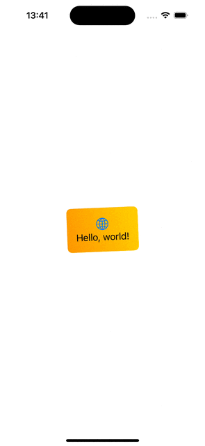
In the previous blog post, we discussed how to use the new phase animator in SwiftUI. Today, we’ll dive into KeyframeAnimator which gives us much more control of the animation. The phase animator worked by specifying different states (e.g. scale, offset etc), and the phase animator animated from one state to another. KeyframeAnimator on the other hand, allows specifying different animation tracks, where each of the track animates a property conforming to the Animatable protocol independently. The value of the property is applied to the view with the content closure of the animator. Each of the animated property is stored by a struct passed into the animator’s initialValues argument. Therefore, the very first thing to start with keyframe animations is creating a new struct which holds animated values and defines initial values. Let’s just animate rotation and scale in our example. Therefore, we can create a struct BannerAnimationValues with rotation and scale properties.
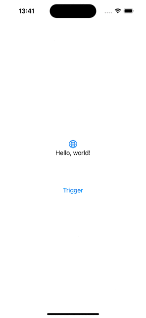
Secondly, we use keyframeAnimator(initialValue:trigger:content:keyframes:) view modifier on the view. The view modifier defines how these values are applied to the view and when and how exactly the values are animated and interpolated.
The first argument is initialValue and we pass our struct with initial values to it. SwiftUI will then modify values of the struct based on the keyframes closure’s KeyframeTracks and keeps calling the content closure to apply new values. In the example above, we can see that the content closure applies scale and rotation effect based on the current animation values. The keyframes closure contains two tracks, since we animate two properties. The first keyframe track defines how the scale property is changed of the BannerAnimationValues struct. Here we keep the scale at 1.0 for 0.5 seconds, then animate the scale value to 2.0 with spring timing function, and finally, setting the scale back to 1.0 using cubic curve timing function. SwiftUI will handle the changes of velocities between different timing functions to keep the animation smooth. The rotation is similar, we use a spring function for setting the rotation to -35 degrees, then to 35 degrees and finally a linear timing for animating the rotation back to 0 degrees.
Some things to keep in mind with keyframe animations is that these animations should not be interrupted or changed in the middle of the animation. This is because we set exact values of the animation, and therefore it can’t retarget to a new set of values and interpolate to new values nicely. Also, the view is updated on every frame, therefore we need to keep in mind performance and not doing any expensive work while the animation is running.

If this was helpful, please let me know on Mastodon@toomasvahter or Twitter @toomasvahter. Feel free to subscribe to RSS feed. Thank you for reading.


 Augmented Code