One of the really common layouts I have needed to implement with collection view is a simple flow layout but with fixed spacings. Apple provides us UICollectionViewFlowLayout, but the sad part is that it has dynamic spacing between items. Everything is there but not quite. Before UICollectionViewCompositionalLayout, one needs to create a subclass of the flow layout and then fixing spacings manually, which is pretty cumbersome to do. Therefore, let’s instead see what it takes to implement a simple self-sizing flow layout with fixed spacings when using UICollectionViewCompositionalLayout. The end goal is visible below, where we have a single section with 7 items.
Flow layout with fixed spacings.
UICollectionViewCompositionalLayout was created to be a flexible layout which allows building all sorts of layouts quickly. Data in that layout is divided into sections, where each section can have one or more groups of items. Grouping allows creating more complex layouts, where each group describes how items in the group are laid out in relation to each other. But in our case we have something really simple in mind, which is having self-sizing items which we can configure with NSCollectionLayoutSize and passing estimated dimensions. Then the next step is creating NSCollectionLayoutItem with that layout size and with some space around the item. The edge spacing with fixed edges gives us the wanted fixed spacing between items. After that, we’ll create NSCollectionLayoutGroup with horizontal layout direction and with a layout size which takes max width, but height is fitted based on item sizes. Creating layouts like this is so much better compared to subclassing UICollectionViewLayout and then calculating frames one by one. Down below is the configured layout object, which has fixed spacing and items are self-sizing.
This file contains hidden or bidirectional Unicode text that may be interpreted or compiled differently than what appears below. To review, open the file in an editor that reveals hidden Unicode characters.
Learn more about bidirectional Unicode characters
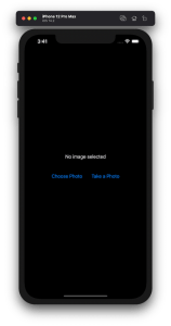
Lots of apps need to deal with selecting or taking photos but in SwiftUI we’ll need to wrap UIKit’s UIImagePickerController with a SwiftUI view.
Example application presenting a UI for opening image picker.
Wrapping UIImagePickerController in SwiftUI
UIImagePickerController has been available since iOS 2 and it supports both selecting photos from photo albums and taking new photos with a camera. If we would like to use an image picker in a SwiftUI view then the first step is wrapping this view controller with a SwiftUI view. UIViewControllerRepresentable protocol defines required methods for representing an UIViewController. We’ll provide a completion handler for passing back the selected image. We need to implement a coordinator which acts as a delegate for the UIImagePickerController. When the imagePickerController(_:didFinishPickingMediaWithInfo:) delegate method is called, then we can call the completion handler and handle the selected image in a SwiftUI view. As UIImagePickerController supports both the camera function and accessing existing photos, we’ll add a source type property for configuring which mode to use.
This file contains hidden or bidirectional Unicode text that may be interpreted or compiled differently than what appears below. To review, open the file in an editor that reveals hidden Unicode characters.
Learn more about bidirectional Unicode characters
ImagePicker view which wraps UIImagePickerController.
The ImagePicker can then be presented with the fullScreenCover view modifier. The presented state and the selected image is stored in the view’s view model. When the image picker is displayed and an image is selected, the completion handler is called and the selectedImage property is updated in the view model which in turn reloads the SwiftUI view.
This file contains hidden or bidirectional Unicode text that may be interpreted or compiled differently than what appears below. To review, open the file in an editor that reveals hidden Unicode characters.
Learn more about bidirectional Unicode characters
This file contains hidden or bidirectional Unicode text that may be interpreted or compiled differently than what appears below. To review, open the file in an editor that reveals hidden Unicode characters.
Learn more about bidirectional Unicode characters
A SwiftUI view containing an image preview and buttons for taking or choosing a photo.
Summary
Wrapping UIKit views with a SwiftUI view is fairly simple. The coordinator object is a perfect fit for handling delegate methods which UIKit views often provide. As we saw, adding a SwiftUI compatible image picker was pretty easy to do. Please check the full example project on GitHub.
SwiftUI provides wrappers for UIViewController and UIView on iOS. Same wrappers are also available for AppKit views on macOS. Let’s see how to use those wrappers for rendering UIKit views in SwiftUI previews and therefore benefiting from seeing changes immediately. Note that even when a project can’t support SwiftUI views because of the minimum deployment target, then this is still something what can be used when compiling the project with debug settings. Preview related code should only be compiled in debug builds and is never meant to be compiled in release builds. Before we jump in, there are two very useful shortcuts for keeping in mind: option+command+return for toggling previews and option+command+p for refreshing previews.
UIViewControllerRepresentable for wrapping UIViewControllers
UIViewControllerRepresentable is a protocol which can be used for wrapping UIViewController and representing it in SwiftUI. We can add a struct which conforms to that protocol and then creating an instance of the view controller in the makeUIViewController method. Second step is to add another struct which implements PreviewProvider protocol and which is used by Xcode for rendering previews. In simple cases we can get away only with such implementation but in more complex view controllers we would need to set up dependencies and generate example data for the preview. If need to do this, then all that code can be added to the makeUIViewController method.
This file contains hidden or bidirectional Unicode text that may be interpreted or compiled differently than what appears below. To review, open the file in an editor that reveals hidden Unicode characters.
Learn more about bidirectional Unicode characters
Wrapping UIViewController with UIViewControllerRepresentable.
UIViewController shown using SwiftUI
UIViewRepresentable for wrapping UIViews
UIViewRepresentable follows the same flow. In the example below, we use Group for showing two views with fixed size and different appearances at the same time.
This file contains hidden or bidirectional Unicode text that may be interpreted or compiled differently than what appears below. To review, open the file in an editor that reveals hidden Unicode characters.
Learn more about bidirectional Unicode characters
Wrapping UIView subclass with UIViewRepresentable.
Multiple UIViews shown in SwiftUI preview at the same time.
Summary
We looked into how to wrap view controllers and views for SwiftUI previews. Previews only required a little bit of code and therefore it is something what we can use for improving our workflows when working with UIKit views.


 Augmented Code