UICollectionViewCompositionalLayout was an important change to how we create collection view layouts. In iOS14 Apple added a new static function to this class which creates a layout object for list views. Meaning, it is very easy to create a list views which look like a table view we are familiar with. The static list() function takes a configuration object UICollectionLayoutListConfiguration which allows further to configure the appearance of the header view. For example, supplementary header views are enabled here. In this blog post, we’ll create a list view with a collection view and use cell registration and diffable data source APIs.
List view created with diffable data source and collection view.
Generating data for the list view
Firstly, we’ll generate some data types which we want to display in the list view. The aim is to represent each Palette type with one section, and each PaletteColor is a row in the section.
This file contains hidden or bidirectional Unicode text that may be interpreted or compiled differently than what appears below. To review, open the file in an editor that reveals hidden Unicode characters.
Learn more about bidirectional Unicode characters
We’ll create the collection view instance with a layout object which is configured to display lists. We go for insetGrouped appearance and turn on header views.
This file contains hidden or bidirectional Unicode text that may be interpreted or compiled differently than what appears below. To review, open the file in an editor that reveals hidden Unicode characters.
Learn more about bidirectional Unicode characters
Configuring collection view data source and cell registration
The UICollectionViewDiffableDataSource is used for managing the data and also provides cells on demand. We’ll need to define section and item types when creating the data source. With the data we want to display, we’ll use String as a section type and PaletteColor as the item type when the section is just the name of the Palette’s name. In addition, we’ll use the cell and supplementary view registration APIs which keep the logic of creating different cells with a model object in the same place, which I find it to be really nice. Cells and supplementary views we’ll configure using the content configuration APIs which describe the data the cell or supplementary view displays. For list views, there is a specialized UIListContentConfiguration type which supports a variety of appearances. In many cases we do not need any custom cell classes at all since UIListContentConfiguration and UICollectionViewListCell takes care of it for us.
This file contains hidden or bidirectional Unicode text that may be interpreted or compiled differently than what appears below. To review, open the file in an editor that reveals hidden Unicode characters.
Learn more about bidirectional Unicode characters
The final missing piece is creating a snapshot and applying it to the collection view data source which then tells the collection view what to render. If we would generate a new snapshot with slightly different data then the collection view only renders the changes between snapshots. No need to do this manually on our own.
This file contains hidden or bidirectional Unicode text that may be interpreted or compiled differently than what appears below. To review, open the file in an editor that reveals hidden Unicode characters.
Learn more about bidirectional Unicode characters
Diffable data sources with new cell registration APIs make a huge difference in how we implement collection views. Although it might take a bit of time to see how all the new APIs work together, I do not want to go back. Please check the example project for full code.
One of the really common layouts I have needed to implement with collection view is a simple flow layout but with fixed spacings. Apple provides us UICollectionViewFlowLayout, but the sad part is that it has dynamic spacing between items. Everything is there but not quite. Before UICollectionViewCompositionalLayout, one needs to create a subclass of the flow layout and then fixing spacings manually, which is pretty cumbersome to do. Therefore, let’s instead see what it takes to implement a simple self-sizing flow layout with fixed spacings when using UICollectionViewCompositionalLayout. The end goal is visible below, where we have a single section with 7 items.
Flow layout with fixed spacings.
UICollectionViewCompositionalLayout was created to be a flexible layout which allows building all sorts of layouts quickly. Data in that layout is divided into sections, where each section can have one or more groups of items. Grouping allows creating more complex layouts, where each group describes how items in the group are laid out in relation to each other. But in our case we have something really simple in mind, which is having self-sizing items which we can configure with NSCollectionLayoutSize and passing estimated dimensions. Then the next step is creating NSCollectionLayoutItem with that layout size and with some space around the item. The edge spacing with fixed edges gives us the wanted fixed spacing between items. After that, we’ll create NSCollectionLayoutGroup with horizontal layout direction and with a layout size which takes max width, but height is fitted based on item sizes. Creating layouts like this is so much better compared to subclassing UICollectionViewLayout and then calculating frames one by one. Down below is the configured layout object, which has fixed spacing and items are self-sizing.
This file contains hidden or bidirectional Unicode text that may be interpreted or compiled differently than what appears below. To review, open the file in an editor that reveals hidden Unicode characters.
Learn more about bidirectional Unicode characters
I have numerous times needed to show some sort of collection view which adjusts its height based on the content. Most of the time it has been a dynamic list within some more complex scrollable UI. Therefore, in this post, we’ll take a look at how to set up a collection view which has its height set to the content height. On the screenshot below, we have a collection view with light grey background and two sections.
Collection view with height fitting size.
The approach for making this working is pretty simple, which involves adding a height constraint with the constant value set to collection view content height. Content height can be retrieved from the layout object. The constraint’s constant value can be updated in viewWillLayoutSubviews.
This file contains hidden or bidirectional Unicode text that may be interpreted or compiled differently than what appears below. To review, open the file in an editor that reveals hidden Unicode characters.
Learn more about bidirectional Unicode characters
UICollectionViewFlowLayout is layout object supplied by UIKit and enables showing items in grid. It allows customising spacings and supports fixed size cells and cells with different sizes. This time I am going to show how to build a collection view containing items with different sizes where sizes are defined by auto layout constraints.
Cell sizes in UICollectionViewFlowLayout
By default UICollectionViewFlowLayout uses itemSize property for defining the sizes of the cells. Another way is to use UICollectionViewDelegateFlowLayout and supplying item sizes by implementing collectionView(_:layout:sizeForItemAt:). Third way is to let auto layout for defining the size of the cell. This is what I am going to build this time.
This file contains hidden or bidirectional Unicode text that may be interpreted or compiled differently than what appears below. To review, open the file in an editor that reveals hidden Unicode characters.
Learn more about bidirectional Unicode characters
Setting up collection view cell with auto-layout constraints
When layout object is configured, second step is to create a cell. In the current prototype it is going to be a simple cell with a label and border around the label. Constraints are set up to have a 8 points space around the label. Constraints together with label’s intrinsicContentSize define the minimum size for the cell. If text is longer, intrinsicContentSize is wider.
This file contains hidden or bidirectional Unicode text that may be interpreted or compiled differently than what appears below. To review, open the file in an editor that reveals hidden Unicode characters.
Learn more about bidirectional Unicode characters
When putting all the things together, the end result is a collection view where every cell has its own size. Moreover, it supports dynamic type and cells will grow if user changes default text sizes.
Summary
UICollectionViewFlowLayout’s estimatedItemSize enables using auto-layout for defining cell sizes. Therefore creating cells where text defines the size of the cell is simple to do on iOS.
UICollectionViewLayout’s responsibility is to define layout: all the cell locations and sizes. It acts like a data source object which provides layout related information to the collection view. Collection view then uses that information for creating cells and placing them on screen. This time we’ll take a look on how to create a custom circle shaped layout.
Creating UICollectionViewLayout subclass
First step for creating a custom layout is to create UICollectionViewLayout subclass. Then we need to define the size of the layout. In this simple case, all the cells will fit into the available area – therefore we can just return the collection view’s own size.
This file contains hidden or bidirectional Unicode text that may be interpreted or compiled differently than what appears below. To review, open the file in an editor that reveals hidden Unicode characters.
Learn more about bidirectional Unicode characters
When-ever user rotates the device, the size of the collection view changes, therefore we would like to reset the layout.
This file contains hidden or bidirectional Unicode text that may be interpreted or compiled differently than what appears below. To review, open the file in an editor that reveals hidden Unicode characters.
Learn more about bidirectional Unicode characters
Prepare is called whenever layout gets invalidated and it is a best place where to pre-calculate cell locations. Then it is possible to return attributes in all of the other methods querying for attributes later on. This gives us the best possible performance.
Items are placed along a circle which is centred in the collection view. As collection view can be under navigation bar, then the frame of the circle needs to take account contentOffset. Moreover, as centre points of items are on the circle, we also need to take account the item size. Calculating positions for items is just a matter of applying simple trigonometry with right-angled triangles.
This file contains hidden or bidirectional Unicode text that may be interpreted or compiled differently than what appears below. To review, open the file in an editor that reveals hidden Unicode characters.
Learn more about bidirectional Unicode characters
If we have pre-calculated attributes, then it is straight-forward to return them in the layout attributes methods. When adding or removing items, cells will move to new location with a nice animation by default.
This file contains hidden or bidirectional Unicode text that may be interpreted or compiled differently than what appears below. To review, open the file in an editor that reveals hidden Unicode characters.
Learn more about bidirectional Unicode characters
I would like to highlight the fact that content presented here is just a bare minimum for setting up custom collection view layout. UICollectionView is highly configurable.
Setting up collection view
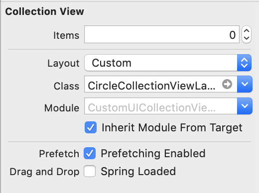
When custom collection view layout is ready, it is time to hook it up to the collection view. Custom collection view layout can be set in storyboard or when initialising collection view or collection view controller.
Setting custom layout in UIStoryBoard
Implementing a basic collection view controller for just showing one type of cells requires only a little bit of code. Data source methods provide the count of the items and sections and return configured collection view cells.
This file contains hidden or bidirectional Unicode text that may be interpreted or compiled differently than what appears below. To review, open the file in an editor that reveals hidden Unicode characters.
Learn more about bidirectional Unicode characters
Adding custom collection view layout requires subclassing UICollectionViewLayout and overriding several methods. The core idea is to provide UICollectionViewAttributes for every cell which UICollectionView will then use for creating and laying out cells.


 Augmented Code