Categories
Foundation iOS Swift UIKit

Adding custom attribute to NSAttributedString on iOS

NSAttributedString is used for displaying rich text on Apple platforms. There are many attributes available for styling the text. Let’s see how to add new attribute and how to draw it in UITextView.

Drawing custom attribute

Defining a new attribute is just a matter of extending NSAttributedString.Key and defining a new static variable. Difficult part is actually drawing the custom attribute. Apple’s documentation says that best way for it is to subclass NSLayoutManager and overriding drawGlyphs(forGlyphRange:at:). This is what we are doing here as well. Whenever glyphs are drawn, we check if the glyph range contains the custom attribute, if it does, then we get the rects for glyphs containing the custom attribute. When we know rects, we can draw the custom styling. In this case, we’ll mimic tokens in text and therefore go for rectangle with rounded corners. Should be noted that enumerating custom attribute, longestEffectiveRangeNotRequired should be specified. Otherwise, if we have two different tokens next to each-other, then this attribute is considered as one.

UITextView has by default text container inset set. For being able to draw the custom styling exactly behind the text, this offset must be taken account. Easiest is to propagate insets to layout manager what we are doing here.

extension NSAttributedString.Key {
    static let token = NSAttributedString.Key("Token")
}

final class TokenLayoutManager: NSLayoutManager {
    var textContainerOriginOffset: CGSize = .zero
    
    override func drawGlyphs(forGlyphRange glyphsToShow: NSRange, at origin: CGPoint) {
        let characterRange = self.characterRange(forGlyphRange: glyphsToShow, actualGlyphRange: nil)
        textStorage?.enumerateAttribute(.token, in: characterRange, options: .longestEffectiveRangeNotRequired, using: { (value, subrange, _) in
            guard let token = value as? String, !token.isEmpty else { return }
            let tokenGlypeRange = glyphRange(forCharacterRange: subrange, actualCharacterRange: nil)
            drawToken(forGlyphRange: tokenGlypeRange)
        })
        super.drawGlyphs(forGlyphRange: glyphsToShow, at: origin)
    }
    
    private func drawToken(forGlyphRange tokenGlypeRange: NSRange) {
        guard let textContainer = textContainer(forGlyphAt: tokenGlypeRange.location, effectiveRange: nil) else { return }
        let withinRange = NSRange(location: NSNotFound, length: 0)
        enumerateEnclosingRects(forGlyphRange: tokenGlypeRange, withinSelectedGlyphRange: withinRange, in: textContainer) { (rect, _) in
            let tokenRect = rect.offsetBy(dx: self.textContainerOriginOffset.width, dy: self.textContainerOriginOffset.height)
            UIColor(hue: 175.0/360.0, saturation: 0.24, brightness: 0.88, alpha: 1).setFill()
            UIBezierPath(roundedRect: tokenRect, cornerRadius: 4).fill()
        }
    }
}

Using custom layout manager in UITextView requires a little bit of setup what we can put into UITextView’s subclass.

final class TokenTextView: UITextView {
    init(frame: CGRect) {
        let layoutManager = TokenLayoutManager()
        let textStorage = NSTextStorage()
        textStorage.addLayoutManager(layoutManager)
        let textContainer = NSTextContainer()
        textContainer.heightTracksTextView = true
        textContainer.widthTracksTextView = true
        layoutManager.addTextContainer(textContainer)
        super.init(frame: frame, textContainer: textContainer)
        updateLayoutManager()
    }
    
    required init?(coder: NSCoder) {
        fatalError("init(coder:) has not been implemented")
    }
    
    override var textContainerInset: UIEdgeInsets {
        didSet {
            updateLayoutManager()
        }
    }
    
    private func updateLayoutManager() {
        guard let layoutManager = layoutManager as? TokenLayoutManager else { return }
        layoutManager.textContainerOriginOffset = CGSize(width: textContainerInset.left, height: textContainerInset.top)
        layoutManager.invalidateDisplay(forCharacterRange: NSRange(location: 0, length: attributedText.length))
    }
}
let textView = TokenTextView(frame: .zero)
textView.translatesAutoresizingMaskIntoConstraints = false
view.addSubview(textView)
NSLayoutConstraint.activate([
    textView.leadingAnchor.constraint(equalTo: view.safeAreaLayoutGuide.leadingAnchor, constant: 16),
    textView.trailingAnchor.constraint(equalTo: view.safeAreaLayoutGuide.trailingAnchor, constant: -16),
    textView.topAnchor.constraint(equalTo: view.safeAreaLayoutGuide.topAnchor, constant: 16),
    textView.bottomAnchor.constraint(equalTo: view.safeAreaLayoutGuide.bottomAnchor, constant: -16)
])
        
let string = "The quick brown fox jumps over the lazy dog"
let attributedString = NSMutableAttributedString(string: string)
let value = "value"
attributedString.addAttribute(.token, value: value, range: NSRange(location: 4, length: 5))
textView.attributedText = attributedString

Summary

We defined a new attribute by extending NSAttributedString.Key. Then we created a new NSLayoutManager subclass and added custom styling to the attribute. Lastly, we configured the UITextView to use custom layout manager and set text with custom attribute to it.

If this was helpful, please let me know on Mastodon@toomasvahter or Twitter @toomasvahter. Feel free to subscribe to RSS feed. Thank you for reading.

Example project

NSAttributedStringCustomAttribute Xcode 11.2, Swift 5.1

Categories
iOS Swift

Circle shaped collection view layout on iOS

UICollectionViewLayout’s responsibility is to define layout: all the cell locations and sizes. It acts like a data source object which provides layout related information to the collection view. Collection view then uses that information for creating cells and placing them on screen. This time we’ll take a look on how to create a custom circle shaped layout.

Creating UICollectionViewLayout subclass

First step for creating a custom layout is to create UICollectionViewLayout subclass. Then we need to define the size of the layout. In this simple case, all the cells will fit into the available area – therefore we can just return the collection view’s own size.

override var collectionViewContentSize: CGSize {
return collectionView?.bounds.size ?? .zero
}

When-ever user rotates the device, the size of the collection view changes, therefore we would like to reset the layout.

override func shouldInvalidateLayout(forBoundsChange newBounds: CGRect) -> Bool {
return true
}

Prepare is called whenever layout gets invalidated and it is a best place where to pre-calculate cell locations. Then it is possible to return attributes in all of the other methods querying for attributes later on. This gives us the best possible performance.

Items are placed along a circle which is centred in the collection view. As collection view can be under navigation bar, then the frame of the circle needs to take account contentOffset. Moreover, as centre points of items are on the circle, we also need to take account the item size. Calculating positions for items is just a matter of applying simple trigonometry with right-angled triangles.

private var layoutCircleFrame = CGRect.zero
private let layoutInsets = UIEdgeInsets(top: 8, left: 8, bottom: 8, right: 8)
private let itemSize = CGSize(width: 100, height: 100)
private var itemLayoutAttributes = [UICollectionViewLayoutAttributes]()
override func prepare() {
super.prepare()
guard let collectionView = collectionView else { return }
itemLayoutAttributes.removeAll()
layoutCircleFrame = CGRect(origin: .zero, size: collectionViewContentSize)
.inset(by: layoutInsets)
.insetBy(dx: itemSize.width / 2.0, dy: itemSize.height / 2.0)
.offsetBy(dx: collectionView.contentOffset.x, dy: collectionView.contentOffset.y)
.insetBy(dx: -collectionView.contentOffset.x, dy: -collectionView.contentOffset.y)
for section in 0..<collectionView.numberOfSections {
switch section {
case 0:
let itemCount = collectionView.numberOfItems(inSection: section)
itemLayoutAttributes = (0..<itemCount).map({ (index) -> UICollectionViewLayoutAttributes in
let angleStep: CGFloat = 2.0 * CGFloat.pi / CGFloat(itemCount)
// CGRect extension for center and innerRadius: https://gist.github.com/laevandus/07955ff394984bda6de4922734429c84
var position = layoutCircleFrame.center
position.x += layoutCircleFrame.size.innerRadius * cos(angleStep * CGFloat(index))
position.y += layoutCircleFrame.size.innerRadius * sin(angleStep * CGFloat(index))
let indexPath = IndexPath(item: index, section: section)
let attributes = UICollectionViewLayoutAttributes(forCellWith: indexPath)
attributes.frame = CGRect(center: position, size: itemSize)
return attributes
})
default:
fatalError("Unhandled section \(section).")
}
}
}

If we have pre-calculated attributes, then it is straight-forward to return them in the layout attributes methods. When adding or removing items, cells will move to new location with a nice animation by default.

override func layoutAttributesForElements(in rect: CGRect) -> [UICollectionViewLayoutAttributes]? {
return itemLayoutAttributes
}
override func layoutAttributesForItem(at indexPath: IndexPath) -> UICollectionViewLayoutAttributes? {
let numberOfItems = collectionView?.numberOfItems(inSection: indexPath.section) ?? 0
guard numberOfItems > 0 else { return nil }
switch indexPath.section {
case 0:
return itemLayoutAttributes[indexPath.item]
default:
fatalError("Unknown section \(indexPath.section).")
}
}

I would like to highlight the fact that content presented here is just a bare minimum for setting up custom collection view layout. UICollectionView is highly configurable.

Setting up collection view

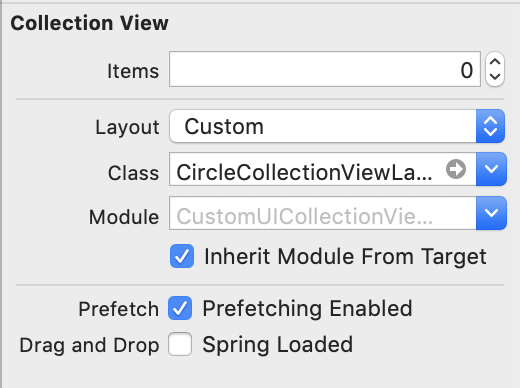
When custom collection view layout is ready, it is time to hook it up to the collection view. Custom collection view layout can be set in storyboard or when initialising collection view or collection view controller.

Setting custom layout in UIStoryBoard

Implementing a basic collection view controller for just showing one type of cells requires only a little bit of code. Data source methods provide the count of the items and sections and return configured collection view cells.

final class CollectionViewController: UICollectionViewController {
// MARK: Managing the View
enum ReuseIdentifier: String {
case item = "ItemCell"
}
override func viewDidLoad() {
super.viewDidLoad()
collectionView!.register(CircleCollectionViewCell.self, forCellWithReuseIdentifier: ReuseIdentifier.item.rawValue)
navigationItem.rightBarButtonItem = UIBarButtonItem(barButtonSystemItem: .add, target: self, action: #selector(addItem))
}
// MARK: Managing the Content
private var items: [UIColor] = [.random(), .random(), .random()]
@objc private func addItem() {
items.append(.random())
collectionView.insertItems(at: [IndexPath(item: items.count – 1, section: 0)])
}
// MARK: Collection View Data Source
override func numberOfSections(in collectionView: UICollectionView) -> Int {
return items.count > 0 ? 1 : 0
}
override func collectionView(_ collectionView: UICollectionView, numberOfItemsInSection section: Int) -> Int {
return items.count
}
override func collectionView(_ collectionView: UICollectionView, cellForItemAt indexPath: IndexPath) -> UICollectionViewCell {
let cell = collectionView.dequeueReusableCell(withReuseIdentifier: ReuseIdentifier.item.rawValue, for: indexPath) as! CircleCollectionViewCell
cell.backgroundView?.backgroundColor = items[indexPath.item]
cell.titleLabel.text = "\(indexPath.item)"
return cell
}
}

Summary

Adding custom collection view layout requires subclassing UICollectionViewLayout and overriding several methods. The core idea is to provide UICollectionViewAttributes for every cell which UICollectionView will then use for creating and laying out cells.

If this was helpful, please let me know on Mastodon@toomasvahter or Twitter @toomasvahter. Feel free to subscribe to RSS feed. Thank you for reading.

Example project

CustomCollectionViewLayout (GitHub), Xcode 10.1, Swift 4.2

Resources