If we want to spice up the user interface, then we can make some titles in the app to use gradient colours. In WWDC’21 Apple introduced an API for making gradient text styles easy to create. The .foregroundStyle() view modifier takes in a type which conforms to ShapeStyle protocol. One of these types are gradient types in SwiftUI. Therefore, creating a fun gradient text is a matter of creating a text and applying a foregroundStyle view modifier with a gradient on it.
This file contains hidden or bidirectional Unicode text that may be interpreted or compiled differently than what appears below. To review, open the file in an editor that reveals hidden Unicode characters.
Learn more about bidirectional Unicode characters
The new view modifier is great, but it is iOS 15+, macOS 12.0+. Another way for achieving this result is recreating it ourselves. This involves in overlaying the text with gradient and then masking it with the text.
This file contains hidden or bidirectional Unicode text that may be interpreted or compiled differently than what appears below. To review, open the file in an editor that reveals hidden Unicode characters.
Learn more about bidirectional Unicode characters
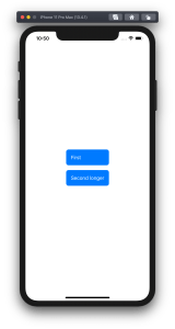
Let’s take a look on how to set an equal width to multiple views where the width equals to the widest Text() view in SwiftUI. SwiftUI does not have an easy to use view modifier for this at the moment, therefore we’ll add one ourselves. Example use case is displaying two text bubbles with width equaling to the widest bubble.
Creating a content view with text bubbles
The content view contains two TextBubble views with different text. The minimum width for both Text() values are stored in the @State property. The property is updated by custom equalWidth() view modifiers in TextBubble views using bindings. In other words, the view modifier updates the minimum width based on the text in a TextBubble view and uses the calculated value for both TextBubble views.
This file contains hidden or bidirectional Unicode text that may be interpreted or compiled differently than what appears below. To review, open the file in an editor that reveals hidden Unicode characters.
Learn more about bidirectional Unicode characters
PreferenceKeys in SwiftUI are used for propagating values from child views to ancestor views. This is what we are using here as well: TextBubble views are reading their size using a GeometryReader and then setting the width of the text to our custom EqualWidthPreferenceKey. The background view modifier is used for layering GeometryReader behind the content view which avoids GeometryReader to affect the layout. Transparent color view is only used for producing a value for the preference key which is then set to the binding in the preference key change callback. The frame view modifier reads the value and makes the returned view wider if needed.
This file contains hidden or bidirectional Unicode text that may be interpreted or compiled differently than what appears below. To review, open the file in an editor that reveals hidden Unicode characters.
Learn more about bidirectional Unicode characters
NSAttributedString is used for displaying rich text on Apple platforms. There are many attributes available for styling the text. Let’s see how to add new attribute and how to draw it in UITextView.
Drawing custom attribute
Defining a new attribute is just a matter of extending NSAttributedString.Key and defining a new static variable. Difficult part is actually drawing the custom attribute. Apple’s documentation says that best way for it is to subclass NSLayoutManager and overriding drawGlyphs(forGlyphRange:at:). This is what we are doing here as well. Whenever glyphs are drawn, we check if the glyph range contains the custom attribute, if it does, then we get the rects for glyphs containing the custom attribute. When we know rects, we can draw the custom styling. In this case, we’ll mimic tokens in text and therefore go for rectangle with rounded corners. Should be noted that enumerating custom attribute, longestEffectiveRangeNotRequired should be specified. Otherwise, if we have two different tokens next to each-other, then this attribute is considered as one.
UITextView has by default text container inset set. For being able to draw the custom styling exactly behind the text, this offset must be taken account. Easiest is to propagate insets to layout manager what we are doing here.
extension NSAttributedString.Key {
    static let token = NSAttributedString.Key("Token")
}

final class TokenLayoutManager: NSLayoutManager {
    var textContainerOriginOffset: CGSize = .zero

    override func drawGlyphs(forGlyphRange glyphsToShow: NSRange, at origin: CGPoint) {
        let characterRange = self.characterRange(forGlyphRange: glyphsToShow, actualGlyphRange: nil)
        textStorage?.enumerateAttribute(.token, in: characterRange, options: .longestEffectiveRangeNotRequired, using: { (value, subrange, _) in
            guard let token = value as? String, !token.isEmpty else { return }
            let tokenGlypeRange = glyphRange(forCharacterRange: subrange, actualCharacterRange: nil)
            drawToken(forGlyphRange: tokenGlypeRange)
        })
        super.drawGlyphs(forGlyphRange: glyphsToShow, at: origin)
    }

    private func drawToken(forGlyphRange tokenGlypeRange: NSRange) {
        guard let textContainer = textContainer(forGlyphAt: tokenGlypeRange.location, effectiveRange: nil) else { return }
        let withinRange = NSRange(location: NSNotFound, length: 0)
        enumerateEnclosingRects(forGlyphRange: tokenGlypeRange, withinSelectedGlyphRange: withinRange, in: textContainer) { (rect, _) in
            let tokenRect = rect.offsetBy(dx: self.textContainerOriginOffset.width, dy: self.textContainerOriginOffset.height)
            UIColor(hue: 175.0/360.0, saturation: 0.24, brightness: 0.88, alpha: 1).setFill()
            UIBezierPath(roundedRect: tokenRect, cornerRadius: 4).fill()
        }
    }
}
Using custom layout manager in UITextView requires a little bit of setup what we can put into UITextView’s subclass.
final class TokenTextView: UITextView {
    init(frame: CGRect) {
        let layoutManager = TokenLayoutManager()
        let textStorage = NSTextStorage()
        textStorage.addLayoutManager(layoutManager)
        let textContainer = NSTextContainer()
        textContainer.heightTracksTextView = true
        textContainer.widthTracksTextView = true
        layoutManager.addTextContainer(textContainer)
        super.init(frame: frame, textContainer: textContainer)
        updateLayoutManager()
    }

    required init?(coder: NSCoder) {
        fatalError("init(coder:) has not been implemented")
    }

    override var textContainerInset: UIEdgeInsets {
        didSet {
            updateLayoutManager()
        }
    }

    private func updateLayoutManager() {
        guard let layoutManager = layoutManager as? TokenLayoutManager else { return }
        layoutManager.textContainerOriginOffset = CGSize(width: textContainerInset.left, height: textContainerInset.top)
        layoutManager.invalidateDisplay(forCharacterRange: NSRange(location: 0, length: attributedText.length))
    }
}
let textView = TokenTextView(frame: .zero)
textView.translatesAutoresizingMaskIntoConstraints = false
view.addSubview(textView)
NSLayoutConstraint.activate([
    textView.leadingAnchor.constraint(equalTo: view.safeAreaLayoutGuide.leadingAnchor, constant: 16),
    textView.trailingAnchor.constraint(equalTo: view.safeAreaLayoutGuide.trailingAnchor, constant: -16),
    textView.topAnchor.constraint(equalTo: view.safeAreaLayoutGuide.topAnchor, constant: 16),
    textView.bottomAnchor.constraint(equalTo: view.safeAreaLayoutGuide.bottomAnchor, constant: -16)
])

let string = "The quick brown fox jumps over the lazy dog"
let attributedString = NSMutableAttributedString(string: string)
let value = "value"
attributedString.addAttribute(.token, value: value, range: NSRange(location: 4, length: 5))
textView.attributedText = attributedString
Summary
We defined a new attribute by extending NSAttributedString.Key. Then we created a new NSLayoutManager subclass and added custom styling to the attribute. Lastly, we configured the UITextView to use custom layout manager and set text with custom attribute to it.
Let’s see how to replace multiple tokens in string. As an example problem to solve we will use this string: The quick <color_1> <animal_1> jumps over the lazy <animal_2>
String extension for replacing tokens
Token’s format is < text _ numbers > what can be turned into regular expression: <[:alpha:]+_{1}[:digit:]+>.
We’ll extend string and add a function what takes in regular expression and closure responsible of providing replacement strings. For finding tokens, we’ll use NSRegularExpression and get all the matches in the string. Next step is to reverse enumerate matches and replace tokens. Reverse enumerating is required it ensures that token ranges are constant. If we would start replacing from the first match, then all the succeeding ranges should be shifted based on the length difference of all the preceding tokens and replacements. In this case reduce is convenient because we can enumerate all the matches and then mutating the copy of the initial string with very few lines. Another aspect to note is that NSRegularExpression uses NSRange instead of <a rel="noreferrer noopener" aria-label="RangeRange<String.Index>. Therefore we need to convert ranges from one type to another making sure character indexes match. This function can now be used with custom logic when providing replacements. For example: we can have a simple mapping or even returning the same replacement string.
This file contains hidden or bidirectional Unicode text that may be interpreted or compiled differently than what appears below. To review, open the file in an editor that reveals hidden Unicode characters.
Learn more about bidirectional Unicode characters
String extension replacing tokens matching a pattern.
Summary
When we would like to do multiple replacements in a string, then one of the approaches is to get all the replacement ranges and then reverse enumerating the ranges and making replacements. In this way we can avoid having complex code trying to adjust based on the length difference of the source and replacement string.
Apple’s Vision framework contains computer vision related functionality and with iOS 13 it can detect text on images as well. Moreover, Apple added a new framework VisionKit what makes it easy to integrate document scanning functionality. For demonstrating the usage of it, let’s build a simple UI what can present the scanner and display scanned text.
Cropping text area when scanning documents
Scanning text with Vision
VisionKit has VNDocumentCameraViewController and when presented, it allows scanning documents and cropping scanned documents. It uses delegate for publishing scanned documents via an instance of VNDocumentCameraScan. This object contains all the taken images (documents). Next, we can use VNImageRequestHandler in Vision for detecting text on those images.
final class TextRecognizer {
    let cameraScan: VNDocumentCameraScan

    init(cameraScan: VNDocumentCameraScan) {
        self.cameraScan = cameraScan
    }

    private let queue = DispatchQueue(label: "com.augmentedcode.scan", qos: .default, attributes: [], autoreleaseFrequency: .workItem)

    func recognizeText(withCompletionHandler completionHandler: @escaping ([String]) -> Void) {
        queue.async {
            let images = (0..<self.cameraScan.pageCount).compactMap({ self.cameraScan.imageOfPage(at: $0).cgImage })
            let imagesAndRequests = images.map({ (image: $0, request: VNRecognizeTextRequest()) })
            let textPerPage = imagesAndRequests.map { image, request -> String in
                let handler = VNImageRequestHandler(cgImage: image, options: [:])
                do {
                    try handler.perform([request])
                    guard let observations = request.results as? [VNRecognizedTextObservation] else { return "" }
                    return observations.compactMap({ $0.topCandidates(1).first?.string }).joined(separator: "\n")
                }
                catch {
                    print(error)
                    return ""
                }
            }
            DispatchQueue.main.async {
                completionHandler(textPerPage)
            }
        }
    }
}
Presenting document scanner with SwiftUI
As VNDocumentCameraViewController is UIKit view controller we can’t directly present it in SwiftUI. For making this work, we’ll need to use a separate value type conforming to UIViewControllerRepresentable protocol. UIViewControllerRepresentable is the glue between SwiftUI and UIKit and enables us to present UIKit views. This protocol requires us to define the class of the view controller and then implementing makeUIViewController(context:) and updateUIViewController(_:context:). In addition, we’ll also create coordinator what is going to be VNDocumentCameraViewController’s delegate. SwiftUI uses UIViewRepresentableContext for holding onto the coordinator and managing the view controller updates behind the scenes. Our case is pretty simple, we just use completion handler for passing back scanned text or nil when it was closed or error occurred. No need to update the view controller itself, only to pass data from it back to SwiftUI.
ContentView is the main SwiftUI view presenting the content for our very simple UI with static text, button and scanned text. When pressing on the button, we’ll set isShowingScannerSheet property to true. As it is @State property, then this change triggers SwiftUI update and sheet modifier will take care of presenting ScannerView with VNDocumentCameraViewController. When view controller finishes, completion handler is called and we will update the text property and set isShowingScannerSheet to false which triggers tearing down the modal during the next update.
struct ContentView: View {
    private let buttonInsets = EdgeInsets(top: 8, leading: 16, bottom: 8, trailing: 16)

    var body: some View {
        VStack(spacing: 32) {
            Text("Vision Kit Example")
            Button(action: openCamera) {
                Text("Scan").foregroundColor(.white)
            }.padding(buttonInsets)
                .background(Color.blue)
                .cornerRadius(3.0)
            Text(text).lineLimit(nil)
        }.sheet(isPresented: self.$isShowingScannerSheet) { self.makeScannerView() }
    }

    @State private var isShowingScannerSheet = false
    @State private var text: String = ""

    private func openCamera() {
        isShowingScannerSheet = true
    }

    private func makeScannerView() -> ScannerView {
        ScannerView(completion: { textPerPage in
            if let text = textPerPage?.joined(separator: "\n").trimmingCharacters(in: .whitespacesAndNewlines) {
                self.text = text
            }
            self.isShowingScannerSheet = false
        })
    }
}
Summary
With the new addition of VisionKit and text recognition APIs, it is extremely easy to add support of scanning text using camera.


 Augmented Code