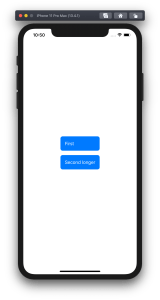
Buttons in SwiftUI are represented with a Button type. Buttons are easy to create and can be customized either with directly providing a styled label or using a ButtonStyle protocol to define the visual appearance. Quite often we can find ourselves in a situation where we need a button which has a title and also a subtitle. In this blog post I am gonna show how to create a SubtitledButton which does exactly that. We’ll also use ButtonStyle protocol to change the appearance of the button. Using buttonStyle view modifier it is easy to change the appearance of the SubtitledButton as sometimes we want to present it in different ways. In the example below we can see two SubtitledButtons where one has a plain and second a custom appearance.
A SwiftUI view with two SubtitledButtons with different styles.
This file contains hidden or bidirectional Unicode text that may be interpreted or compiled differently than what appears below. To review, open the file in an editor that reveals hidden Unicode characters.
Learn more about bidirectional Unicode characters
Let’s now take a look at the SubtitledButton. It is a SwiftUI view which just incorporates a SwiftUI button with two Text values. The first Text represents the title and the second Text represents the subtitle. The title font can be changed by applying a font view modifier on the SubtitledButton. In the example below, the subtitle font is currently not configurable, although we could add another argument if needed. As the subtitle already has font view modifier applied then setting a font modifier on the whole button it does not override it.
This file contains hidden or bidirectional Unicode text that may be interpreted or compiled differently than what appears below. To review, open the file in an editor that reveals hidden Unicode characters.
Learn more about bidirectional Unicode characters
ButtonStyle is a protocol in SwiftUI which is used for custom button appearances. In the makeBody function we can apply view modifiers to the label where the label is a view created when the Button was created.
This file contains hidden or bidirectional Unicode text that may be interpreted or compiled differently than what appears below. To review, open the file in an editor that reveals hidden Unicode characters.
Learn more about bidirectional Unicode characters
Let’s take a look on how to set an equal width to multiple views where the width equals to the widest Text() view in SwiftUI. SwiftUI does not have an easy to use view modifier for this at the moment, therefore we’ll add one ourselves. Example use case is displaying two text bubbles with width equaling to the widest bubble.
Creating a content view with text bubbles
The content view contains two TextBubble views with different text. The minimum width for both Text() values are stored in the @State property. The property is updated by custom equalWidth() view modifiers in TextBubble views using bindings. In other words, the view modifier updates the minimum width based on the text in a TextBubble view and uses the calculated value for both TextBubble views.
This file contains hidden or bidirectional Unicode text that may be interpreted or compiled differently than what appears below. To review, open the file in an editor that reveals hidden Unicode characters.
Learn more about bidirectional Unicode characters
PreferenceKeys in SwiftUI are used for propagating values from child views to ancestor views. This is what we are using here as well: TextBubble views are reading their size using a GeometryReader and then setting the width of the text to our custom EqualWidthPreferenceKey. The background view modifier is used for layering GeometryReader behind the content view which avoids GeometryReader to affect the layout. Transparent color view is only used for producing a value for the preference key which is then set to the binding in the preference key change callback. The frame view modifier reads the value and makes the returned view wider if needed.
This file contains hidden or bidirectional Unicode text that may be interpreted or compiled differently than what appears below. To review, open the file in an editor that reveals hidden Unicode characters.
Learn more about bidirectional Unicode characters
Everything can’t go exactly as planned and therefore, at some point, there is a need for presenting localized error messages to the user. Let’s take a look at how to add custom error type what provides error description, failure reason and recovery suggestion and presenting it in SwiftUI view.
Adding custom error type
Custom error type is needed when we want to propagate errors using Swift’s error handling mechanism. Custom error types need to, at minimum, conform to Error protocol which defines localizedDescription property. If we would like to provide more information to users, including recovery suggestions, then we need to use LocalizedError instead. LocalizedError inherits from Error and defines additional properties which are intended for describing the error further. Note that LocalizedError is very similar to NSError: errorDescription, failureReason, recoverySuggestion, helpAnchor are all represented by NSError.UserInfoKey.
In the example app we’ll use LoginError currently definiing only one error: incorrectPassword.
enum LoginError: LocalizedError {
    case incorrectPassword // invalidUserName etc

    var errorDescription: String? {
        switch self {
        case .incorrectPassword:
            return "Failed logging in account"
        }
    }

    var failureReason: String? {
        switch self {
        case .incorrectPassword:
            return "Entered password was incorrect"
        }
    }

    var recoverySuggestion: String? {
        switch self {
        case .incorrectPassword:
            return "Please try again with different password"
        }
    }
}
Presenting error in SwiftUI
Custom error defined, the next step is to present the error using SwiftUI’s alert view modifier: alert(isPresented:content:). Alert view modifier requires boolean binding and Alert container defining title, optional message, and buttons. In the example below, error is handled by the view model and Alert itself is created using convenience initializer which we’ll look at a bit later. Convenience initializer makes the view implementation more readable and reduces code duplication.
Alert view modifier requires a boolean binding controlling if the alert is visible or not. When alert is dismissed, SwiftUI automatically calls the binding with false, indicating that the alert should not be visible anymore. Note that force unwrap is safe here because view model makes sure isPresentingAlert never returns true when underlying error is nil.
final class ContentViewModel: ObservableObject {
    @Published private(set) var activeError: LocalizedError?

    var isPresentingAlert: Binding<Bool> {
        return Binding<Bool>(get: {
            return self.activeError != nil
        }, set: { newValue in
            guard !newValue else { return }
            self.activeError = nil
        })
    }

    func showAlertView() {
        activeError = LoginError.incorrectPassword
    }
}
Boolean binding is created manually and implemented in such way that when activeError is set, isPresentingAlert returns true. When alert is dismissed, set will clear the current active error. This approach makes it simple to handle any errors conforming to LocalizedError in the view model. Like mentioned before, LocalizedError enables us to add detailed information about the alert and we can use that when creating the Alert. Let’s take a look on it next.
Alert’s extension has initializers both for LocalizedError and NSError. NSError is used a lot in Objective-C frameworks so there is high probability that we need to present NSError in the future as well. Here, we can use Swift language’s built-in support of converting Swift error type to NSError and therefore we can implement convenience method only once for NSError. LocalizedError can be bridged to NSError and Swift compiler takes care of keeping the information about the error. In this implementation, I decided to include both the failureReason and recoverySuggestion when creating the message for Alert. This enables custom error types to choose how much information they provide (choosing which properties return text). Moreover, it is better to show as much information about the error as possible.
LoginError.incorrectPassword presented by Alert in SwiftUI
Summary
We created a custom error type and used LocalizedError instead of Error for making it suitable for displaying as an alert. We looked into how to use alert view modifier and MVVM together and introduced design pattern for easy alert presentation. If you need action sheet, then follow similar steps but use actionSheet view modifier with ActionSheet container.


 Augmented Code