Categories
iOS Swift SwiftUI UIKit

Using a multi component picker in a SwiftUI form

SwiftUI has a Picker view available with multiple different styles. One example of when it falls short is when we want to use a multi component picker with wheel style. One way how to try to achieve this is using a HStack with two Picker views, but it does not work very well, especially when trying to show it inside a Form view. So what else we can do? If something can’t be done in SwiftUI then we can use UIKit instead.

In my case, I wanted to create a picker which allows picking a date duration. It would have one wheel for selecting a number and the other wheel for selecting either days, weeks or months.

Screenshot of a SwiftUI form with a two component wheel picker where left wheel selects a number and right wheel selects days, weeks or months.

Firstly, let’s create a tiny struct which is going to hold the state of this picker. It needs to store a numeric value and the unit: days, weeks, months. Let’s name it as DateDuration. Since we want to iterate over the DateDuration.Unit, we’ll conform it to CaseIterable protocol.

struct DateDuration {
let value: Int
let unit: Unit
enum Unit: String, CaseIterable {
case days, weeks, months
}
}

UIPickerView in UIKit can do everything we want, therefore we’ll need to wrap it into a SwiftUI view. This can be done by creating a new type which conforms to UIViewRepresentable protocol. Also, we need a binding which holds the value of the current selection: when the user changes it, the binding communicates the changes back and vice-versa. Additionally, we’ll add properties for configuring values and units. UIPickerView us created and configured in the makeUIView(context:) function. UIPickerView is driven by a data source and a delegate, which means we require a coordinator object as well. Coordinator is part of the UIViewRepresentable protocol.

struct DateDurationPicker: UIViewRepresentable {
let selection: Binding<DateDuration>
let values: [Int]
let units: [DateDuration.Unit]
func makeUIView(context: Context) -> UIPickerView {
let pickerView = UIPickerView(frame: .zero)
pickerView.translatesAutoresizingMaskIntoConstraints = false
pickerView.delegate = context.coordinator
pickerView.dataSource = context.coordinator
return pickerView
}
//
}

Coordinator is created in the makeCoordinator() function. It is going to do most of the work by providing data to the UIPickerView and handling the current selection. Therefore, we’ll store the selection binding, values, and units in the Coordinator class as well.

struct DateDurationPicker: UIViewRepresentable {
//
func makeCoordinator() -> Coordinator {
return Coordinator(selection: selection, values: values, units: units)
}
final class Coordinator: NSObject, UIPickerViewDataSource, UIPickerViewDelegate {
let selection: Binding<DateDuration>
let values: [Int]
let units: [DateDuration.Unit]
init(selection: Binding<DateDuration>, values: [Int], units: [DateDuration.Unit]) {
self.selection = selection
self.values = values
self.units = units
}
//
}
}

The last missing piece is implementing UIPickerViewDataSource and UIPickerViewDelegate methods in the Coordinator class. This is pretty straight-forward to do. We’ll need to display two components where the first component is the list of values and the second component is the unit: days, weeks, months. When the user selects a new value, we’ll change the DateDuration value of the binding.

func numberOfComponents(in pickerView: UIPickerView) -> Int {
return 2
}
func pickerView(_ pickerView: UIPickerView, numberOfRowsInComponent component: Int) -> Int {
return component == 0 ? values.count : units.count
}
func pickerView(_ pickerView: UIPickerView, titleForRow row: Int, forComponent component: Int) -> String? {
if component == 0 {
return "\(values[row])"
}
else {
return units[row].rawValue
}
}
func pickerView(_ pickerView: UIPickerView, didSelectRow row: Int, inComponent component: Int) {
let valueIndex = pickerView.selectedRow(inComponent: 0)
let unitIndex = pickerView.selectedRow(inComponent: 1)
selection.wrappedValue = DateDuration(value: values[valueIndex], unit: units[unitIndex])
}

Finally, let’s hook it up in an example view.

struct ContentView: View {
@StateObject var viewModel = ViewModel()
var body: some View {
NavigationView {
Form {
Section {
//
DateDurationPicker(
selection: $viewModel.selection,
values: Array(1..<100),
units: DateDuration.Unit.allCases
)
//
}
}
.navigationTitle("Reminders")
}
}
}
extension ContentView {
final class ViewModel: ObservableObject {
@Published var selection = DateDuration(value: 1, unit: .days)
//
}
}

Example Project

SwiftUIDateDurationPicker (GitHub, Xcode 13.2.1)

If this was helpful, please let me know on Mastodon@toomasvahter or Twitter @toomasvahter. Feel free to subscribe to RSS feed. Thank you for reading.

Categories
iOS Swift SwiftUI

Setting an equal width to text views in SwiftUI

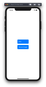
Let’s take a look on how to set an equal width to multiple views where the width equals to the widest Text() view in SwiftUI. SwiftUI does not have an easy to use view modifier for this at the moment, therefore we’ll add one ourselves. Example use case is displaying two text bubbles with width equaling to the widest bubble.

Creating a content view with text bubbles

The content view contains two TextBubble views with different text. The minimum width for both Text() values are stored in the @State property. The property is updated by custom equalWidth() view modifiers in TextBubble views using bindings. In other words, the view modifier updates the minimum width based on the text in a TextBubble view and uses the calculated value for both TextBubble views.

struct ContentView: View {
@State private var textMinWidth: CGFloat?
var body: some View {
VStack(spacing: 16) {
TextBubble(text: "First", minTextWidth: $textMinWidth)
TextBubble(text: "Second longer", minTextWidth: $textMinWidth)
}
}
}
struct TextBubble: View {
let text: String
let minTextWidth: Binding<CGFloat?>
var body: some View {
Text(text).equalWidth(minTextWidth) // custom view modifier
.foregroundColor(Color.white)
.padding()
.background(Color.blue)
.cornerRadius(8)
}
}
ContentView with equal widths view modifier.
ContentView without equal widths view modifier.

A view modifier applying equal widths

PreferenceKeys in SwiftUI are used for propagating values from child views to ancestor views. This is what we are using here as well: TextBubble views are reading their size using a GeometryReader and then setting the width of the text to our custom EqualWidthPreferenceKey. The background view modifier is used for layering GeometryReader behind the content view which avoids GeometryReader to affect the layout. Transparent color view is only used for producing a value for the preference key which is then set to the binding in the preference key change callback. The frame view modifier reads the value and makes the returned view wider if needed.

struct EqualWidthPreferenceKey: PreferenceKey {
typealias Value = CGFloat
static var defaultValue: CGFloat = 0
static func reduce(value: inout CGFloat, nextValue: () -> CGFloat) {
value = nextValue()
}
}
struct EqualWidth: ViewModifier {
let width: Binding<CGFloat?>
func body(content: Content) -> some View {
content.frame(width: width.wrappedValue, alignment: .leading)
.background(GeometryReader { proxy in
Color.clear.preference(key: EqualWidthPreferenceKey.self, value: proxy.size.width)
}).onPreferenceChange(EqualWidthPreferenceKey.self) { (value) in
self.width.wrappedValue = max(self.width.wrappedValue ?? 0, value)
}
}
}
extension View {
func equalWidth(_ width: Binding<CGFloat?>) -> some View {
return modifier(EqualWidth(width: width))
}
}

Summary

We created a view modifier which reads a view width and propagates the value to other views using a preference key, a binding, and a @State property.

If this was helpful, please let me know on Mastodon@toomasvahter or Twitter @toomasvahter. Feel free to subscribe to RSS feed. Thank you for reading.

Categories
Combine Foundation iOS Swift SwiftUI Xcode

Validating string in TextField with NumberFormatter in SwiftUI

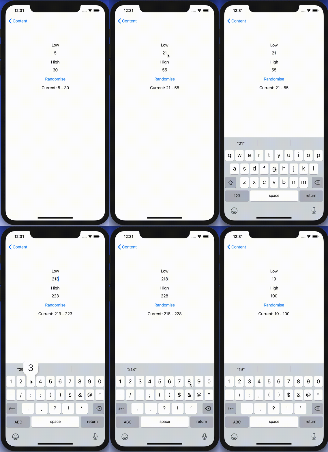
I was looking into creating a view which has TextField with NumberFormatter. Typed text would show up in a separate label and when trying to enter non-numbers, the TextField would reject those characters. Although TextField component in SwiftUI has generic initialiser init(_:value:formatter:onEditingChanged:onCommit:) it does not seem to do what we need. Value binding does not update while typing, non-number characters are not discarded, and string is not reloaded when view reloads with different model data. Therefore, I decided to create a wrapper around TextField which deals with transforming numbers to strings and implements all the before mentioned features.

End result after creating a custom NumberTextField.

Content view with temperature limits

Example use-case is basic view for editing temperature limits where model type will force high value to be at least 10 units higher compared to low value. The model type also have separate properties for getting NSNumber instances what we use later (such conversion could also happen on SwiftUI level).

struct TemperatureLimits {
var low: Int = 5 {
didSet {
let high = max(self.high, low + 10)
guard self.high != high else { return }
self.high = high
}
}
var high: Int = 30 {
didSet {
let low = min(self.low, high 10)
guard self.low != low else { return }
self.low = low
}
}
var lowNumber: NSNumber {
get { NSNumber(value: low) }
set { low = newValue.intValue }
}
var highNumber: NSNumber {
get { NSNumber(value: high) }
set { high = newValue.intValue }
}
}
Model type storing temperature limits which are forced to have 10 unit difference.

Content view has text fields, button for randomising limits and label for displaying current values. NumberTextField is a custom view which implements all the features what we listed in the beginning of the post.

import Combine
import SwiftUI
struct FormatterView: View {
@State var limits: TemperatureLimits
var body: some View {
VStack(spacing: 16) {
VStack {
Text("Low")
NumberTextField("Low", value: $limits.lowNumber, formatter: NumberFormatter.decimal)
}
VStack {
Text("High")
NumberTextField("High", value: $limits.highNumber, formatter: NumberFormatter.decimal)
}
Button(action: {
self.limits.low = Int.random(in: 040)
self.limits.high = Int.random(in: 50100)
}, label: {
Text("Randomise")
})
Text("Current: \(limits.low)\(limits.high)")
Spacer()
}.padding()
.multilineTextAlignment(.center)
}
}
extension NumberFormatter {
static var decimal: NumberFormatter {
let formatter = NumberFormatter()
formatter.allowsFloats = false
return formatter
}
}
View with custom NumberTextFields bound to temperature limits.

Creating NumberTextField with NSNumber binding and NumberFormatter

NumberTextField is a wrapper around TextField and internally handles NSNumber to String and String to NSNumber transformations. Transformations happen inside a separate class called StringTransformer which stores editable string in @Published property. @Published property is first populated with string value by transforming NSNumber to String using the formatter. Changes made by user are captured by subscribing to stringValue publisher (@Published properties provide publishers). String to NSNumber transformation is tried when user edits the string: if successful, NSNumber is send back to model using the value binding, if fails, stringValue is set back to previous value. Note that dropFirst skips initial update when setting up sink and receive operator is used for scheduling updates at later time when SwiftUI has finished current layout update cycle.

struct NumberTextField: View {
init(_ title: String, value: Binding<NSNumber>, formatter: NumberFormatter) {
self.title = title
self.stringTransformer = StringTransformer(value, formatter: formatter)
}
private let title: String
@ObservedObject private var stringTransformer: StringTransformer
var body: some View {
TextField(title, text: $stringTransformer.stringValue)
}
}
fileprivate extension NumberTextField {
final class StringTransformer: ObservableObject {
private var cancellable: AnyCancellable?
init(_ value: Binding<NSNumber>, formatter: NumberFormatter) {
// NSNumber -> String
stringValue = formatter.string(from: value.wrappedValue) ?? ""
// String -> NSNumber
cancellable = $stringValue.dropFirst().receive(on: RunLoop.main)
.sink(receiveValue: { [weak self] (editingString) in
if let number = formatter.number(from: editingString) {
value.wrappedValue = number
}
else if !editingString.isEmpty {
// Force current model value when editing value is invalid (invalid value or out of range).
self?.stringValue = formatter.string(from: value.wrappedValue) ?? ""
}
})
}
@Published var stringValue: String = ""
}
}
NumberTextField transforming NSNumber to String using NumberFormatter and vice versa.

Summary

TextField’s formatter initialiser does not seem to be operating as expected and therefore we built a custom view. It handles number to string transformations and refreshes the view when string can’t be transformed to number. Hopefully future SwiftUI iterations will fix the init(_:value:formatter:onEditingChanged:onCommit:) initialiser and NumberTextField is not needed at all.

If this was helpful, please let me know on Mastodon@toomasvahter or Twitter @toomasvahter. Feel free to subscribe to RSS feed. Thank you for reading.

Example project

SwiftUIFormattedTextField (Xcode 11.4.1)

Categories
Foundation iOS Swift SwiftUI Xcode

Alert and LocalizedError in SwiftUI

Everything can’t go exactly as planned and therefore, at some point, there is a need for presenting localized error messages to the user. Let’s take a look at how to add custom error type what provides error description, failure reason and recovery suggestion and presenting it in SwiftUI view.

Adding custom error type

Custom error type is needed when we want to propagate errors using Swift’s error handling mechanism. Custom error types need to, at minimum, conform to Error protocol which defines localizedDescription property. If we would like to provide more information to users, including recovery suggestions, then we need to use LocalizedError instead. LocalizedError inherits from Error and defines additional properties which are intended for describing the error further. Note that LocalizedError is very similar to NSError: errorDescription, failureReason, recoverySuggestion, helpAnchor are all represented by NSError.UserInfoKey.

In the example app we’ll use LoginError currently definiing only one error: incorrectPassword.

enum LoginError: LocalizedError {
    case incorrectPassword // invalidUserName etc
    
    var errorDescription: String? {
        switch self {
        case .incorrectPassword:
            return "Failed logging in account"
        }
    }
    
    var failureReason: String? {
        switch self {
        case .incorrectPassword:
            return "Entered password was incorrect"
        }
    }
    
    var recoverySuggestion: String? {
        switch self {
        case .incorrectPassword:
            return "Please try again with different password"
        }
    }
}

Presenting error in SwiftUI

Custom error defined, the next step is to present the error using SwiftUI’s alert view modifier: alert(isPresented:content:). Alert view modifier requires boolean binding and Alert container defining title, optional message, and buttons. In the example below, error is handled by the view model and Alert itself is created using convenience initializer which we’ll look at a bit later. Convenience initializer makes the view implementation more readable and reduces code duplication.

struct ContentView: View {
    @ObservedObject var viewModel: ContentViewModel
    
    var body: some View {
        VStack(spacing: 16) {
            Text("Alert Views")
            Button(action: viewModel.showAlertView) {
                Text("Show Alert View")
            }
        }.alert(isPresented: viewModel.isPresentingAlert, content: {
            Alert(localizedError: viewModel.activeError!)
        })
    }
}

Alert view modifier requires a boolean binding controlling if the alert is visible or not. When alert is dismissed, SwiftUI automatically calls the binding with false, indicating that the alert should not be visible anymore. Note that force unwrap is safe here because view model makes sure isPresentingAlert never returns true when underlying error is nil.

final class ContentViewModel: ObservableObject {
    @Published private(set) var activeError: LocalizedError?

    var isPresentingAlert: Binding<Bool> {
        return Binding<Bool>(get: {
            return self.activeError != nil
        }, set: { newValue in
            guard !newValue else { return }
            self.activeError = nil
        })
    }
        
    func showAlertView() {
        activeError = LoginError.incorrectPassword
    }
}

Boolean binding is created manually and implemented in such way that when activeError is set, isPresentingAlert returns true. When alert is dismissed, set will clear the current active error. This approach makes it simple to handle any errors conforming to LocalizedError in the view model. Like mentioned before, LocalizedError enables us to add detailed information about the alert and we can use that when creating the Alert. Let’s take a look on it next.

extension Alert {
    init(localizedError: LocalizedError) {
        self = Alert(nsError: localizedError as NSError)
    }
    
    init(nsError: NSError) {
        let message: Text? = {
            let message = [nsError.localizedFailureReason, nsError.localizedRecoverySuggestion].compactMap({ $0 }).joined(separator: "\n\n")
            return message.isEmpty ? nil : Text(message)
        }()
        self = Alert(title: Text(nsError.localizedDescription),
                     message: message,
                     dismissButton: .default(Text("OK")))
    }
}

Alert’s extension has initializers both for LocalizedError and NSError. NSError is used a lot in Objective-C frameworks so there is high probability that we need to present NSError in the future as well. Here, we can use Swift language’s built-in support of converting Swift error type to NSError and therefore we can implement convenience method only once for NSError. LocalizedError can be bridged to NSError and Swift compiler takes care of keeping the information about the error. In this implementation, I decided to include both the failureReason and recoverySuggestion when creating the message for Alert. This enables custom error types to choose how much information they provide (choosing which properties return text). Moreover, it is better to show as much information about the error as possible.

LoginError.incorrectPassword presented by Alert in SwiftUI

Summary

We created a custom error type and used LocalizedError instead of Error for making it suitable for displaying as an alert. We looked into how to use alert view modifier and MVVM together and introduced design pattern for easy alert presentation. If you need action sheet, then follow similar steps but use actionSheet view modifier with ActionSheet container.

If this was helpful, please let me know on Mastodon@toomasvahter or Twitter @toomasvahter. Feel free to subscribe to RSS feed. Thank you for reading.

Example project

SwiftUIAlertView (Xcode 11.4 beta 2)

Categories
Combine Foundation iOS Swift SwiftUI

MVVM in SwiftUI

Let’s build a simple app using MVVM (model-view-view model) where every SwiftUI view has its own view model. It’s going to be an app with two views: list of movies and add a movie view what utilises Form view. Added movies are stored in MovieStore which is shared by the two view models. We will use environment for sharing the MovieStore. It will be read from the environment when we need to create AddMovieView with its view model.

Movie and MovieStore representing data

Movie is a small struct and just stores the title and rating. Title and rating are mutable as we are going to update those in AddMovieView. We also conform to protocol Identifiable because we are going to use List view for showing all the movies. List needs a way of identifiyng the content and its the simplest way of satisfiying the requirement.

struct Movie: Equatable, Identifiable {
    let id = UUID()
    var fullTitle: String
    var givenRating: Rating = .notSeen
}

extension Movie {
    enum Rating: Int, CaseIterable {
        case notSeen, terrible, poor, decent, good, excellent
    }
}

MovieStore is also a pretty simple although in a more sophisticated app it would contain much more logic: persistence, deleting etc. We use Published property wrapper which automatically provides a publisher we can use to subscribe against.

final class MovieStore {
    @Published private(set) var allMovies = [Movie]()
    
    func add(_ movie: Movie) {
        allMovies.append(movie)
    }
}

For inserting shared MovieStore to environment, we’ll use custom EnvironmentKey. Custom key is just an object conforming to EnvironmentKey protocol. We need to provide the type and default value.

struct MovieStoreKey: EnvironmentKey {
    typealias Value = MovieStore
    static var defaultValue = MovieStore()
}

extension EnvironmentValues {
    var movieStore: MovieStore {
        get {
            return self[MovieStoreKey]
        }
        set {
            self[MovieStoreKey] = newValue
        }
    }
}

If we do not insert our own instance of MovieStore to the environment, the instance returned by defaultValue is used. Typically we would like to use a specific instance initialised outside of the view hierarchy. Therefore let’s take a look how to do that next.

SceneDelegate and MovieScene presentation

MovieStore dependency is passed into view models with initialiser. We’ll use the instance stored in SceneDelegate. Yet again, in a real app, it would probably live in a separate dependency container or in something similar. MovieListView is the first view we need to present, therefore we’ll initialise view model, view and insert instance of MovieStore to environment for later use (movieStore keypath is the one we just defined in EnvironmentValues‘ extension).

final class SceneDelegate: UIResponder, UIWindowSceneDelegate {
    var window: UIWindow?
    private let movieStore = MovieStore()

    func scene(_ scene: UIScene, willConnectTo session: UISceneSession, options connectionOptions: UIScene.ConnectionOptions) {
        let viewModel = MovieListView.ViewModel(movieStore: movieStore)
        let contentView = MovieListView(viewModel: viewModel).environment(\.movieStore, movieStore)
        
        guard let windowScene = scene as? UIWindowScene else { return }
        let window = UIWindow(windowScene: windowScene)
        window.rootViewController = UIHostingController(rootView: contentView)
        self.window = window
        window.makeKeyAndVisible()
    }
}

MovieListView and its ViewModel

We still haven’t taken a look on MovieListView and its view model, let’s do it now. View model conforms to protocol ObservableObject and uses @Published property wrappers. ObservableObject’s default implementation provides objectWillChange publisher. @Published property wrapper automatically fires the publisher when the property value is about to change. On MovieListView we have declared view model property with @ObservedObject property wrapper. This will make the view to subscribe to objectWillChange publisher and will refresh the view when-ever objectWillChange fires.

extension MovieListView {
    final class ViewModel: ObservableObject {
        private let movieStore: MovieStore
        private var cancellables = [AnyCancellable]()
        
        init(movieStore: MovieStore) {
            self.movieStore = movieStore
            cancellables.append(movieStore.$allMovies.assign(to: \.movies, on: self))
        }
        
        @Published private(set) var movies = [Movie]()
        @Published var isPresentingAddMovie = false
    }
}
struct MovieListView: View {
    @Environment(\.self) var environment
    @ObservedObject var viewModel: ViewModel
    
    var body: some View {
        NavigationView {
            List(self.viewModel.movies) { movie in
                Text(movie.fullTitle)
            }.navigationBarTitle("Movies")
                .navigationBarItems(trailing: navigationBarTrailingItem)
        }
    }
    
    private var navigationBarTrailingItem: some View {
        Button(action: {
            self.viewModel.isPresentingAddMovie = true
        }, label: {
            Image(systemName: "plus").frame(minWidth: 32, minHeight: 32)
        }).sheet(isPresented: self.$viewModel.isPresentingAddMovie) {
            self.makeAddMovieView()
        }
    }
    
    private func makeAddMovieView() -> AddMovieView {
        let movieStore = environment[MovieStoreKey]
        let viewModel = AddMovieView.ViewModel(movieStore: movieStore)
        return AddMovieView(viewModel: viewModel)
    }
}

Changes in MovieStore are observed by subscribing to allMovies subscriber and then assigning the new list of movies to view model’s own property. Note that assignment is triggered on subscribing and when changes happen: like KVO with initial option. Only downside is that now the list is duplicated but that’s OK. We would need to do that anyway when we would like to sort or filter the list later on.

AddMovieView and its view model are created when user taps on the plus button in the navigation bar. Environment property wrapper can be used to get the whole environment or any of the values using a specific key. In current case I went for accessing the whole environment object and then getting MovieStore using a MovieStoreKey later when needed. Then the MovieStore is not available in the whole view scope and only when creating the AddMovieView. Other option would be to use @Environment(\.movieStore) var movieStore instead.

AddMovieView and its ViewModel

AddMovieView’s view model is initialised with MovieStore and internally it represents and instance of Movie. Published property wrapper is used similarly like in MovieListView’s view model. The model object is a private property and instead of direct access, two bindings are provded for TextField and Picker. Binding represents a two way connection between the view and model. In addition, there is canSave property what is used for enabling the save button in the navigation bar. Save button should be enabled only when title is filled. To recap the view update flow: TextField or Picker will use Binding to update private property newMovie. As newMovie property uses @Published property wrapper, it will fire ObservableObject’s objectWillChange publisher. SwiftUI automatically subscribes to objectWillChange because view model’s property uses @ObservedObject.

extension AddMovieView {
    class ViewModel: ObservableObject {
        private let movieStore: MovieStore
        
        init(movieStore: MovieStore) {
            self.movieStore = movieStore
        }
        
        @Published private var newMovie = Movie(fullTitle: "")
        
        lazy var title = Binding<String>(get: {
            self.newMovie.fullTitle
        }, set: {
            self.newMovie.fullTitle = $0
        })
        
        lazy var rating = Binding<Movie.Rating>(get: {
            self.newMovie.givenRating
        }, set: {
            self.newMovie.givenRating = $0
        })
        
        var canSave: Bool {
            return !newMovie.fullTitle.isEmpty
        }
        
        func save() {
            movieStore.add(newMovie)
        }
    }
}

struct AddMovieView: View {
    @Environment(\.presentationMode) private var presentationMode
    @ObservedObject var viewModel: ViewModel
    
    var body: some View {
        NavigationView {
            Form {
                titleSection
                ratingSection
            }.navigationBarTitle("Add Movie", displayMode: .inline)
                .navigationBarItems(leading: leadingBarItem, trailing: trailingBarItem)
                .navigationViewStyle(StackNavigationViewStyle())
            
        }
    }
    
    private var titleSection: some View {
        Section() {
            TextField("Title", text: viewModel.title)
        }
    }

    private var ratingSection: some View {
        Section() {
            Picker(LocalizedStringKey("Rating"), selection: viewModel.rating) {
                ForEach(Movie.Rating.allCases, id: \.rawValue) {
                    Text($0.localizedName).tag($0)
                }
            }
        }
    }
    
    private var leadingBarItem: some View {
        Button(action: { self.presentationMode.wrappedValue.dismiss() }, label: {
            Text("Cancel")
        })
    }
    
    private var trailingBarItem: some View {
        Button(action: {
            self.viewModel.save()
            self.presentationMode.wrappedValue.dismiss()
        }, label: {
            Text("Save").disabled(!self.viewModel.canSave)
        })
    }
}

Summary

We created a simple app with two views. Both views had its own view model and both view models used the same dependency: MovieStore. One view model triggered changes in MovieStore and those changes were observed by the other view model. In addition, we looked into how to use SwiftUI’s environment and how to trigger view updates from view models.

If this was helpful, please let me know on Mastodon@toomasvahter or Twitter @toomasvahter. Feel free to subscribe to RSS feed. Thank you for reading.

Example

SwiftUICombineMVVMExample (GitHub, Xcode 11.3, Swift 5)