Structs can’t be directly stored in UserDefaults because UserDefaults does not know how to serialize it. As UserDefaults is backed by plist files, struct needs to be converted representation supported by it. The core idea boils down to the question, how to convert struct into Dictionary.
Converting struct to Dictionary
The most straight-forward way would be to manually create dictionary by adding all the properties one by one. Depending on the struct, it might get pretty long and also requires maintenance when changing the struct. Therefore, let’s take a look on a way of converting struct into JSON representation instead. This can be achieved by conforming to Encodable and using JSONEncoder and JSONSerialization. In the same way, we can convert Dictionary back to struct with JSONSerialization, JSONDecoder and conforming to Decodable. When conforming struct to Encodable and Decodable, Swift compiler will take care of generating default implementations for methods in those protocols. JSONEncoder and JSONDecoder use those methods for converting struct to Data and back. It should be noted that we could just store data in user defaults. But as data is not human-readable, let’s convert it to Dictionary instead.
This file contains hidden or bidirectional Unicode text that may be interpreted or compiled differently than what appears below. To review, open the file in an editor that reveals hidden Unicode characters.
Learn more about bidirectional Unicode characters
Adding DictionaryConvertible and DictionaryDecodable
This implementation can be made a bit more usable by using protocols and protocol extensions for providing default implementations. This makes it extremely easy to adopt this to any objects.
This file contains hidden or bidirectional Unicode text that may be interpreted or compiled differently than what appears below. To review, open the file in an editor that reveals hidden Unicode characters.
Learn more about bidirectional Unicode characters
Using Swift’s Codable together with JSONEncoder, JSONDecoder and JSONSerialization we can skip writing code for converting data into different types and instead, providing a concise implementation for turning structs into dictionaries. We only talked about structs but this approach can be applied to classes as well.
UIViewPropertyAnimator enables configuring animations which can be modified when running. Animations can be paused and progress can be changed allowing to build interactive animations. UIViewPropertyAnimations are in stopped state by default. If we want to run the animation immediately, we can use class method runningPropertyAnimator(withDuration:delay:options:animations:completion:). UIViewPropertyAnimator gives us a lot of flexibility when it comes to composing animations and controlling them. Therefore let’s build an animation consisting of rotating and moving a view out of the visible rect.
Adding a view to animate
Firstly, we need to add a view which we are going to animate using UIViewPropertyAnimator. View is a UIView subclass which just overrides layerClass and returns CAGradientLayer instead. View is positioned into initial place using auto layout.
This file contains hidden or bidirectional Unicode text that may be interpreted or compiled differently than what appears below. To review, open the file in an editor that reveals hidden Unicode characters.
Learn more about bidirectional Unicode characters
UIViewPropertyAnimator has several initialisers allowing to control the used timing function. In this example we’ll just use built-in ease in and ease out timing. This just means animation pace increases in the beginning and slows down at the end of the animation. In addition to mentioned UICubicTimingParameters (ease in and ease out), there is support for UISpringTimingParameters as well. Both timing parameters can be passed in using the convenience initialiser init(duration:timingParameters:). The animation is configured to rotate the view by 90 degrees and move the view following a spline created by current point of the view and two other points. When animation ends, we reset the transform and tell auto layout to update the layout which will just move the view back to the initial position.
This file contains hidden or bidirectional Unicode text that may be interpreted or compiled differently than what appears below. To review, open the file in an editor that reveals hidden Unicode characters.
Learn more about bidirectional Unicode characters
Interrupting animation with UIPanGestureRecognizer
UIPanGestureRecognizer is used for interrupting the animation. When user starts dragging a finger on the screen, we capture the current animation progress and the initial point of the touch. Then, we can update the animation progress when dragging the finger to the left or right. When moving the finger back and forth, we can move the animation forward or backwards. As soon as letting the finger go, we start the animation which continues the animation from the update fractionComplete. The constant 300 is just a value defining the amount user needs to move the finger to be able to change the fractionComplete from 0.0 to 1.0.
This file contains hidden or bidirectional Unicode text that may be interpreted or compiled differently than what appears below. To review, open the file in an editor that reveals hidden Unicode characters.
Learn more about bidirectional Unicode characters
With UIViewPropertyAnimator we can build interactive animations with a very little code. Its API allows controlling the flow of the animations by pausing the animation and controlling the progress of the animation dynamically.
UICollectionViewFlowLayout is layout object supplied by UIKit and enables showing items in grid. It allows customising spacings and supports fixed size cells and cells with different sizes. This time I am going to show how to build a collection view containing items with different sizes where sizes are defined by auto layout constraints.
Cell sizes in UICollectionViewFlowLayout
By default UICollectionViewFlowLayout uses itemSize property for defining the sizes of the cells. Another way is to use UICollectionViewDelegateFlowLayout and supplying item sizes by implementing collectionView(_:layout:sizeForItemAt:). Third way is to let auto layout for defining the size of the cell. This is what I am going to build this time.
This file contains hidden or bidirectional Unicode text that may be interpreted or compiled differently than what appears below. To review, open the file in an editor that reveals hidden Unicode characters.
Learn more about bidirectional Unicode characters
Setting up collection view cell with auto-layout constraints
When layout object is configured, second step is to create a cell. In the current prototype it is going to be a simple cell with a label and border around the label. Constraints are set up to have a 8 points space around the label. Constraints together with label’s intrinsicContentSize define the minimum size for the cell. If text is longer, intrinsicContentSize is wider.
This file contains hidden or bidirectional Unicode text that may be interpreted or compiled differently than what appears below. To review, open the file in an editor that reveals hidden Unicode characters.
Learn more about bidirectional Unicode characters
When putting all the things together, the end result is a collection view where every cell has its own size. Moreover, it supports dynamic type and cells will grow if user changes default text sizes.
Summary
UICollectionViewFlowLayout’s estimatedItemSize enables using auto-layout for defining cell sizes. Therefore creating cells where text defines the size of the cell is simple to do on iOS.
There are several ways how to create user interfaces on iOS: programmatically, xib per view or using storyboard for multiple views. Personally I tend to use xibs and programmatically created layouts more but sometimes I also use UIStoryboard – depends on the situation on hand. Therefore I like to present two small additions to UIStoryboard API what makes instantiating view controllers more compact and convenient to use.
This file contains hidden or bidirectional Unicode text that may be interpreted or compiled differently than what appears below. To review, open the file in an editor that reveals hidden Unicode characters.
Learn more about bidirectional Unicode characters
The approach I would like to present is a generic instantiate view controller method. It implies that in storyboard, the view controller’s identifier is set to the name of the view controller class.
When Storyboard ID for the view controller is set to the class name, it is now easy to derive the identifier from a type. It should be noted that in Swift, NSStringFromClass returns string with format <module name>.<class name>. Therefore it required to parse the returned string and taking only the class name part.
This file contains hidden or bidirectional Unicode text that may be interpreted or compiled differently than what appears below. To review, open the file in an editor that reveals hidden Unicode characters.
Learn more about bidirectional Unicode characters
In addition, with convenience method for getting storyboard, we can get to end result which is more compact and also avoids having identifier strings in the code.
This file contains hidden or bidirectional Unicode text that may be interpreted or compiled differently than what appears below. To review, open the file in an editor that reveals hidden Unicode characters.
Learn more about bidirectional Unicode characters
Since iOS 11 it is easy to add swipe actions in a table view. What we need to do, is to implement UITableView delegate methods for providing actions for leading and trailing edge. Let’s jump right into it.
Default swipe actions
Swipe actions are provided by two delegate methods which return UISwipeActionsConfiguration. It should be mentioned that when returning nil in those delegates, table view will use its default set of actions. Default action is delete action and acton should be implemented in the editingStyle delegate method.
This file contains hidden or bidirectional Unicode text that may be interpreted or compiled differently than what appears below. To review, open the file in an editor that reveals hidden Unicode characters.
Learn more about bidirectional Unicode characters
Let’s leave default actions aside and see what is this configuration object swipe action delegates need to return. It just provides the set of different actions and a property of controlling if the full swipe triggers the first action or not. By default, this is turned on and full swipe triggers the first action. Action itself is represented by UIContextualAction class. This class defines handler block, title, image and background color of the action. Action can’t have both image and title, whenever image is set, title is ignored. In addition, action’s initialiser defines style: normal style means light grey background and destructive style uses red background. One needs to be aware that when adding too many actions results in having overlapping action buttons in the table view. Therefore it always makes to test and see if the amount of actions really works on the smallest display size.
This file contains hidden or bidirectional Unicode text that may be interpreted or compiled differently than what appears below. To review, open the file in an editor that reveals hidden Unicode characters.
Learn more about bidirectional Unicode characters
In summary, swipe actions are extremely simple to add using table view delegates. It is an easy way of providing important actions in an accessible manner.
UICollectionViewLayout’s responsibility is to define layout: all the cell locations and sizes. It acts like a data source object which provides layout related information to the collection view. Collection view then uses that information for creating cells and placing them on screen. This time we’ll take a look on how to create a custom circle shaped layout.
Creating UICollectionViewLayout subclass
First step for creating a custom layout is to create UICollectionViewLayout subclass. Then we need to define the size of the layout. In this simple case, all the cells will fit into the available area – therefore we can just return the collection view’s own size.
This file contains hidden or bidirectional Unicode text that may be interpreted or compiled differently than what appears below. To review, open the file in an editor that reveals hidden Unicode characters.
Learn more about bidirectional Unicode characters
When-ever user rotates the device, the size of the collection view changes, therefore we would like to reset the layout.
This file contains hidden or bidirectional Unicode text that may be interpreted or compiled differently than what appears below. To review, open the file in an editor that reveals hidden Unicode characters.
Learn more about bidirectional Unicode characters
Prepare is called whenever layout gets invalidated and it is a best place where to pre-calculate cell locations. Then it is possible to return attributes in all of the other methods querying for attributes later on. This gives us the best possible performance.
Items are placed along a circle which is centred in the collection view. As collection view can be under navigation bar, then the frame of the circle needs to take account contentOffset. Moreover, as centre points of items are on the circle, we also need to take account the item size. Calculating positions for items is just a matter of applying simple trigonometry with right-angled triangles.
This file contains hidden or bidirectional Unicode text that may be interpreted or compiled differently than what appears below. To review, open the file in an editor that reveals hidden Unicode characters.
Learn more about bidirectional Unicode characters
If we have pre-calculated attributes, then it is straight-forward to return them in the layout attributes methods. When adding or removing items, cells will move to new location with a nice animation by default.
This file contains hidden or bidirectional Unicode text that may be interpreted or compiled differently than what appears below. To review, open the file in an editor that reveals hidden Unicode characters.
Learn more about bidirectional Unicode characters
I would like to highlight the fact that content presented here is just a bare minimum for setting up custom collection view layout. UICollectionView is highly configurable.
Setting up collection view
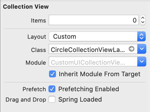
When custom collection view layout is ready, it is time to hook it up to the collection view. Custom collection view layout can be set in storyboard or when initialising collection view or collection view controller.
Setting custom layout in UIStoryBoard
Implementing a basic collection view controller for just showing one type of cells requires only a little bit of code. Data source methods provide the count of the items and sections and return configured collection view cells.
This file contains hidden or bidirectional Unicode text that may be interpreted or compiled differently than what appears below. To review, open the file in an editor that reveals hidden Unicode characters.
Learn more about bidirectional Unicode characters
Adding custom collection view layout requires subclassing UICollectionViewLayout and overriding several methods. The core idea is to provide UICollectionViewAttributes for every cell which UICollectionView will then use for creating and laying out cells.
Particle emitters are encountered the most often in games. Apple’s SpriteKit framework contains SKEmitterNode for this exact purpose. Moreover, Xcode even has a live editor for configuring SKEmitterNode. As SKEmitterNode can only be added to SKScene, it is not a good fit for apps. But no worries, apps can take advantage of CAEmitterLayer which is part of the CoreAnimation framework. CAEmitterLayer is subclass of CALayer and therefore we can add it to anywhere in our UIKit based apps. Snowboarding and skiing related apps could add a cool snow effect with a little bit of code.
CAEmitterLayer and CAEmitterCell
Particles used by CAEmitterLayer are defined by CAEmitterCell. Every emitter layer can have multiple cells and every cell can have it’s own subcells as well. Meaning every particle has an ability of emitting other particles. CAEmitterCell itself is just a definition of the particle: how it moves, looks and lives.
This file contains hidden or bidirectional Unicode text that may be interpreted or compiled differently than what appears below. To review, open the file in an editor that reveals hidden Unicode characters.
Learn more about bidirectional Unicode characters
This example presents a way of how to create a simple CAEmitterLayer what only has one cell with predefined image. Here we can see that cell defines birthrate: (particles per second), scale and its variance, lifetime in seconds, velocity, and emission direction. Emission longitude and range define a cone in which particles are emitted: if range is zero, all the particles have the same direction (emissionLongitude) and if range is 2 * pi, then particles are emitted in all the directions.
CAEmitterLayer also several different emitter shapes: circle, cuboid, line, point, rectangle, sphere (checkout the example project down below). It should be noted those shapes are defined by emitterPosition, emitterDepth, emitterSize, emitterZPosition and therefore, if you want to move emission location, update emitterPosition, not layer’s position.
Adding emitter layer
On iOS every UIView is backed by an instance of CALayer. As CAEmitterLayer is also a layer then adding it to view hierarchy is as simple as adding a sublayer to view’s backing layer.
This file contains hidden or bidirectional Unicode text that may be interpreted or compiled differently than what appears below. To review, open the file in an editor that reveals hidden Unicode characters.
Learn more about bidirectional Unicode characters
CAEmitterLayer is an efficient way of adding particle systems to any app. Setting up emitter layer required to define particle(s) and then adding the CAEmitterLayer to the view hierarchy. With a little bit of code, we can add playful touch to any app. Only if I could design an awesome looking particle emitter. 🤔
It is this time of the year when to look back. In total I published 22 blog posts and had 2765 views by 1632 people. Together with 3 posts from the 2017 I now have 25 blog posts.
In the end of the July I posted Sharing UI code with protocol extension what marked the beginning of the biweekly schedule. Since then I have tried to find a topic for every second week and write a concise post with sample code. The aim is to share the knowledge in a compact format and have some ready to use sample code what can be used in your projects. I would like to remind that all the source code is under MIT license so feel free to use as you would like to.
My hope is that at least some people found those posts useful and they learned something new. Feel free to contact me on Twitter @toomasvahter. Thank you for reading.
Loading an image and displaying it on a screen consists of several steps. Firstly, we need to load the image data into memory, then decoding it to pixel data and finally, telling GPU to display it on screen. The whole process can be as short as two lines of code: creating an instance of UIImage using the name of the image and then assigning it to an UIImageView. Simple, but not so efficient.
Memory consumption impacts
Memory management is important topic as misusing memory can lead to, in worse case, system terminating our app. In addition, using too much memory will cause high system CPU usage due to it trying to make more memory available by compressing it. Moreover, high CPU will lead to shorter battery life and no-one is happy about it.
High memory usage can be caused by keeping whole images in the memory and letting GPU to downscale it. The more efficient approach is to create a thumbnail with the size of the image view. This approach will use the minimum amount of pixel data and therefore system will use less resources.
Creating a thumbnail
For keeping resource consumption low, lets create UIImage extension for loading and creating the image at URL with specified size.
This file contains hidden or bidirectional Unicode text that may be interpreted or compiled differently than what appears below. To review, open the file in an editor that reveals hidden Unicode characters.
Learn more about bidirectional Unicode characters
Thumbnail creation consists of a couple of steps. Firstly, we create an instance of CGImageSource and tell it not to load and decode the data immediately (by setting kCGImageSourceShouldCacheImmediately to false). Instead, we pass the source into the thumbnail creation method which will immediately process the image data and scale it to the appropriate size. This approach avoids keeping the whole image in memory and instead, just uses the unscaled version.
This file contains hidden or bidirectional Unicode text that may be interpreted or compiled differently than what appears below. To review, open the file in an editor that reveals hidden Unicode characters.
Learn more about bidirectional Unicode characters
In a bit extreme example: displaying a thumbnail of a 5120 by 2880 pixels JPG image makes the app’s memory usage to be around 7 MB compared to 28 MB when the whole image is in memory. But on the other hand, we can have an app with multiple image views, each of them displaying a much larger image. Depending on the app, the difference can be huge.
Summary
We took a look at issues what can be caused by excessive use of system resources when displaying images. Then, we added an extension to UIImage for loading a larger image and scaling it to the size it is going to displayed. Small change, but has a huge impact.
Almost every app needs a way of inserting information using keyboard. When keyboard shows up, we do not want to keep content behind the keyboard hidden and instead, allow user to see it. UIResponder contains several notifications we can use to adjust the layout.
Keyboard change notifications
UIResponder contains a list of notifications and user info keys. We have notifications for reacting to visibility and frame changes (for example when rotating device). Notification’s userInfo contains a variety of information about the change. What makes this API a little bit difficult to use is parsing the user info every time we need to use those notifications. If we need to observe keyboard in several view controllers then the amount of code of setting up observation and doing type casting starts to build up. Therefore it makes more sense to have an object handling the observation and type casting user info keys.
This file contains hidden or bidirectional Unicode text that may be interpreted or compiled differently than what appears below. To review, open the file in an editor that reveals hidden Unicode characters.
Learn more about bidirectional Unicode characters
KeyboardObserver is a lightweight object observing keyboard related notifications and calling the changeHandler when any of the notifications is received. User info and notification type information is represented with struct Info. Before looking into how it is implemented, let’s take a look on the example.
This file contains hidden or bidirectional Unicode text that may be interpreted or compiled differently than what appears below. To review, open the file in an editor that reveals hidden Unicode characters.
Learn more about bidirectional Unicode characters
Here we can see that setting up observer is straight-forward and accessing end frame of the keyboard does not require any type casting. Compare it with adding observers to those notifications and then using conditional casts for getting relevant information in the view controller.
Creating a KeyboardObserver
But let’s now take a look on how it is implemented and see how much less code we need to write in the future. KeyboardObserver is initialised with a changeHandler closure like seen in the previous paragraph. Initialiser retains the handler and sets up observers for all the relevant notifications. For simplicity, we are observing all the notifications but it would also be possible to have an extra argument defining a set of Events and then observing only the notifications we really want to react to.
Type casting relies completely on promises made by UIKit. As UIKit promises that user info always contains those values, we can avoid having any optional values in the Info struct. Therefore it is simpler to use the struct later on as no unwrapping is required.
This file contains hidden or bidirectional Unicode text that may be interpreted or compiled differently than what appears below. To review, open the file in an editor that reveals hidden Unicode characters.
Learn more about bidirectional Unicode characters
We took a look on how to avoid observing multiple notifications and type casting notification user info values on the view controller level. Instead, we created a separate object handling observing and type casting and gives us a simple and concise API to work with.


 Augmented Code