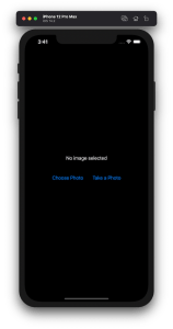
Lots of apps need to deal with selecting or taking photos but in SwiftUI we’ll need to wrap UIKit’s UIImagePickerController with a SwiftUI view.
Example application presenting a UI for opening image picker.
Wrapping UIImagePickerController in SwiftUI
UIImagePickerController has been available since iOS 2 and it supports both selecting photos from photo albums and taking new photos with a camera. If we would like to use an image picker in a SwiftUI view then the first step is wrapping this view controller with a SwiftUI view. UIViewControllerRepresentable protocol defines required methods for representing an UIViewController. We’ll provide a completion handler for passing back the selected image. We need to implement a coordinator which acts as a delegate for the UIImagePickerController. When the imagePickerController(_:didFinishPickingMediaWithInfo:) delegate method is called, then we can call the completion handler and handle the selected image in a SwiftUI view. As UIImagePickerController supports both the camera function and accessing existing photos, we’ll add a source type property for configuring which mode to use.
This file contains hidden or bidirectional Unicode text that may be interpreted or compiled differently than what appears below. To review, open the file in an editor that reveals hidden Unicode characters.
Learn more about bidirectional Unicode characters
ImagePicker view which wraps UIImagePickerController.
The ImagePicker can then be presented with the fullScreenCover view modifier. The presented state and the selected image is stored in the view’s view model. When the image picker is displayed and an image is selected, the completion handler is called and the selectedImage property is updated in the view model which in turn reloads the SwiftUI view.
This file contains hidden or bidirectional Unicode text that may be interpreted or compiled differently than what appears below. To review, open the file in an editor that reveals hidden Unicode characters.
Learn more about bidirectional Unicode characters
This file contains hidden or bidirectional Unicode text that may be interpreted or compiled differently than what appears below. To review, open the file in an editor that reveals hidden Unicode characters.
Learn more about bidirectional Unicode characters
A SwiftUI view containing an image preview and buttons for taking or choosing a photo.
Summary
Wrapping UIKit views with a SwiftUI view is fairly simple. The coordinator object is a perfect fit for handling delegate methods which UIKit views often provide. As we saw, adding a SwiftUI compatible image picker was pretty easy to do. Please check the full example project on GitHub.
In model-view-view model (MVVM) architecture the view model observes the model and provides data for the view by transforming it when needed. When the user interacts with the view and changes the data in it then the view model’s responsibility is to propagate those mutations back to the model object. Therefore, the important part in MVVM is how to manage data flows between objects. This time we’ll take a look on observing key-value observing (KVO) compatible model objects with Combine framework in SwiftUI view. The example view what we’ll build looks like this:
SwiftUI view which enables editing package related information and displays a summary of the package.
Model layer
The model object represents a package which contains information about the recipient, the sender, and the contents. The recipient and the sender are represented by a Person object which includes a first name, a last name, and a postal address. The contents is an array of immutable PackageContent objects. In Swift, we can use KVO by specifying @objc and dynamic modifiers on properties. Dynamic means that method dispatch is using objective-c runtime and therefore all the types must be representable in objective-c runtime. This immediately adds restrictions to the types we can use. When writing pure Swift code I do not recommend using KVO but sometimes we just need to use it. One example is NSManagedObject from the CoreData framework. But in this app we are not dealing with NSManagedObject but with a simple NSObject subclass instead.
This file contains hidden or bidirectional Unicode text that may be interpreted or compiled differently than what appears below. To review, open the file in an editor that reveals hidden Unicode characters.
Learn more about bidirectional Unicode characters
The view object is responsible for describing the UI and rendering data represented by the view model. We have a simple form for modifying the recipient’s first name, last name, and the street name (for keeping this UI simple I left out all the other postal address related properties). At the bottom of the view we have a text object which just describes the package and a button for adding new items to the package’s contents. Whenever any of the package’s properties change, the view needs to reload. View reload is done through the @StateObject property wrapper (read mode about observing view models in MVVM in SwiftUI and @StateObject and MVVM in SwiftUI).
This file contains hidden or bidirectional Unicode text that may be interpreted or compiled differently than what appears below. To review, open the file in an editor that reveals hidden Unicode characters.
Learn more about bidirectional Unicode characters
The view model’s responsibility is to observe the model object and propagating view changes to the model. It acts as a transformation layer where we can transform any data in the model to anything suitable for displaying. In the example below we are reading CNPostalAddress and only returning street name and reading multiple properties and returning a summary string. View models make it easy to contain such logic and also make it more easy to test.
Foundation framework defines a publisher named NSObject.KeyValueObservingPublisher which can be used for observing KVO compatible properties. One of the approaches is to use this publisher and then bind the model changes to the view model’s own property. Combine framework provides a convenient assign operator which takes a target publisher as an argument. Convenient because we can connect it with @Published properties in the view model. @Published properties automatically notify the ObservableObject’s objectWillChange publisher which is observed by a SwiftUI view. As soon as the property changes, SwiftUI view picks up the change and reloads itself. Note that we’ll also need to propagate changes back to the model when user updates the view and therfore the @Published property. This can be achieved by connecting property’s publisher with dropFirst, removeDuplicates and assign publishers where the latter assigns the value to the model object. Drop first is used for ignoring the initial value of the property. One downside is that now we can have the same information both in the view model and in the model. But on the other hand it makes the data streams easy to read and no need to have extra observation for triggering the view reload by manually calling send() on the objectWillChange publisher.
This file contains hidden or bidirectional Unicode text that may be interpreted or compiled differently than what appears below. To review, open the file in an editor that reveals hidden Unicode characters.
Learn more about bidirectional Unicode characters
Another approach what we can use is providing properties in the view model which return a Binding. This allows us to write the transformation code inside the get and set closures. This is what we have done with the street property. Note that we’ll still need to observe the model as the model can change at any point. Binding just provides a way of accessing the value. Therefore, we’ll need to set up an observation and calling send() on the objectWillChange publisher.
This file contains hidden or bidirectional Unicode text that may be interpreted or compiled differently than what appears below. To review, open the file in an editor that reveals hidden Unicode characters.
Learn more about bidirectional Unicode characters
If we go back to the SwiftUI view and connect all the properties then the full implementation of the view model looks like this:
This file contains hidden or bidirectional Unicode text that may be interpreted or compiled differently than what appears below. To review, open the file in an editor that reveals hidden Unicode characters.
Learn more about bidirectional Unicode characters
Key-value observing is getting less and less used after the introduction of Combine and SwiftUI. But there are still times when we need to connect good old KVO compatible NSObject subclasses with a SwiftUI view. Therefore, it is good to know how to handle KVO in SwiftUI views as well.
Resizing images is an important topic when we need to display images which do not match with the intended display size. For example, rendering much large images in a small rectangle. UIImageView supports scaling images automatically but that becomes inefficient when dealing with larger images. In this blog post we’ll take a look on how to crop and resize images to fill a target size while keeping the original aspect ratio.
Cropping and scaling UIImages
The end goal of this exercise is to create a small ImageScaler struct which supports cropping the original image and resizing it to the target size. The final instance of the UIImage has smaller size which means that less memory is required for rendering the image.
This file contains hidden or bidirectional Unicode text that may be interpreted or compiled differently than what appears below. To review, open the file in an editor that reveals hidden Unicode characters.
Learn more about bidirectional Unicode characters
As the first step let’s take a look on how to write the cropping and scaling logic. NSHipster has a great post about the different techniques what we can use for resizing images. We are going to use UIGraphicsImageRenderer for creating the scaled image. One important thing to note is that when we use CGContext for drawing the image then we need to flip the coordinate system because UIImage’s and CGContext’s coordinates do not match (UIImage uses upper left corner, CGContext bottom left corner). Coordinates can be transformed from the UIImage coordinate system to the CGContext coordinate system by combining translation and scale transforms. First we’ll move the image and then flip it in the opposite direction so that the final frame stays in the image rect.
This file contains hidden or bidirectional Unicode text that may be interpreted or compiled differently than what appears below. To review, open the file in an editor that reveals hidden Unicode characters.
Learn more about bidirectional Unicode characters
Next step after applying the affine transform is to crop the image. UIImage has a cgImage property but it can be nil when the instance was initialized with a CIImage backing storage. Therefore, we’ll need to handle both cases. Apple has a convenience drawing method for CIImage which already knows how to handle cropping. On the otherhand CGImage needs to be cropped first and then drawn. The full implementation of the crop and resize becomes:
This file contains hidden or bidirectional Unicode text that may be interpreted or compiled differently than what appears below. To review, open the file in an editor that reveals hidden Unicode characters.
Learn more about bidirectional Unicode characters
Now we have cropping and resize logic available. Depending on the target size of the image we’ll need to figure out which parts of the original image should be cropped so that the original aspect ratio does not change. Note that the original image size and the target size can have different aspect ratios: square, portrait, landscape. Therefore, we’ll need to handle all the cases. Let’s start by adding convenience properties to CGSize.
This file contains hidden or bidirectional Unicode text that may be interpreted or compiled differently than what appears below. To review, open the file in an editor that reveals hidden Unicode characters.
Learn more about bidirectional Unicode characters
After that we can add a method on CGRect which calculates a CGRect of the original image, what can be drawn in the target image. There are 9 different combinations what we need to handle. But the core logic stays the same: scale the current rectangle so that it fills the target size while keeping the original aspect ratio. Then chop off the sides which go over the target size and center the image in the target size.
This file contains hidden or bidirectional Unicode text that may be interpreted or compiled differently than what appears below. To review, open the file in an editor that reveals hidden Unicode characters.
Learn more about bidirectional Unicode characters
Scaling rect to the target size with keeping the initial aspect ratio.
Finalizing the ImageScaler
We can proceed with creating a single static method which takes care of scaling the original image to the target size while keeping the aspect ratio. The whole implementation looks like this:
This file contains hidden or bidirectional Unicode text that may be interpreted or compiled differently than what appears below. To review, open the file in an editor that reveals hidden Unicode characters. Learn more about bidirectional Unicode characters
Jazzy is an excellent tool for generating API documentation for Swift and Objective-C projects. Let’s take a look how to generate and publish API documentation in GitHub with Jazzy.
Installing Jazzy
Installation: sudo gem install jazzy
Jazzy config file for a Swift package
Configuration options can be passed into Jazzy directly with the command or adding them to the a file, by default it is .jazzy.yaml. We’ll use the default path as then we can run Jazzy without any command line arguments: the configuration is read from the configuration file. For seeing all the available configuration options run jazzy config -h. Just note that the configuration file expects snakecase (build-tool-arguments becomes build_tool_arguments). Let’s take a look on Swift package IndexedDataStore which can be built both for macOS and iOS. It has some additional functions for iOS and therefore it is preferred to build iOS target when running Jazzy. Otherwise API documentation would not contain those public functions meant for iOS. Typically Swift package is built using swift build command. The current state is that there is no easy way for just specifying the target OS to the swift build command. What we can do instead is using xcodebuild command which knows how to build Swift packages as well. We’ll just need to specify the scheme, sdk, and destination arguments. If we now run jazzy command without any arguments, it will read the configuration file, and generate API documentation which includes functions which require UIKit.
This file contains hidden or bidirectional Unicode text that may be interpreted or compiled differently than what appears below. To review, open the file in an editor that reveals hidden Unicode characters.
Learn more about bidirectional Unicode characters
Configuration file for Jazzy which builds documentation for iOS.
GitHub action for publish API documentation
Thankfully there is a GitHub action available for publishing API documentation with Jazzy. We can set up a GitHub action with a name PublishDocumentation and store it in the repository’s .github/workflows folder.
This file contains hidden or bidirectional Unicode text that may be interpreted or compiled differently than what appears below. To review, open the file in an editor that reveals hidden Unicode characters.
Learn more about bidirectional Unicode characters
GitHub action which publishes API documentation to GitHub pages.
The GitHub action is triggered either manually or when publishing a release. Manual trigger is called workflow_dispatch and when it is set, GitHub webpage will display a “Run workflow” button. This is very handy when testing GitHub actions. Another thing to note is that publish-jazzy-docs requires repository access because it needs to write the documentation files to the gh-pages branch. For giving repository access we’ll need to set up personal access token with repo scope. Secondly, we’ll need to paste the created token to the repository’s secrets. In this example, we have added a secret named ACCESS_TOKEN and the value is the personal access token. Now, if we have committed and pushed the GitHub action then we can open the repository on GitHub.com, navigate to actions, selecting PublishDocumentation, and using Run workspace button for triggering the wokrflow. If everything goes well, then the workspace creates a gh-pages branch which in turn creates a new GitHub page. In this case the URL to the new GitHub page looks like: https://laevandus.github.io/IndexedDataStore/ (link). This is what we wanted to achieve, API documentation publiched on GitHub.
Summary
We set up Jazzy for a Swift package and used it to generate API documentation. Generated API documentation was published to a GitHub page.
Shape protocol in SwiftUI is used for defining views which render custom shapes. Shapes have one required method which takes in a rect and returns a Path. In addition to view protocol, shape conforms to Animatable protocol as well. Therefore we can quite easily make our custom shape to animate from one state to another. We’ll use two parameters for defining our Wave shape: amplitude and frequency. Amplitude dictates the height of the wave and frequency the distance between wave peaks.
Animating wave shape.
SwiftUI view displaying an animatable wave shape
Let’s take a look on an example view which displays custom Wave shape. We’ll use @State property wrappers for storing amplitude and frequency because we want to change those values when running the app. Those properties are updated with random values when pressing a button. The wave has blue fill color, fixed height, and basic easeInOut animation. The animation is used when amplitude and/or frequency change.
This file contains hidden or bidirectional Unicode text that may be interpreted or compiled differently than what appears below. To review, open the file in an editor that reveals hidden Unicode characters.
Learn more about bidirectional Unicode characters
Content view rendering a wave shape with a button starting an animation.
Animatable wave shape
Like mentioned in the introduction, the Shape protocol defines a required method which has a rect argument and returns a Path. The path starts from the top left edge. Sine function is used for calculating y coordinates for every x coordinate with a 1 point step. Right, bottom and left edges are just straight lines.
Animatable protocol defines an animatableData property and because we have two parameters (amplitude and frequency) we’ll need to use AnimatablePair type. If there would be more parameters then AnimatablePair should contain one or more AnimatablePair types (and so on). Note that values in animatableData must conform to VectorArithmetic protocol which Double type already does.
When animation is running then SwiftUI calculates amplitude and frequency values based on the current animation frame and sets it to the animatableData property. Then new Path value is calculated and rendered.
This file contains hidden or bidirectional Unicode text that may be interpreted or compiled differently than what appears below. To review, open the file in an editor that reveals hidden Unicode characters.
Learn more about bidirectional Unicode characters
We took a look at the Shape protocol and created a wave shape. In addition, we made the wave to animate from one amplitude and frequency state to a new state.
SwiftLint is a tool for validating the style and conventions in Swift files. It is easy to integrate to a project. Minimum set up consists of installing SwiftLint and adding a build phase to your app target in Xcode. SwiftLint comes with a default list of rules, but if you would like to change the rules then it is required to create a configuration file in yaml. Let’s take a look on how to install, add build step, and use a separate configuration file with a custom set of rules.
SwiftLint is available in homebrew so the easies way is to install it with brew install swiftlint command. Next step is to add the build phase to a target. I am gonna use one of my example app which is available on GitHub: SwiftPackageAppWorkspace. This project uses a workspace and includes an app project and Swift package.
This file contains hidden or bidirectional Unicode text that may be interpreted or compiled differently than what appears below. To review, open the file in an editor that reveals hidden Unicode characters.
Learn more about bidirectional Unicode characters
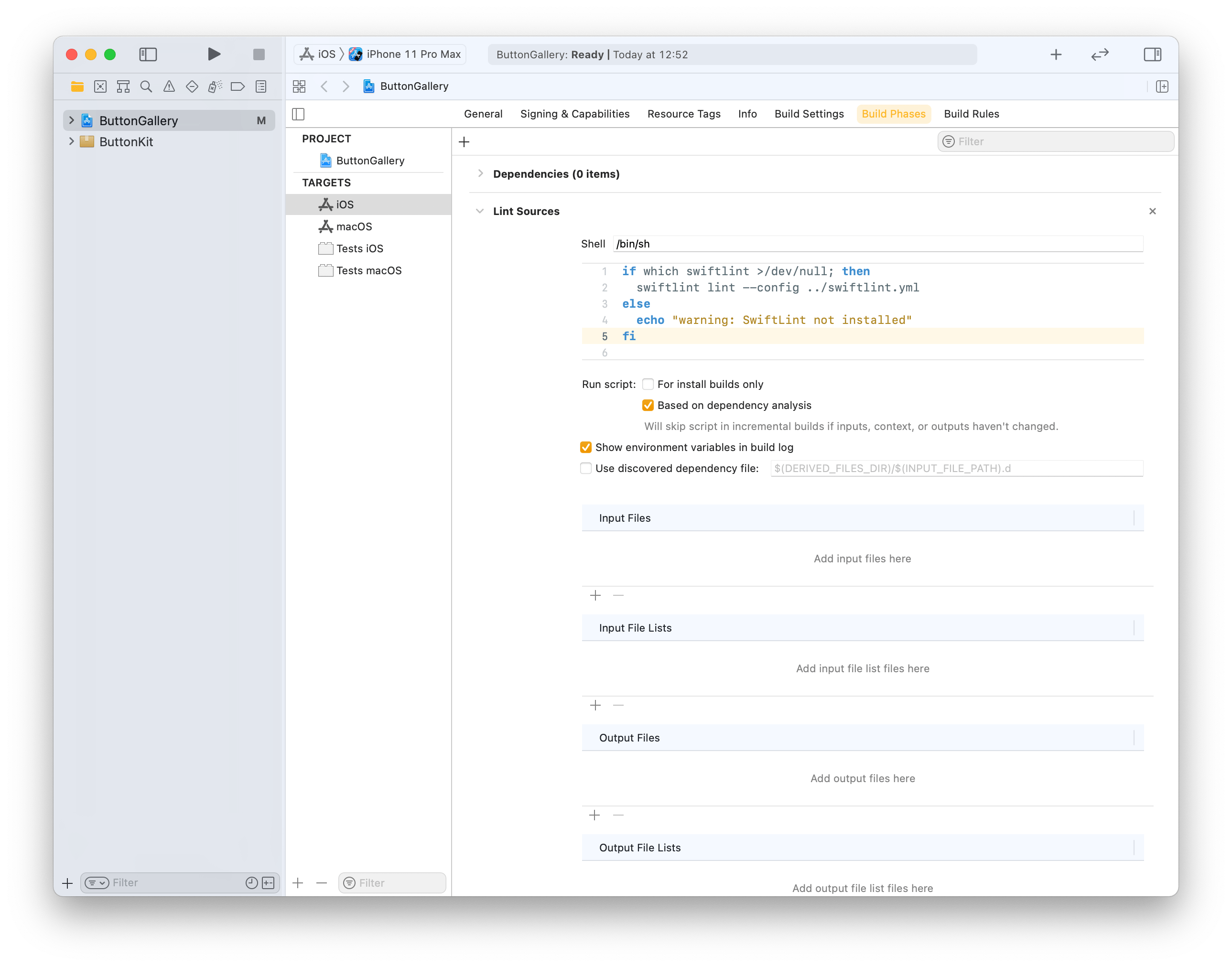
Click on the ButtonGallery project in the file navigator, then on the iOS target and build phases. Will use the + button for adding a new run script phase. Note that we already use the config argument for letting SwiftLint know where the config file exists (by default SwiftLint looks for .swiftlint.yml file in the same folder the project file is).
This file contains hidden or bidirectional Unicode text that may be interpreted or compiled differently than what appears below. To review, open the file in an editor that reveals hidden Unicode characters.
Learn more about bidirectional Unicode characters
Build phase calling swiftlint with custom configuration file in one folder up from the .xcodeproj.
Build phase which triggers swiftlint with custom configuration.
Last step is to add a custom configuration file to the repository checkout. We’ll add it to the checkout’s root folder which is the parent folder of the ButtonGallery.xcodeproj. I have went through the full list of rules available for SwiftLint and picked the ones which match with my coding style. SwiftLint has a list of default rules. The list of evaluated rules can be expanded with opt_in_rules and rules from default list can be disabled with disabled_rules list. Also I prefer to have else on a newline so I added statement_position configuration with statement_mode: uncuddled_else. Included defines a list of folder paths relative to the .xcodeproj calling swiftlint.
This file contains hidden or bidirectional Unicode text that may be interpreted or compiled differently than what appears below. To review, open the file in an editor that reveals hidden Unicode characters.
Learn more about bidirectional Unicode characters
The next time the target is built it will run SwiftLint with custom configuration and show warnings and/or errors in Xcode.
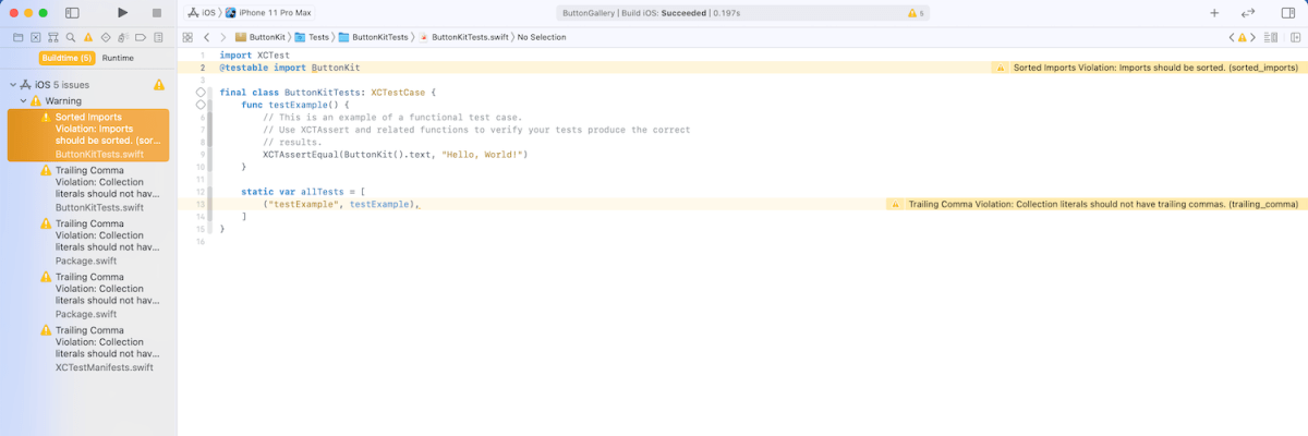
Warnings generated by SwiftLint in the example project.
Summary
SwiftLint is easy to set up and helps to keep the code style consistent in projects. In additional to style SwiftLint is capable of suggesting different coding conventions like use enum instead of struct with only static functions. For making it easy to add custom configuration to new project I have set up a command alias in ~/.zshrc which looks like this: alias xcode_lint_add='cp ~/Dev/swiftlint.yml swiftlint.yml && mate swiftlint.yml' Run xcode_lint_add in the root of the cloned project.
Git hooks are scripts written in any scripting language and are triggered when important actions occur. Hooks are stored in the repository’s .git/hooks folder. The script needs to have an appropriate filename without a path extension and also have executable permissions. Push event is an excellent time for triggering unit-tests and making sure local changes have not broken any. Therefore we’ll look into how to create a pre-push script for an iOS project in Swift.
Quick introduction to scripts written in Swift
Setting up a simple script in Swift follows steps familiar from other languages. The script file needs to start with #!/usr/bin/swift followed by the actual script. A simple example script can look like this.
This file contains hidden or bidirectional Unicode text that may be interpreted or compiled differently than what appears below. To review, open the file in an editor that reveals hidden Unicode characters.
Learn more about bidirectional Unicode characters
The command for running the script is swift Script.swift (if the filename is Script.swift). Another way is making the script executable by adding executable permissions to the file by running chmod +x Script.swift command. Then the script can be run with ./Script.swift (makes sense to drop the file extension).
Building a Xcode project for testing
The pre-push script contains of 3 steps: building the project for testing, running tests, and finally printing out the code coverage results. The first step catches build errors, the second step test failures, and the third step prints out code coverage results. Code coverage can be enabled in the scheme’s test action or adding -enableCodeCoverage YES to the xcodebuild command. Before we jump into creating a xcodebuild command with correct arguments then we’ll need to tackle the problem of calling the xcodebuild command line application from the Swift script. Command line applications can be invoked with the Foundation’s Process class. We’ll add an extension which deals with launching a specified command with zsh and printing out the standard output and error.
This file contains hidden or bidirectional Unicode text that may be interpreted or compiled differently than what appears below. To review, open the file in an editor that reveals hidden Unicode characters.
Learn more about bidirectional Unicode characters
The next step in the script is to define the project related configuration and create the xcodebuild command. All the user defined arguments are wrapped in quotes for avoiding any issues with whitespaces. The command is pretty straight-forward. If there are any build errors then the result code is not equal to 0. Then we can use the same error code for exiting the Swift script with exit() function.
This file contains hidden or bidirectional Unicode text that may be interpreted or compiled differently than what appears below. To review, open the file in an editor that reveals hidden Unicode characters.
Learn more about bidirectional Unicode characters
The command used for running unit-tests is fairly similar. Instead of build-without-testing we are using test-without-building argument and additionally provide a path where the result bundle is written to. This bundle contains information about the test run. Note that this path must not exist, otherwise xcodebuild stops with an error. Therefore we delete the existing file before running the command. Moreover, when there is a failure, we’ll clean up the path as well – pre-push script should not leave any temporary files.
This file contains hidden or bidirectional Unicode text that may be interpreted or compiled differently than what appears below. To review, open the file in an editor that reveals hidden Unicode characters.
Learn more about bidirectional Unicode characters
Last step is optional but it is nice to see code coverage information when pushing changes to a server. Xcode provides a command line application for viewing coverage data in human readable form. One of the options is printing out code coverage per target which gives a nice and concise overview.
This file contains hidden or bidirectional Unicode text that may be interpreted or compiled differently than what appears below. To review, open the file in an editor that reveals hidden Unicode characters.
Learn more about bidirectional Unicode characters
We looked into how to create a pre-push script in Swift. It called other command line applications for building the project, running the tests, and printing out code coverage information. The full script is available below, feel free to copy-paste it to your projects. The one last thing to consider is adding an alias in Terminal for easy installation: alias xcode_pre_push_add='cp ~/Dev/pre-push .git/hooks/pre-push && mate .git/hooks/pre-push' This just copies it from predefined location to the repository checkout and opens it in an editor for setting project related settings (replace mate with any editor).
This file contains hidden or bidirectional Unicode text that may be interpreted or compiled differently than what appears below. To review, open the file in an editor that reveals hidden Unicode characters.
Learn more about bidirectional Unicode characters
WWDC’20 introduced WidgetKit which is a new framework for building widgets on iOS, iPadOS, and macOS. Widgets provide a quick way for displaying content from your app either on the home screen on iOS or on the notification center on macOS. As I have an iOS app which stores data with CoreData then let’s see what it takes to share it with a widget. Note that we’ll only concentrate on sharing data between the app and the widget. For adding a widget to an existing project I would recommend taking a look at Apple’s excellent article: “Creating a Widget Extension”.
Configuring the project for sharing data with the widget
The project I have is an iOS app which keeps track of plants. Therefore, we’ll look into providing plants to a simple widget which just displays one of the plants which needs to be watered next. CoreData store contains all the plants with previous and next watering date. As widgets are meant to be lightweight extensions to your app we’ll aim at passing the minimum amount of data to the widget. WidgetKit does not provide a connectivity framework like WatchOS does because widgets are not running all the time. Therefore we will store data in a file and write the file to a shared container which the app and the widget can access. This can be done by adding app groups capability to both targets. The group name could be something like group.com.company.appname.widget. When this is set, then the url to a shared container can be created using FileManager like shown below.
This file contains hidden or bidirectional Unicode text that may be interpreted or compiled differently than what appears below. To review, open the file in an editor that reveals hidden Unicode characters.
Learn more about bidirectional Unicode characters
The iOS app has a class named WidgetPlantProvider which is responsible of updating the shared file and letting WidgetKit know when the data has changed. This class uses NSPersistentContainer for accessing CoreData storage and fetches dictionary representations of Plant entities. As those dictionaries contain NSDate objects then we’ll need to convert dates to double values which represent dates as seconds from the year of 1970. This enables us to archive the list of dictionaries to a data object with NSKeyedArchiver and writing the data object into the shared container. Last step is letting WidgetKit to know that timelines should be reloaded because data has changed. The implementation of the class is available below including observing managed object save notification.
This file contains hidden or bidirectional Unicode text that may be interpreted or compiled differently than what appears below. To review, open the file in an editor that reveals hidden Unicode characters.
Learn more about bidirectional Unicode characters
WidgetPlantProvider which stores Plant entities as dictionaries in the shared file.
Reading the shared file in the widget
Reading the file in the widget requires us to create an URL pointing at the shared container, reading the data, and converting the data to a list of plants. As the data contains a list of dictionary objects then we can take advantage of JSONDecoder and convert dictionaries to PlantRepresentation value type. PlantRepresentation struct conforms to Codable protocol which enables converting dictionary object to a JSON data representation and then decoding the JSON data to a value type. Date properties are represented as seconds from the year of 1970, then JSONDecoder’s dateDecodingStrategy must be set to DateDecodingStrategy.secondsSince1970. This approach of converting dictionary to a value type is discussed in detail in “Storing struct in UserDefaults”. An example provider type with described approach is available below.
This file contains hidden or bidirectional Unicode text that may be interpreted or compiled differently than what appears below. To review, open the file in an editor that reveals hidden Unicode characters.
Learn more about bidirectional Unicode characters
Timeline provider for a Widget which reads the data from the shared file.
Summary
We went through the steps of setting up app groups and sharing data in CoreData store with a widget. Next steps would be to use the timeline and polishing the Widget’s appearance.
A while ago I wrote about using MVVM in a SwiftUI project. During the WWDC’20 Apple announced @StateObject property wrapper which is a nice addition in the context of MVVM. @StateObject makes sure that only one instance is created per a view structure. This enables us to use @StateObject property wrappers for class type view models which eliminates the need of managing the view model’s lifecycle ourselves.
Comparing @StateObject and @ObservableObject for view model property
The most common flow in MVVM is creating and configuring a view model, which includes injecting dependencies, and then passing it into a view. This creates a question in SwiftUI: how to manage the lifecycle of the view model when view hierarchy renders and view structs are recreated. @StateObject property wrapper is going to solve this question in a nice and concise way. Let’s consider an example code.
This file contains hidden or bidirectional Unicode text that may be interpreted or compiled differently than what appears below. To review, open the file in an editor that reveals hidden Unicode characters.
Learn more about bidirectional Unicode characters
ContentView is a simple view which has a view model managing the view state and DependencyContainer used for injecting a dependency to the BottomBarViewModel when it is created. As we can see, ContentView’s view model is managed by @StateObject property wrapper. This means that ContentViewModel is created once although ContentView can be recreated several times. BottomBarView has a little bit more complex setup where the view model requires external dependency managed by the DependencyContainer. Therefore, we’ll need to create the view model with a dependency and then initialize BottomBarView with it. BottomBarView’s view model property is also annotated with @StateObject property wrapper.
This file contains hidden or bidirectional Unicode text that may be interpreted or compiled differently than what appears below. To review, open the file in an editor that reveals hidden Unicode characters.
Learn more about bidirectional Unicode characters
Magical aspect here is that when the ContentView’s body is accessed multiple times then BottomBarViewModel is not recreated when the BottomBarView struct is initialized. Exactly what we need – view will manage the lifecycle of its view model. This can be verified by adding a print to view model initializers and logging when ContentView’s body is accessed. Here is example log which compares BottomBarView’s view model property when it is annotated with @StateObject or @ObservableObject. Note how view model is not created multiple times when BottomBarView uses @StateObject.
BottomBarView uses @StateObject for its view model property
SwiftUIStateObject.ContentViewModel init()
1 ContentView.body accessed
SwiftUIStateObject.BottomBarViewModel init(entryStore:)
Triggering ContentView refresh
2 ContentView.body accessed
Triggering ContentView refresh
3 ContentView.body accessed

BottomBarView uses @ObservableObject for its view model property
SwiftUIStateObject.ContentViewModel init()
1 ContentView.body accessed
SwiftUIStateObject.BottomBarViewModel init(entryStore:)
Triggering ContentView refresh
2 ContentView.body accessed
SwiftUIStateObject.BottomBarViewModel init(entryStore:)
Triggering ContentView refresh
3 ContentView.body accessed
SwiftUIStateObject.BottomBarViewModel init(entryStore:)
Summary
WWDC’20 brought us @StateObject which simplifies handling view model’s lifecycle in apps using MVVM design pattern.
In the previous post we looked into how to separate code with local Swift packages within a project. This time let’s create a Swift package, publish it on GitHub, and add it to a separate project. We’ll create a package which extends UIImage and enables calculating color contrast ratios. Color contrast is important factor for keeping text readable in apps.
Creating a Swift package
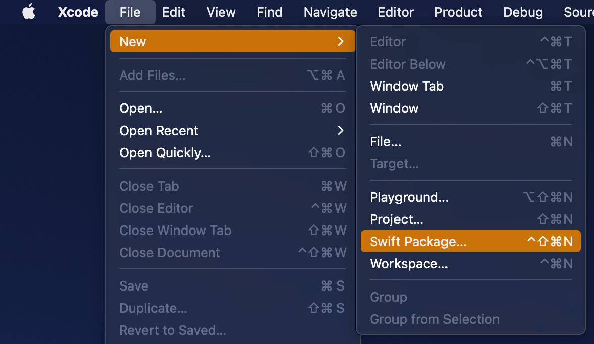
Open Xcode and select “Swift Package” item from the File > New menu. We’ll set the name of the package to “ColorContrastRatio”.
Selecting a new Swift Package.
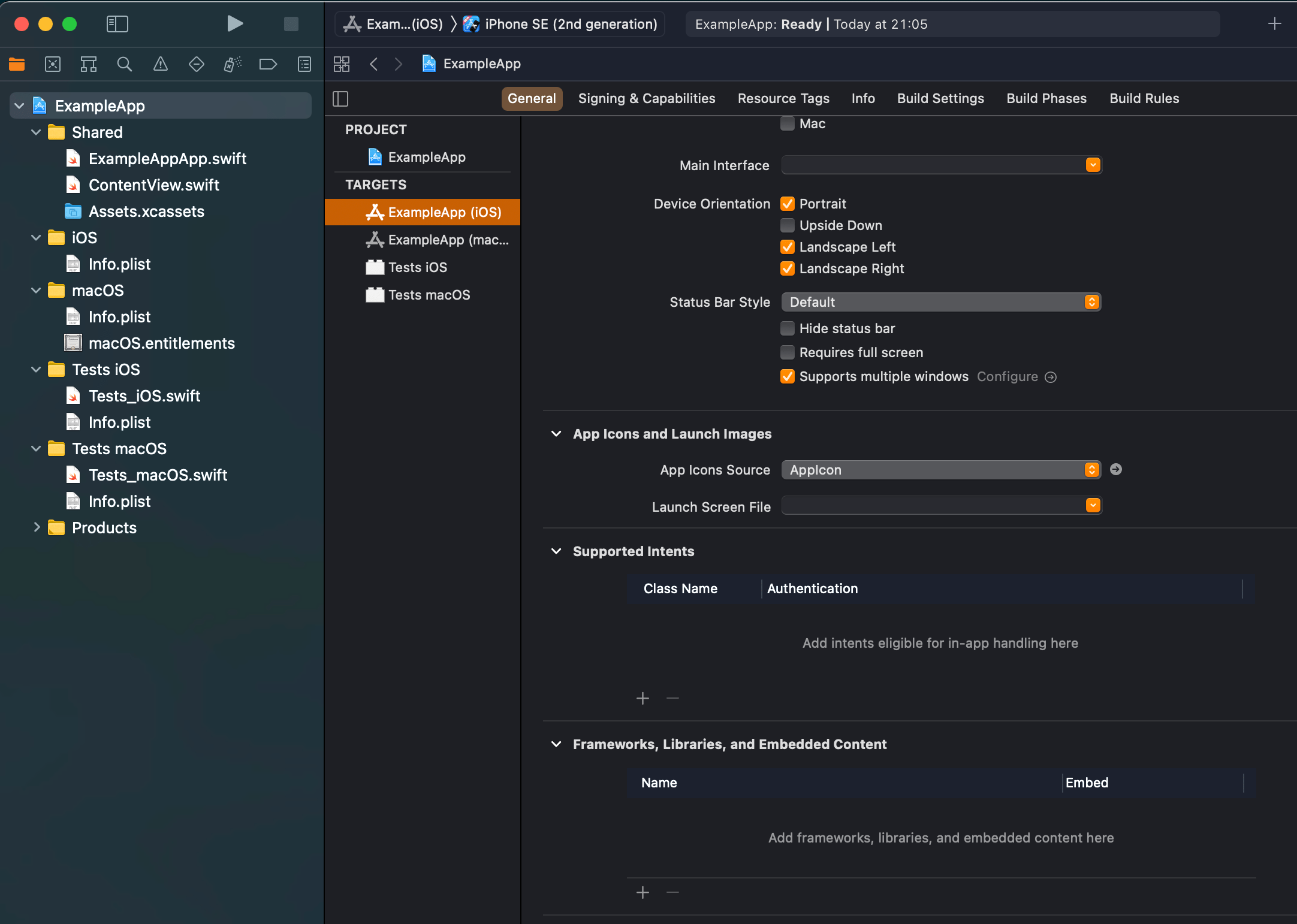
Saving a new Swift package.
Xcode’s template of new Swift packages is configured to have a basic hello world example with an unit-test. Before we change the package’s implementation, we’ll add minimum platform versions to the Package.swift file, in other words, minimum deployment target.
This file contains hidden or bidirectional Unicode text that may be interpreted or compiled differently than what appears below. To review, open the file in an editor that reveals hidden Unicode characters.
Learn more about bidirectional Unicode characters
Next step is to implement functionality of the package. We’ll keep the package simple and make it UIKit only which can be built for iOS and macCatalyst apps. Package is adding an UIColor extension and providing functionality for calculating relative luminance and contrast ratio. Functionality is set, next step is to publish it.
This file contains hidden or bidirectional Unicode text that may be interpreted or compiled differently than what appears below. To review, open the file in an editor that reveals hidden Unicode characters.
Learn more about bidirectional Unicode characters
First step is to go to GitHub and adding a new repository. I chose to include an automatically created license file, cloned the repository on my mac and then moved the code we added in the previous step to that checkout, then committed and pushed. Alternative is to add a remote to your local git repository. Either way is fine as long as our project ends up on GitHub. In addition, will add a tag which will mark the first release 0.1.0. Tags can be added by running those commands in Terminal:
Adding the published Swift package to another project
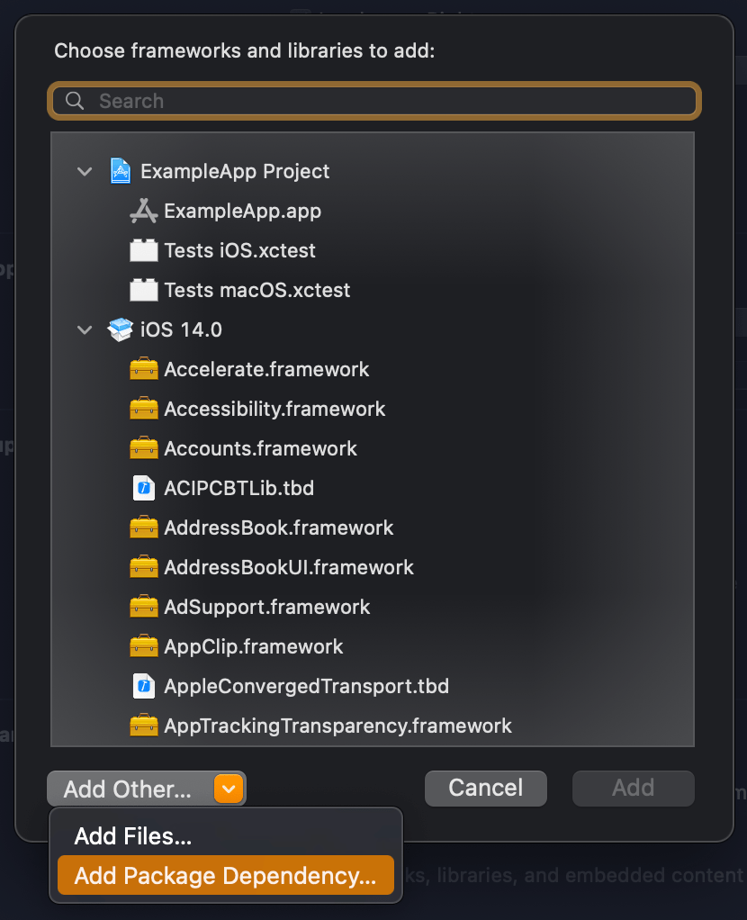
We published our package on GitHub and it requires only a few steps for adding it to an existing project. In an existing project, open the target settings and click on the plus button in the “Frameworks, Libraries, and Embedded Content”. In the opened view, click on the “Add Other” and select “Add Package Dependency”. Then we can paste the package’s GitHub url (https://github.com/laevandus/ColorContrastRatio) to the search field and complete the flow. From then on, it is just a matter of importing the new package and using it in the main project. Described steps are shown below:
Selecting the target where to the package is added.Selecting “Add Package Dependency” which allows adding Swift package.Searching for the Swift package by url.Setting the package update rule.Choosing products from the package.Finished example application using the Swift package’s color contrast ratio function.
This file contains hidden or bidirectional Unicode text that may be interpreted or compiled differently than what appears below. To review, open the file in an editor that reveals hidden Unicode characters.
Learn more about bidirectional Unicode characters
We created a Swift package and a repository on GitHub. Then we proceed with making the first release by adding a git tag. After that, we went ahead and added the package to another example project.


 Augmented Code