SwiftUI has a Picker view available with multiple different styles. One example of when it falls short is when we want to use a multi component picker with wheel style. One way how to try to achieve this is using a HStack with two Picker views, but it does not work very well, especially when trying to show it inside a Form view. So what else we can do? If something can’t be done in SwiftUI then we can use UIKit instead.
In my case, I wanted to create a picker which allows picking a date duration. It would have one wheel for selecting a number and the other wheel for selecting either days, weeks or months.
Firstly, let’s create a tiny struct which is going to hold the state of this picker. It needs to store a numeric value and the unit: days, weeks, months. Let’s name it as DateDuration. Since we want to iterate over the DateDuration.Unit, we’ll conform it to CaseIterable protocol.
This file contains hidden or bidirectional Unicode text that may be interpreted or compiled differently than what appears below. To review, open the file in an editor that reveals hidden Unicode characters.
Learn more about bidirectional Unicode characters
UIPickerView in UIKit can do everything we want, therefore we’ll need to wrap it into a SwiftUI view. This can be done by creating a new type which conforms to UIViewRepresentable protocol. Also, we need a binding which holds the value of the current selection: when the user changes it, the binding communicates the changes back and vice-versa. Additionally, we’ll add properties for configuring values and units. UIPickerView us created and configured in the makeUIView(context:) function. UIPickerView is driven by a data source and a delegate, which means we require a coordinator object as well. Coordinator is part of the UIViewRepresentable protocol.
This file contains hidden or bidirectional Unicode text that may be interpreted or compiled differently than what appears below. To review, open the file in an editor that reveals hidden Unicode characters.
Learn more about bidirectional Unicode characters
Coordinator is created in the makeCoordinator() function. It is going to do most of the work by providing data to the UIPickerView and handling the current selection. Therefore, we’ll store the selection binding, values, and units in the Coordinator class as well.
This file contains hidden or bidirectional Unicode text that may be interpreted or compiled differently than what appears below. To review, open the file in an editor that reveals hidden Unicode characters.
Learn more about bidirectional Unicode characters
The last missing piece is implementing UIPickerViewDataSource and UIPickerViewDelegate methods in the Coordinator class. This is pretty straight-forward to do. We’ll need to display two components where the first component is the list of values and the second component is the unit: days, weeks, months. When the user selects a new value, we’ll change the DateDuration value of the binding.
This file contains hidden or bidirectional Unicode text that may be interpreted or compiled differently than what appears below. To review, open the file in an editor that reveals hidden Unicode characters.
Learn more about bidirectional Unicode characters
This file contains hidden or bidirectional Unicode text that may be interpreted or compiled differently than what appears below. To review, open the file in an editor that reveals hidden Unicode characters.
Learn more about bidirectional Unicode characters
If we want to spice up the user interface, then we can make some titles in the app to use gradient colours. In WWDC’21 Apple introduced an API for making gradient text styles easy to create. The .foregroundStyle() view modifier takes in a type which conforms to ShapeStyle protocol. One of these types are gradient types in SwiftUI. Therefore, creating a fun gradient text is a matter of creating a text and applying a foregroundStyle view modifier with a gradient on it.
This file contains hidden or bidirectional Unicode text that may be interpreted or compiled differently than what appears below. To review, open the file in an editor that reveals hidden Unicode characters.
Learn more about bidirectional Unicode characters
The new view modifier is great, but it is iOS 15+, macOS 12.0+. Another way for achieving this result is recreating it ourselves. This involves in overlaying the text with gradient and then masking it with the text.
This file contains hidden or bidirectional Unicode text that may be interpreted or compiled differently than what appears below. To review, open the file in an editor that reveals hidden Unicode characters.
Learn more about bidirectional Unicode characters
WWDC’21 introduced APIs for managing focus in SwiftUI. When dealing with multiple focusable views, we can create an enum for representing these and use the new @FocusState property wrapper along with focused() view modifier, where each of the focusable view binds its focus to an enum case. This can look like this:
This file contains hidden or bidirectional Unicode text that may be interpreted or compiled differently than what appears below. To review, open the file in an editor that reveals hidden Unicode characters.
Learn more about bidirectional Unicode characters
In this example we have FormEntry enum which represents focusable elements in the view. Each of the view has a focused() view modifier, which binds the current focus state to the text field if it matches with the enum case. Meaning, setting focused property to FormEntry.email will move the focus to the email text field. It works the other way around as well. If we tap on the email text field, SwiftUI will set the focused property value to FormEntry.email.
Sometimes we just want to control the focus only once. Let’s take an example use case where we enter an order id and after tapping a search button we would like to remove the focus from the order id text field. In this case, we can just use a boolean property and bind the focus state boolean property to the text field’s focused() view modifier. Setting the property value to false in the button action will tell SwiftUI to resign focus from the text field.
This file contains hidden or bidirectional Unicode text that may be interpreted or compiled differently than what appears below. To review, open the file in an editor that reveals hidden Unicode characters.
Learn more about bidirectional Unicode characters
TabView is a container view which enables navigating between multiple flows by selecting one of the items on the tab bar. Tapping on a tab item replaces the visible view with a view associated with the item. Tab view is set up by creating views which have tab items attached. Tab items are created with the tabItem() view modifier, which supports setting a text and an image. In addition, there is a badge() view modifier if we would like to show a badge on top of the item.
Tab view also supports selection handling. Selection handling is needed when we need to programmatically control which tab is selected. For that, we’ll need to choose a type which represents the selection. The only requirement is that the type is Hashable. Therefore, we can use an enum with raw values and have a clear and readable representation of tabs. Next, all the views managed the tab view need to have a tag set with one of the enum cases. Then we can create a binding with the selection type and pass it into TabView and SwiftUI will select the tab view item which has a tag equal to the selection. Just to reiterate that we can use any other type for representing the selection, as long as it conforms to Hashable. Could be just integers as well.
This file contains hidden or bidirectional Unicode text that may be interpreted or compiled differently than what appears below. To review, open the file in an editor that reveals hidden Unicode characters.
Learn more about bidirectional Unicode characters
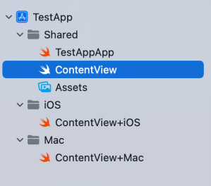
Xcode provides a cross-platform app template in SwiftUI which can be built for macOS and iOS. This template includes a Shared folder which is meant for code used both on macOS and iOS. Many SwiftUI types and functions work both on macOS and iOS but along with developing an app we’ll encounter cases where we need to specialize per platform. When I was building a multiplatform app then the very first thing I encountered was list styles. On macOS I wanted to use a different list style than on iOS (SidebarListStyle vs GroupedListStyle). Therefore, let’s take this as an example and see what are the ways how to handle this.
Compile time checks
The first way is to add compile time checks directly to the UI code. Swift provides #if os() for branching out code which should only be compiled on the specified platform. One downside of this approach is that it can make the code pretty long in the view body when we have multiple platform specific branches. In those cases, it might make sense to have separate functions which just contain the #if os() branch. But in the example below, we just have a listStyle view modifier, which is configured differently on macOS and iOS.
This file contains hidden or bidirectional Unicode text that may be interpreted or compiled differently than what appears below. To review, open the file in an editor that reveals hidden Unicode characters.
Learn more about bidirectional Unicode characters
Another way for handling platform specific code is to create a separate files which are only included to platform targets. In this concrete case, those files contain a view extension and define a contentListStyle property which returns a list style. ContentView.swift file can access the property and when we are building for macOS then ContentView+Mac.swift is compiled and when building for iOS then ContentView+iOS.swift. I would recommend creating separate folders for platform specific code. For example, the project folders could be Shared, Mac, and iOS. Separate folders give a clear overview where the platform specific code is.
This file contains hidden or bidirectional Unicode text that may be interpreted or compiled differently than what appears below. To review, open the file in an editor that reveals hidden Unicode characters.
Learn more about bidirectional Unicode characters
This file contains hidden or bidirectional Unicode text that may be interpreted or compiled differently than what appears below. To review, open the file in an editor that reveals hidden Unicode characters.
Learn more about bidirectional Unicode characters
This file contains hidden or bidirectional Unicode text that may be interpreted or compiled differently than what appears below. To review, open the file in an editor that reveals hidden Unicode characters.
Learn more about bidirectional Unicode characters
Project structure with Shared, Mac, and iOS folders.
Summary
SwiftUI code can be shared most of the time between platforms. Sometimes we’ll need to configure the shared code per platform or use platform specific APIs. Hopefully those two approaches will give some flexibility on handling such code.
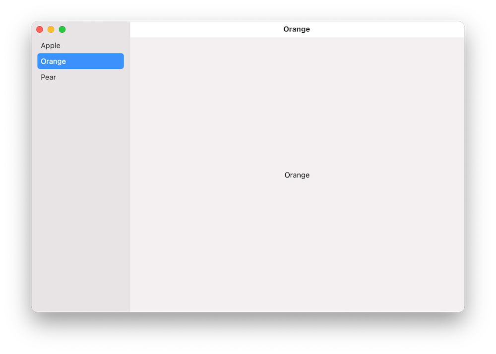
A common UI layout on macOS has a sidebar and detail view side by side. The sidebar contains a list of items, where the selected item is displayed on the right and displays details of it. One would expect that creating such a view hierarchy in SwiftUI should be pretty easy to set up. In this post, we’ll take a look at how to create a basic view with sidebar which supports selection.
Building the layout
We’ll build a simple sample app which shows a list of fruits in the sidebar and when clicking on any of the fruits, the right pane displays the name of the fruit. Therefore, we’ll need a struct representing a fruit, a view model for storing the list of fruits, and a property for storing the selected fruit in the sidebar.
This file contains hidden or bidirectional Unicode text that may be interpreted or compiled differently than what appears below. To review, open the file in an editor that reveals hidden Unicode characters.
Learn more about bidirectional Unicode characters
We can create the layout with NavigationView and NavigationLink. Inside the NavigationView we’ll first add a List where each of the item in the list is represented by a NavigationLink. One of the NavigationLink initializers takes a title, tag, and selection binding. Tag is used for identifying items in the list and setting one of the tag values to the selection binding will make the sidebar to select the item programmatically. Also, we’ll need to set the list style to “sidebar” which adds the appropriate styling to it. Finally, we’ll add a Text element, which acts as a placeholder view when there is no selection. And that is all what we need to do to get going with a view with sidebar and detail pane.
This file contains hidden or bidirectional Unicode text that may be interpreted or compiled differently than what appears below. To review, open the file in an editor that reveals hidden Unicode characters.
Learn more about bidirectional Unicode characters
We used NavigationView and NavigationLink to create a common layout for macOS apps, which features a sidebar with list of items and detailed view on the right. With only a bit of code, we were able to set it up.
WWDC’21 brought new APIs for creating attributed strings. AttributedString is a new value type which provides a type-safe API for dealing with attributes, its also localizable, supports limited amount of Markdown syntax, and can be even archived and unarchived thanks to the Codable support. In this blog post, we’ll take a look at the new API and will compose some attributed strings.
An AttributedString with attributes applied to multiple ranges.
The attributed string visible above contains multiple attributes starting with background color attribute and finishing with a link attribute. In the snippet below we can find different ways how to set attributes: searching for a range, manually creating a range, using AttributedContainer for setting multiple attributes at once, and also setting attributes to the whole string. As this string is displayed in a SwiftUI view then all the used attributes are part of the SwiftUI attribute scope.
This file contains hidden or bidirectional Unicode text that may be interpreted or compiled differently than what appears below. To review, open the file in an editor that reveals hidden Unicode characters.
Learn more about bidirectional Unicode characters
If we would like to see the ranges attributes were set to, we can use the runs API. A single run is a set of attributes shared by a single range. If we print all the runs, in this case 9, then it would look like this:
The {
	NSLanguage = en
	NSPresentationIntent = [paragraph (id 1)]
	SwiftUI.Font = Font(provider: SwiftUI.(unknown context at $7fff5bb7d400).FontBox<SwiftUI.Font.(unknown context at $7fff5bbfdb68).SystemProvider>)
	SwiftUI.BackgroundColor = indigo
}
 quick  {
	SwiftUI.Font = Font(provider: SwiftUI.(unknown context at $7fff5bb7d400).FontBox<SwiftUI.Font.(unknown context at $7fff5bbfdb68).SystemProvider>)
	NSLanguage = en
	NSPresentationIntent = [paragraph (id 1)]
}
brown {
	NSPresentationIntent = [paragraph (id 1)]
	NSLanguage = en
	SwiftUI.Font = Font(provider: SwiftUI.(unknown context at $7fff5bb7d400).FontBox<SwiftUI.Font.(unknown context at $7fff5bbfdb68).SystemProvider>)
	SwiftUI.ForegroundColor = brown
}
 fox  {
	SwiftUI.Font = Font(provider: SwiftUI.(unknown context at $7fff5bb7d400).FontBox<SwiftUI.Font.(unknown context at $7fff5bbfdb68).SystemProvider>)
	NSLanguage = en
	NSPresentationIntent = [paragraph (id 1)]
}
jumps {
	SwiftUI.UnderlineColor = cyan
	NSLanguage = en
	SwiftUI.Kern = 5.0
	SwiftUI.BaselineOffset = 4.0
	SwiftUI.Font = Font(provider: SwiftUI.(unknown context at $7fff5bb7d400).FontBox<SwiftUI.Font.(unknown context at $7fff5bbfdb68).SystemProvider>)
	NSPresentationIntent = [paragraph (id 1)]
	NSUnderline = NSUnderlineStyle(rawValue: 256)
}
 over the  {
	SwiftUI.Font = Font(provider: SwiftUI.(unknown context at $7fff5bb7d400).FontBox<SwiftUI.Font.(unknown context at $7fff5bbfdb68).SystemProvider>)
	NSLanguage = en
	NSPresentationIntent = [paragraph (id 1)]
}
lazy {
	SwiftUI.StrikethroughColor = yellow
	SwiftUI.Font = Font(provider: SwiftUI.(unknown context at $7fff5bb7d400).FontBox<SwiftUI.Font.(unknown context at $7fff5bbfdb68).SystemProvider>)
	NSLanguage = en
	NSPresentationIntent = [paragraph (id 1)]
	NSStrikethrough = NSUnderlineStyle(rawValue: 1)
}
  {
	SwiftUI.Font = Font(provider: SwiftUI.(unknown context at $7fff5bb7d400).FontBox<SwiftUI.Font.(unknown context at $7fff5bbfdb68).SystemProvider>)
	NSLanguage = en
	NSPresentationIntent = [paragraph (id 1)]
}
dog {
	NSLink = https://www.apple.com
	SwiftUI.Font = Font(provider: SwiftUI.(unknown context at $7fff5bb7d400).FontBox<SwiftUI.Font.(unknown context at $7fff5bbfdb68).SystemProvider>)
	NSLanguage = en
	NSPresentationIntent = [paragraph (id 1)]
}
The new AttributedString API also supports custom attributes. Custom attributes need to conform to a AttributeStringKey protocol in bare minimum. But when we would like to benefit from using the custom attribute in Markdown and also allowing to decode and encode it to data with Codable then we would need to conform to MarkdownDecodableAttributedStringKey and CodableAttributedStringKey respectively. In a simple example, let’s create a new attribute named MessageAttribute which can store a value of Message struct with id and value fields. The MessageAttribute needs to define the type it stores and a name used when encoding and decoding. In addition, we’ll need to add a new attribute scope which contains the new attribute. As we intend to use the new attribute in a SwiftUI app then we’ll add swiftUI attributes to the scope as well.
This file contains hidden or bidirectional Unicode text that may be interpreted or compiled differently than what appears below. To review, open the file in an editor that reveals hidden Unicode characters.
Learn more about bidirectional Unicode characters
With this set we can create attributed strings with this attribute either using markdown syntax or adding the attribute manually. Markdown syntax for custom attributes uses caret followed with square brackets and with the content in brackets after that. We also need to make sure to pass custom attribute scope into the AttributedString initializer as well. One thing what I have not figured out is how to create a completely custom appearance for custom attributes in SwiftUI views, like we can do in UIKit views.
This file contains hidden or bidirectional Unicode text that may be interpreted or compiled differently than what appears below. To review, open the file in an editor that reveals hidden Unicode characters.
Learn more about bidirectional Unicode characters
This file contains hidden or bidirectional Unicode text that may be interpreted or compiled differently than what appears below. To review, open the file in an editor that reveals hidden Unicode characters.
Learn more about bidirectional Unicode characters
We took a look on AttributedString, AttributeContainer, AttributeScope, and created attributed strings with the new API. With this knowledge, we got going with the new API and can continue exploring it further. The last thing to mention is that AttributedString can be converted to and from NSAttributedString with breeze.
Buttons in SwiftUI are represented with a Button type. Buttons are easy to create and can be customized either with directly providing a styled label or using a ButtonStyle protocol to define the visual appearance. Quite often we can find ourselves in a situation where we need a button which has a title and also a subtitle. In this blog post I am gonna show how to create a SubtitledButton which does exactly that. We’ll also use ButtonStyle protocol to change the appearance of the button. Using buttonStyle view modifier it is easy to change the appearance of the SubtitledButton as sometimes we want to present it in different ways. In the example below we can see two SubtitledButtons where one has a plain and second a custom appearance.
A SwiftUI view with two SubtitledButtons with different styles.
This file contains hidden or bidirectional Unicode text that may be interpreted or compiled differently than what appears below. To review, open the file in an editor that reveals hidden Unicode characters.
Learn more about bidirectional Unicode characters
Let’s now take a look at the SubtitledButton. It is a SwiftUI view which just incorporates a SwiftUI button with two Text values. The first Text represents the title and the second Text represents the subtitle. The title font can be changed by applying a font view modifier on the SubtitledButton. In the example below, the subtitle font is currently not configurable, although we could add another argument if needed. As the subtitle already has font view modifier applied then setting a font modifier on the whole button it does not override it.
This file contains hidden or bidirectional Unicode text that may be interpreted or compiled differently than what appears below. To review, open the file in an editor that reveals hidden Unicode characters.
Learn more about bidirectional Unicode characters
ButtonStyle is a protocol in SwiftUI which is used for custom button appearances. In the makeBody function we can apply view modifiers to the label where the label is a view created when the Button was created.
This file contains hidden or bidirectional Unicode text that may be interpreted or compiled differently than what appears below. To review, open the file in an editor that reveals hidden Unicode characters.
Learn more about bidirectional Unicode characters
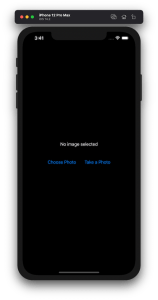
Lots of apps need to deal with selecting or taking photos but in SwiftUI we’ll need to wrap UIKit’s UIImagePickerController with a SwiftUI view.
Example application presenting a UI for opening image picker.
Wrapping UIImagePickerController in SwiftUI
UIImagePickerController has been available since iOS 2 and it supports both selecting photos from photo albums and taking new photos with a camera. If we would like to use an image picker in a SwiftUI view then the first step is wrapping this view controller with a SwiftUI view. UIViewControllerRepresentable protocol defines required methods for representing an UIViewController. We’ll provide a completion handler for passing back the selected image. We need to implement a coordinator which acts as a delegate for the UIImagePickerController. When the imagePickerController(_:didFinishPickingMediaWithInfo:) delegate method is called, then we can call the completion handler and handle the selected image in a SwiftUI view. As UIImagePickerController supports both the camera function and accessing existing photos, we’ll add a source type property for configuring which mode to use.
This file contains hidden or bidirectional Unicode text that may be interpreted or compiled differently than what appears below. To review, open the file in an editor that reveals hidden Unicode characters.
Learn more about bidirectional Unicode characters
ImagePicker view which wraps UIImagePickerController.
The ImagePicker can then be presented with the fullScreenCover view modifier. The presented state and the selected image is stored in the view’s view model. When the image picker is displayed and an image is selected, the completion handler is called and the selectedImage property is updated in the view model which in turn reloads the SwiftUI view.
This file contains hidden or bidirectional Unicode text that may be interpreted or compiled differently than what appears below. To review, open the file in an editor that reveals hidden Unicode characters.
Learn more about bidirectional Unicode characters
This file contains hidden or bidirectional Unicode text that may be interpreted or compiled differently than what appears below. To review, open the file in an editor that reveals hidden Unicode characters.
Learn more about bidirectional Unicode characters
A SwiftUI view containing an image preview and buttons for taking or choosing a photo.
Summary
Wrapping UIKit views with a SwiftUI view is fairly simple. The coordinator object is a perfect fit for handling delegate methods which UIKit views often provide. As we saw, adding a SwiftUI compatible image picker was pretty easy to do. Please check the full example project on GitHub.
In model-view-view model (MVVM) architecture the view model observes the model and provides data for the view by transforming it when needed. When the user interacts with the view and changes the data in it then the view model’s responsibility is to propagate those mutations back to the model object. Therefore, the important part in MVVM is how to manage data flows between objects. This time we’ll take a look on observing key-value observing (KVO) compatible model objects with Combine framework in SwiftUI view. The example view what we’ll build looks like this:
SwiftUI view which enables editing package related information and displays a summary of the package.
Model layer
The model object represents a package which contains information about the recipient, the sender, and the contents. The recipient and the sender are represented by a Person object which includes a first name, a last name, and a postal address. The contents is an array of immutable PackageContent objects. In Swift, we can use KVO by specifying @objc and dynamic modifiers on properties. Dynamic means that method dispatch is using objective-c runtime and therefore all the types must be representable in objective-c runtime. This immediately adds restrictions to the types we can use. When writing pure Swift code I do not recommend using KVO but sometimes we just need to use it. One example is NSManagedObject from the CoreData framework. But in this app we are not dealing with NSManagedObject but with a simple NSObject subclass instead.
This file contains hidden or bidirectional Unicode text that may be interpreted or compiled differently than what appears below. To review, open the file in an editor that reveals hidden Unicode characters.
Learn more about bidirectional Unicode characters
The view object is responsible for describing the UI and rendering data represented by the view model. We have a simple form for modifying the recipient’s first name, last name, and the street name (for keeping this UI simple I left out all the other postal address related properties). At the bottom of the view we have a text object which just describes the package and a button for adding new items to the package’s contents. Whenever any of the package’s properties change, the view needs to reload. View reload is done through the @StateObject property wrapper (read mode about observing view models in MVVM in SwiftUI and @StateObject and MVVM in SwiftUI).
This file contains hidden or bidirectional Unicode text that may be interpreted or compiled differently than what appears below. To review, open the file in an editor that reveals hidden Unicode characters.
Learn more about bidirectional Unicode characters
The view model’s responsibility is to observe the model object and propagating view changes to the model. It acts as a transformation layer where we can transform any data in the model to anything suitable for displaying. In the example below we are reading CNPostalAddress and only returning street name and reading multiple properties and returning a summary string. View models make it easy to contain such logic and also make it more easy to test.
Foundation framework defines a publisher named NSObject.KeyValueObservingPublisher which can be used for observing KVO compatible properties. One of the approaches is to use this publisher and then bind the model changes to the view model’s own property. Combine framework provides a convenient assign operator which takes a target publisher as an argument. Convenient because we can connect it with @Published properties in the view model. @Published properties automatically notify the ObservableObject’s objectWillChange publisher which is observed by a SwiftUI view. As soon as the property changes, SwiftUI view picks up the change and reloads itself. Note that we’ll also need to propagate changes back to the model when user updates the view and therfore the @Published property. This can be achieved by connecting property’s publisher with dropFirst, removeDuplicates and assign publishers where the latter assigns the value to the model object. Drop first is used for ignoring the initial value of the property. One downside is that now we can have the same information both in the view model and in the model. But on the other hand it makes the data streams easy to read and no need to have extra observation for triggering the view reload by manually calling send() on the objectWillChange publisher.
This file contains hidden or bidirectional Unicode text that may be interpreted or compiled differently than what appears below. To review, open the file in an editor that reveals hidden Unicode characters.
Learn more about bidirectional Unicode characters
Another approach what we can use is providing properties in the view model which return a Binding. This allows us to write the transformation code inside the get and set closures. This is what we have done with the street property. Note that we’ll still need to observe the model as the model can change at any point. Binding just provides a way of accessing the value. Therefore, we’ll need to set up an observation and calling send() on the objectWillChange publisher.
This file contains hidden or bidirectional Unicode text that may be interpreted or compiled differently than what appears below. To review, open the file in an editor that reveals hidden Unicode characters.
Learn more about bidirectional Unicode characters
If we go back to the SwiftUI view and connect all the properties then the full implementation of the view model looks like this:
This file contains hidden or bidirectional Unicode text that may be interpreted or compiled differently than what appears below. To review, open the file in an editor that reveals hidden Unicode characters.
Learn more about bidirectional Unicode characters
Key-value observing is getting less and less used after the introduction of Combine and SwiftUI. But there are still times when we need to connect good old KVO compatible NSObject subclasses with a SwiftUI view. Therefore, it is good to know how to handle KVO in SwiftUI views as well.


 Augmented Code