Lots of apps need to deal with selecting or taking photos but in SwiftUI we’ll need to wrap UIKit’s UIImagePickerController with a SwiftUI view.
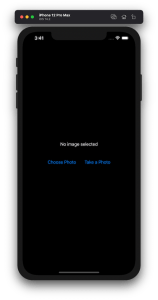
Example application presenting a UI for opening image picker.
Wrapping UIImagePickerController in SwiftUI
UIImagePickerController has been available since iOS 2 and it supports both selecting photos from photo albums and taking new photos with a camera. If we would like to use an image picker in a SwiftUI view then the first step is wrapping this view controller with a SwiftUI view. UIViewControllerRepresentable protocol defines required methods for representing an UIViewController. We’ll provide a completion handler for passing back the selected image. We need to implement a coordinator which acts as a delegate for the UIImagePickerController. When the imagePickerController(_:didFinishPickingMediaWithInfo:) delegate method is called, then we can call the completion handler and handle the selected image in a SwiftUI view. As UIImagePickerController supports both the camera function and accessing existing photos, we’ll add a source type property for configuring which mode to use.
This file contains hidden or bidirectional Unicode text that may be interpreted or compiled differently than what appears below. To review, open the file in an editor that reveals hidden Unicode characters.
Learn more about bidirectional Unicode characters
ImagePicker view which wraps UIImagePickerController.
The ImagePicker can then be presented with the fullScreenCover view modifier. The presented state and the selected image is stored in the view’s view model. When the image picker is displayed and an image is selected, the completion handler is called and the selectedImage property is updated in the view model which in turn reloads the SwiftUI view.
This file contains hidden or bidirectional Unicode text that may be interpreted or compiled differently than what appears below. To review, open the file in an editor that reveals hidden Unicode characters.
Learn more about bidirectional Unicode characters
This file contains hidden or bidirectional Unicode text that may be interpreted or compiled differently than what appears below. To review, open the file in an editor that reveals hidden Unicode characters.
Learn more about bidirectional Unicode characters
A SwiftUI view containing an image preview and buttons for taking or choosing a photo.
Summary
Wrapping UIKit views with a SwiftUI view is fairly simple. The coordinator object is a perfect fit for handling delegate methods which UIKit views often provide. As we saw, adding a SwiftUI compatible image picker was pretty easy to do. Please check the full example project on GitHub.
Resizing images is an important topic when we need to display images which do not match with the intended display size. For example, rendering much large images in a small rectangle. UIImageView supports scaling images automatically but that becomes inefficient when dealing with larger images. In this blog post we’ll take a look on how to crop and resize images to fill a target size while keeping the original aspect ratio.
Cropping and scaling UIImages
The end goal of this exercise is to create a small ImageScaler struct which supports cropping the original image and resizing it to the target size. The final instance of the UIImage has smaller size which means that less memory is required for rendering the image.
This file contains hidden or bidirectional Unicode text that may be interpreted or compiled differently than what appears below. To review, open the file in an editor that reveals hidden Unicode characters.
Learn more about bidirectional Unicode characters
As the first step let’s take a look on how to write the cropping and scaling logic. NSHipster has a great post about the different techniques what we can use for resizing images. We are going to use UIGraphicsImageRenderer for creating the scaled image. One important thing to note is that when we use CGContext for drawing the image then we need to flip the coordinate system because UIImage’s and CGContext’s coordinates do not match (UIImage uses upper left corner, CGContext bottom left corner). Coordinates can be transformed from the UIImage coordinate system to the CGContext coordinate system by combining translation and scale transforms. First we’ll move the image and then flip it in the opposite direction so that the final frame stays in the image rect.
This file contains hidden or bidirectional Unicode text that may be interpreted or compiled differently than what appears below. To review, open the file in an editor that reveals hidden Unicode characters.
Learn more about bidirectional Unicode characters
Next step after applying the affine transform is to crop the image. UIImage has a cgImage property but it can be nil when the instance was initialized with a CIImage backing storage. Therefore, we’ll need to handle both cases. Apple has a convenience drawing method for CIImage which already knows how to handle cropping. On the otherhand CGImage needs to be cropped first and then drawn. The full implementation of the crop and resize becomes:
This file contains hidden or bidirectional Unicode text that may be interpreted or compiled differently than what appears below. To review, open the file in an editor that reveals hidden Unicode characters.
Learn more about bidirectional Unicode characters
Now we have cropping and resize logic available. Depending on the target size of the image we’ll need to figure out which parts of the original image should be cropped so that the original aspect ratio does not change. Note that the original image size and the target size can have different aspect ratios: square, portrait, landscape. Therefore, we’ll need to handle all the cases. Let’s start by adding convenience properties to CGSize.
This file contains hidden or bidirectional Unicode text that may be interpreted or compiled differently than what appears below. To review, open the file in an editor that reveals hidden Unicode characters.
Learn more about bidirectional Unicode characters
After that we can add a method on CGRect which calculates a CGRect of the original image, what can be drawn in the target image. There are 9 different combinations what we need to handle. But the core logic stays the same: scale the current rectangle so that it fills the target size while keeping the original aspect ratio. Then chop off the sides which go over the target size and center the image in the target size.
This file contains hidden or bidirectional Unicode text that may be interpreted or compiled differently than what appears below. To review, open the file in an editor that reveals hidden Unicode characters.
Learn more about bidirectional Unicode characters
Scaling rect to the target size with keeping the initial aspect ratio.
Finalizing the ImageScaler
We can proceed with creating a single static method which takes care of scaling the original image to the target size while keeping the aspect ratio. The whole implementation looks like this:
This file contains hidden or bidirectional Unicode text that may be interpreted or compiled differently than what appears below. To review, open the file in an editor that reveals hidden Unicode characters. Learn more about bidirectional Unicode characters
SwiftUI provides wrappers for UIViewController and UIView on iOS. Same wrappers are also available for AppKit views on macOS. Let’s see how to use those wrappers for rendering UIKit views in SwiftUI previews and therefore benefiting from seeing changes immediately. Note that even when a project can’t support SwiftUI views because of the minimum deployment target, then this is still something what can be used when compiling the project with debug settings. Preview related code should only be compiled in debug builds and is never meant to be compiled in release builds. Before we jump in, there are two very useful shortcuts for keeping in mind: option+command+return for toggling previews and option+command+p for refreshing previews.
UIViewControllerRepresentable for wrapping UIViewControllers
UIViewControllerRepresentable is a protocol which can be used for wrapping UIViewController and representing it in SwiftUI. We can add a struct which conforms to that protocol and then creating an instance of the view controller in the makeUIViewController method. Second step is to add another struct which implements PreviewProvider protocol and which is used by Xcode for rendering previews. In simple cases we can get away only with such implementation but in more complex view controllers we would need to set up dependencies and generate example data for the preview. If need to do this, then all that code can be added to the makeUIViewController method.
This file contains hidden or bidirectional Unicode text that may be interpreted or compiled differently than what appears below. To review, open the file in an editor that reveals hidden Unicode characters.
Learn more about bidirectional Unicode characters
Wrapping UIViewController with UIViewControllerRepresentable.
UIViewController shown using SwiftUI
UIViewRepresentable for wrapping UIViews
UIViewRepresentable follows the same flow. In the example below, we use Group for showing two views with fixed size and different appearances at the same time.
This file contains hidden or bidirectional Unicode text that may be interpreted or compiled differently than what appears below. To review, open the file in an editor that reveals hidden Unicode characters.
Learn more about bidirectional Unicode characters
Wrapping UIView subclass with UIViewRepresentable.
Multiple UIViews shown in SwiftUI preview at the same time.
Summary
We looked into how to wrap view controllers and views for SwiftUI previews. Previews only required a little bit of code and therefore it is something what we can use for improving our workflows when working with UIKit views.
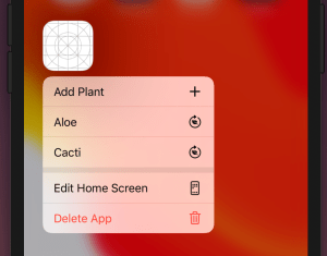
iOS apps can add quick actions which are displayed when force touching on the app’s icon. We’ll add quick actions to my open source WaterMyPlants example app. Quick actions can be static and dynamic: static actions are defined in the Info.plist and dynamic actions are configured in the code by updating UIApplication’s shortcutItems property. In the WaterMyPlants app, we’ll add one static action for adding a new plant and dynamic actions for opening added plants.
Home screen quick actions.
Static quick actions
Static quick actions are defined in the Info.plist. We need to add the UIApplicationShortcutItems key with array of dictionaries. Every dictionary in the array defines a quick action. Quick actions are required to have type and title and optionally we can add a subtitle and an icon. In the example below, we used one of the predefined icons. Predefined icons can be used by adding a key UIApplicationShortcutItemIconType with a string matching a format UIApplicationShortcutIconType<name>. Custom images are defined by the UIApplicationShortcutItemIconFile key where the string value is the name of an image in the asset catalog.
This file contains hidden or bidirectional Unicode text that may be interpreted or compiled differently than what appears below. To review, open the file in an editor that reveals hidden Unicode characters.
Learn more about bidirectional Unicode characters
Actions which depend on the data or state of the app can be added by setting the UIApplications’s shortcutItems property. Note that when adding items then we can use UIApplicationShortcutIcon‘s systemImageName initializer which enables us using any of the SF Symbols. Otherwise it is pretty much the same as defining a static quick action: setting type and title. It is useful to add an enum containing all the action types which becomes handy when we are handling actions. WaterMyPlants app uses scene delegates and therefore a good time to set dynamic quick actions is when the scene is resigning active status (see sceneWillResignActive(_:)).
This file contains hidden or bidirectional Unicode text that may be interpreted or compiled differently than what appears below. To review, open the file in an editor that reveals hidden Unicode characters.
Learn more about bidirectional Unicode characters
Quick actions are handled either in the UIApplicationDelegate or in the UISceneDelegate. WaterMyPlants uses scene delegates, therefore we’ll look into how to perform actions using scene delegates. We need to keep in mind that when selecting a shortcut launches the app, then we would need to check the shortcut property in the UIScene.ConnectionOptions and use it for configuring the UI to perform the action (windowScene(_:performActionFor:completionHandler:) is not called in that case). But if the app is already running in the background, then we can handle the action in the performActionFor delegate callback.
This file contains hidden or bidirectional Unicode text that may be interpreted or compiled differently than what appears below. To review, open the file in an editor that reveals hidden Unicode characters.
Learn more about bidirectional Unicode characters
We added home screen quick actions to the WaterMyPlants app. We looked into how to add static and dynamic quick actions and how to perform the selected action.
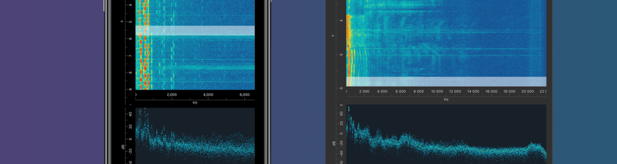
I am happy to announce that Signal Path 2.0 is available now for macOS and iOS. Signal Path uses Apple’s universal purchase offering – buy it once for both platforms.
I spent a lot of time architecting both apps in a way that they reuse as much functionality as possible: from Metal pipelines to view models powering the UI. Most of the UI is written in SwiftUI, but there are a couple of views using UIKit (iOS) and AppKit (macOS) directly. Now when the groundwork is done, every next release will offer the same core functionality on both platforms and also integrating OS specific features. Future is bright, give Signal Path a try!
What is Signal Path
Signal Path is the most performant spectrum viewing app with beautiful user interface. You can record audio spectrums using microphone or open large recordings containing I/Q data. Read more about Signal Path.
Thank you to everyone who visted my blog and I really hope that you learnt something new. I am trying to keep my blog post short and having sample code what can be used instantly. But now, its time to take a look back on all the blog posts I wrote in 2019. This year I kept following my schedule of publishing a blog post every second week. This means that in this year I published 27 blog post covering wide variaty of topics from UIKit to SwiftUI, SpriteKit, VisionKit, CryptoKit, app architecture and so on. I finally managed to get noticed by iOS Dev Weekly and the issue 430 contained my post Adding custom attribute to NSAttributedString on iOS. Really happy about it! All in all, I am very happy to see how my blog grew in 2019. Total view count grew more than 5 times compared to 2018 (started blogging in late 2017).
Let’s take a look on stats from 2019 and list blog posts by the number of vists in 2019. The first list contains blog posts written in 2019 and the second list contains all the other blog posts people read in 2019.
Have a great coming year! I’ll keep publishing new blog posts every second week so follow me on Twitter @toomasvahter or subscribe to RSS feed. Thank you!
NSAttributedString is used for displaying rich text on Apple platforms. There are many attributes available for styling the text. Let’s see how to add new attribute and how to draw it in UITextView.
Drawing custom attribute
Defining a new attribute is just a matter of extending NSAttributedString.Key and defining a new static variable. Difficult part is actually drawing the custom attribute. Apple’s documentation says that best way for it is to subclass NSLayoutManager and overriding drawGlyphs(forGlyphRange:at:). This is what we are doing here as well. Whenever glyphs are drawn, we check if the glyph range contains the custom attribute, if it does, then we get the rects for glyphs containing the custom attribute. When we know rects, we can draw the custom styling. In this case, we’ll mimic tokens in text and therefore go for rectangle with rounded corners. Should be noted that enumerating custom attribute, longestEffectiveRangeNotRequired should be specified. Otherwise, if we have two different tokens next to each-other, then this attribute is considered as one.
UITextView has by default text container inset set. For being able to draw the custom styling exactly behind the text, this offset must be taken account. Easiest is to propagate insets to layout manager what we are doing here.
extension NSAttributedString.Key {
    static let token = NSAttributedString.Key("Token")
}

final class TokenLayoutManager: NSLayoutManager {
    var textContainerOriginOffset: CGSize = .zero

    override func drawGlyphs(forGlyphRange glyphsToShow: NSRange, at origin: CGPoint) {
        let characterRange = self.characterRange(forGlyphRange: glyphsToShow, actualGlyphRange: nil)
        textStorage?.enumerateAttribute(.token, in: characterRange, options: .longestEffectiveRangeNotRequired, using: { (value, subrange, _) in
            guard let token = value as? String, !token.isEmpty else { return }
            let tokenGlypeRange = glyphRange(forCharacterRange: subrange, actualCharacterRange: nil)
            drawToken(forGlyphRange: tokenGlypeRange)
        })
        super.drawGlyphs(forGlyphRange: glyphsToShow, at: origin)
    }

    private func drawToken(forGlyphRange tokenGlypeRange: NSRange) {
        guard let textContainer = textContainer(forGlyphAt: tokenGlypeRange.location, effectiveRange: nil) else { return }
        let withinRange = NSRange(location: NSNotFound, length: 0)
        enumerateEnclosingRects(forGlyphRange: tokenGlypeRange, withinSelectedGlyphRange: withinRange, in: textContainer) { (rect, _) in
            let tokenRect = rect.offsetBy(dx: self.textContainerOriginOffset.width, dy: self.textContainerOriginOffset.height)
            UIColor(hue: 175.0/360.0, saturation: 0.24, brightness: 0.88, alpha: 1).setFill()
            UIBezierPath(roundedRect: tokenRect, cornerRadius: 4).fill()
        }
    }
}
Using custom layout manager in UITextView requires a little bit of setup what we can put into UITextView’s subclass.
final class TokenTextView: UITextView {
    init(frame: CGRect) {
        let layoutManager = TokenLayoutManager()
        let textStorage = NSTextStorage()
        textStorage.addLayoutManager(layoutManager)
        let textContainer = NSTextContainer()
        textContainer.heightTracksTextView = true
        textContainer.widthTracksTextView = true
        layoutManager.addTextContainer(textContainer)
        super.init(frame: frame, textContainer: textContainer)
        updateLayoutManager()
    }

    required init?(coder: NSCoder) {
        fatalError("init(coder:) has not been implemented")
    }

    override var textContainerInset: UIEdgeInsets {
        didSet {
            updateLayoutManager()
        }
    }

    private func updateLayoutManager() {
        guard let layoutManager = layoutManager as? TokenLayoutManager else { return }
        layoutManager.textContainerOriginOffset = CGSize(width: textContainerInset.left, height: textContainerInset.top)
        layoutManager.invalidateDisplay(forCharacterRange: NSRange(location: 0, length: attributedText.length))
    }
}
let textView = TokenTextView(frame: .zero)
textView.translatesAutoresizingMaskIntoConstraints = false
view.addSubview(textView)
NSLayoutConstraint.activate([
    textView.leadingAnchor.constraint(equalTo: view.safeAreaLayoutGuide.leadingAnchor, constant: 16),
    textView.trailingAnchor.constraint(equalTo: view.safeAreaLayoutGuide.trailingAnchor, constant: -16),
    textView.topAnchor.constraint(equalTo: view.safeAreaLayoutGuide.topAnchor, constant: 16),
    textView.bottomAnchor.constraint(equalTo: view.safeAreaLayoutGuide.bottomAnchor, constant: -16)
])

let string = "The quick brown fox jumps over the lazy dog"
let attributedString = NSMutableAttributedString(string: string)
let value = "value"
attributedString.addAttribute(.token, value: value, range: NSRange(location: 4, length: 5))
textView.attributedText = attributedString
Summary
We defined a new attribute by extending NSAttributedString.Key. Then we created a new NSLayoutManager subclass and added custom styling to the attribute. Lastly, we configured the UITextView to use custom layout manager and set text with custom attribute to it.
This time we are going to look into how to embed custom view in UIScrollView and setting up autolayout constraints for different scenarios.
Setting up view controller with scroll view
We’ll gonna create a new view controller what contains UIScrollView as it’s subview. UIScrollView will cover the whole view area. Everything is set up in code as it is easier to represent the steps needed. It is easy to use those steps and setting up constraints in interface builder.
This file contains hidden or bidirectional Unicode text that may be interpreted or compiled differently than what appears below. To review, open the file in an editor that reveals hidden Unicode characters.
Learn more about bidirectional Unicode characters
Most common case is to have scroll view with vertically scrollable content. Embedded view’s leading, trailing, top and bottom layout anchors should be equal to scroll view’s content layout margin’s corresponding anchors. For making the view only scrollable in vertical axis, embedded view’s width should match with scroll view’s width. This is achieved by adding an extra width constraint to the embedded view. Width constraint should make the view width equal to scroll view’s width. When setting view’s up in interface builder, make sure to add at least one subview to the embedded view what has intrinsic content size (label, button etc) (also add constraints). Otherwise interface builder does not know what size the embedded view has.
This file contains hidden or bidirectional Unicode text that may be interpreted or compiled differently than what appears below. To review, open the file in an editor that reveals hidden Unicode characters.
Learn more about bidirectional Unicode characters
Horizontally scrollable view follows the same setup except instead of width constraint, we’ll add height constraint instead. When setting up the height constraint, scroll view’s safeAreaLayoutGuide’s heightAnchor should be used. This layout guide ignores the portion of the view what is covered by navigation bars, tab bars, toolbars, and other views.
This file contains hidden or bidirectional Unicode text that may be interpreted or compiled differently than what appears below. To review, open the file in an editor that reveals hidden Unicode characters.
Learn more about bidirectional Unicode characters
Case 3: Vertically and horizontally scrollable view
For making the embedded view to be scrollable in horizontal and vertical axis, we’ll only add leading, trailing, top and bottom constraints to scroll view’s contentLayoutGuide’s corresponding anchors. Embedded view should define intrinsicContentSize as this size is used by scroll view for knowing what size the view wants to be. This kind of layout is probably usable only for fixed size view’s. For example, building a custom grid view where the row and column count define the size of the view.
This file contains hidden or bidirectional Unicode text that may be interpreted or compiled differently than what appears below. To review, open the file in an editor that reveals hidden Unicode characters.
Learn more about bidirectional Unicode characters
Vertically and horizontally scrollable embedded view
Summary
We took a look on how to add constraints to embedded view in scroll view for getting a specific scrolling behaviour. In one sentence: leading, trailing, top, and bottom constraints to contentLayoutGuide and adding width or height constraint when necessary.
iOS and macOS got a new framework in WWDC’19 named LinkPresentation. LinkPresentation enables fetching URL previews.
Adding LPLinkView for presenting preview
LPLinkView is a view subclass meant for rendering LPLinkMetadata. LPLinkMetadata contains information about the link: title, icon, image, video.
This file contains hidden or bidirectional Unicode text that may be interpreted or compiled differently than what appears below. To review, open the file in an editor that reveals hidden Unicode characters.
Learn more about bidirectional Unicode characters
Instances of LPLinkMetadata are fetched using LPLinkMetadataProvider for a given url. LPLinkMetadata is conforming to NSSecureCoding what enables a way of converting it to Data and storing the metadata on disk. Next time we need metadata for this url, we can use a locally cached data instead. Archiving and unarchiving is done with help of NSKeyedArchiver and NSKeyedUnarchiver and in the example archived data is stored in UserDefaults. In real apps it makes sense to store the data in separate files instead and not polluting UserDefaults with preview data.
This file contains hidden or bidirectional Unicode text that may be interpreted or compiled differently than what appears below. To review, open the file in an editor that reveals hidden Unicode characters.
Learn more about bidirectional Unicode characters
This file contains hidden or bidirectional Unicode text that may be interpreted or compiled differently than what appears below. To review, open the file in an editor that reveals hidden Unicode characters.
Learn more about bidirectional Unicode characters
Local LPMetadata storage using UserDefaults as storage
Summary
LinkPresentation framework adds a easy way of fetching previews for web pages. It provides a LPLinkView class making it extremely easy to render the preview.
iOS 13 added a new class named UIContextMenuInteraction what is used for attaching menus to views. When adding menu interaction to a view and user uses 3D Touch or long press gesture on devices not supporting it, a menu is presented alongside with the highlighted content view. Therefore depending on the available space, not all the menu items can fit into the menu.
Setting up UIContextMenuInteraction
UIContextMenuInteraction is initialised with a delegate. Delegate’s job is to create an instance of UIContextMenuConfiguration with provider block for creating a menu when needed. It also should be noted that delegate can return nil in what case no menu is shown.
This file contains hidden or bidirectional Unicode text that may be interpreted or compiled differently than what appears below. To review, open the file in an editor that reveals hidden Unicode characters.
Learn more about bidirectional Unicode characters
Action provider of UIContextMenuConfiguration is a function taking in suggested menu items and returning an instance of UIMenu. Suggested menu items are the ones provided by responders from responder chain. For example we could use it for sharing actions among multiple responders.
Every menu item is represented by UIAction or another UIMenu allowing to have nested menus. UIActions have title and optionally image and state icon if the state is on. In addition we can explicitly disable actions and set a destructive appearance.
This file contains hidden or bidirectional Unicode text that may be interpreted or compiled differently than what appears below. To review, open the file in an editor that reveals hidden Unicode characters.
Learn more about bidirectional Unicode characters


 Augmented Code