WWDC’21 introduced APIs for managing focus in SwiftUI. When dealing with multiple focusable views, we can create an enum for representing these and use the new @FocusState property wrapper along with focused() view modifier, where each of the focusable view binds its focus to an enum case. This can look like this:
This file contains hidden or bidirectional Unicode text that may be interpreted or compiled differently than what appears below. To review, open the file in an editor that reveals hidden Unicode characters.
Learn more about bidirectional Unicode characters
In this example we have FormEntry enum which represents focusable elements in the view. Each of the view has a focused() view modifier, which binds the current focus state to the text field if it matches with the enum case. Meaning, setting focused property to FormEntry.email will move the focus to the email text field. It works the other way around as well. If we tap on the email text field, SwiftUI will set the focused property value to FormEntry.email.
Sometimes we just want to control the focus only once. Let’s take an example use case where we enter an order id and after tapping a search button we would like to remove the focus from the order id text field. In this case, we can just use a boolean property and bind the focus state boolean property to the text field’s focused() view modifier. Setting the property value to false in the button action will tell SwiftUI to resign focus from the text field.
This file contains hidden or bidirectional Unicode text that may be interpreted or compiled differently than what appears below. To review, open the file in an editor that reveals hidden Unicode characters.
Learn more about bidirectional Unicode characters
Another welcomed change what WWDC’21 brought us was UISheetPresentationController. The sheet presentation controller makes it extremely easy to present sheets like the ones which just take a half of the screen. It allows us to configure the sheet size with detents where there are currently two of them: medium and large. The medium detent means that the sheet takes about the half of the screen height, and the large detent means that the full screen is covered with the sheet. Additionally, we can configure some other visual aspects like corner radius and if the grabber should be visible. The detents property is an array, and we can set both medium and large to it, which enables to dynamically change the size either by dragging or controlling the size programmatically by setting the selectedDetentIdentifier property. And if we would like to animate the change, then the property needs to be set within the animateChanges closure.
This file contains hidden or bidirectional Unicode text that may be interpreted or compiled differently than what appears below. To review, open the file in an editor that reveals hidden Unicode characters.
Learn more about bidirectional Unicode characters
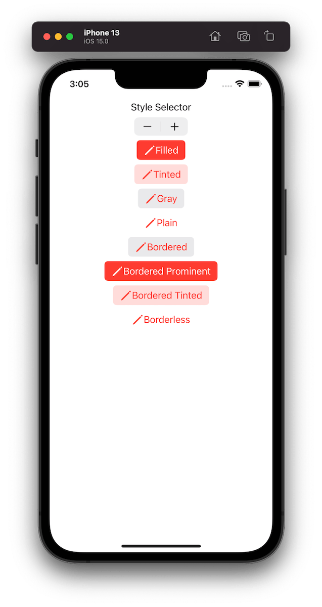
UIButton.Configuration API was introduced in WWDC’21 with a goal of making it easier to create buttons with many styles, sizes, colours etc. Configurations API comes with functions for creating common button configurations: filled(), bordered(), borderedProminent(), borderedTinted(), borderless(), plain(), gray(), tinted(). These configurations can be further customized. One benefit of the API is that it will take care of different states of the button like highlighted, disabled, hovered and so on and applies different styling based on the state. Most of the time that is all we needed, but additionally we can also adjust styling for different states as well through the configurationUpdateHandler().
The basic usage of the API involves in creating a UIButton.Configuration object and passing it to UIButton init function of setting it to UIButton’s configuration property. The button will then apply the configuration. In WWDC session it was emphasized that applying a new configuration is cheap and optimized behind the scenes therefore we should never compare the new configuration with the one currently applied on the button.
This file contains hidden or bidirectional Unicode text that may be interpreted or compiled differently than what appears below. To review, open the file in an editor that reveals hidden Unicode characters.
Learn more about bidirectional Unicode characters
Example of button configurations when the tint colour is set to red.
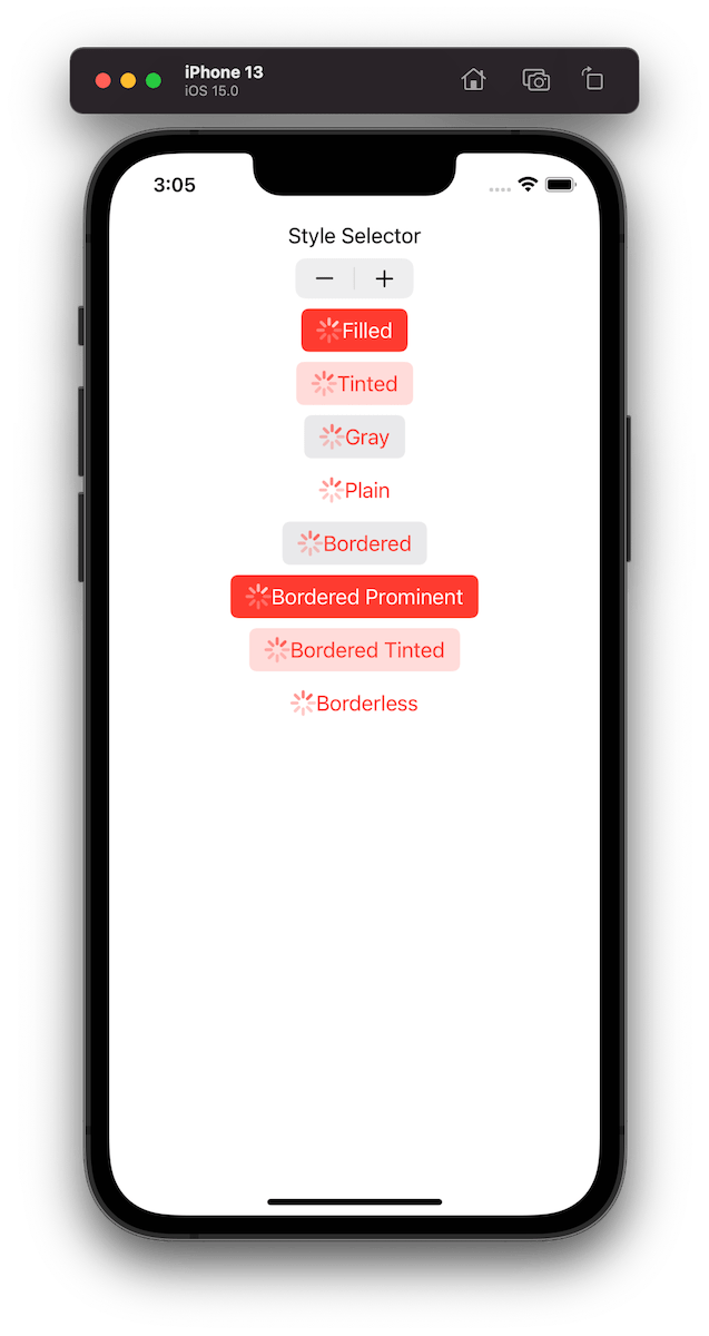
For getting a better overview on how default configurations change based on the properties, we set on UIButton.Configuration type, I built a simple preview app which takes configurations: filled(), bordered(), borderedProminent(), borderedTinted(), borderless(), plain(), gray(), tinted() and applies some modifications on these. The results are shown below.
This file contains hidden or bidirectional Unicode text that may be interpreted or compiled differently than what appears below. To review, open the file in an editor that reveals hidden Unicode characters.
Learn more about bidirectional Unicode characters
TabView is a container view which enables navigating between multiple flows by selecting one of the items on the tab bar. Tapping on a tab item replaces the visible view with a view associated with the item. Tab view is set up by creating views which have tab items attached. Tab items are created with the tabItem() view modifier, which supports setting a text and an image. In addition, there is a badge() view modifier if we would like to show a badge on top of the item.
Tab view also supports selection handling. Selection handling is needed when we need to programmatically control which tab is selected. For that, we’ll need to choose a type which represents the selection. The only requirement is that the type is Hashable. Therefore, we can use an enum with raw values and have a clear and readable representation of tabs. Next, all the views managed the tab view need to have a tag set with one of the enum cases. Then we can create a binding with the selection type and pass it into TabView and SwiftUI will select the tab view item which has a tag equal to the selection. Just to reiterate that we can use any other type for representing the selection, as long as it conforms to Hashable. Could be just integers as well.
This file contains hidden or bidirectional Unicode text that may be interpreted or compiled differently than what appears below. To review, open the file in an editor that reveals hidden Unicode characters.
Learn more about bidirectional Unicode characters
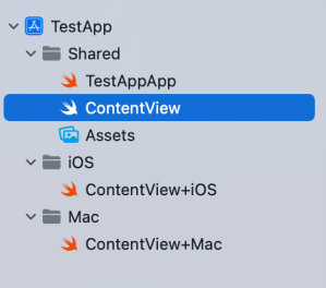
Xcode provides a cross-platform app template in SwiftUI which can be built for macOS and iOS. This template includes a Shared folder which is meant for code used both on macOS and iOS. Many SwiftUI types and functions work both on macOS and iOS but along with developing an app we’ll encounter cases where we need to specialize per platform. When I was building a multiplatform app then the very first thing I encountered was list styles. On macOS I wanted to use a different list style than on iOS (SidebarListStyle vs GroupedListStyle). Therefore, let’s take this as an example and see what are the ways how to handle this.
Compile time checks
The first way is to add compile time checks directly to the UI code. Swift provides #if os() for branching out code which should only be compiled on the specified platform. One downside of this approach is that it can make the code pretty long in the view body when we have multiple platform specific branches. In those cases, it might make sense to have separate functions which just contain the #if os() branch. But in the example below, we just have a listStyle view modifier, which is configured differently on macOS and iOS.
This file contains hidden or bidirectional Unicode text that may be interpreted or compiled differently than what appears below. To review, open the file in an editor that reveals hidden Unicode characters.
Learn more about bidirectional Unicode characters
Another way for handling platform specific code is to create a separate files which are only included to platform targets. In this concrete case, those files contain a view extension and define a contentListStyle property which returns a list style. ContentView.swift file can access the property and when we are building for macOS then ContentView+Mac.swift is compiled and when building for iOS then ContentView+iOS.swift. I would recommend creating separate folders for platform specific code. For example, the project folders could be Shared, Mac, and iOS. Separate folders give a clear overview where the platform specific code is.
This file contains hidden or bidirectional Unicode text that may be interpreted or compiled differently than what appears below. To review, open the file in an editor that reveals hidden Unicode characters.
Learn more about bidirectional Unicode characters
This file contains hidden or bidirectional Unicode text that may be interpreted or compiled differently than what appears below. To review, open the file in an editor that reveals hidden Unicode characters.
Learn more about bidirectional Unicode characters
This file contains hidden or bidirectional Unicode text that may be interpreted or compiled differently than what appears below. To review, open the file in an editor that reveals hidden Unicode characters.
Learn more about bidirectional Unicode characters
Project structure with Shared, Mac, and iOS folders.
Summary
SwiftUI code can be shared most of the time between platforms. Sometimes we’ll need to configure the shared code per platform or use platform specific APIs. Hopefully those two approaches will give some flexibility on handling such code.
One of the really common layouts I have needed to implement with collection view is a simple flow layout but with fixed spacings. Apple provides us UICollectionViewFlowLayout, but the sad part is that it has dynamic spacing between items. Everything is there but not quite. Before UICollectionViewCompositionalLayout, one needs to create a subclass of the flow layout and then fixing spacings manually, which is pretty cumbersome to do. Therefore, let’s instead see what it takes to implement a simple self-sizing flow layout with fixed spacings when using UICollectionViewCompositionalLayout. The end goal is visible below, where we have a single section with 7 items.
Flow layout with fixed spacings.
UICollectionViewCompositionalLayout was created to be a flexible layout which allows building all sorts of layouts quickly. Data in that layout is divided into sections, where each section can have one or more groups of items. Grouping allows creating more complex layouts, where each group describes how items in the group are laid out in relation to each other. But in our case we have something really simple in mind, which is having self-sizing items which we can configure with NSCollectionLayoutSize and passing estimated dimensions. Then the next step is creating NSCollectionLayoutItem with that layout size and with some space around the item. The edge spacing with fixed edges gives us the wanted fixed spacing between items. After that, we’ll create NSCollectionLayoutGroup with horizontal layout direction and with a layout size which takes max width, but height is fitted based on item sizes. Creating layouts like this is so much better compared to subclassing UICollectionViewLayout and then calculating frames one by one. Down below is the configured layout object, which has fixed spacing and items are self-sizing.
This file contains hidden or bidirectional Unicode text that may be interpreted or compiled differently than what appears below. To review, open the file in an editor that reveals hidden Unicode characters.
Learn more about bidirectional Unicode characters
I have numerous times needed to show some sort of collection view which adjusts its height based on the content. Most of the time it has been a dynamic list within some more complex scrollable UI. Therefore, in this post, we’ll take a look at how to set up a collection view which has its height set to the content height. On the screenshot below, we have a collection view with light grey background and two sections.
Collection view with height fitting size.
The approach for making this working is pretty simple, which involves adding a height constraint with the constant value set to collection view content height. Content height can be retrieved from the layout object. The constraint’s constant value can be updated in viewWillLayoutSubviews.
This file contains hidden or bidirectional Unicode text that may be interpreted or compiled differently than what appears below. To review, open the file in an editor that reveals hidden Unicode characters.
Learn more about bidirectional Unicode characters
WWDC’21 brought us a new protocol named AsyncSequence. As the name stands, it represents a sequence of asynchronous elements. For trying out the new API we’ll build a tiny ThumbnailSequence which takes in a list of image names and by iterating the sequence, we’ll get back scaled thumbnails for those image names one by one. The image scaling runs on a background thread.
The AsyncSequence protocol comes with two associated types: Element and AsyncIterator. Element represents the type which is produced by the sequence, and AsyncIterator is the type responsible for reproducing elements. Same as with sequences, but the main difference is that accessing each of the element is asynchronous. Therefore, for creating a custom type ThumbnailSequence which conforms to AsyncSequence we’ll, set the associated type Element to be equal to UIImage, and implement a custom iterator. ThumbnailSequence initializers takes a list of image names and also defines a max scaled image size. Additionally, we’ll take advantage of the new byPreparingThumbnail(ofSize) async method for scaling the image. Implementation of the async sequence is shown below:
This file contains hidden or bidirectional Unicode text that may be interpreted or compiled differently than what appears below. To review, open the file in an editor that reveals hidden Unicode characters.
Learn more about bidirectional Unicode characters
With a simple async sequence created, we can hook it up to a SwiftUI view. WWDC’21 also brought a new task view modifier, which is invoked when the view appears and cancelled when the view is removed. In the task view modifier we’ll loop over the sequence and one by one load UIImages which then are set to a local images array which in turn is connected to a LazyVStack. The flow we’ll get is that we are loading images one by one, and after every image load we’ll add a new item to the stack.
This file contains hidden or bidirectional Unicode text that may be interpreted or compiled differently than what appears below. To review, open the file in an editor that reveals hidden Unicode characters.
Learn more about bidirectional Unicode characters
The final sample app displaying images in a vertical stack.
Summary
In this post, we took a quick look at the AsyncSequence protocol and created a pipeline which converts image names to scaled image instances one by one. After that, we connected the pipeline to a SwiftUI view.
I have written before about running tests and getting code coverage data for Swift packages in Running tests in Swift package with GitHub actions and Code coverage for Swift Packages with Fastlane. In this post, I am going to revisit the problem and use only tools from Xcode: xcodebuild and xccov. One downside of the approach in Code coverage for Swift Packages with Fastlane is that it required to generate Xcode project which is a deprecated feature in Xcode 12.5, and also it used xcov for forcing code coverage which does not seem to be maintained. Therefore, take two is here. I have a tiny Swift package on GitHub called IndexedDataStore, and we’ll add min code coverage requirement with GitHub action to that package.
Generating xcresult bundle with code coverage information
IndexedDataStore Swift package already has a GitHub action set up which runs tests for macOS and iOS platforms. As we’ll need to run several commands, then we’ll add a new ci-ios-code-coverage.sh script to Scripts folder and then the GitHub action will just invoke that script. This allows to run the same commands easily in the local development environment. Let’s take a look at the first half of the script, which builds and runs tests and generates a result bundle with code coverage information.
This file contains hidden or bidirectional Unicode text that may be interpreted or compiled differently than what appears below. To review, open the file in an editor that reveals hidden Unicode characters.
Learn more about bidirectional Unicode characters
Building and running tests with code coverage enabled.
The pre-clean section of the script makes sure that we do not have files present. The RESULT_BUNDLE is created by xcodebuild and RESULT_JSON later when processing the bundle. Although we could skip deleting the RESULT_JSON then on the other hand RESULT_BUNDLE must always be deleted or otherwise xcodebuild will log a warning and wouldn’t create a new one. The run tests section is separated into two steps: build the package for testing and then running tests without building. An alternative would be to use test argument instead of build-for-testing and test-without-building. The current setup makes it easier to see which step failed: was it a build error or a test error. Code coverage is enabled by passing enableCodeCoverage=YES and specifying a path where the result bundle should be created with resultBundlePath. Other things to note is that we are using set -o pipefail for making sure the script wouldn’t ignore any errors and would fail immediately. Also, we’ll pipe xcodebuild’s output to xcpretty for a bit nicer output in logs. If we run this piece of script then we end up with a CodeCoverage.xcbundle which contains code coverage information in the package root.
Extracting line coverage and forcing min coverage
For extracting code coverage information from the CodeCoverage.xcresult bundle we can use Apple’s xccov command line tool which was built exactly for that. The first step is that we’ll convert CodeCoverage.xcresult to CodeCoverage.json file with xccov.
CodeCoverage.json
The second step is to parse the create json file which lists all the targets and their code coverage. I am not fully sure why, but it contains two targets with the same name IndexedDataStore. One target contains correct code coverage, but the other one is just an empty target but with the same name. Therefore we’ll need to filter out the empty one which luckily is not so difficult with jq command line tool. The jq command first takes an array for key targets and then finds a target which has a name “IndexedDataStore” and value for key executableLines is greater than 0. After that, we can access the key lineCoverage in the found target. Finally, we’ll convert the code coverage to percentages, but as the value is in float then we’ll need to use the bc command.
This file contains hidden or bidirectional Unicode text that may be interpreted or compiled differently than what appears below. To review, open the file in an editor that reveals hidden Unicode characters.
Learn more about bidirectional Unicode characters
After extracting the code coverage, we can proceed with forcing a minimum code coverage. Yet again, we’ll use bc command when comparing two float values and then checking if the comparison was true. If code coverage is too low, we’ll print red error message and in case it was enough, we’ll print success message in green colour.
This file contains hidden or bidirectional Unicode text that may be interpreted or compiled differently than what appears below. To review, open the file in an editor that reveals hidden Unicode characters.
Learn more about bidirectional Unicode characters
Success message when min code coverage is 50%.Error message when min code coverage requirement is 90%.
Calling the script from GitHub action
The created script can now be called from a GitHub action.
This file contains hidden or bidirectional Unicode text that may be interpreted or compiled differently than what appears below. To review, open the file in an editor that reveals hidden Unicode characters.
Learn more about bidirectional Unicode characters
In this blog post we revisited code coverage set up for Swift packages. By using xcodebuild and xccov we created code coverage setup for Swift packages.
WWDC’21 brought new APIs for creating attributed strings. AttributedString is a new value type which provides a type-safe API for dealing with attributes, its also localizable, supports limited amount of Markdown syntax, and can be even archived and unarchived thanks to the Codable support. In this blog post, we’ll take a look at the new API and will compose some attributed strings.
An AttributedString with attributes applied to multiple ranges.
The attributed string visible above contains multiple attributes starting with background color attribute and finishing with a link attribute. In the snippet below we can find different ways how to set attributes: searching for a range, manually creating a range, using AttributedContainer for setting multiple attributes at once, and also setting attributes to the whole string. As this string is displayed in a SwiftUI view then all the used attributes are part of the SwiftUI attribute scope.
This file contains hidden or bidirectional Unicode text that may be interpreted or compiled differently than what appears below. To review, open the file in an editor that reveals hidden Unicode characters.
Learn more about bidirectional Unicode characters
If we would like to see the ranges attributes were set to, we can use the runs API. A single run is a set of attributes shared by a single range. If we print all the runs, in this case 9, then it would look like this:
The {
	NSLanguage = en
	NSPresentationIntent = [paragraph (id 1)]
	SwiftUI.Font = Font(provider: SwiftUI.(unknown context at $7fff5bb7d400).FontBox<SwiftUI.Font.(unknown context at $7fff5bbfdb68).SystemProvider>)
	SwiftUI.BackgroundColor = indigo
}
 quick  {
	SwiftUI.Font = Font(provider: SwiftUI.(unknown context at $7fff5bb7d400).FontBox<SwiftUI.Font.(unknown context at $7fff5bbfdb68).SystemProvider>)
	NSLanguage = en
	NSPresentationIntent = [paragraph (id 1)]
}
brown {
	NSPresentationIntent = [paragraph (id 1)]
	NSLanguage = en
	SwiftUI.Font = Font(provider: SwiftUI.(unknown context at $7fff5bb7d400).FontBox<SwiftUI.Font.(unknown context at $7fff5bbfdb68).SystemProvider>)
	SwiftUI.ForegroundColor = brown
}
 fox  {
	SwiftUI.Font = Font(provider: SwiftUI.(unknown context at $7fff5bb7d400).FontBox<SwiftUI.Font.(unknown context at $7fff5bbfdb68).SystemProvider>)
	NSLanguage = en
	NSPresentationIntent = [paragraph (id 1)]
}
jumps {
	SwiftUI.UnderlineColor = cyan
	NSLanguage = en
	SwiftUI.Kern = 5.0
	SwiftUI.BaselineOffset = 4.0
	SwiftUI.Font = Font(provider: SwiftUI.(unknown context at $7fff5bb7d400).FontBox<SwiftUI.Font.(unknown context at $7fff5bbfdb68).SystemProvider>)
	NSPresentationIntent = [paragraph (id 1)]
	NSUnderline = NSUnderlineStyle(rawValue: 256)
}
 over the  {
	SwiftUI.Font = Font(provider: SwiftUI.(unknown context at $7fff5bb7d400).FontBox<SwiftUI.Font.(unknown context at $7fff5bbfdb68).SystemProvider>)
	NSLanguage = en
	NSPresentationIntent = [paragraph (id 1)]
}
lazy {
	SwiftUI.StrikethroughColor = yellow
	SwiftUI.Font = Font(provider: SwiftUI.(unknown context at $7fff5bb7d400).FontBox<SwiftUI.Font.(unknown context at $7fff5bbfdb68).SystemProvider>)
	NSLanguage = en
	NSPresentationIntent = [paragraph (id 1)]
	NSStrikethrough = NSUnderlineStyle(rawValue: 1)
}
  {
	SwiftUI.Font = Font(provider: SwiftUI.(unknown context at $7fff5bb7d400).FontBox<SwiftUI.Font.(unknown context at $7fff5bbfdb68).SystemProvider>)
	NSLanguage = en
	NSPresentationIntent = [paragraph (id 1)]
}
dog {
	NSLink = https://www.apple.com
	SwiftUI.Font = Font(provider: SwiftUI.(unknown context at $7fff5bb7d400).FontBox<SwiftUI.Font.(unknown context at $7fff5bbfdb68).SystemProvider>)
	NSLanguage = en
	NSPresentationIntent = [paragraph (id 1)]
}
The new AttributedString API also supports custom attributes. Custom attributes need to conform to a AttributeStringKey protocol in bare minimum. But when we would like to benefit from using the custom attribute in Markdown and also allowing to decode and encode it to data with Codable then we would need to conform to MarkdownDecodableAttributedStringKey and CodableAttributedStringKey respectively. In a simple example, let’s create a new attribute named MessageAttribute which can store a value of Message struct with id and value fields. The MessageAttribute needs to define the type it stores and a name used when encoding and decoding. In addition, we’ll need to add a new attribute scope which contains the new attribute. As we intend to use the new attribute in a SwiftUI app then we’ll add swiftUI attributes to the scope as well.
This file contains hidden or bidirectional Unicode text that may be interpreted or compiled differently than what appears below. To review, open the file in an editor that reveals hidden Unicode characters.
Learn more about bidirectional Unicode characters
With this set we can create attributed strings with this attribute either using markdown syntax or adding the attribute manually. Markdown syntax for custom attributes uses caret followed with square brackets and with the content in brackets after that. We also need to make sure to pass custom attribute scope into the AttributedString initializer as well. One thing what I have not figured out is how to create a completely custom appearance for custom attributes in SwiftUI views, like we can do in UIKit views.
This file contains hidden or bidirectional Unicode text that may be interpreted or compiled differently than what appears below. To review, open the file in an editor that reveals hidden Unicode characters.
Learn more about bidirectional Unicode characters
This file contains hidden or bidirectional Unicode text that may be interpreted or compiled differently than what appears below. To review, open the file in an editor that reveals hidden Unicode characters.
Learn more about bidirectional Unicode characters
We took a look on AttributedString, AttributeContainer, AttributeScope, and created attributed strings with the new API. With this knowledge, we got going with the new API and can continue exploring it further. The last thing to mention is that AttributedString can be converted to and from NSAttributedString with breeze.


 Augmented Code