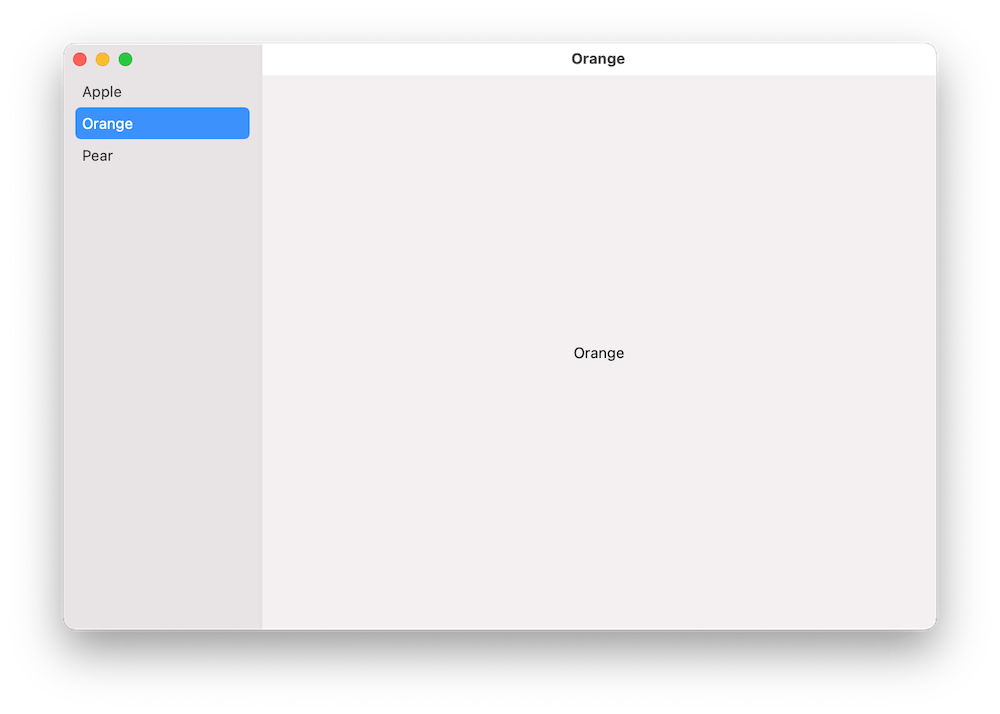
A common UI layout on macOS has a sidebar and detail view side by side. The sidebar contains a list of items, where the selected item is displayed on the right and displays details of it. One would expect that creating such a view hierarchy in SwiftUI should be pretty easy to set up. In this post, we’ll take a look at how to create a basic view with sidebar which supports selection.
Building the layout
We’ll build a simple sample app which shows a list of fruits in the sidebar and when clicking on any of the fruits, the right pane displays the name of the fruit. Therefore, we’ll need a struct representing a fruit, a view model for storing the list of fruits, and a property for storing the selected fruit in the sidebar.
This file contains hidden or bidirectional Unicode text that may be interpreted or compiled differently than what appears below. To review, open the file in an editor that reveals hidden Unicode characters.
Learn more about bidirectional Unicode characters
We can create the layout with NavigationView and NavigationLink. Inside the NavigationView we’ll first add a List where each of the item in the list is represented by a NavigationLink. One of the NavigationLink initializers takes a title, tag, and selection binding. Tag is used for identifying items in the list and setting one of the tag values to the selection binding will make the sidebar to select the item programmatically. Also, we’ll need to set the list style to “sidebar” which adds the appropriate styling to it. Finally, we’ll add a Text element, which acts as a placeholder view when there is no selection. And that is all what we need to do to get going with a view with sidebar and detail pane.
This file contains hidden or bidirectional Unicode text that may be interpreted or compiled differently than what appears below. To review, open the file in an editor that reveals hidden Unicode characters.
Learn more about bidirectional Unicode characters
We used NavigationView and NavigationLink to create a common layout for macOS apps, which features a sidebar with list of items and detailed view on the right. With only a bit of code, we were able to set it up.
Xcode 13 with Swift 5.5 toolchain brings async-await to the Swift language. The aim of this blog post is not to cover everything it brings, but instead concentrate on seeing how completion handler based code can be wrapped with async await. In the end, we have reused existing code but made it available to be called from async task contexts. For demonstrating this, we’ll take my IndexedDataStore Swift package and add async await supported methods to existing completion handler based API.
The IndexedDataStore package has async methods for loading data and storing data.
We can easily add async await methods to these completion hander based methods. We’ll need to use one of the withCheckedXXXContinuation functions. This allows us to add a method to IndexedDataStore class like this:
This file contains hidden or bidirectional Unicode text that may be interpreted or compiled differently than what appears below. To review, open the file in an editor that reveals hidden Unicode characters.
Learn more about bidirectional Unicode characters
What happens here is that we use the async withCheckedContinuation function, which gives us a hook into async await machinery. The function suspends the current task in hand and calls the completion handler with a continuation object. Then we can use our completion handler based async code and resume the suspended task when we are done by calling resume.
When we are dealing with completion handlers which use the Result type or provide an error value, then we’ll need to use withCheckedThrowingContinuation instead. This function provides a continuation object which supports throwing errors. This is exactly the case with the storeData function.
This file contains hidden or bidirectional Unicode text that may be interpreted or compiled differently than what appears below. To review, open the file in an editor that reveals hidden Unicode characters.
Learn more about bidirectional Unicode characters
When it comes to unit-testing then async await makes the testing code so much shorter. We can annotate test functions with the async keyword and do not need to deal with XCTestExpectations.
This file contains hidden or bidirectional Unicode text that may be interpreted or compiled differently than what appears below. To review, open the file in an editor that reveals hidden Unicode characters.
Learn more about bidirectional Unicode characters
One of the really common layouts I have needed to implement with collection view is a simple flow layout but with fixed spacings. Apple provides us UICollectionViewFlowLayout, but the sad part is that it has dynamic spacing between items. Everything is there but not quite. Before UICollectionViewCompositionalLayout, one needs to create a subclass of the flow layout and then fixing spacings manually, which is pretty cumbersome to do. Therefore, let’s instead see what it takes to implement a simple self-sizing flow layout with fixed spacings when using UICollectionViewCompositionalLayout. The end goal is visible below, where we have a single section with 7 items.
Flow layout with fixed spacings.
UICollectionViewCompositionalLayout was created to be a flexible layout which allows building all sorts of layouts quickly. Data in that layout is divided into sections, where each section can have one or more groups of items. Grouping allows creating more complex layouts, where each group describes how items in the group are laid out in relation to each other. But in our case we have something really simple in mind, which is having self-sizing items which we can configure with NSCollectionLayoutSize and passing estimated dimensions. Then the next step is creating NSCollectionLayoutItem with that layout size and with some space around the item. The edge spacing with fixed edges gives us the wanted fixed spacing between items. After that, we’ll create NSCollectionLayoutGroup with horizontal layout direction and with a layout size which takes max width, but height is fitted based on item sizes. Creating layouts like this is so much better compared to subclassing UICollectionViewLayout and then calculating frames one by one. Down below is the configured layout object, which has fixed spacing and items are self-sizing.
This file contains hidden or bidirectional Unicode text that may be interpreted or compiled differently than what appears below. To review, open the file in an editor that reveals hidden Unicode characters.
Learn more about bidirectional Unicode characters
I have numerous times needed to show some sort of collection view which adjusts its height based on the content. Most of the time it has been a dynamic list within some more complex scrollable UI. Therefore, in this post, we’ll take a look at how to set up a collection view which has its height set to the content height. On the screenshot below, we have a collection view with light grey background and two sections.
Collection view with height fitting size.
The approach for making this working is pretty simple, which involves adding a height constraint with the constant value set to collection view content height. Content height can be retrieved from the layout object. The constraint’s constant value can be updated in viewWillLayoutSubviews.
This file contains hidden or bidirectional Unicode text that may be interpreted or compiled differently than what appears below. To review, open the file in an editor that reveals hidden Unicode characters.
Learn more about bidirectional Unicode characters
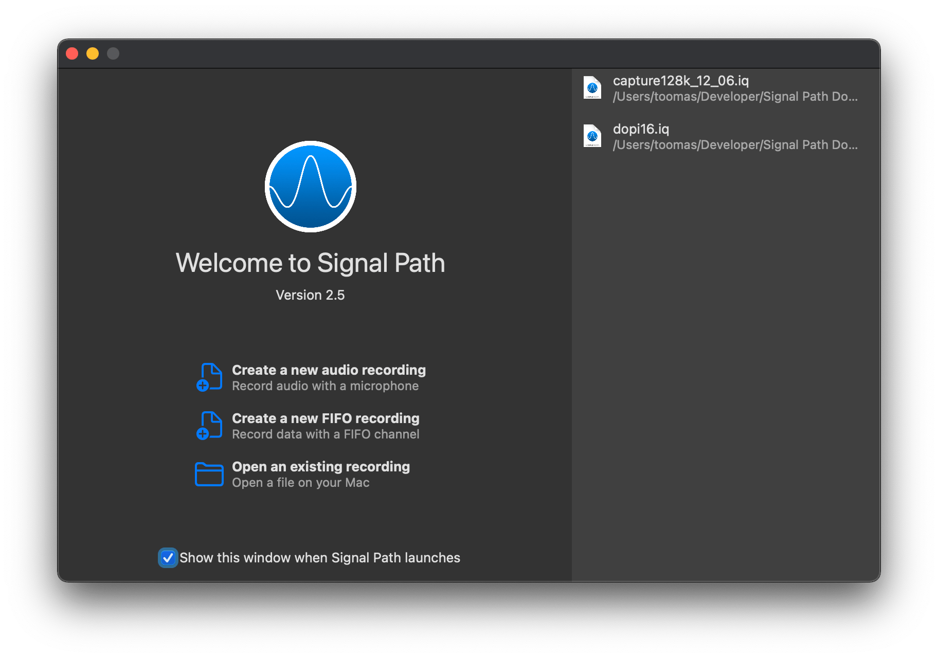
Signal Path version 2.6 is out. Signal Path now supports wav files in addition to the existing raw IQ data format. Audio recordings are now saved as wav files, and it means that audio recordings can be played with other music player apps. Additionally, some audio quality issues related to playing audio recordings were fixed along with it.
WWDC’21 brought us a new protocol named AsyncSequence. As the name stands, it represents a sequence of asynchronous elements. For trying out the new API we’ll build a tiny ThumbnailSequence which takes in a list of image names and by iterating the sequence, we’ll get back scaled thumbnails for those image names one by one. The image scaling runs on a background thread.
The AsyncSequence protocol comes with two associated types: Element and AsyncIterator. Element represents the type which is produced by the sequence, and AsyncIterator is the type responsible for reproducing elements. Same as with sequences, but the main difference is that accessing each of the element is asynchronous. Therefore, for creating a custom type ThumbnailSequence which conforms to AsyncSequence we’ll, set the associated type Element to be equal to UIImage, and implement a custom iterator. ThumbnailSequence initializers takes a list of image names and also defines a max scaled image size. Additionally, we’ll take advantage of the new byPreparingThumbnail(ofSize) async method for scaling the image. Implementation of the async sequence is shown below:
This file contains hidden or bidirectional Unicode text that may be interpreted or compiled differently than what appears below. To review, open the file in an editor that reveals hidden Unicode characters.
Learn more about bidirectional Unicode characters
With a simple async sequence created, we can hook it up to a SwiftUI view. WWDC’21 also brought a new task view modifier, which is invoked when the view appears and cancelled when the view is removed. In the task view modifier we’ll loop over the sequence and one by one load UIImages which then are set to a local images array which in turn is connected to a LazyVStack. The flow we’ll get is that we are loading images one by one, and after every image load we’ll add a new item to the stack.
This file contains hidden or bidirectional Unicode text that may be interpreted or compiled differently than what appears below. To review, open the file in an editor that reveals hidden Unicode characters.
Learn more about bidirectional Unicode characters
The final sample app displaying images in a vertical stack.
Summary
In this post, we took a quick look at the AsyncSequence protocol and created a pipeline which converts image names to scaled image instances one by one. After that, we connected the pipeline to a SwiftUI view.
I have written before about running tests and getting code coverage data for Swift packages in Running tests in Swift package with GitHub actions and Code coverage for Swift Packages with Fastlane. In this post, I am going to revisit the problem and use only tools from Xcode: xcodebuild and xccov. One downside of the approach in Code coverage for Swift Packages with Fastlane is that it required to generate Xcode project which is a deprecated feature in Xcode 12.5, and also it used xcov for forcing code coverage which does not seem to be maintained. Therefore, take two is here. I have a tiny Swift package on GitHub called IndexedDataStore, and we’ll add min code coverage requirement with GitHub action to that package.
Generating xcresult bundle with code coverage information
IndexedDataStore Swift package already has a GitHub action set up which runs tests for macOS and iOS platforms. As we’ll need to run several commands, then we’ll add a new ci-ios-code-coverage.sh script to Scripts folder and then the GitHub action will just invoke that script. This allows to run the same commands easily in the local development environment. Let’s take a look at the first half of the script, which builds and runs tests and generates a result bundle with code coverage information.
This file contains hidden or bidirectional Unicode text that may be interpreted or compiled differently than what appears below. To review, open the file in an editor that reveals hidden Unicode characters.
Learn more about bidirectional Unicode characters
Building and running tests with code coverage enabled.
The pre-clean section of the script makes sure that we do not have files present. The RESULT_BUNDLE is created by xcodebuild and RESULT_JSON later when processing the bundle. Although we could skip deleting the RESULT_JSON then on the other hand RESULT_BUNDLE must always be deleted or otherwise xcodebuild will log a warning and wouldn’t create a new one. The run tests section is separated into two steps: build the package for testing and then running tests without building. An alternative would be to use test argument instead of build-for-testing and test-without-building. The current setup makes it easier to see which step failed: was it a build error or a test error. Code coverage is enabled by passing enableCodeCoverage=YES and specifying a path where the result bundle should be created with resultBundlePath. Other things to note is that we are using set -o pipefail for making sure the script wouldn’t ignore any errors and would fail immediately. Also, we’ll pipe xcodebuild’s output to xcpretty for a bit nicer output in logs. If we run this piece of script then we end up with a CodeCoverage.xcbundle which contains code coverage information in the package root.
Extracting line coverage and forcing min coverage
For extracting code coverage information from the CodeCoverage.xcresult bundle we can use Apple’s xccov command line tool which was built exactly for that. The first step is that we’ll convert CodeCoverage.xcresult to CodeCoverage.json file with xccov.
CodeCoverage.json
The second step is to parse the create json file which lists all the targets and their code coverage. I am not fully sure why, but it contains two targets with the same name IndexedDataStore. One target contains correct code coverage, but the other one is just an empty target but with the same name. Therefore we’ll need to filter out the empty one which luckily is not so difficult with jq command line tool. The jq command first takes an array for key targets and then finds a target which has a name “IndexedDataStore” and value for key executableLines is greater than 0. After that, we can access the key lineCoverage in the found target. Finally, we’ll convert the code coverage to percentages, but as the value is in float then we’ll need to use the bc command.
This file contains hidden or bidirectional Unicode text that may be interpreted or compiled differently than what appears below. To review, open the file in an editor that reveals hidden Unicode characters.
Learn more about bidirectional Unicode characters
After extracting the code coverage, we can proceed with forcing a minimum code coverage. Yet again, we’ll use bc command when comparing two float values and then checking if the comparison was true. If code coverage is too low, we’ll print red error message and in case it was enough, we’ll print success message in green colour.
This file contains hidden or bidirectional Unicode text that may be interpreted or compiled differently than what appears below. To review, open the file in an editor that reveals hidden Unicode characters.
Learn more about bidirectional Unicode characters
Success message when min code coverage is 50%.Error message when min code coverage requirement is 90%.
Calling the script from GitHub action
The created script can now be called from a GitHub action.
This file contains hidden or bidirectional Unicode text that may be interpreted or compiled differently than what appears below. To review, open the file in an editor that reveals hidden Unicode characters.
Learn more about bidirectional Unicode characters
In this blog post we revisited code coverage set up for Swift packages. By using xcodebuild and xccov we created code coverage setup for Swift packages.
WWDC’21 brought new APIs for creating attributed strings. AttributedString is a new value type which provides a type-safe API for dealing with attributes, its also localizable, supports limited amount of Markdown syntax, and can be even archived and unarchived thanks to the Codable support. In this blog post, we’ll take a look at the new API and will compose some attributed strings.
An AttributedString with attributes applied to multiple ranges.
The attributed string visible above contains multiple attributes starting with background color attribute and finishing with a link attribute. In the snippet below we can find different ways how to set attributes: searching for a range, manually creating a range, using AttributedContainer for setting multiple attributes at once, and also setting attributes to the whole string. As this string is displayed in a SwiftUI view then all the used attributes are part of the SwiftUI attribute scope.
This file contains hidden or bidirectional Unicode text that may be interpreted or compiled differently than what appears below. To review, open the file in an editor that reveals hidden Unicode characters.
Learn more about bidirectional Unicode characters
If we would like to see the ranges attributes were set to, we can use the runs API. A single run is a set of attributes shared by a single range. If we print all the runs, in this case 9, then it would look like this:
The {
	NSLanguage = en
	NSPresentationIntent = [paragraph (id 1)]
	SwiftUI.Font = Font(provider: SwiftUI.(unknown context at $7fff5bb7d400).FontBox<SwiftUI.Font.(unknown context at $7fff5bbfdb68).SystemProvider>)
	SwiftUI.BackgroundColor = indigo
}
 quick  {
	SwiftUI.Font = Font(provider: SwiftUI.(unknown context at $7fff5bb7d400).FontBox<SwiftUI.Font.(unknown context at $7fff5bbfdb68).SystemProvider>)
	NSLanguage = en
	NSPresentationIntent = [paragraph (id 1)]
}
brown {
	NSPresentationIntent = [paragraph (id 1)]
	NSLanguage = en
	SwiftUI.Font = Font(provider: SwiftUI.(unknown context at $7fff5bb7d400).FontBox<SwiftUI.Font.(unknown context at $7fff5bbfdb68).SystemProvider>)
	SwiftUI.ForegroundColor = brown
}
 fox  {
	SwiftUI.Font = Font(provider: SwiftUI.(unknown context at $7fff5bb7d400).FontBox<SwiftUI.Font.(unknown context at $7fff5bbfdb68).SystemProvider>)
	NSLanguage = en
	NSPresentationIntent = [paragraph (id 1)]
}
jumps {
	SwiftUI.UnderlineColor = cyan
	NSLanguage = en
	SwiftUI.Kern = 5.0
	SwiftUI.BaselineOffset = 4.0
	SwiftUI.Font = Font(provider: SwiftUI.(unknown context at $7fff5bb7d400).FontBox<SwiftUI.Font.(unknown context at $7fff5bbfdb68).SystemProvider>)
	NSPresentationIntent = [paragraph (id 1)]
	NSUnderline = NSUnderlineStyle(rawValue: 256)
}
 over the  {
	SwiftUI.Font = Font(provider: SwiftUI.(unknown context at $7fff5bb7d400).FontBox<SwiftUI.Font.(unknown context at $7fff5bbfdb68).SystemProvider>)
	NSLanguage = en
	NSPresentationIntent = [paragraph (id 1)]
}
lazy {
	SwiftUI.StrikethroughColor = yellow
	SwiftUI.Font = Font(provider: SwiftUI.(unknown context at $7fff5bb7d400).FontBox<SwiftUI.Font.(unknown context at $7fff5bbfdb68).SystemProvider>)
	NSLanguage = en
	NSPresentationIntent = [paragraph (id 1)]
	NSStrikethrough = NSUnderlineStyle(rawValue: 1)
}
  {
	SwiftUI.Font = Font(provider: SwiftUI.(unknown context at $7fff5bb7d400).FontBox<SwiftUI.Font.(unknown context at $7fff5bbfdb68).SystemProvider>)
	NSLanguage = en
	NSPresentationIntent = [paragraph (id 1)]
}
dog {
	NSLink = https://www.apple.com
	SwiftUI.Font = Font(provider: SwiftUI.(unknown context at $7fff5bb7d400).FontBox<SwiftUI.Font.(unknown context at $7fff5bbfdb68).SystemProvider>)
	NSLanguage = en
	NSPresentationIntent = [paragraph (id 1)]
}
The new AttributedString API also supports custom attributes. Custom attributes need to conform to a AttributeStringKey protocol in bare minimum. But when we would like to benefit from using the custom attribute in Markdown and also allowing to decode and encode it to data with Codable then we would need to conform to MarkdownDecodableAttributedStringKey and CodableAttributedStringKey respectively. In a simple example, let’s create a new attribute named MessageAttribute which can store a value of Message struct with id and value fields. The MessageAttribute needs to define the type it stores and a name used when encoding and decoding. In addition, we’ll need to add a new attribute scope which contains the new attribute. As we intend to use the new attribute in a SwiftUI app then we’ll add swiftUI attributes to the scope as well.
This file contains hidden or bidirectional Unicode text that may be interpreted or compiled differently than what appears below. To review, open the file in an editor that reveals hidden Unicode characters.
Learn more about bidirectional Unicode characters
With this set we can create attributed strings with this attribute either using markdown syntax or adding the attribute manually. Markdown syntax for custom attributes uses caret followed with square brackets and with the content in brackets after that. We also need to make sure to pass custom attribute scope into the AttributedString initializer as well. One thing what I have not figured out is how to create a completely custom appearance for custom attributes in SwiftUI views, like we can do in UIKit views.
This file contains hidden or bidirectional Unicode text that may be interpreted or compiled differently than what appears below. To review, open the file in an editor that reveals hidden Unicode characters.
Learn more about bidirectional Unicode characters
This file contains hidden or bidirectional Unicode text that may be interpreted or compiled differently than what appears below. To review, open the file in an editor that reveals hidden Unicode characters.
Learn more about bidirectional Unicode characters
We took a look on AttributedString, AttributeContainer, AttributeScope, and created attributed strings with the new API. With this knowledge, we got going with the new API and can continue exploring it further. The last thing to mention is that AttributedString can be converted to and from NSAttributedString with breeze.
Buttons in SwiftUI are represented with a Button type. Buttons are easy to create and can be customized either with directly providing a styled label or using a ButtonStyle protocol to define the visual appearance. Quite often we can find ourselves in a situation where we need a button which has a title and also a subtitle. In this blog post I am gonna show how to create a SubtitledButton which does exactly that. We’ll also use ButtonStyle protocol to change the appearance of the button. Using buttonStyle view modifier it is easy to change the appearance of the SubtitledButton as sometimes we want to present it in different ways. In the example below we can see two SubtitledButtons where one has a plain and second a custom appearance.
A SwiftUI view with two SubtitledButtons with different styles.
This file contains hidden or bidirectional Unicode text that may be interpreted or compiled differently than what appears below. To review, open the file in an editor that reveals hidden Unicode characters.
Learn more about bidirectional Unicode characters
Let’s now take a look at the SubtitledButton. It is a SwiftUI view which just incorporates a SwiftUI button with two Text values. The first Text represents the title and the second Text represents the subtitle. The title font can be changed by applying a font view modifier on the SubtitledButton. In the example below, the subtitle font is currently not configurable, although we could add another argument if needed. As the subtitle already has font view modifier applied then setting a font modifier on the whole button it does not override it.
This file contains hidden or bidirectional Unicode text that may be interpreted or compiled differently than what appears below. To review, open the file in an editor that reveals hidden Unicode characters.
Learn more about bidirectional Unicode characters
ButtonStyle is a protocol in SwiftUI which is used for custom button appearances. In the makeBody function we can apply view modifiers to the label where the label is a view created when the Button was created.
This file contains hidden or bidirectional Unicode text that may be interpreted or compiled differently than what appears below. To review, open the file in an editor that reveals hidden Unicode characters.
Learn more about bidirectional Unicode characters


 Augmented Code