Categories
Swift

Using XCTExpectFailure in XCTests

XCTExpectFailure is a function in XCTest framework which tackles the problem of managing failing tests. Test which are broken, but not ready to be fixed. An example use-case is when refactoring code which causes some tests to fail but since the whole refactoring is far for complete we might want to hold off fixing tests now because everything can change yet again. This is when we can use XCTExpectFailure function to mark the entire test or just a code block in a test as an expected failure. Every time we run tests, the test code runs but if it fails, the expected failure message is added to the test result. In addition, this failure does not fail the entire suit. This is important when there is a CI pipeline set up which requires that there are no failing tests. In reality the test is failing, but we have marked it to be OK for now. Something to keep in mind is that XCTest framework also has a XCTSkip functions. The main difference between XCTExpectFailure and XCTSkip is that the latter stops the test code execution immediately, where the former always runs the test. Therefore, XCTExpectFailure allows us to see when the test is passing again. Might be that after a lot of refactorings, the code is in a shape again where it produces expected output.

The simplest usage of XCTExpectFailure takes no arguments. If an error is thrown inside the test then the test is marked as an expected failure, but if the test does not throw any errors then XCTExpectFailure fails the test. This is due to the fact that XCTExpectFailure is strict by default strict. The strict mode means that a failure must be happening in the test or otherwise XCTExpectFailure fails the tests. When taking that refactoring example again, then that is useful for removing XCTExpectFailure calls as soon as the test starts passing. If non-strict mode is used, then the test is marked as passed if no failures are happening, although XCTExpectFailure is used within that test. An example use-case is that we’ll clean up all XCTExpectFailures at the end of the refactoring cycle when all the tests are passing again. In addition to the strict flag, there is also enabled flag which can be used for disabling the XCTExpectFailure based on environment or any other reason on run-time. Another thing what we can configure is what kind of failure is observed by passing in an issue matcher closure, where we can inspect the issue and decide if it should be considered as an expected failure or not in fine detail. An example could be that there is a very specific error thrown which we want to consider as expected failure, but all the other failures should lead to failing the test itself.

Different usages of the XCTExpectFailure are shown below.

XCTExpectFailure("Will be fixed in ticket XXX")
XCTExpectFailure("Will be fixed in ticket XXX", strict: false)
XCTExpectFailure("Will be fixed in ticket XXX", enabled: true, strict: false) {
    XCTAssertEqual(validateData(), false)
}
XCTExpectFailure("Will be fixed in ticket XXX", enabled: false, strict: false, failingBlock: {
    XCTAssertEqual(validateData(), false)
}, issueMatcher: { issue in
    issue.type == .assertionFailure
})

If this was helpful, please let me know on Mastodon@toomasvahter or Twitter @toomasvahter. Feel free to subscribe to RSS feed. Thank you for reading.

Categories
Swift Swift Package

Creating a signed Swift package collection

Swift 5.5 brought us a new feature which allows creating Swift package collections (SE-0291). In this blog post we’ll go through required steps and create a package collection with Augmented Code packages. At the time of writing, there is only one package: IndexedDataStore.

Install Swift Package Collection Generator

First, we’ll need to install a tool which Apple created for package collections. It is called Swift Package Collection Generator. We’ll need to clone the repository, build it and then either using the built tools in their current location or also installing them to /usr/local/bin for easy access later on.


git clone https://github.com/apple/swift-package-collection-generator.git
cd swift-package-collection-generator
swift build --configuration release
install .build/release/package-collection-generate /usr/local/bin/package-collection-generate
install .build/release/package-collection-diff /usr/local/bin/package-collection-diff
install .build/release/package-collection-sign /usr/local/bin/package-collection-sign
install .build/release/package-collection-validate /usr/local/bin/package-collection-validate

Collection description in JSON

When the tool is installed, then the next step is to create a definition for the collection. Supported keys in that JSON file are available here: PackageCollectionsModel/Formats/v1.md.

{
  "name": "Augmented Code Collection",
  "overview": "Packages created by Augmented Code",
  "author": {
    "name": "Toomas Vahter"
  },
  "packages": [
    { "url": "https://github.com/laevandus/IndexedDataStore.git" }
  ]
}

Next step is to feed that JSON into the package-collection-generate tool which fetches additional metadata for these packages (–auth-token argument with GitHub personal access token must be used if the GitHub access is not already set up with SSH).

package-collection-generate input.json output.json --verbose --pretty-printed

The output.json looks like this:

{
  "formatVersion" : "1.0",
  "generatedAt" : "2022-01-08T07:05:44Z",
  "generatedBy" : {
    "name" : "Toomas Vahter"
  },
  "name" : "Augmented Code Collection",
  "overview" : "Packages created by Augmented Code",
  "packages" : [
    {
      "keywords" : [

      ],
      "license" : {
        "name" : "MIT",
        "url" : "https://raw.githubusercontent.com/laevandus/IndexedDataStore/main/LICENSE"
      },
      "readmeURL" : "https://raw.githubusercontent.com/laevandus/IndexedDataStore/main/README.md",
      "url" : "https://github.com/laevandus/IndexedDataStore.git",
      "versions" : [
        {
// … version descriptions which are pretty long

Signing the package collection

Before we go ahead and sign the package collection, we’ll need to prepare certificates. Open Keychain Access and then from the main menu Keychain Access > Certificate Assistant > Request Certificate from a Certificate Authority. Use your email and name and check the “Saved to disk” option. The next step is uploading the certificate request file to Apple. Uploading is done in Certificates, Identifiers & Profiles by tapping on the plus button and selecting Swift Package Collection Certificate. After clicking on the Continue button, we can upload the certificate request file we created with the Keychain Access. After that, we’ll download the certificate and double-clicking on the certificate file adds it to Keychain Access. Before we can sign the collection, the next step is exporting the private key from Keychain Access. Look for “Swift Package Collection” certificate, expand the item which reveals the private key, right-click on it and export it (set a password). Keychain Access creates .p12 file, which we’ll need to convert to .pem (set a password when asked). In the example below, I saved the exported private key to swift_package.p12.

openssl pkcs12 -nocerts -in swift_package.p12 -out swift_package.pem
openssl rsa -in swift_package.pem -out swift_package_rsa.pem

Now we have ready for signing the package collection as we have .cer and .pem files prepared.

package-collection-sign output.json output-signed.json swift_package_rsa.pem swift_package.cer

When the command is successful, we have an output-signed.json file, which we can share and add to Xcode.

Adding a new package collection

A new package collection can be added in Xcode by navigating to File > Add Packages sheet and clicking on the plus button and selecting Add Swift Package Collection. Xcode asks for a https URL of the collection. One option is to upload the signed collection json file to GitHub and then passing in an URL to the raw representation of the file. The URL to Augmented Code’s package collection is available here.

Package collection view in Xcode showing added Augmented Code Packages collection.
Package collection view in Xcode.

If this was helpful, please let me know on Mastodon@toomasvahter or Twitter @toomasvahter. Feel free to subscribe to RSS feed. Thank you for reading.
Categories
CoreData iOS macOS Swift SwiftUI UIKit

Most visited blog posts in 2021

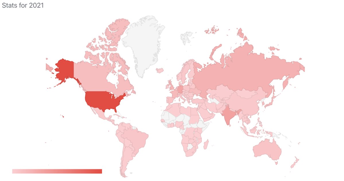
Another year spent on writing blog posts. Let’s see which were the most read blog posts in 2021.

Top 10 written on any year

  1. Opening hyperlinks in UILabel on iOS (December 20, 2020)
  2. Using an image picker in SwiftUI (November 22, 2020)
  3. Using SwiftUI previews for UIKit views (June 7, 2020)
  4. Resizing UIImages with aspect fill on iOS (October 25, 2020)
  5. Alert and LocalizedError in SwiftUI (March 1, 2020)
  6. Adding custom attribute to NSAttributedString on iOS (November 10, 2019)
  7. Using CoreData with SwiftUI (January 19, 2020)
  8. Text input in UITableView (November 4, 2018)
  9. Adding SwiftLint to a project in Xcode (September 13, 2020)
  10. @StateObject and MVVM in SwiftUI (August 2, 2020)

Top 3 written in 2021

  1. Measurement, Unit, Dimension, and MeasurementFormatter on iOS (January 18, 2021)
  2. Running tests in Swift package with GitHub actions (April 26, 2021)
  3. Exploring AttributedString and custom attributes (June 21, 2021)
  4. Code coverage for Swift Packages with Fastlane (April 12, 2021)
  5. Sidebar layout on macOS in SwiftUI (September 13, 2021)

If this was helpful, please let me know on Mastodon@toomasvahter or Twitter @toomasvahter. Feel free to subscribe to RSS feed. Thank you for reading.

Categories
Foundation iOS macOS Swift

Sorting data with KeyPathComparator

KeyPathComparator was added to Foundation in iOS 15 and macOS 12. The KeyPathComparator is used by defining a key path which is used for fetching a value for comparison. Values are then compared with a SortComparator. In the simplest form we do not need to create the SortComparator ourselves and instead, ComparableComparator is created automatically. But if the value is String then String.StandardComparator.localizedStandard is used instead of ComparableComparator. All in all it is pretty much the similar to NSSortDescriptor which was used for sorting NSArray and NSMutableArray. New comparator types on the other hand can be used with many more types.

Using KeyPathComparator

As an example, let’s take a case of having an array of Player types where each player has played two rounds and therefore have two different scores. Additionally, each player type stores a competitor number as well.

struct Player {
let competitorNumber: Int
let round1: Int
let round2: Int
}
let players = [
Player(competitorNumber: 1, round1: 75, round2: 69),
Player(competitorNumber: 2, round1: 31, round2: 93),
Player(competitorNumber: 3, round1: 91, round2: 88),
Player(competitorNumber: 4, round1: 84, round2: 62),
Player(competitorNumber: 5, round1: 88, round2: 20),
]
view raw Player.swift hosted with ❤ by GitHub

If we want to sort the array of players by first and second round scores then it goes like this (note that order is set to reverse which gives us descending order):

let round1 = players.sorted(using: KeyPathComparator(\.round1, order: .reverse))
/*
player3 round1=91 round2=88
player5 round1=88 round2=20
player4 round1=84 round2=62
player1 round1=75 round2=69
player2 round1=31 round2=93
*/
let round2 = players.sorted(using: KeyPathComparator(\.round2, order: .reverse))
/*
player2 round1=31 round2=93
player3 round1=91 round2=88
player1 round1=75 round2=69
player4 round1=84 round2=62
player5 round1=88 round2=20
*/
view raw Sorted.swift hosted with ❤ by GitHub

Here we can see that sequences have sorted(using:) functions which take in either one comparator or several. An example of using several comparators is sorting the same players array by the highest score first and if two or more players hace the same highest score, then sorting by the worst score from these two rounds.

extension Player {
var bestRound: Int {
max(round1, round2)
}
var worstRound: Int {
min(round1, round2)
}
}
let maxScore = players.sorted(using: [
KeyPathComparator(\.bestRound, order: .reverse),
KeyPathComparator(\.worstRound, order: .reverse)
])
/*
Sorted by max score
player2 round1=31 round2=93
player3 round1=91 round2=88 <– equal best score
player5 round1=88 round2=20 <– equal best score
player4 round1=84 round2=62
player1 round1=75 round2=69
*/

If this was helpful, please let me know on Mastodon@toomasvahter or Twitter @toomasvahter. Feel free to subscribe to RSS feed. Thank you for reading.

Categories
Swift SwiftUI

Gradient text in SwiftUI

If we want to spice up the user interface, then we can make some titles in the app to use gradient colours. In WWDC’21 Apple introduced an API for making gradient text styles easy to create. The .foregroundStyle() view modifier takes in a type which conforms to ShapeStyle protocol. One of these types are gradient types in SwiftUI. Therefore, creating a fun gradient text is a matter of creating a text and applying a foregroundStyle view modifier with a gradient on it.

let gradientColors: [Color] = [.purple, .blue, .cyan, .green, .yellow, .orange, .red]
Text("Hello, world!")
.font(.system(size: 60))
.foregroundStyle(
.linearGradient(
colors: gradientColors,
startPoint: .leading,
endPoint: .trailing
)
)
Text("Hello, world!")
.font(.system(size: 60))
.foregroundStyle(
.ellipticalGradient(
colors: gradientColors
)
)
Text("Hello, world!")
.font(.system(size: 60))
.foregroundStyle(
.conicGradient(
colors: gradientColors,
center: .center
)
)
Text("Hello, world!")
.font(.system(size: 60))
.foregroundStyle(
.radialGradient(
colors: gradientColors,
center: .center,
startRadius: 50,
endRadius: 100
)
)
view raw Text.swift hosted with ❤ by GitHub

The new view modifier is great, but it is iOS 15+, macOS 12.0+. Another way for achieving this result is recreating it ourselves. This involves in overlaying the text with gradient and then masking it with the text.

Text("Hello, world!")
.font(.system(size: 60))
.myForegroundStyle(
LinearGradient(
colors: gradientColors,
startPoint: .leading,
endPoint: .trailing
)
)
.padding()
.background(.black)
extension View {
func myForegroundStyle<Content: View>(_ content: Content) -> some View {
self.overlay(content).mask(self)
}
}
view raw Mask.swift hosted with ❤ by GitHub

If this was helpful, please let me know on Mastodon@toomasvahter or Twitter @toomasvahter. Feel free to subscribe to RSS feed. Thank you for reading.

Categories
iOS macOS Swift SwiftUI

Focusing views in SwiftUI

WWDC’21 introduced APIs for managing focus in SwiftUI. When dealing with multiple focusable views, we can create an enum for representing these and use the new @FocusState property wrapper along with focused() view modifier, where each of the focusable view binds its focus to an enum case. This can look like this:

struct ContentView: View {
@StateObject var viewModel = ViewModel()
enum FormEntry: Hashable {
case lastName, firstName, email
}
@FocusState var focused: FormEntry?
var body: some View {
VStack {
Text("Application")
TextField("Last Name", text: $viewModel.lastName, prompt: nil)
.focused($focused, equals: .lastName)
TextField("First Name", text: $viewModel.firstName, prompt: nil)
.focused($focused, equals: .firstName)
TextField("Email", text: $viewModel.email, prompt: nil)
.focused($focused, equals: .email)
Button("Reset") {
viewModel.reset()
focused = .lastName
}
}
.frame(idealWidth: 600)
.padding()
}
}

In this example we have FormEntry enum which represents focusable elements in the view. Each of the view has a focused() view modifier, which binds the current focus state to the text field if it matches with the enum case. Meaning, setting focused property to FormEntry.email will move the focus to the email text field. It works the other way around as well. If we tap on the email text field, SwiftUI will set the focused property value to FormEntry.email.

Sometimes we just want to control the focus only once. Let’s take an example use case where we enter an order id and after tapping a search button we would like to remove the focus from the order id text field. In this case, we can just use a boolean property and bind the focus state boolean property to the text field’s focused() view modifier. Setting the property value to false in the button action will tell SwiftUI to resign focus from the text field.

struct ContentView: View {
@StateObject var viewModel = ViewModel()
@FocusState var isOrderIDFocused: Bool
var body: some View {
VStack {
Text("Orders")
TextField("Order ID", text: $viewModel.orderId, prompt: nil)
.focused($isOrderIDFocused)
Button("Search") {
viewModel.search()
isOrderIDFocused = false
}
}
.padding()
}
}

If this was helpful, please let me know on Mastodon@toomasvahter or Twitter @toomasvahter. Feel free to subscribe to RSS feed. Thank you for reading.

Categories
iOS Swift UIKit

Presenting sheets with UISheetPresentationController

Another welcomed change what WWDC’21 brought us was UISheetPresentationController. The sheet presentation controller makes it extremely easy to present sheets like the ones which just take a half of the screen. It allows us to configure the sheet size with detents where there are currently two of them: medium and large. The medium detent means that the sheet takes about the half of the screen height, and the large detent means that the full screen is covered with the sheet. Additionally, we can configure some other visual aspects like corner radius and if the grabber should be visible. The detents property is an array, and we can set both medium and large to it, which enables to dynamically change the size either by dragging or controlling the size programmatically by setting the selectedDetentIdentifier property. And if we would like to animate the change, then the property needs to be set within the animateChanges closure.

let sheetViewController = SheetViewController()
if let sheetController = sheetViewController.sheetPresentationController {
sheetController.detents = [.medium(), .large()]
sheetController.preferredCornerRadius = 4
sheetController.prefersGrabberVisible = true
}
present(sheetViewController, animated: true, completion: nil)
view raw Sheet.swift hosted with ❤ by GitHub

Example Project

SheetPresentationController (Xcode 13.1)

If this was helpful, please let me know on Mastodon@toomasvahter or Twitter @toomasvahter. Feel free to subscribe to RSS feed. Thank you for reading.

Categories
iOS Swift UIKit

Getting started with UIButton.Configuration on iOS

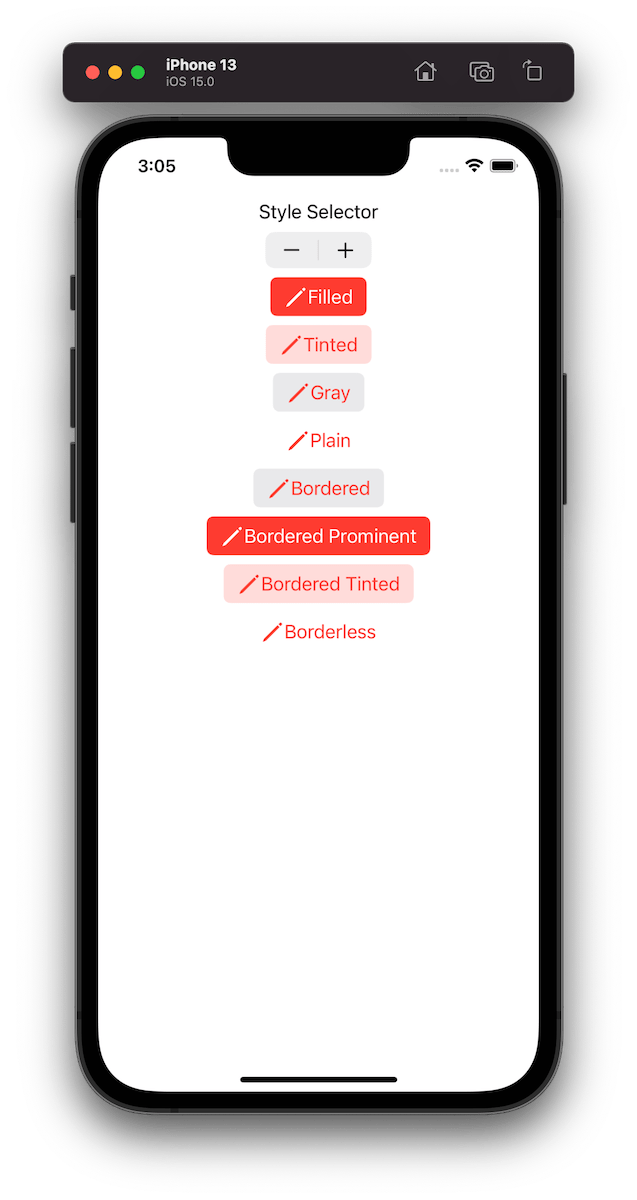
UIButton.Configuration API was introduced in WWDC’21 with a goal of making it easier to create buttons with many styles, sizes, colours etc. Configurations API comes with functions for creating common button configurations: filled(), bordered(), borderedProminent(), borderedTinted(), borderless(), plain(), gray(), tinted(). These configurations can be further customized. One benefit of the API is that it will take care of different states of the button like highlighted, disabled, hovered and so on and applies different styling based on the state. Most of the time that is all we needed, but additionally we can also adjust styling for different states as well through the configurationUpdateHandler().

The basic usage of the API involves in creating a UIButton.Configuration object and passing it to UIButton init function of setting it to UIButton’s configuration property. The button will then apply the configuration. In WWDC session it was emphasized that applying a new configuration is cheap and optimized behind the scenes therefore we should never compare the new configuration with the one currently applied on the button.

var configuration = UIButton.Configuration.filled() // or .plain() or something else
configuration.baseBackgroundColor = .systemCyan
configuration.buttonSize = .large
configuration.cornerStyle = .dynamic
configuration.showsActivityIndicator = false
configuration.image = UIImage(systemName: "pencil")
configuration.imagePlacement = .trailing
configuration.imagePadding = 6
configuration.title = "Title"
configuration.titleAlignment = .leading
configuration.titlePadding = 10
configuration.subtitle = "Subtitle"
// and more
button.configuration = configuration
// or
let button2 = UIButton(configuration: configuration, primaryAction: action)
Example of button configurations when the tint colour is set to red.

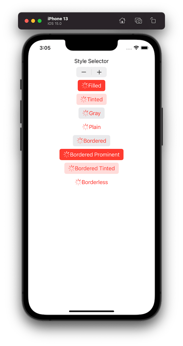
For getting a better overview on how default configurations change based on the properties, we set on UIButton.Configuration type, I built a simple preview app which takes configurations: filled(), bordered(), borderedProminent(), borderedTinted(), borderless(), plain(), gray(), tinted() and applies some modifications on these. The results are shown below.

private func configurations(forStyleIndex index: Int) -> [UIButton.Configuration] {
var configuration1 = UIButton.Configuration.filled()
configuration1.title = "Filled"
var configuration2 = UIButton.Configuration.tinted()
configuration2.title = "Tinted"
var configuration3 = UIButton.Configuration.gray()
configuration3.title = "Gray"
var configuration4 = UIButton.Configuration.plain()
configuration4.title = "Plain"
var configuration5 = UIButton.Configuration.bordered()
configuration5.title = "Bordered"
var configuration6 = UIButton.Configuration.borderedProminent()
configuration6.title = "Bordered Prominent"
var configuration7 = UIButton.Configuration.borderedTinted()
configuration7.title = "Bordered Tinted"
var configuration8 = UIButton.Configuration.borderless()
configuration8.title = "Borderless"
let all: [UIButton.Configuration] = [configuration1, configuration2, configuration3, configuration4, configuration5, configuration6, configuration7, configuration8]
.map({ original in
var configuration = original
switch index {
case 0:
break
case 1:
configuration.subtitle = "Subtitle"
case 2:
configuration.image = UIImage(systemName: "pencil")
case 3:
configuration.buttonSize = .large
case 4:
configuration.image = UIImage(systemName: "pencil")
configuration.imagePlacement = .trailing
case 5:
configuration.baseBackgroundColor = .systemBlue
case 6:
configuration.buttonSize = .mini
case 7:
configuration.showsActivityIndicator = true
case 8:
configuration.baseBackgroundColor = .systemCyan
configuration.buttonSize = .large
configuration.cornerStyle = .dynamic
configuration.showsActivityIndicator = false
configuration.image = UIImage(systemName: "pencil")
configuration.imagePlacement = .trailing
configuration.imagePadding = 6
configuration.titleAlignment = .leading
configuration.titlePadding = 10
configuration.subtitle = "Subtitle"
default:
fatalError("Implement")
}
return configuration
})
return all
}
view raw Buttons.swift hosted with ❤ by GitHub

Example Project

UIButtonConfigurationPreview (Xcode 13)

If this was helpful, please let me know on Mastodon@toomasvahter or Twitter @toomasvahter. Feel free to subscribe to RSS feed. Thank you for reading.

Categories
iOS Swift SwiftUI

Tab view in SwiftUI

TabView is a container view which enables navigating between multiple flows by selecting one of the items on the tab bar. Tapping on a tab item replaces the visible view with a view associated with the item. Tab view is set up by creating views which have tab items attached. Tab items are created with the tabItem() view modifier, which supports setting a text and an image. In addition, there is a badge() view modifier if we would like to show a badge on top of the item.

Tab view also supports selection handling. Selection handling is needed when we need to programmatically control which tab is selected. For that, we’ll need to choose a type which represents the selection. The only requirement is that the type is Hashable. Therefore, we can use an enum with raw values and have a clear and readable representation of tabs. Next, all the views managed the tab view need to have a tag set with one of the enum cases. Then we can create a binding with the selection type and pass it into TabView and SwiftUI will select the tab view item which has a tag equal to the selection. Just to reiterate that we can use any other type for representing the selection, as long as it conforms to Hashable. Could be just integers as well.

struct ContentView: View {
@State private var selection: Tab = .schedule
enum Tab: Int {
case conversations, schedule, settings
}
var body: some View {
TabView(selection: $selection) {
ConversationListView()
.badge(1)
.tabItem {
Image(systemName: "bubble.left.and.bubble.right.fill")
Text("Messages")
}
.tag(Tab.conversations)
ScheduleView()
.tabItem {
Image(systemName: "clock.fill")
Text("Schedule")
}
.tag(Tab.schedule)
SettingsView()
.tabItem {
Image(systemName: "gearshape.fill")
Text("Settings")
}
.tag(Tab.settings)
}
}
}
view raw TabView.swift hosted with ❤ by GitHub
iOSsimulator with an app which shows tab view with 3 items: messages with a badge showing 1, schedule, and settings.

If this was helpful, please let me know on Mastodon@toomasvahter or Twitter @toomasvahter. Feel free to subscribe to RSS feed. Thank you for reading.

Categories
iOS macOS Swift SwiftUI

Structuring platform specific code in SwiftUI

Xcode provides a cross-platform app template in SwiftUI which can be built for macOS and iOS. This template includes a Shared folder which is meant for code used both on macOS and iOS. Many SwiftUI types and functions work both on macOS and iOS but along with developing an app we’ll encounter cases where we need to specialize per platform. When I was building a multiplatform app then the very first thing I encountered was list styles. On macOS I wanted to use a different list style than on iOS (SidebarListStyle vs GroupedListStyle). Therefore, let’s take this as an example and see what are the ways how to handle this.

Compile time checks

The first way is to add compile time checks directly to the UI code. Swift provides #if os() for branching out code which should only be compiled on the specified platform. One downside of this approach is that it can make the code pretty long in the view body when we have multiple platform specific branches. In those cases, it might make sense to have separate functions which just contain the #if os() branch. But in the example below, we just have a listStyle view modifier, which is configured differently on macOS and iOS.

struct ContentView: View {
@State var items = [1, 2, 3]
var body: some View {
List {
ForEach(items, id: \.self) { item in
Text("\(item)")
}
}
#if os(macOS)
.listStyle(SidebarListStyle())
#else
.listStyle(GroupedListStyle())
#endif
}
}

Platform specific extensions

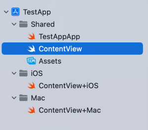
Another way for handling platform specific code is to create a separate files which are only included to platform targets. In this concrete case, those files contain a view extension and define a contentListStyle property which returns a list style. ContentView.swift file can access the property and when we are building for macOS then ContentView+Mac.swift is compiled and when building for iOS then ContentView+iOS.swift. I would recommend creating separate folders for platform specific code. For example, the project folders could be Shared, Mac, and iOS. Separate folders give a clear overview where the platform specific code is.

struct ContentView: View {
@State var items = [1, 2, 3]
var body: some View {
List {
ForEach(items, id: \.self) { item in
Text("\(item)")
}
}
.listStyle(contentListStyle)
}
}
extension ContentView {
var contentListStyle: GroupedListStyle {
return GroupedListStyle()
}
}
extension ContentView {
var contentListStyle: SidebarListStyle {
return SidebarListStyle()
}
}
Project structure in Xcode with Shared, Mac, and iOS folders for managing platform specific code.
Project structure with Shared, Mac, and iOS folders.

Summary

SwiftUI code can be shared most of the time between platforms. Sometimes we’ll need to configure the shared code per platform or use platform specific APIs. Hopefully those two approaches will give some flexibility on handling such code.

If this was helpful, please let me know on Mastodon@toomasvahter or Twitter @toomasvahter. Feel free to subscribe to RSS feed. Thank you for reading.