I have been writing a new blog post at least every second week and therefore in 2020 I have published total of 27 blog posts. It is time to take a look back on the 2020 and see which blog posts were the most popular ones. I am just looking at the total count of views per blog post.
Lots of apps need to deal with selecting or taking photos but in SwiftUI we’ll need to wrap UIKit’s UIImagePickerController with a SwiftUI view.
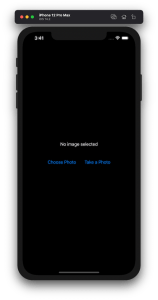
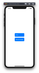
Example application presenting a UI for opening image picker.
Wrapping UIImagePickerController in SwiftUI
UIImagePickerController has been available since iOS 2 and it supports both selecting photos from photo albums and taking new photos with a camera. If we would like to use an image picker in a SwiftUI view then the first step is wrapping this view controller with a SwiftUI view. UIViewControllerRepresentable protocol defines required methods for representing an UIViewController. We’ll provide a completion handler for passing back the selected image. We need to implement a coordinator which acts as a delegate for the UIImagePickerController. When the imagePickerController(_:didFinishPickingMediaWithInfo:) delegate method is called, then we can call the completion handler and handle the selected image in a SwiftUI view. As UIImagePickerController supports both the camera function and accessing existing photos, we’ll add a source type property for configuring which mode to use.
This file contains hidden or bidirectional Unicode text that may be interpreted or compiled differently than what appears below. To review, open the file in an editor that reveals hidden Unicode characters.
Learn more about bidirectional Unicode characters
ImagePicker view which wraps UIImagePickerController.
The ImagePicker can then be presented with the fullScreenCover view modifier. The presented state and the selected image is stored in the view’s view model. When the image picker is displayed and an image is selected, the completion handler is called and the selectedImage property is updated in the view model which in turn reloads the SwiftUI view.
This file contains hidden or bidirectional Unicode text that may be interpreted or compiled differently than what appears below. To review, open the file in an editor that reveals hidden Unicode characters.
Learn more about bidirectional Unicode characters
This file contains hidden or bidirectional Unicode text that may be interpreted or compiled differently than what appears below. To review, open the file in an editor that reveals hidden Unicode characters.
Learn more about bidirectional Unicode characters
A SwiftUI view containing an image preview and buttons for taking or choosing a photo.
Summary
Wrapping UIKit views with a SwiftUI view is fairly simple. The coordinator object is a perfect fit for handling delegate methods which UIKit views often provide. As we saw, adding a SwiftUI compatible image picker was pretty easy to do. Please check the full example project on GitHub.
In model-view-view model (MVVM) architecture the view model observes the model and provides data for the view by transforming it when needed. When the user interacts with the view and changes the data in it then the view model’s responsibility is to propagate those mutations back to the model object. Therefore, the important part in MVVM is how to manage data flows between objects. This time we’ll take a look on observing key-value observing (KVO) compatible model objects with Combine framework in SwiftUI view. The example view what we’ll build looks like this:
SwiftUI view which enables editing package related information and displays a summary of the package.
Model layer
The model object represents a package which contains information about the recipient, the sender, and the contents. The recipient and the sender are represented by a Person object which includes a first name, a last name, and a postal address. The contents is an array of immutable PackageContent objects. In Swift, we can use KVO by specifying @objc and dynamic modifiers on properties. Dynamic means that method dispatch is using objective-c runtime and therefore all the types must be representable in objective-c runtime. This immediately adds restrictions to the types we can use. When writing pure Swift code I do not recommend using KVO but sometimes we just need to use it. One example is NSManagedObject from the CoreData framework. But in this app we are not dealing with NSManagedObject but with a simple NSObject subclass instead.
This file contains hidden or bidirectional Unicode text that may be interpreted or compiled differently than what appears below. To review, open the file in an editor that reveals hidden Unicode characters.
Learn more about bidirectional Unicode characters
The view object is responsible for describing the UI and rendering data represented by the view model. We have a simple form for modifying the recipient’s first name, last name, and the street name (for keeping this UI simple I left out all the other postal address related properties). At the bottom of the view we have a text object which just describes the package and a button for adding new items to the package’s contents. Whenever any of the package’s properties change, the view needs to reload. View reload is done through the @StateObject property wrapper (read mode about observing view models in MVVM in SwiftUI and @StateObject and MVVM in SwiftUI).
This file contains hidden or bidirectional Unicode text that may be interpreted or compiled differently than what appears below. To review, open the file in an editor that reveals hidden Unicode characters.
Learn more about bidirectional Unicode characters
The view model’s responsibility is to observe the model object and propagating view changes to the model. It acts as a transformation layer where we can transform any data in the model to anything suitable for displaying. In the example below we are reading CNPostalAddress and only returning street name and reading multiple properties and returning a summary string. View models make it easy to contain such logic and also make it more easy to test.
Foundation framework defines a publisher named NSObject.KeyValueObservingPublisher which can be used for observing KVO compatible properties. One of the approaches is to use this publisher and then bind the model changes to the view model’s own property. Combine framework provides a convenient assign operator which takes a target publisher as an argument. Convenient because we can connect it with @Published properties in the view model. @Published properties automatically notify the ObservableObject’s objectWillChange publisher which is observed by a SwiftUI view. As soon as the property changes, SwiftUI view picks up the change and reloads itself. Note that we’ll also need to propagate changes back to the model when user updates the view and therfore the @Published property. This can be achieved by connecting property’s publisher with dropFirst, removeDuplicates and assign publishers where the latter assigns the value to the model object. Drop first is used for ignoring the initial value of the property. One downside is that now we can have the same information both in the view model and in the model. But on the other hand it makes the data streams easy to read and no need to have extra observation for triggering the view reload by manually calling send() on the objectWillChange publisher.
This file contains hidden or bidirectional Unicode text that may be interpreted or compiled differently than what appears below. To review, open the file in an editor that reveals hidden Unicode characters.
Learn more about bidirectional Unicode characters
Another approach what we can use is providing properties in the view model which return a Binding. This allows us to write the transformation code inside the get and set closures. This is what we have done with the street property. Note that we’ll still need to observe the model as the model can change at any point. Binding just provides a way of accessing the value. Therefore, we’ll need to set up an observation and calling send() on the objectWillChange publisher.
This file contains hidden or bidirectional Unicode text that may be interpreted or compiled differently than what appears below. To review, open the file in an editor that reveals hidden Unicode characters.
Learn more about bidirectional Unicode characters
If we go back to the SwiftUI view and connect all the properties then the full implementation of the view model looks like this:
This file contains hidden or bidirectional Unicode text that may be interpreted or compiled differently than what appears below. To review, open the file in an editor that reveals hidden Unicode characters.
Learn more about bidirectional Unicode characters
Key-value observing is getting less and less used after the introduction of Combine and SwiftUI. But there are still times when we need to connect good old KVO compatible NSObject subclasses with a SwiftUI view. Therefore, it is good to know how to handle KVO in SwiftUI views as well.
Shape protocol in SwiftUI is used for defining views which render custom shapes. Shapes have one required method which takes in a rect and returns a Path. In addition to view protocol, shape conforms to Animatable protocol as well. Therefore we can quite easily make our custom shape to animate from one state to another. We’ll use two parameters for defining our Wave shape: amplitude and frequency. Amplitude dictates the height of the wave and frequency the distance between wave peaks.
Animating wave shape.
SwiftUI view displaying an animatable wave shape
Let’s take a look on an example view which displays custom Wave shape. We’ll use @State property wrappers for storing amplitude and frequency because we want to change those values when running the app. Those properties are updated with random values when pressing a button. The wave has blue fill color, fixed height, and basic easeInOut animation. The animation is used when amplitude and/or frequency change.
This file contains hidden or bidirectional Unicode text that may be interpreted or compiled differently than what appears below. To review, open the file in an editor that reveals hidden Unicode characters.
Learn more about bidirectional Unicode characters
Content view rendering a wave shape with a button starting an animation.
Animatable wave shape
Like mentioned in the introduction, the Shape protocol defines a required method which has a rect argument and returns a Path. The path starts from the top left edge. Sine function is used for calculating y coordinates for every x coordinate with a 1 point step. Right, bottom and left edges are just straight lines.
Animatable protocol defines an animatableData property and because we have two parameters (amplitude and frequency) we’ll need to use AnimatablePair type. If there would be more parameters then AnimatablePair should contain one or more AnimatablePair types (and so on). Note that values in animatableData must conform to VectorArithmetic protocol which Double type already does.
When animation is running then SwiftUI calculates amplitude and frequency values based on the current animation frame and sets it to the animatableData property. Then new Path value is calculated and rendered.
This file contains hidden or bidirectional Unicode text that may be interpreted or compiled differently than what appears below. To review, open the file in an editor that reveals hidden Unicode characters.
Learn more about bidirectional Unicode characters
We took a look at the Shape protocol and created a wave shape. In addition, we made the wave to animate from one amplitude and frequency state to a new state.
A while ago I wrote about using MVVM in a SwiftUI project. During the WWDC’20 Apple announced @StateObject property wrapper which is a nice addition in the context of MVVM. @StateObject makes sure that only one instance is created per a view structure. This enables us to use @StateObject property wrappers for class type view models which eliminates the need of managing the view model’s lifecycle ourselves.
Comparing @StateObject and @ObservableObject for view model property
The most common flow in MVVM is creating and configuring a view model, which includes injecting dependencies, and then passing it into a view. This creates a question in SwiftUI: how to manage the lifecycle of the view model when view hierarchy renders and view structs are recreated. @StateObject property wrapper is going to solve this question in a nice and concise way. Let’s consider an example code.
This file contains hidden or bidirectional Unicode text that may be interpreted or compiled differently than what appears below. To review, open the file in an editor that reveals hidden Unicode characters.
Learn more about bidirectional Unicode characters
ContentView is a simple view which has a view model managing the view state and DependencyContainer used for injecting a dependency to the BottomBarViewModel when it is created. As we can see, ContentView’s view model is managed by @StateObject property wrapper. This means that ContentViewModel is created once although ContentView can be recreated several times. BottomBarView has a little bit more complex setup where the view model requires external dependency managed by the DependencyContainer. Therefore, we’ll need to create the view model with a dependency and then initialize BottomBarView with it. BottomBarView’s view model property is also annotated with @StateObject property wrapper.
This file contains hidden or bidirectional Unicode text that may be interpreted or compiled differently than what appears below. To review, open the file in an editor that reveals hidden Unicode characters.
Learn more about bidirectional Unicode characters
Magical aspect here is that when the ContentView’s body is accessed multiple times then BottomBarViewModel is not recreated when the BottomBarView struct is initialized. Exactly what we need – view will manage the lifecycle of its view model. This can be verified by adding a print to view model initializers and logging when ContentView’s body is accessed. Here is example log which compares BottomBarView’s view model property when it is annotated with @StateObject or @ObservableObject. Note how view model is not created multiple times when BottomBarView uses @StateObject.
BottomBarView uses @StateObject for its view model property
SwiftUIStateObject.ContentViewModel init()
1 ContentView.body accessed
SwiftUIStateObject.BottomBarViewModel init(entryStore:)
Triggering ContentView refresh
2 ContentView.body accessed
Triggering ContentView refresh
3 ContentView.body accessed

BottomBarView uses @ObservableObject for its view model property
SwiftUIStateObject.ContentViewModel init()
1 ContentView.body accessed
SwiftUIStateObject.BottomBarViewModel init(entryStore:)
Triggering ContentView refresh
2 ContentView.body accessed
SwiftUIStateObject.BottomBarViewModel init(entryStore:)
Triggering ContentView refresh
3 ContentView.body accessed
SwiftUIStateObject.BottomBarViewModel init(entryStore:)
Summary
WWDC’20 brought us @StateObject which simplifies handling view model’s lifecycle in apps using MVVM design pattern.
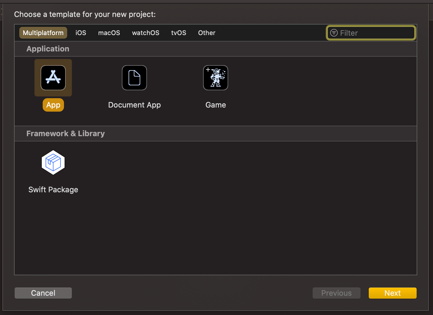
Xcode 12 comes with Swift toolchain 5.3 which brings resource and localisation support to Swift packages. Nice thing is that Swift package support only depends on the toolchain’s version and does not have additional OS requirements. At the same time, let’s keep in mind that OS requirements come from the code we actually add to the package. This means that it is a good time to start using Swift packages for separating code into separate libraries and stop using separate framework projects in a workspace. Additional benefit is that, if needed, it is pretty easy to move the package out of the workspace and creating a sharable package what can be publish and reused in other projects. But for now, let’s take a look on how to set up a new workspace with an app project and a Swift package which represents a design library with custom button style.
File structure of the workspace
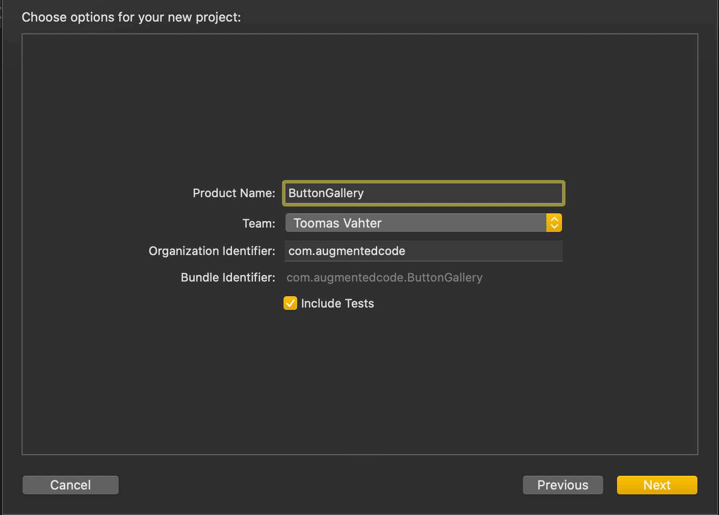
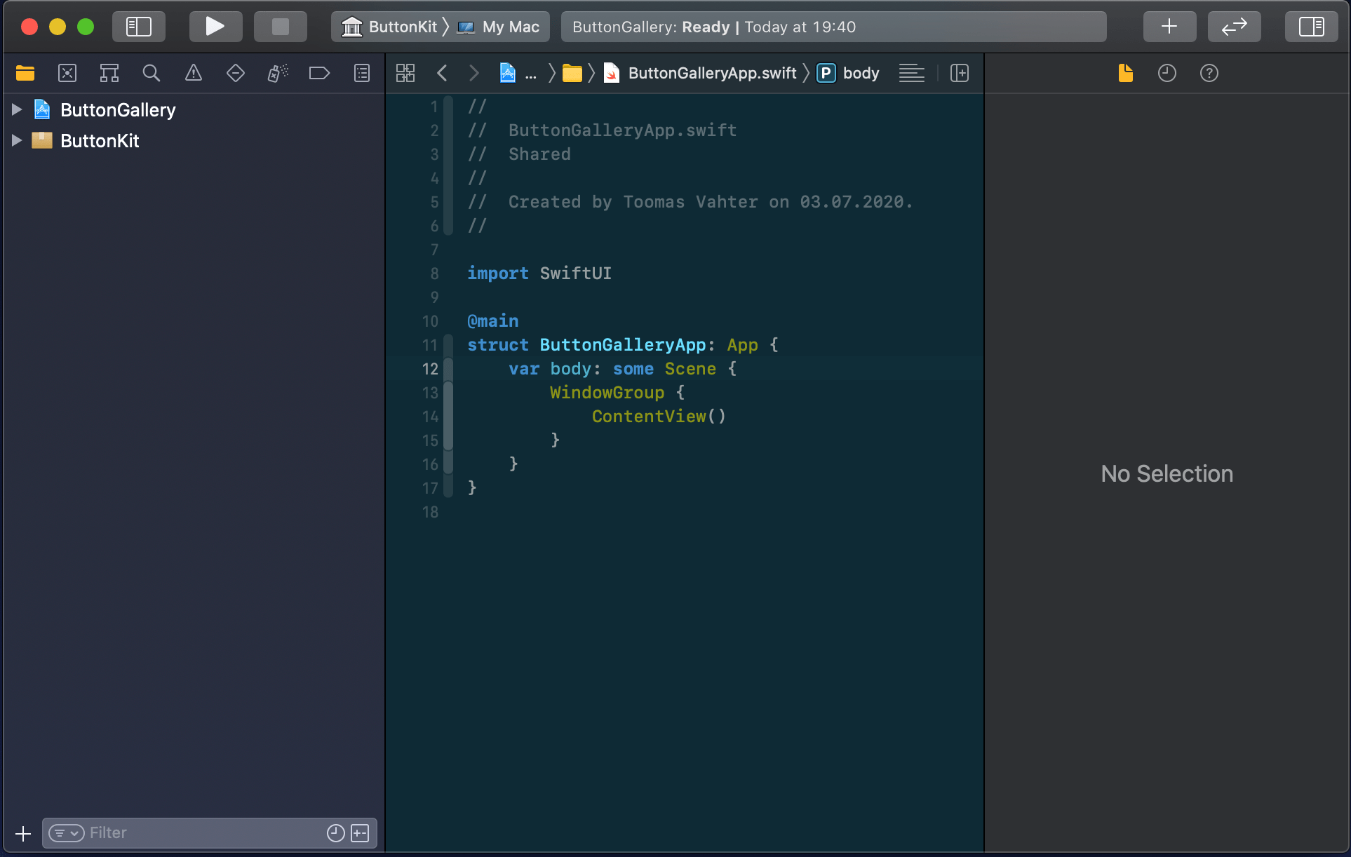
The app project will have a name “ButtonGallery” and the Swift package will have a name “ButtonKit”. But first, let’s create a folder named “SwiftPackageAppWorkspace” which is the root folder of the project. The app project and the Swift package will go to that folder in separate folders.
Adding the workspace, the app project, and the Swift package
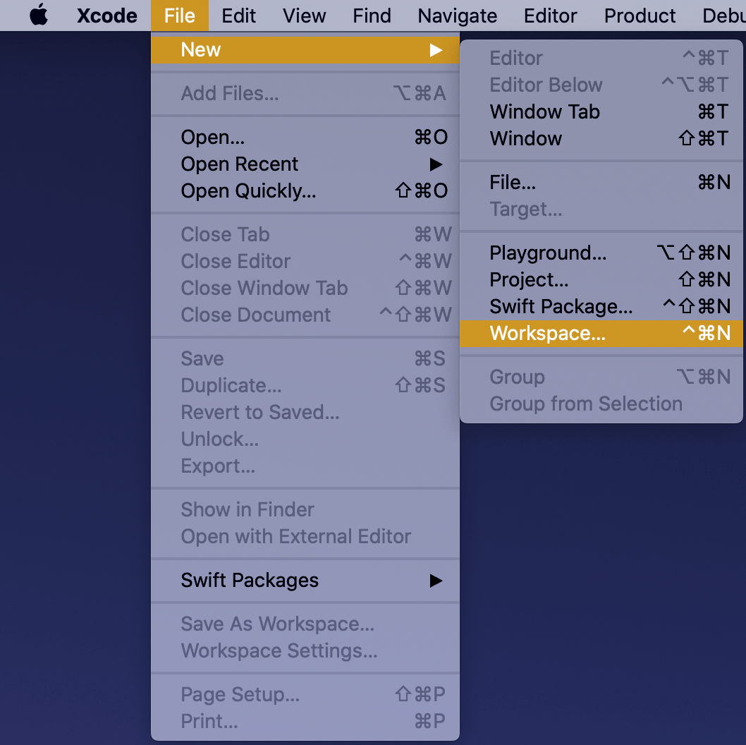
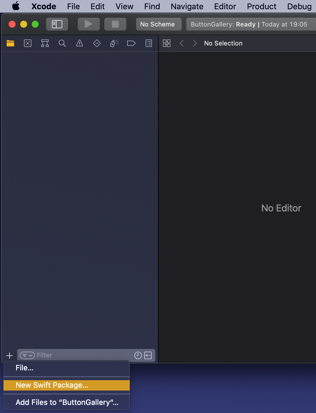
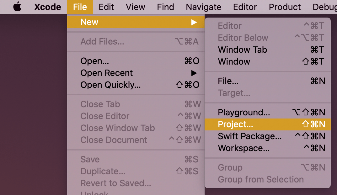
New workspace can be created by selecting the Workspace menu item in File>New menu in the Xcode. Save the workspace in the “SwiftPackageAppWorkspace” folder what we created just before. Xcode opens the created workspace after clicking on save and then the next step is to add a new Swift package. Easiest is to use the plus button at the bottom of the left corner, selecting “New Swift Package”, and saving the package in the “SwiftPackageAppWorkspace” folder. Uncheck the option on the save panel for creating a git repository because the git repository should be added in the “SwiftPackageAppWorkspace” instead (we skipped this step). Third step is to add the app project by using File>New menu. Xcode also offers an option to add the new project to the workspace. Therefore make sure “Add to” and “Group” have the workspace selected on the save panel. Described steps are shown below.
Selecting a new workspace in the main menu.Using the plus button in the workspace for creating a new package.Saving Swift package in the root folder.Adding a new Xcode project.Selecting template for the project.Adding a name to the app project.Saving a new app project and adding to an existing workspace.Workspace with a Swift package and an app project.
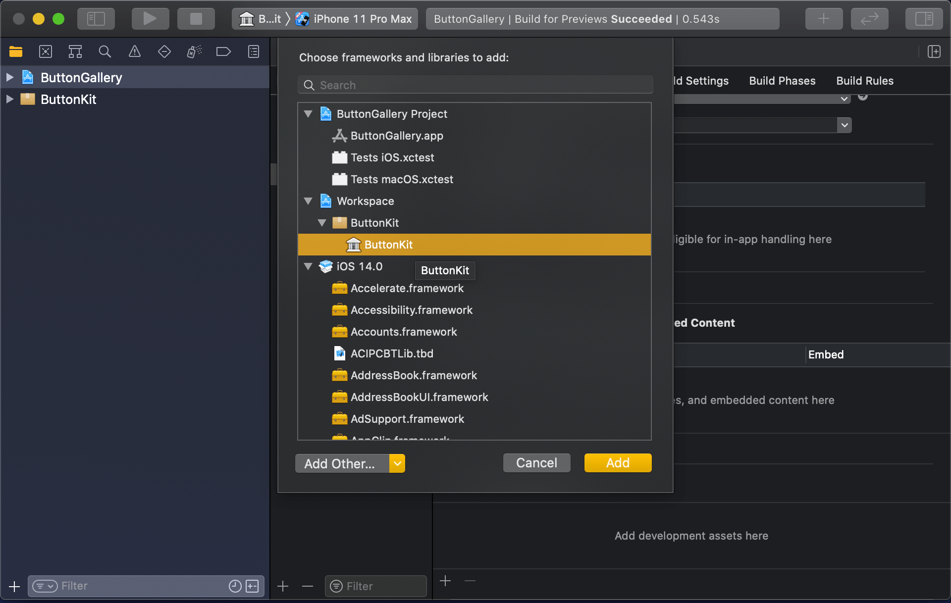
Linking the Swift package in the app project
Swift package needs to be added to the app target: select “ButtonGallery” in the project navigator, click on the iOS target, General, and then on the plus button in the “Frameworks, Libraries, and Embedded Content” section, select the “ButtonKit” library.
Navigating to iOS target’s general settings.Linking with the ButtonKit.
Now the workspace is configured but there is not any useful code in the “ButtonKit”. Let’s fix that next and add a FunkyButtonStyle.swift to the package and set minimum platforms in the package manifest because we’ll use SwiftUI in the implementation and it has minimum platform requirements. Because FunkyButtonStyle is in a separate module and by default access control is set to internal, then we’ll need to make it public before it can be imported to the app target.
This file contains hidden or bidirectional Unicode text that may be interpreted or compiled differently than what appears below. To review, open the file in an editor that reveals hidden Unicode characters.
Learn more about bidirectional Unicode characters
This file contains hidden or bidirectional Unicode text that may be interpreted or compiled differently than what appears below. To review, open the file in an editor that reveals hidden Unicode characters.
Learn more about bidirectional Unicode characters
This file contains hidden or bidirectional Unicode text that may be interpreted or compiled differently than what appears below. To review, open the file in an editor that reveals hidden Unicode characters.
Learn more about bidirectional Unicode characters
ContentView in the app target which imports ButtonKit and uses its FunkyButtonStyle.
Summary
We created a new workspace what contains a Swift package and an app project. We looked into how to provide functionality in the package and making it available for the main app target.
Picker is used for presenting a selection consisting of multiple options. UISegmentedControl which is known from UIKit is just a different picker style in SwiftUI. Let’s take a quick look on how to create a form with two items: picker with default style and picker with segmented style.
Creating a from
Form should be typically presented in a NavigationView which enables picker to present a list of items on a separate view in the navigation stack. Using the code below, we can create a form view which has a familiar visual style.
This file contains hidden or bidirectional Unicode text that may be interpreted or compiled differently than what appears below. To review, open the file in an editor that reveals hidden Unicode characters.
Learn more about bidirectional Unicode characters
Form view in navigation view for enabling navigation stack.
Example app presenting a form with pickers.
Setting up a picker and providing data with enum
Creating a picker requires specifying a title, a binding for selection, and function for providing a content. In the example below, we are using ForEach for creating views on demand. The number of options is defined by the number of items in the array. Each string is also used as identification of the view provided by the ForEach.
This file contains hidden or bidirectional Unicode text that may be interpreted or compiled differently than what appears below. To review, open the file in an editor that reveals hidden Unicode characters.
Learn more about bidirectional Unicode characters
An enum which is conforming to CaseIterable protocol is a convenient way for defining data for a picker. In the example below, data is identified by enum case’s rawValue and each view has a tag equal to enum’s case. Without a tag, selection would not be displayed because there would not be a connection between the selection binding and the view returned by ForEach.
This file contains hidden or bidirectional Unicode text that may be interpreted or compiled differently than what appears below. To review, open the file in an editor that reveals hidden Unicode characters.
Learn more about bidirectional Unicode characters
Creating a form view which uses the familiar style from iOS requires only a little bit of code in SwiftUI. Adding pickers and segmented controls, which are used a lot in forms, are pretty easy to set up.
SwiftUI provides wrappers for UIViewController and UIView on iOS. Same wrappers are also available for AppKit views on macOS. Let’s see how to use those wrappers for rendering UIKit views in SwiftUI previews and therefore benefiting from seeing changes immediately. Note that even when a project can’t support SwiftUI views because of the minimum deployment target, then this is still something what can be used when compiling the project with debug settings. Preview related code should only be compiled in debug builds and is never meant to be compiled in release builds. Before we jump in, there are two very useful shortcuts for keeping in mind: option+command+return for toggling previews and option+command+p for refreshing previews.
UIViewControllerRepresentable for wrapping UIViewControllers
UIViewControllerRepresentable is a protocol which can be used for wrapping UIViewController and representing it in SwiftUI. We can add a struct which conforms to that protocol and then creating an instance of the view controller in the makeUIViewController method. Second step is to add another struct which implements PreviewProvider protocol and which is used by Xcode for rendering previews. In simple cases we can get away only with such implementation but in more complex view controllers we would need to set up dependencies and generate example data for the preview. If need to do this, then all that code can be added to the makeUIViewController method.
This file contains hidden or bidirectional Unicode text that may be interpreted or compiled differently than what appears below. To review, open the file in an editor that reveals hidden Unicode characters.
Learn more about bidirectional Unicode characters
Wrapping UIViewController with UIViewControllerRepresentable.
UIViewController shown using SwiftUI
UIViewRepresentable for wrapping UIViews
UIViewRepresentable follows the same flow. In the example below, we use Group for showing two views with fixed size and different appearances at the same time.
This file contains hidden or bidirectional Unicode text that may be interpreted or compiled differently than what appears below. To review, open the file in an editor that reveals hidden Unicode characters.
Learn more about bidirectional Unicode characters
Wrapping UIView subclass with UIViewRepresentable.
Multiple UIViews shown in SwiftUI preview at the same time.
Summary
We looked into how to wrap view controllers and views for SwiftUI previews. Previews only required a little bit of code and therefore it is something what we can use for improving our workflows when working with UIKit views.
I am happy to announce that Signal Path 2.0 is available now for macOS and iOS. Signal Path uses Apple’s universal purchase offering – buy it once for both platforms.
I spent a lot of time architecting both apps in a way that they reuse as much functionality as possible: from Metal pipelines to view models powering the UI. Most of the UI is written in SwiftUI, but there are a couple of views using UIKit (iOS) and AppKit (macOS) directly. Now when the groundwork is done, every next release will offer the same core functionality on both platforms and also integrating OS specific features. Future is bright, give Signal Path a try!
What is Signal Path
Signal Path is the most performant spectrum viewing app with beautiful user interface. You can record audio spectrums using microphone or open large recordings containing I/Q data. Read more about Signal Path.
Let’s take a look on how to set an equal width to multiple views where the width equals to the widest Text() view in SwiftUI. SwiftUI does not have an easy to use view modifier for this at the moment, therefore we’ll add one ourselves. Example use case is displaying two text bubbles with width equaling to the widest bubble.
Creating a content view with text bubbles
The content view contains two TextBubble views with different text. The minimum width for both Text() values are stored in the @State property. The property is updated by custom equalWidth() view modifiers in TextBubble views using bindings. In other words, the view modifier updates the minimum width based on the text in a TextBubble view and uses the calculated value for both TextBubble views.
This file contains hidden or bidirectional Unicode text that may be interpreted or compiled differently than what appears below. To review, open the file in an editor that reveals hidden Unicode characters.
Learn more about bidirectional Unicode characters
PreferenceKeys in SwiftUI are used for propagating values from child views to ancestor views. This is what we are using here as well: TextBubble views are reading their size using a GeometryReader and then setting the width of the text to our custom EqualWidthPreferenceKey. The background view modifier is used for layering GeometryReader behind the content view which avoids GeometryReader to affect the layout. Transparent color view is only used for producing a value for the preference key which is then set to the binding in the preference key change callback. The frame view modifier reads the value and makes the returned view wider if needed.
This file contains hidden or bidirectional Unicode text that may be interpreted or compiled differently than what appears below. To review, open the file in an editor that reveals hidden Unicode characters.
Learn more about bidirectional Unicode characters


 Augmented Code