Categories
iOS macOS Swift SwiftUI

Animating a custom wave shape in SwiftUI

Shape protocol in SwiftUI is used for defining views which render custom shapes. Shapes have one required method which takes in a rect and returns a Path. In addition to view protocol, shape conforms to Animatable protocol as well. Therefore we can quite easily make our custom shape to animate from one state to another. We’ll use two parameters for defining our Wave shape: amplitude and frequency. Amplitude dictates the height of the wave and frequency the distance between wave peaks.

Animating wave shape by changing amplitude and frequency
Animating wave shape.

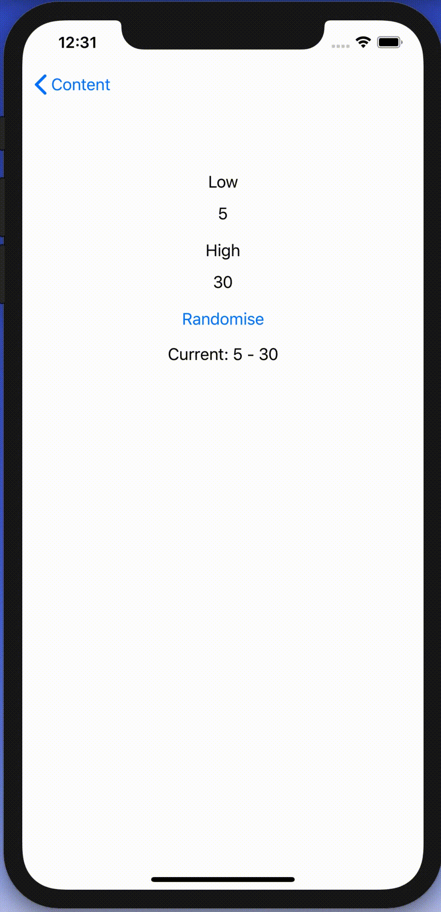
SwiftUI view displaying an animatable wave shape

Let’s take a look on an example view which displays custom Wave shape. We’ll use @State property wrappers for storing amplitude and frequency because we want to change those values when running the app. Those properties are updated with random values when pressing a button. The wave has blue fill color, fixed height, and basic easeInOut animation. The animation is used when amplitude and/or frequency change.

struct ContentView: View {
@State private var amplitude = 10.0
@State private var frequency = 0.1
var body: some View {
ZStack {
Wave(amplitude: amplitude, frequency: frequency)
.fill(Color.blue)
.frame(height: 300.0)
.animation(.easeInOut(duration: 3))
Button(action: toggleAnimation, label: {
Text("Animate")
})
.padding(4)
.background(Color.red)
.cornerRadius(8)
.foregroundColor(.white)
}
}
func toggleAnimation() {
amplitude = amplitude <= 15.0 ? Double.random(in: 30.0…60.0) : Double.random(in: 5.0…15.0)
frequency = frequency <= 0.2 ? Double.random(in: 0.2…0.4) : Double.random(in: 0.05…0.2)
}
}
Content view rendering a wave shape with a button starting an animation.

Animatable wave shape

Like mentioned in the introduction, the Shape protocol defines a required method which has a rect argument and returns a Path. The path starts from the top left edge. Sine function is used for calculating y coordinates for every x coordinate with a 1 point step. Right, bottom and left edges are just straight lines.

Animatable protocol defines an animatableData property and because we have two parameters (amplitude and frequency) we’ll need to use AnimatablePair type. If there would be more parameters then AnimatablePair should contain one or more AnimatablePair types (and so on). Note that values in animatableData must conform to VectorArithmetic protocol which Double type already does.

When animation is running then SwiftUI calculates amplitude and frequency values based on the current animation frame and sets it to the animatableData property. Then new Path value is calculated and rendered.

struct Wave: Shape {
var amplitude: Double
var frequency: Double
func path(in rect: CGRect) -> Path {
let sinCenterY = amplitude
let path = CGMutablePath()
path.move(to: CGPoint(x: 0, y: sinCenterY))
let width = Double(rect.width)
for x in stride(from: 0, through: width, by: 1) {
let y = sinCenterY + amplitude * sin(frequency * x)
path.addLine(to: CGPoint(x: x, y: y))
}
path.addLine(to: CGPoint(x: rect.maxX, y: rect.maxY))
path.addLine(to: CGPoint(x: rect.minX, y: rect.maxY))
path.addLine(to: CGPoint(x: Double(rect.minX), y: sinCenterY))
return Path(path)
}
var animatableData: AnimatablePair<Double, Double> {
get {
return AnimatablePair(amplitude, frequency)
}
set {
amplitude = newValue.first
frequency = newValue.second
}
}
}
view raw Wave.swift hosted with ❤ by GitHub
Animatable Wave shape.

Summary

We took a look at the Shape protocol and created a wave shape. In addition, we made the wave to animate from one amplitude and frequency state to a new state.

If this was helpful, please let me know on Mastodon@toomasvahter or Twitter @toomasvahter. Feel free to subscribe to RSS feed. Thank you for reading.

Categories
CoreData iOS macOS Swift WidgetKit

Sharing data from CoreData storage with a Widget on iOS

WWDC’20 introduced WidgetKit which is a new framework for building widgets on iOS, iPadOS, and macOS. Widgets provide a quick way for displaying content from your app either on the home screen on iOS or on the notification center on macOS. As I have an iOS app which stores data with CoreData then let’s see what it takes to share it with a widget. Note that we’ll only concentrate on sharing data between the app and the widget. For adding a widget to an existing project I would recommend taking a look at Apple’s excellent article: “Creating a Widget Extension”.

Configuring the project for sharing data with the widget

The project I have is an iOS app which keeps track of plants. Therefore, we’ll look into providing plants to a simple widget which just displays one of the plants which needs to be watered next. CoreData store contains all the plants with previous and next watering date. As widgets are meant to be lightweight extensions to your app we’ll aim at passing the minimum amount of data to the widget. WidgetKit does not provide a connectivity framework like WatchOS does because widgets are not running all the time. Therefore we will store data in a file and write the file to a shared container which the app and the widget can access. This can be done by adding app groups capability to both targets. The group name could be something like group.com.company.appname.widget. When this is set, then the url to a shared container can be created using FileManager like shown below.

extension WidgetPlantProvider {
static let sharedDataFileURL: URL = {
let appGroupIdentifier = "group.com.company.appname.widget"
if let url = FileManager.default.containerURL(forSecurityApplicationGroupIdentifier: appGroupIdentifier) {
return url.appendingPathComponent("Plants.plist")
}
else {
preconditionFailure("Expected a valid app group container")
}
}()
}
Creating an URL for shared file.

Updating the shared file

The iOS app has a class named WidgetPlantProvider which is responsible of updating the shared file and letting WidgetKit know when the data has changed. This class uses NSPersistentContainer for accessing CoreData storage and fetches dictionary representations of Plant entities. As those dictionaries contain NSDate objects then we’ll need to convert dates to double values which represent dates as seconds from the year of 1970. This enables us to archive the list of dictionaries to a data object with NSKeyedArchiver and writing the data object into the shared container. Last step is letting WidgetKit to know that timelines should be reloaded because data has changed. The implementation of the class is available below including observing managed object save notification.

final class WidgetPlantProvider {
private var cancellables = [AnyCancellable]()
private let plantContainer: PlantContainer // NSPersistentContainer subclass
init(plantContainer: PlantContainer, notificationCenter: NotificationCenter = .default) {
self.plantContainer = plantContainer
let notificationCancellable = notificationCenter.publisher(for: .NSManagedObjectContextDidSave, object: plantContainer.viewContext).sink { [weak self] _ in
self?.reloadData()
}
cancellables.append(notificationCancellable)
}
// Called when NSPersistentContainer is first loaded
func reloadData() {
plantContainer.performBackgroundTask { context in
let descriptors = [NSSortDescriptor(keyPath: \Plant.nextWateringDate, ascending: true)]
// fetchDictionaries is convenience method which creates and executes NSFetchRequest<NSDictionary> and sets resultType = .dictionaryResultType
let dictionaries = Plant.fetchDictionaries(context, sortDescriptors: descriptors, fetchLimit: 3) as! [[String: Any]]
// NSDate -> double conversion
let converted = dictionaries.map { (plantDictionary) -> [String: Any] in
return plantDictionary.mapValues { (value) -> Any in
guard let date = value as? Date else { return value }
return date.timeIntervalSince1970
}
}
do {
let needsFileReload: Bool = {
guard let storedData = try? Data(contentsOf: Self.sharedDataFileURL) else { return true }
guard let storedDictionaries = try? NSKeyedUnarchiver.unarchiveTopLevelObjectWithData(storedData) as? [NSDictionary] else { return true }
return storedDictionaries != converted as [NSDictionary]
}()
if !needsFileReload {
os_log(.debug, log: .widget, "Plants already up to date for widget")
return
}
let data = try NSKeyedArchiver.archivedData(withRootObject: converted, requiringSecureCoding: true)
try data.write(to: Self.sharedDataFileURL)
os_log(.debug, log: .widget, "Reloading widget because plants changed")
WidgetCenter.shared.reloadAllTimelines()
}
catch {
os_log(.debug, log: .widget, "Failed updating plants for widget with error %s", error.localizedDescription)
}
}
}
}
WidgetPlantProvider which stores Plant entities as dictionaries in the shared file.

Reading the shared file in the widget

Reading the file in the widget requires us to create an URL pointing at the shared container, reading the data, and converting the data to a list of plants. As the data contains a list of dictionary objects then we can take advantage of JSONDecoder and convert dictionaries to PlantRepresentation value type. PlantRepresentation struct conforms to Codable protocol which enables converting dictionary object to a JSON data representation and then decoding the JSON data to a value type. Date properties are represented as seconds from the year of 1970, then JSONDecoder’s dateDecodingStrategy must be set to DateDecodingStrategy.secondsSince1970. This approach of converting dictionary to a value type is discussed in detail in “Storing struct in UserDefaults”. An example provider type with described approach is available below.

struct Provider: TimelineProvider {
// …
func getTimeline(in context: Context, completion: @escaping (Timeline<Entry>) -> ()) {
let plants = loadPlants()
let entry = PlantEntry(date: Date(), plants: plants)
let timeline = Timeline(entries: [entry], policy: .atEnd)
completion(timeline)
}
private func loadPlants() -> [PlantRepresentation] {
do {
let data = try Data(contentsOf: Self.sharedDataFileURL)
let plantDictionaries = try NSKeyedUnarchiver.unarchiveTopLevelObjectWithData(data) as? [[String: Any]]
let decoder = JSONDecoder()
decoder.dateDecodingStrategy = .secondsSince1970
return plantDictionaries?.compactMap({ PlantRepresentation(dictionary: $0, decoder: decoder) }) ?? []
}
catch {
print(error.localizedDescription)
return []
}
}
private static var sharedDataFileURL: URL {
let identifier = "group.com.company.appname.widget"
if let url = FileManager.default.containerURL(forSecurityApplicationGroupIdentifier: identifier) {
return url.appendingPathComponent("Plants.plist")
}
else {
preconditionFailure("Expected a valid app group container")
}
}
}
// DictionaryDecodable: https://augmentedcode.io/2019/05/12/storing-struct-in-userdefaults/
struct PlantRepresentation: Identifiable, Decodable, DictionaryDecodable {
let id: String
let name: String
let lastWateringDate: Date
let nextWateringDate: Date
}
struct PlantEntry: TimelineEntry {
let date: Date
let plants: [PlantRepresentation]
}
view raw Provider.swift hosted with ❤ by GitHub
Timeline provider for a Widget which reads the data from the shared file.

Summary

We went through the steps of setting up app groups and sharing data in CoreData store with a widget. Next steps would be to use the timeline and polishing the Widget’s appearance.

If this was helpful, please let me know on Mastodon@toomasvahter or Twitter @toomasvahter. Feel free to subscribe to RSS feed. Thank you for reading.

Categories
iOS macOS Swift SwiftUI

@StateObject and MVVM in SwiftUI

A while ago I wrote about using MVVM in a SwiftUI project. During the WWDC’20 Apple announced @StateObject property wrapper which is a nice addition in the context of MVVM. @StateObject makes sure that only one instance is created per a view structure. This enables us to use @StateObject property wrappers for class type view models which eliminates the need of managing the view model’s lifecycle ourselves.

Comparing @StateObject and @ObservableObject for view model property

The most common flow in MVVM is creating and configuring a view model, which includes injecting dependencies, and then passing it into a view. This creates a question in SwiftUI: how to manage the lifecycle of the view model when view hierarchy renders and view structs are recreated. @StateObject property wrapper is going to solve this question in a nice and concise way. Let’s consider an example code.

import SwiftUI
struct ContentView: View {
@EnvironmentObject var dependencyContainer: DependencyContainer
@StateObject var viewModel = ContentViewModel()
var body: some View {
VStack(alignment: .center) {
VStack(spacing: 32) {
Text(viewModel.refreshTimestamp)
Button(action: viewModel.refresh, label: {
Text("Refresh")
})
}
Spacer()
BottomBarView(viewModel: BottomBarViewModel(entryStore: dependencyContainer.entryStore))
}
}
}
ContentView which has a subview.

ContentView is a simple view which has a view model managing the view state and DependencyContainer used for injecting a dependency to the BottomBarViewModel when it is created. As we can see, ContentView’s view model is managed by @StateObject property wrapper. This means that ContentViewModel is created once although ContentView can be recreated several times. BottomBarView has a little bit more complex setup where the view model requires external dependency managed by the DependencyContainer. Therefore, we’ll need to create the view model with a dependency and then initialize BottomBarView with it. BottomBarView’s view model property is also annotated with @StateObject property wrapper.

import Combine
import SwiftUI
struct BottomBarView: View {
@StateObject var viewModel: BottomBarViewModel
var body: some View {
Text(viewModel.text)
}
}
final class BottomBarViewModel: ObservableObject {
@Published var text: String = ""
private var cancellables = [AnyCancellable]()
private let entryStore: EntryStore
init(entryStore: EntryStore) {
self.entryStore = entryStore
print(self, #function)
cancellables.append(Timer.publish(every: 2, on: .main, in: .default).autoconnect().sink { [weak self] (_) in
self?.text = "Random number: \(Int.random(in: 0..<100))"
})
}
}
BottomBarView and its view model.

Magical aspect here is that when the ContentView’s body is accessed multiple times then BottomBarViewModel is not recreated when the BottomBarView struct is initialized. Exactly what we need – view will manage the lifecycle of its view model. This can be verified by adding a print to view model initializers and logging when ContentView’s body is accessed. Here is example log which compares BottomBarView’s view model property when it is annotated with @StateObject or @ObservableObject. Note how view model is not created multiple times when BottomBarView uses @StateObject.

BottomBarView uses @StateObject for its view model property
SwiftUIStateObject.ContentViewModel init()
1 ContentView.body accessed
SwiftUIStateObject.BottomBarViewModel init(entryStore:)
Triggering ContentView refresh
2 ContentView.body accessed
Triggering ContentView refresh
3 ContentView.body accessed

BottomBarView uses @ObservableObject for its view model property
SwiftUIStateObject.ContentViewModel init()
1 ContentView.body accessed
SwiftUIStateObject.BottomBarViewModel init(entryStore:)
Triggering ContentView refresh
2 ContentView.body accessed
SwiftUIStateObject.BottomBarViewModel init(entryStore:)
Triggering ContentView refresh
3 ContentView.body accessed
SwiftUIStateObject.BottomBarViewModel init(entryStore:)

Summary

WWDC’20 brought us @StateObject which simplifies handling view model’s lifecycle in apps using MVVM design pattern.

If you are looking more information about the MVVM design pattern then please check: MVVM in SwiftUI and MVVM and @dynamicMemberLookup in Swift.

If this was helpful, please let me know on Mastodon@toomasvahter or Twitter @toomasvahter. Feel free to subscribe to RSS feed. Thank you for reading.

Example

SwiftUIStateObject (GitHub) Xcode 12.0 beta 3

Categories
iOS macOS Swift Swift Package SwiftUI Xcode

Separating code with Swift packages in Xcode

Xcode 12 comes with Swift toolchain 5.3 which brings resource and localisation support to Swift packages. Nice thing is that Swift package support only depends on the toolchain’s version and does not have additional OS requirements. At the same time, let’s keep in mind that OS requirements come from the code we actually add to the package. This means that it is a good time to start using Swift packages for separating code into separate libraries and stop using separate framework projects in a workspace. Additional benefit is that, if needed, it is pretty easy to move the package out of the workspace and creating a sharable package what can be publish and reused in other projects. But for now, let’s take a look on how to set up a new workspace with an app project and a Swift package which represents a design library with custom button style.

File structure of the workspace

The app project will have a name “ButtonGallery” and the Swift package will have a name “ButtonKit”. But first, let’s create a folder named “SwiftPackageAppWorkspace” which is the root folder of the project. The app project and the Swift package will go to that folder in separate folders.

Adding the workspace, the app project, and the Swift package

New workspace can be created by selecting the Workspace menu item in File>New menu in the Xcode. Save the workspace in the “SwiftPackageAppWorkspace” folder what we created just before. Xcode opens the created workspace after clicking on save and then the next step is to add a new Swift package. Easiest is to use the plus button at the bottom of the left corner, selecting “New Swift Package”, and saving the package in the “SwiftPackageAppWorkspace” folder. Uncheck the option on the save panel for creating a git repository because the git repository should be added in the “SwiftPackageAppWorkspace” instead (we skipped this step). Third step is to add the app project by using File>New menu. Xcode also offers an option to add the new project to the workspace. Therefore make sure “Add to” and “Group” have the workspace selected on the save panel. Described steps are shown below.

Selecting a new workspace in the main menu.
Using the plus button in the workspace for creating a new package.
Saving Swift package in the root folder.
Adding a new Xcode project.
Selecting template for the project.
Adding a name to the app project.
Saving a new app project and adding to an existing workspace.
Workspace with a Swift package and an app project.

Linking the Swift package in the app project

Swift package needs to be added to the app target: select “ButtonGallery” in the project navigator, click on the iOS target, General, and then on the plus button in the “Frameworks, Libraries, and Embedded Content” section, select the “ButtonKit” library.

Navigating to iOS target’s general settings.
Linking with the ButtonKit.

Now the workspace is configured but there is not any useful code in the “ButtonKit”. Let’s fix that next and add a FunkyButtonStyle.swift to the package and set minimum platforms in the package manifest because we’ll use SwiftUI in the implementation and it has minimum platform requirements. Because FunkyButtonStyle is in a separate module and by default access control is set to internal, then we’ll need to make it public before it can be imported to the app target.

// swift-tools-version:5.3
import PackageDescription
let package = Package(
name: "ButtonKit",
platforms: [
.iOS(.v14), .macOS(.v10_15)
],
products: [
.library(
name: "ButtonKit",
targets: ["ButtonKit"]),
],
targets: [
.target(
name: "ButtonKit", dependencies: []),
.testTarget(name: "ButtonKitTests", dependencies: ["ButtonKit"]),
]
)
view raw Package.swift hosted with ❤ by GitHub
import SwiftUI
public struct FunkyButtonStyle: ButtonStyle {
public init() {}
public func makeBody(configuration: Self.Configuration) -> some View {
configuration.label.padding()
.background(Color.red)
.cornerRadius(16)
.foregroundColor(.white)
}
}
import ButtonKit
import SwiftUI
struct ContentView: View {
var body: some View {
Button("Title", action: tap).buttonStyle(FunkyButtonStyle())
}
func tap() {
print("Tapped")
}
}
ContentView in the app target which imports ButtonKit and uses its FunkyButtonStyle.

Summary

We created a new workspace what contains a Swift package and an app project. We looked into how to provide functionality in the package and making it available for the main app target.

If this was helpful, please let me know on Mastodon@toomasvahter or Twitter @toomasvahter. Feel free to subscribe to RSS feed. Thank you for reading.

Project

SwiftPackageAppWorkspace (Xcode 12b1)

Categories
iOS Swift SwiftUI

Picker and segmented control in SwiftUI on iOS

Picker is used for presenting a selection consisting of multiple options. UISegmentedControl which is known from UIKit is just a different picker style in SwiftUI. Let’s take a quick look on how to create a form with two items: picker with default style and picker with segmented style.

Creating a from

Form should be typically presented in a NavigationView which enables picker to present a list of items on a separate view in the navigation stack. Using the code below, we can create a form view which has a familiar visual style.

var body: some View {
NavigationView {
Form {
Section {
makeFruitPicker()
makePlanetPicker()
}.navigationBarTitle("Pickers")
}
}.navigationViewStyle(StackNavigationViewStyle())
}
Form view in navigation view for enabling navigation stack.
Example app presenting a form with pickers.

Setting up a picker and providing data with enum

Creating a picker requires specifying a title, a binding for selection, and function for providing a content. In the example below, we are using ForEach for creating views on demand. The number of options is defined by the number of items in the array. Each string is also used as identification of the view provided by the ForEach.

@State private var selectedPlanet = ""
let planets = ["Mercury", "Venus", "Earth", "Mars", "Jupiter", "Saturn", "Neptune", "Uranus"]
func makePlanetPicker() -> some View {
Picker("Planets", selection: $selectedPlanet) {
ForEach(planets, id: \.self) { planet in
Text(planet)
}.navigationBarTitle("Planets")
}
}
Creating a picker with a list of items.

Picker with SegmentedPickerStyle

An enum which is conforming to CaseIterable protocol is a convenient way for defining data for a picker. In the example below, data is identified by enum case’s rawValue and each view has a tag equal to enum’s case. Without a tag, selection would not be displayed because there would not be a connection between the selection binding and the view returned by ForEach.

enum Fruit: String, CaseIterable {
case apple, orange, pear
}
func makeFruitPicker() -> some View {
Picker("Fruits", selection: $selectedFruit) {
ForEach(Fruit.allCases, id: \.rawValue) { fruit in
Text(fruit.rawValue).tag(fruit)
}
}.pickerStyle(SegmentedPickerStyle())
}
Picker displayed with segmented control style.

Summary

Creating a form view which uses the familiar style from iOS requires only a little bit of code in SwiftUI. Adding pickers and segmented controls, which are used a lot in forms, are pretty easy to set up.

If this was helpful, please let me know on Mastodon@toomasvahter or Twitter @toomasvahter. Feel free to subscribe to RSS feed. Thank you for reading.

Categories
iOS Swift SwiftUI UIKit

Using SwiftUI previews for UIKit views

SwiftUI provides wrappers for UIViewController and UIView on iOS. Same wrappers are also available for AppKit views on macOS. Let’s see how to use those wrappers for rendering UIKit views in SwiftUI previews and therefore benefiting from seeing changes immediately. Note that even when a project can’t support SwiftUI views because of the minimum deployment target, then this is still something what can be used when compiling the project with debug settings. Preview related code should only be compiled in debug builds and is never meant to be compiled in release builds. Before we jump in, there are two very useful shortcuts for keeping in mind: option+command+return for toggling previews and option+command+p for refreshing previews.

UIViewControllerRepresentable for wrapping UIViewControllers

UIViewControllerRepresentable is a protocol which can be used for wrapping UIViewController and representing it in SwiftUI. We can add a struct which conforms to that protocol and then creating an instance of the view controller in the makeUIViewController method. Second step is to add another struct which implements PreviewProvider protocol and which is used by Xcode for rendering previews. In simple cases we can get away only with such implementation but in more complex view controllers we would need to set up dependencies and generate example data for the preview. If need to do this, then all that code can be added to the makeUIViewController method.

import UIKit
import SwiftUI
final class ContentViewController: UIViewController {
override func loadView() {
self.view = UIView()
self.view.backgroundColor = .systemBackground
}
override func viewDidLoad() {
super.viewDidLoad()
let stackView = UIStackView(frame: .zero)
stackView.translatesAutoresizingMaskIntoConstraints = false
view.addSubview(stackView)
NSLayoutConstraint.activate([
stackView.leadingAnchor.constraint(equalTo: view.leadingAnchor, constant: 16),
stackView.trailingAnchor.constraint(equalTo: view.trailingAnchor, constant: -16),
stackView.topAnchor.constraint(equalTo: view.topAnchor, constant: 16)
])
let label = UILabel(frame: .zero)
label.translatesAutoresizingMaskIntoConstraints = false
stackView.addArrangedSubview(label)
label.textColor = .systemRed
label.text = "Red text"
}
}
// MARK: SwiftUI Preview
#if DEBUG
struct ContentViewControllerContainerView: UIViewControllerRepresentable {
typealias UIViewControllerType = ContentViewController
func makeUIViewController(context: Context) -> UIViewControllerType {
return ContentViewController()
}
func updateUIViewController(_ uiViewController: UIViewControllerType, context: Context) {}
}
struct ContentViewController_Previews: PreviewProvider {
static var previews: some View {
ContentViewControllerContainerView().colorScheme(.light) // or .dark
}
}
#endif
Wrapping UIViewController with UIViewControllerRepresentable.
UIViewController shown using SwiftUI

UIViewRepresentable for wrapping UIViews

UIViewRepresentable follows the same flow. In the example below, we use Group for showing two views with fixed size and different appearances at the same time.

import SwiftUI
import UIKit
final class BackgroundView: UIView {
override init(frame: CGRect) {
super.init(frame: .zero)
backgroundColor = .systemBackground
layer.cornerRadius = 32
layer.borderColor = UIColor.systemBlue.cgColor
layer.borderWidth = 14
}
required init?(coder: NSCoder) {
fatalError("init(coder:) has not been implemented")
}
}
// MARK: SwiftUI Preview
#if DEBUG
struct BackgroundViewContainer: UIViewRepresentable {
typealias UIViewType = BackgroundView
func makeUIView(context: Context) -> UIViewType {
return BackgroundView(frame: .zero)
}
func updateUIView(_ uiView: BackgroundView, context: Context) {}
}
struct BackgroundViewContainer_Previews: PreviewProvider {
static var previews: some View {
Group {
BackgroundViewContainer().colorScheme(.light)
BackgroundViewContainer().colorScheme(.dark)
}.previewLayout(.fixed(width: 200, height: 200))
}
}
#endif
Wrapping UIView subclass with UIViewRepresentable.
Multiple UIViews shown in SwiftUI preview at the same time.

Summary

We looked into how to wrap view controllers and views for SwiftUI previews. Previews only required a little bit of code and therefore it is something what we can use for improving our workflows when working with UIKit views.

If this was helpful, please let me know on Mastodon@toomasvahter or Twitter @toomasvahter. Feel free to subscribe to RSS feed. Thank you for reading.

Project

UIKitInSwiftUIPreview (Xcode 11.5)

Categories
AppKit iOS macOS SignalPath Swift SwiftUI UIKit

Signal Path 2.0 for iOS and macOS is available now!

I am happy to announce that Signal Path 2.0 is available now for macOS and iOS. Signal Path uses Apple’s universal purchase offering – buy it once for both platforms.

Signal Path 2.0 on the App Store

Past, present, and future

I spent a lot of time architecting both apps in a way that they reuse as much functionality as possible: from Metal pipelines to view models powering the UI. Most of the UI is written in SwiftUI, but there are a couple of views using UIKit (iOS) and AppKit (macOS) directly. Now when the groundwork is done, every next release will offer the same core functionality on both platforms and also integrating OS specific features. Future is bright, give Signal Path a try!

What is Signal Path

Signal Path is the most performant spectrum viewing app with beautiful user interface. You can record audio spectrums using microphone or open large recordings containing I/Q data. Read more about Signal Path.

Categories
iOS Swift SwiftUI

Setting an equal width to text views in SwiftUI

Let’s take a look on how to set an equal width to multiple views where the width equals to the widest Text() view in SwiftUI. SwiftUI does not have an easy to use view modifier for this at the moment, therefore we’ll add one ourselves. Example use case is displaying two text bubbles with width equaling to the widest bubble.

Creating a content view with text bubbles

The content view contains two TextBubble views with different text. The minimum width for both Text() values are stored in the @State property. The property is updated by custom equalWidth() view modifiers in TextBubble views using bindings. In other words, the view modifier updates the minimum width based on the text in a TextBubble view and uses the calculated value for both TextBubble views.

struct ContentView: View {
@State private var textMinWidth: CGFloat?
var body: some View {
VStack(spacing: 16) {
TextBubble(text: "First", minTextWidth: $textMinWidth)
TextBubble(text: "Second longer", minTextWidth: $textMinWidth)
}
}
}
struct TextBubble: View {
let text: String
let minTextWidth: Binding<CGFloat?>
var body: some View {
Text(text).equalWidth(minTextWidth) // custom view modifier
.foregroundColor(Color.white)
.padding()
.background(Color.blue)
.cornerRadius(8)
}
}
ContentView with equal widths view modifier.
ContentView without equal widths view modifier.

A view modifier applying equal widths

PreferenceKeys in SwiftUI are used for propagating values from child views to ancestor views. This is what we are using here as well: TextBubble views are reading their size using a GeometryReader and then setting the width of the text to our custom EqualWidthPreferenceKey. The background view modifier is used for layering GeometryReader behind the content view which avoids GeometryReader to affect the layout. Transparent color view is only used for producing a value for the preference key which is then set to the binding in the preference key change callback. The frame view modifier reads the value and makes the returned view wider if needed.

struct EqualWidthPreferenceKey: PreferenceKey {
typealias Value = CGFloat
static var defaultValue: CGFloat = 0
static func reduce(value: inout CGFloat, nextValue: () -> CGFloat) {
value = nextValue()
}
}
struct EqualWidth: ViewModifier {
let width: Binding<CGFloat?>
func body(content: Content) -> some View {
content.frame(width: width.wrappedValue, alignment: .leading)
.background(GeometryReader { proxy in
Color.clear.preference(key: EqualWidthPreferenceKey.self, value: proxy.size.width)
}).onPreferenceChange(EqualWidthPreferenceKey.self) { (value) in
self.width.wrappedValue = max(self.width.wrappedValue ?? 0, value)
}
}
}
extension View {
func equalWidth(_ width: Binding<CGFloat?>) -> some View {
return modifier(EqualWidth(width: width))
}
}

Summary

We created a view modifier which reads a view width and propagates the value to other views using a preference key, a binding, and a @State property.

If this was helpful, please let me know on Mastodon@toomasvahter or Twitter @toomasvahter. Feel free to subscribe to RSS feed. Thank you for reading.

Categories
Combine Foundation iOS Swift SwiftUI Xcode

Validating string in TextField with NumberFormatter in SwiftUI

I was looking into creating a view which has TextField with NumberFormatter. Typed text would show up in a separate label and when trying to enter non-numbers, the TextField would reject those characters. Although TextField component in SwiftUI has generic initialiser init(_:value:formatter:onEditingChanged:onCommit:) it does not seem to do what we need. Value binding does not update while typing, non-number characters are not discarded, and string is not reloaded when view reloads with different model data. Therefore, I decided to create a wrapper around TextField which deals with transforming numbers to strings and implements all the before mentioned features.

End result after creating a custom NumberTextField.

Content view with temperature limits

Example use-case is basic view for editing temperature limits where model type will force high value to be at least 10 units higher compared to low value. The model type also have separate properties for getting NSNumber instances what we use later (such conversion could also happen on SwiftUI level).

struct TemperatureLimits {
var low: Int = 5 {
didSet {
let high = max(self.high, low + 10)
guard self.high != high else { return }
self.high = high
}
}
var high: Int = 30 {
didSet {
let low = min(self.low, high – 10)
guard self.low != low else { return }
self.low = low
}
}
var lowNumber: NSNumber {
get { NSNumber(value: low) }
set { low = newValue.intValue }
}
var highNumber: NSNumber {
get { NSNumber(value: high) }
set { high = newValue.intValue }
}
}
Model type storing temperature limits which are forced to have 10 unit difference.

Content view has text fields, button for randomising limits and label for displaying current values. NumberTextField is a custom view which implements all the features what we listed in the beginning of the post.

import Combine
import SwiftUI
struct FormatterView: View {
@State var limits: TemperatureLimits
var body: some View {
VStack(spacing: 16) {
VStack {
Text("Low")
NumberTextField("Low", value: $limits.lowNumber, formatter: NumberFormatter.decimal)
}
VStack {
Text("High")
NumberTextField("High", value: $limits.highNumber, formatter: NumberFormatter.decimal)
}
Button(action: {
self.limits.low = Int.random(in: 0…40)
self.limits.high = Int.random(in: 50…100)
}, label: {
Text("Randomise")
})
Text("Current: \(limits.low) – \(limits.high)")
Spacer()
}.padding()
.multilineTextAlignment(.center)
}
}
extension NumberFormatter {
static var decimal: NumberFormatter {
let formatter = NumberFormatter()
formatter.allowsFloats = false
return formatter
}
}
View with custom NumberTextFields bound to temperature limits.

Creating NumberTextField with NSNumber binding and NumberFormatter

NumberTextField is a wrapper around TextField and internally handles NSNumber to String and String to NSNumber transformations. Transformations happen inside a separate class called StringTransformer which stores editable string in @Published property. @Published property is first populated with string value by transforming NSNumber to String using the formatter. Changes made by user are captured by subscribing to stringValue publisher (@Published properties provide publishers). String to NSNumber transformation is tried when user edits the string: if successful, NSNumber is send back to model using the value binding, if fails, stringValue is set back to previous value. Note that dropFirst skips initial update when setting up sink and receive operator is used for scheduling updates at later time when SwiftUI has finished current layout update cycle.

struct NumberTextField: View {
init(_ title: String, value: Binding<NSNumber>, formatter: NumberFormatter) {
self.title = title
self.stringTransformer = StringTransformer(value, formatter: formatter)
}
private let title: String
@ObservedObject private var stringTransformer: StringTransformer
var body: some View {
TextField(title, text: $stringTransformer.stringValue)
}
}
fileprivate extension NumberTextField {
final class StringTransformer: ObservableObject {
private var cancellable: AnyCancellable?
init(_ value: Binding<NSNumber>, formatter: NumberFormatter) {
// NSNumber -> String
stringValue = formatter.string(from: value.wrappedValue) ?? ""
// String -> NSNumber
cancellable = $stringValue.dropFirst().receive(on: RunLoop.main)
.sink(receiveValue: { [weak self] (editingString) in
if let number = formatter.number(from: editingString) {
value.wrappedValue = number
}
else if !editingString.isEmpty {
// Force current model value when editing value is invalid (invalid value or out of range).
self?.stringValue = formatter.string(from: value.wrappedValue) ?? ""
}
})
}
@Published var stringValue: String = ""
}
}
NumberTextField transforming NSNumber to String using NumberFormatter and vice versa.

Summary

TextField’s formatter initialiser does not seem to be operating as expected and therefore we built a custom view. It handles number to string transformations and refreshes the view when string can’t be transformed to number. Hopefully future SwiftUI iterations will fix the init(_:value:formatter:onEditingChanged:onCommit:) initialiser and NumberTextField is not needed at all.

If this was helpful, please let me know on Mastodon@toomasvahter or Twitter @toomasvahter. Feel free to subscribe to RSS feed. Thank you for reading.

Example project

SwiftUIFormattedTextField (Xcode 11.4.1)

Categories
iOS Swift SwiftUI

MVVM and @dynamicMemberLookup in Swift

View models in MVVM are responsible of making the model suitable for presenting by a view. Quite often model objects themselves have properties which can be directly presented by the view. SE-0195 added dynamic member lookup types. Using @dynamicMemberLookup we can add all the model object’s properties to the view model itself. Result, model.name is also accessible by calling name on the view model.

View model with @dynamicMemberLookup

Example app presents chemical element: symbol, name, atomic number, and atomic weight. Model object’s properties which can be displayed without transformations are symbol and name. Atomic number and weight are transformed and label is prepended to a value.

View presenting properties of a chemical element.
struct ChemicalElement {
    let name: String // Hydrogen
    let symbol: String // H
    let atomicNumber: Int // 1
    let atomicWeight: Double // 1.008
}

View model is initialised with an instance of chemical element. What we would like to have is accessing all the data by asking it from view model: viewModel.name, viewModel.symbol, viewModel.numberDescription, viewModel.weightDescription. Dynamic member lookup enables us adding all the model object’s properties to the view model with only some lines of code. It makes a real difference if the model and view model have a way more data than in the current example.

struct ContentView: View {
    let viewModel: ContentViewModel
    
    var body: some View {
        VStack(spacing: 4) {
            Text(viewModel.symbol).font(.system(size: 42)).fontWeight(.bold)
            VStack(spacing: 4) {
                Text(viewModel.name)
                Group {
                    Text(viewModel.numberDescription)
                    Text(viewModel.weightDescription)
                }.font(.footnote)
            }
        }
    }
}

Let’s take a look on the view model. When view model is annotated with @dynamicMemerLookup, we’ll just need to implement one method. This is what is used to passing through model object’s data directly to the view. That is all we need to do for exposing model object’s properties on the view model level.

@dynamicMemberLookup
struct ContentViewModel {
    private let chemicalElement: ChemicalElement
    
    init(chemicalElement: ChemicalElement) {
        self.chemicalElement = element
    }
    
    subscript<T>(dynamicMember keyPath: KeyPath<ChemicalElement, T>) -> T {
        return chemicalElement[keyPath: keyPath]
    }
    
    var numberDescription: String {
        return "Number: \(chemicalElement.atomicNumber)"
    }
    
    var weightDescription: String {
        return "Weight: \(chemicalElement.atomicWeight)"
    }
}

Summary

Dynamic member lookup in Swift is useful addition to MVVM pattern when there is need to expose model’s properties directly to the view. When working with models with many properties, it is very useful.

Please also take a look on MVVM in SwiftUI.

If this was helpful, please let me know on Mastodon@toomasvahter or Twitter @toomasvahter. Feel free to subscribe to RSS feed. Thank you for reading.